You worked closely with Antwerp fashion designers in the 1990s. One iconic example is the invitation for Jurgen Persoons, I Know What You’ll Wear Next Summer (summer 1999).
Exclusive interview with Paul Boudens
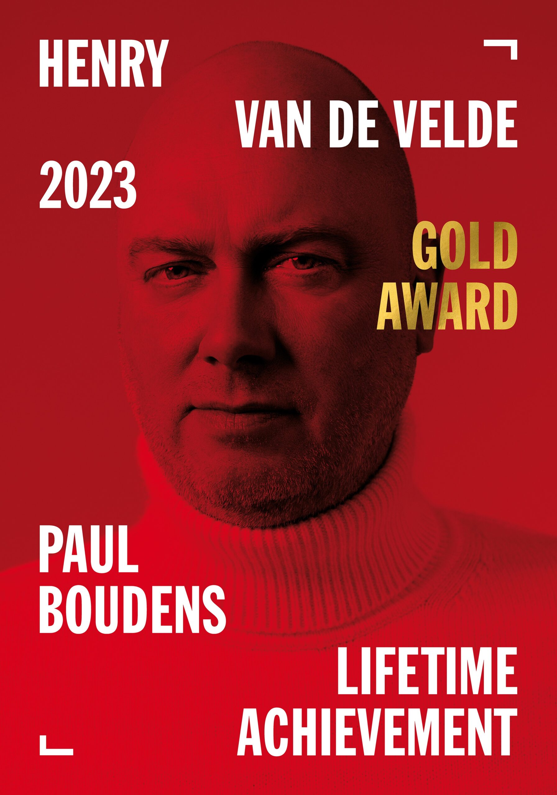
In February, our graphic designer Paul Boudens received the prestigious Henry van de Velde Lifetime Achievement Award.
Paul has become a constant presence in the Belgian fashion and design world over the past three decades. His distinctive approach has earned him major national and international recognition. To mark this milestone, we sat down with him behind the scenes to talk about his life, his work, the past and the future, as well as his experience with The Phoebus Foundation.
How did you become a graphic designer? Did you always have a passion for design?
I didn’t really know anything about design back then. As a teenager I thought I’d become a fashion designer, because I could make a fabulous evening dress for my Barbies out of a single handkerchief (laughs). I could draw, though I wasn’t and still am not the best draughtsman. That’s why I failed the entrance exam for the Antwerp fashion academy.
So I ended up studying applied communication, which really wasn’t my thing. I also tried English–Italian interpreting and translation, but that went nowhere either. Halfway through my second year I gave up on that too. Meanwhile, back in my student digs, I kept tinkering away, making cassette covers and designing birthday cards with Tipp-Ex and photocopies. That’s how I got ‘discovered’. The rest is history.
How did your collaboration with The Phoebus Foundation begin?
I met Katharina (Van Cauteren, chief of staff of The Phoebus Foundation, ed.) during another project, back when The Phoebus Foundation didn’t even exist yet. We worked together on Walter Van Beirendonck’s book for the exhibition Happy Birthday Dear Academie: 350 Years of the Academy at the MAS. Since I’ve been Walter’s right hand, or left hand (laughs), for my entire career and have done countless projects with him, he always knows where to find me for a good project or publication. That’s how I met Katharina.
We clicked straight away, and her vision really matched mine. She wanted a book with a bit of an edge. A woman after my own heart. A few years later, when Katharina took on her role at The Phoebus Foundation, she contacted me to work together again. That working relationship really matters to me. There has to be a spark between both sides.
What do you look for in a client or a project?
I think it’s crucial that a client’s vision lines up with mine and that we get on well. If it doesn’t, I just seize up and nothing comes out. That’s why I sometimes have to turn down jobs. I once even said no to a project for garden furniture, simply because it really wasn’t my thing. It may have paid very well, but money has never been what drives me. I need to get energy from what I do. You wouldn’t believe how much I did for free early in my career to help young designers. Back then, none of us had a penny to spare.
Oh yeah! That’s my line! That one is still being copied.

I more or less just rolled from one thing into the next. These days people are very career-minded, and fair enough. I never really was. At the start I took on all kinds of jobs, and more and more kept coming in. At one point I was working for four designers at the same time: Walter Van Beirendonck, Dries Van Noten, Jurgen Persoons and Olivier Theyskens. Great fun, but you can’t do the same thing for everyone.
So I went a bit schizophrenic and invented a different style for each of them, always based on their own input. I’m really more of a conduit. The same goes for theatre or completely different clients. I always step into their story.
Do you have a step-by-step plan for when you start a new assignment?
No, I always start with a blank page. If I’m working on the design of a new exhibition, all I need is images and text, and then I start playing. That’s my sandbox. I love starting something from scratch.
You often mention in interviews that you aim for a timeless kind of design.
I do, yes. It’s not always possible, of course, but I’m always looking for the right balance. First of all, I choose a typeface very carefully, and that’s already half the battle. I still believe in the whole less-is-more idea and I stick to a few rules of my own. For instance, I never use more than three typefaces in a single design.
Having grown up in the analogue era, I do think differently from younger designers. Today graphic designers switch on their computer and can instantly choose from hundreds of typefaces, which actually makes it harder to decide. I don’t use many graphic elements made by other people. A lot of what we’re offered digitally today already feels like yesterday rather than tomorrow. I’m always aiming for something that will still look good five years from now. Of course you have to move with the times, and I try to do that as well.
Red keeps cropping up in your work. Is it a favourite colour, and what does red mean to you?
For me, red stands for passion. It’s a colour that contrasts beautifully with black, so you can really see what you’re working with when you start something. I picked that up during my studies, from Paul van Ostaijen, Coca-Cola red, Andy Warhol and the rest. I simply have a big soft spot for red. Get used to it. (laughs)
How do you balance your own style with your clients’ wishes, and how does that translate into your designs for The Phoebus Foundation?
My style is really part of my DNA. I actually have four different style modes, including a very wild one, but also a very classic one. It just has to feel right.
With The Phoebus Foundation there’s room for a subtle edge, and I love that. I genuinely enjoy working for them, because playing with words and images lets me really express myself. Sometimes I might push things a bit too far, but then I get pulled back. It’s always a matter of feeling it out. That design phase, that search for the right style, is what I love most.
Many of The Phoebus Foundation’s projects revolve around Old Masters, which is of course very different from bold fashion work in bright colours. Does that make it more challenging to work with these artworks, where the tone can sometimes feel darker?
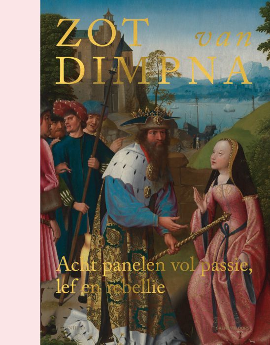
I think it’s a great move to pair that kind of work with a bold pop of colour, like I did for the books and printed material for Blind Date (2020) and Crazy about Dymphna (2022). I gave them a good dose of neon yellow and pink. That does call for a bit of restraint, though. You need enough white between the bright colours and the artworks, otherwise it can clash.
One upside of working with artists who’ve been dead for a long time is that they can’t complain. Contemporary artists are a lot more challenging in that sense, and not always easy. There’s usually a bit of distrust at first. I always tell them, “I’m here to help you, not to mess up your work. It’s not about me, it’s about you and your work looking as good as it possibly can… just in my way”.

Do you have a favourite artwork from The Phoebus Foundation’s collection?
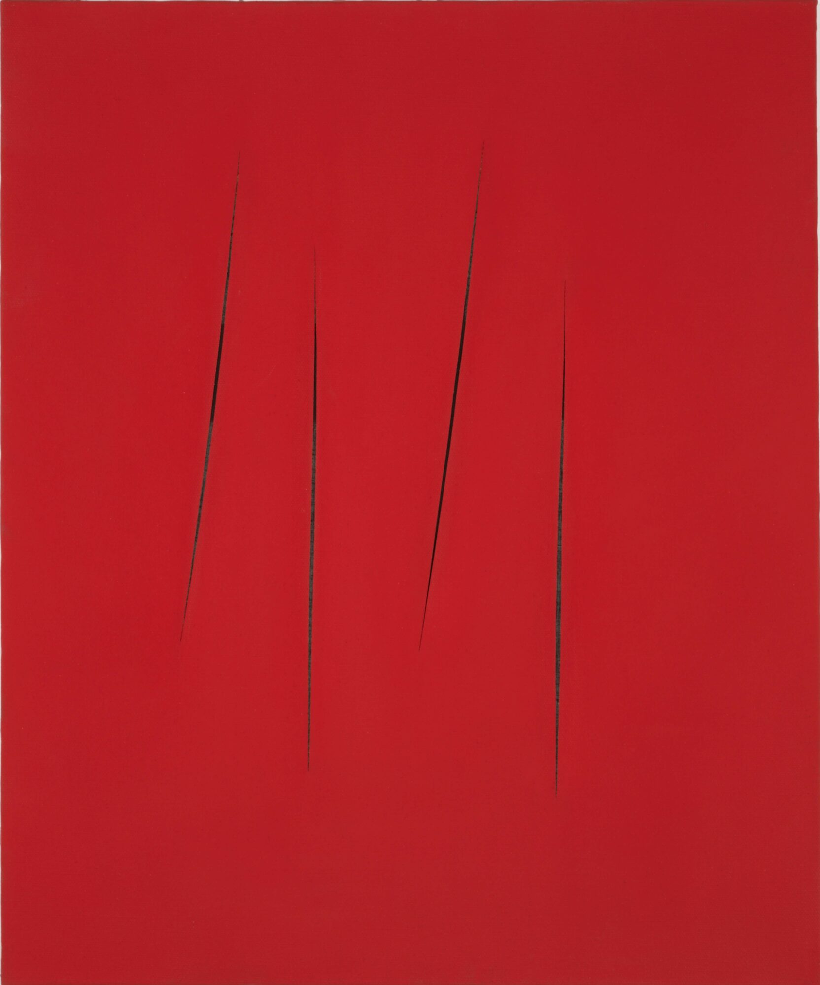
Absolutely: Concetto Spaziale by Lucio Fontana. I’d happily hang that in my office. I also love Bird by Karel Appel. And when it comes to the Old Masters, I go for Portrait of a Young Lady. It has that Portrait of a Young Lady kind of vibe, I think.
A major identity crisis (laughs). No, I’m already planning a new exhibition. Winning the award definitely gave me a taste for more. I’m not going to slow down, I always want more of a challenge. I actually enjoy a bit of suffering. I’m having a great time. I’ve always found that the more I work, the more comes out of it. So, bring it on.
After 2001 I briefly thought about starting a studio, but first of all, I simply love designing too much. And with a studio I’d have to delegate and look for work for interns and staff. No way.
I’ve been around a long time, since the late eighties, but I still try to get the very best out of every project, for myself as much as for anyone else. Getting older is no excuse to slack off. In a way I make everything for myself, and I think that’s the secret. If I don’t think it’s good, neither will my clients. So I’m the one guarding the quality of my work.

Will there be a Paul Boudens Volume II?
Probably in 2025, when I turn sixty. I’m planning two exhibitions at the same time, one at the Fashion Museum and one at another venue.
Go back to Japan. Visit New Zealand. Keep working on my second monograph. But above all, not get bored and keep making great things. I have no regrets, and I’m really happy I found my thing in this life.