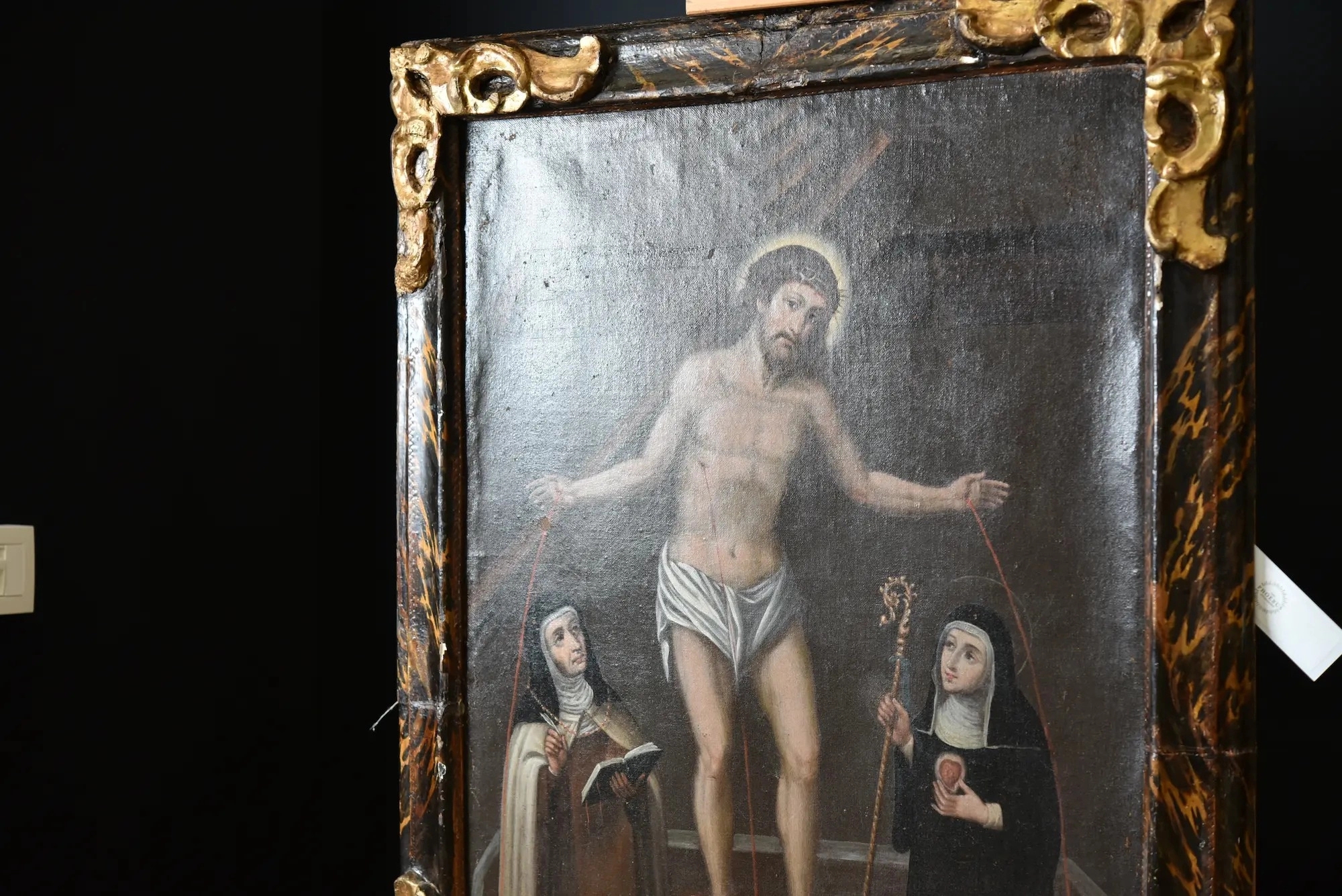
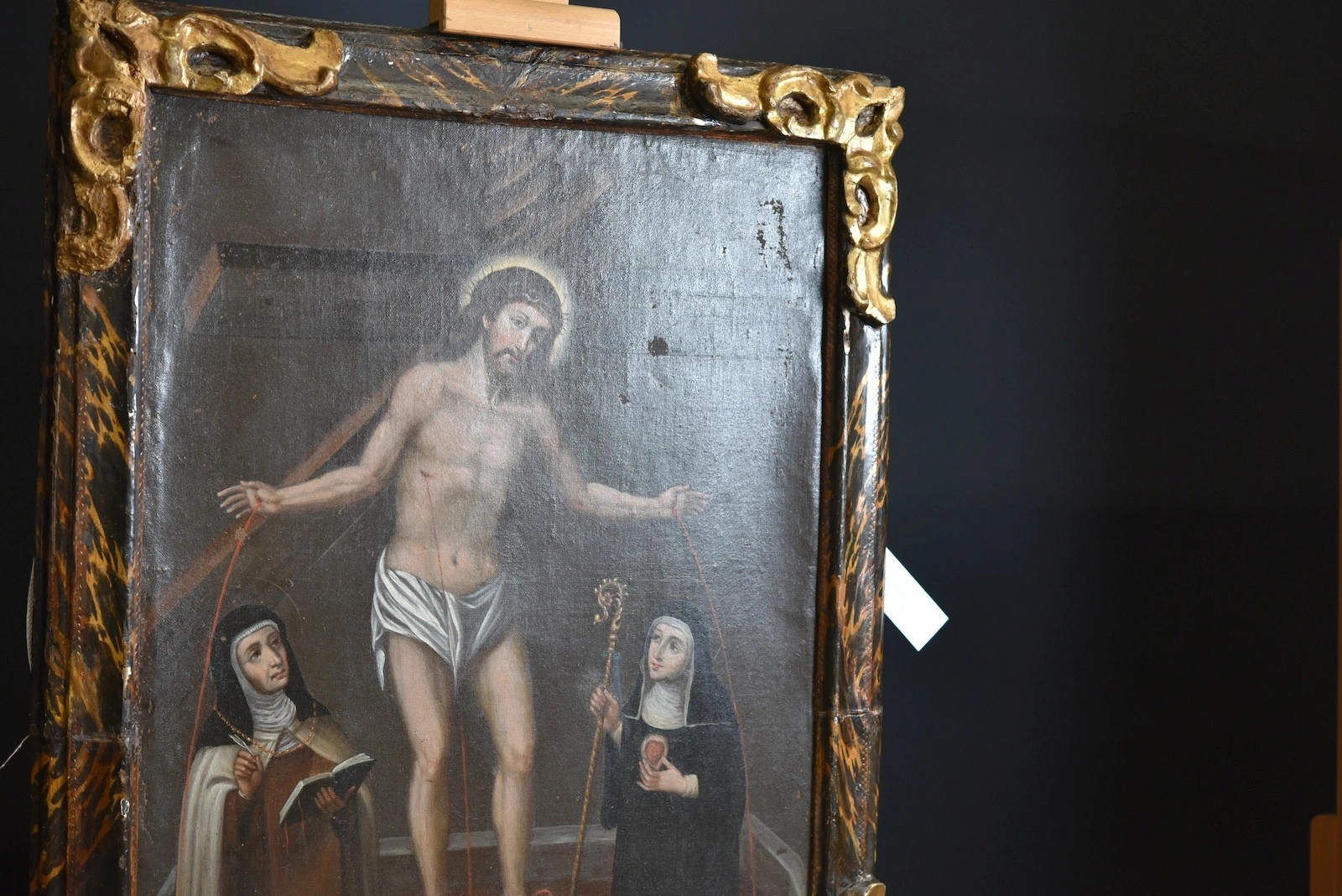
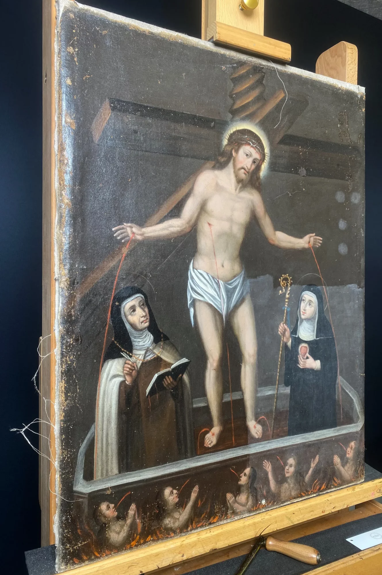
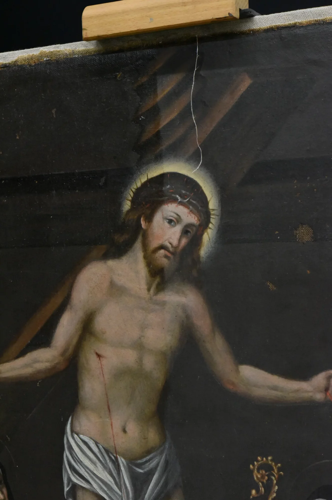
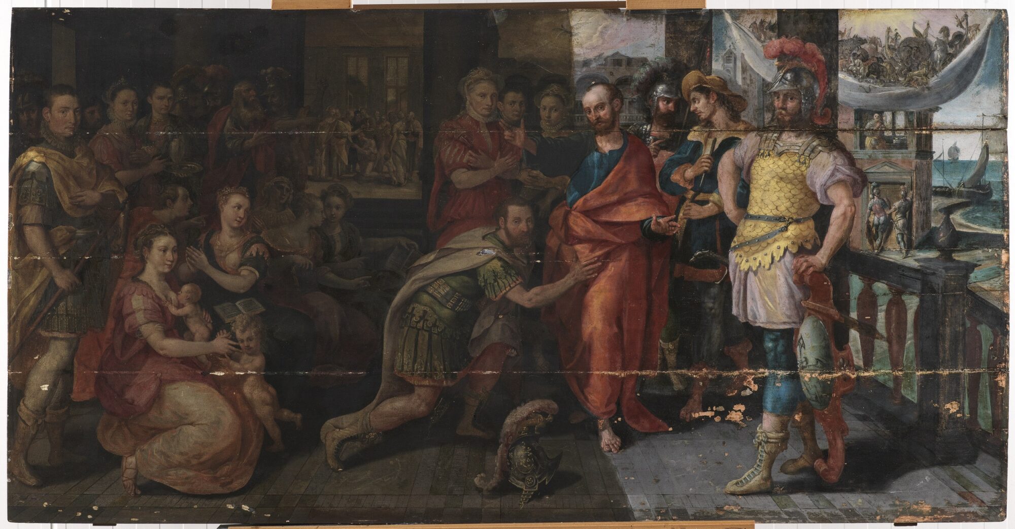
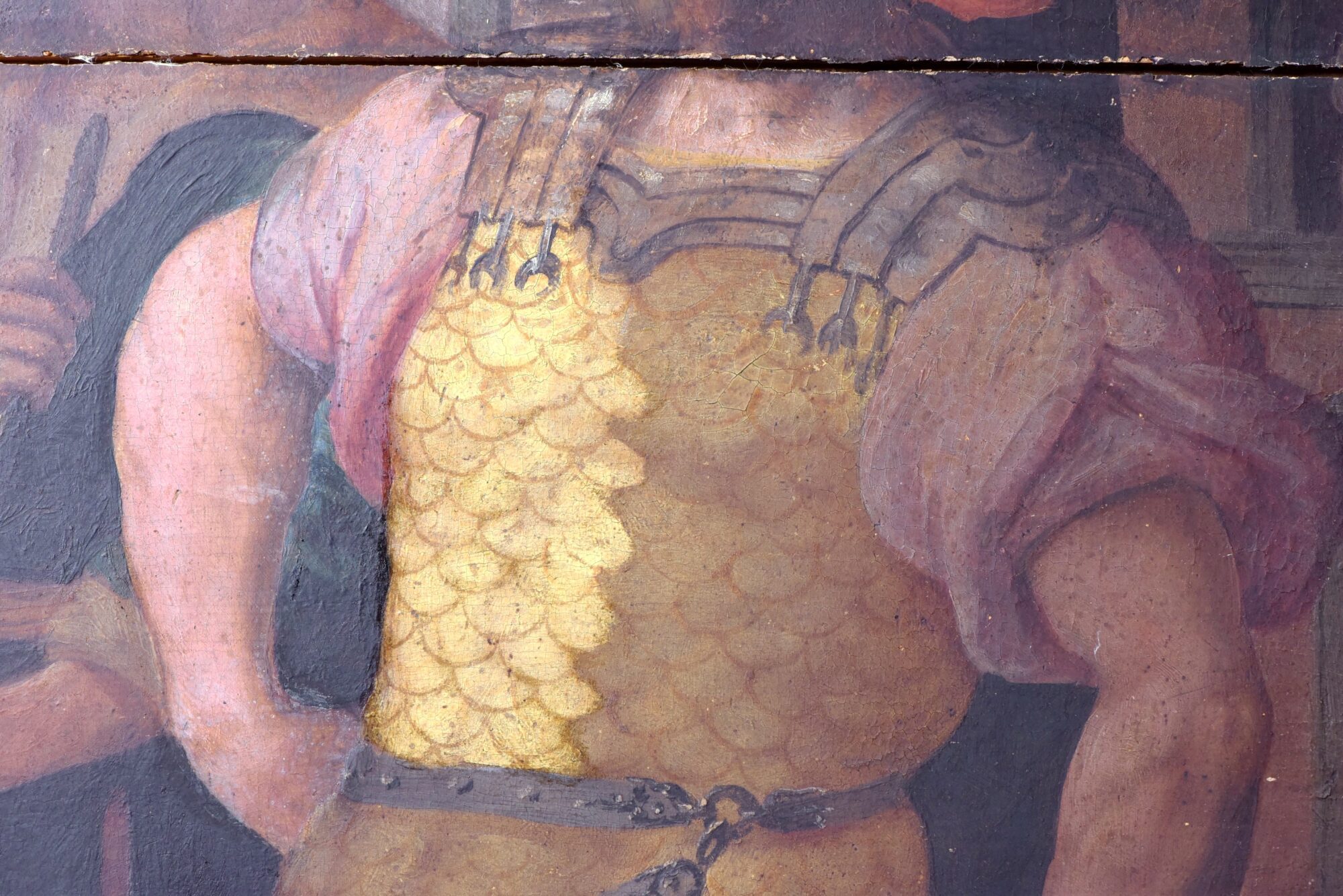
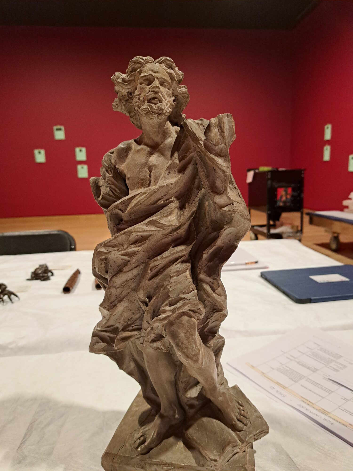
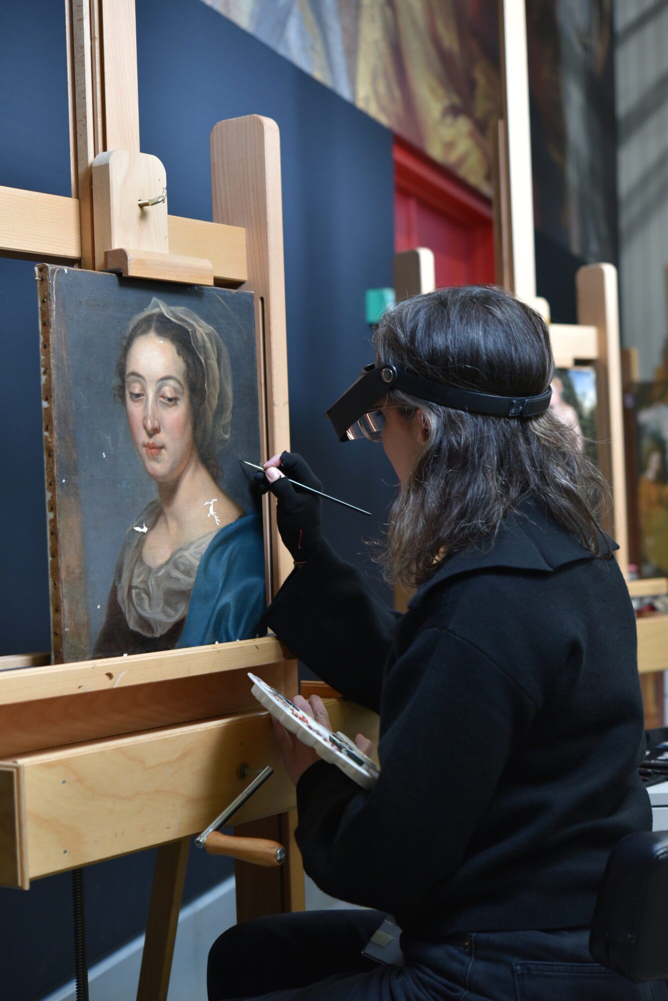
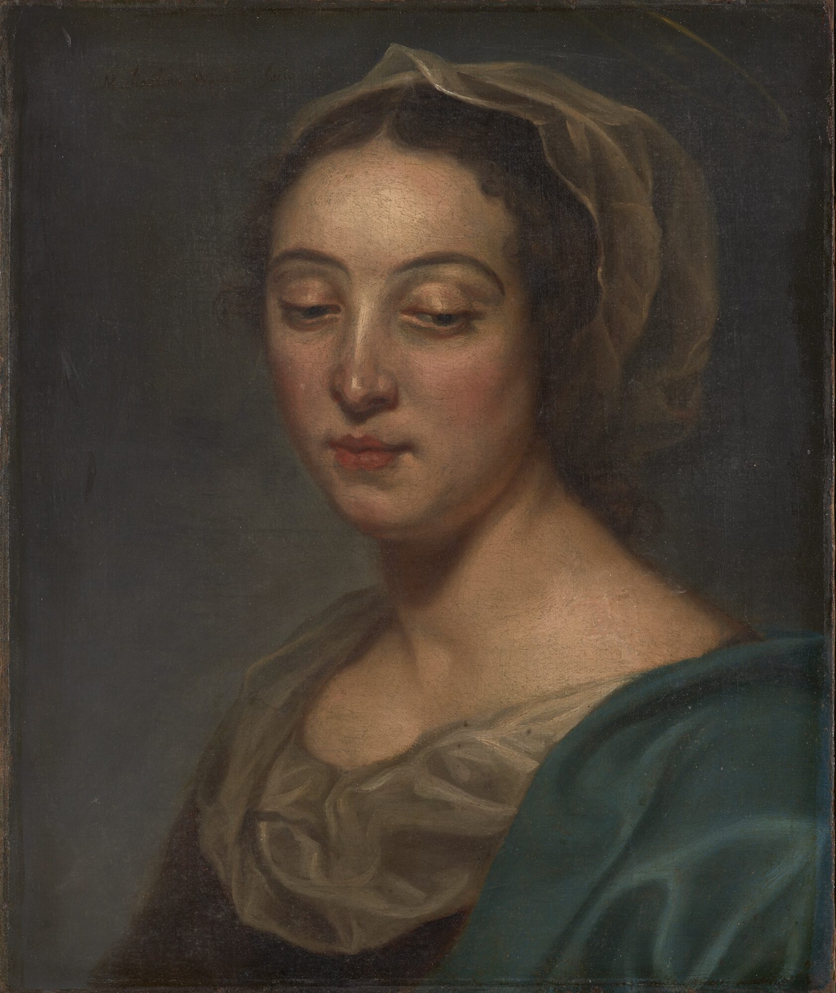
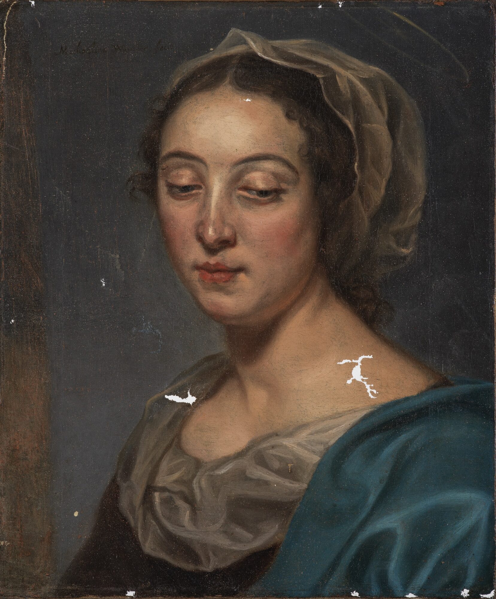
Appearance of the risen Christ to Saints Gertrude and Teresa
Phoebus Fellow Soraia Martins, conservator-restorer from Portugal, is currently restoring the 17th-century oil painting Appearance of the risen Christ to Saints Gertrude and Teresa from The Phoebus Foundation collection. The conservation treatment offers a valuable opportunity to study both the painting’s technique and its condition in detail. It soon became clear that several of the issues affecting the work were the result of earlier restoration campaigns.
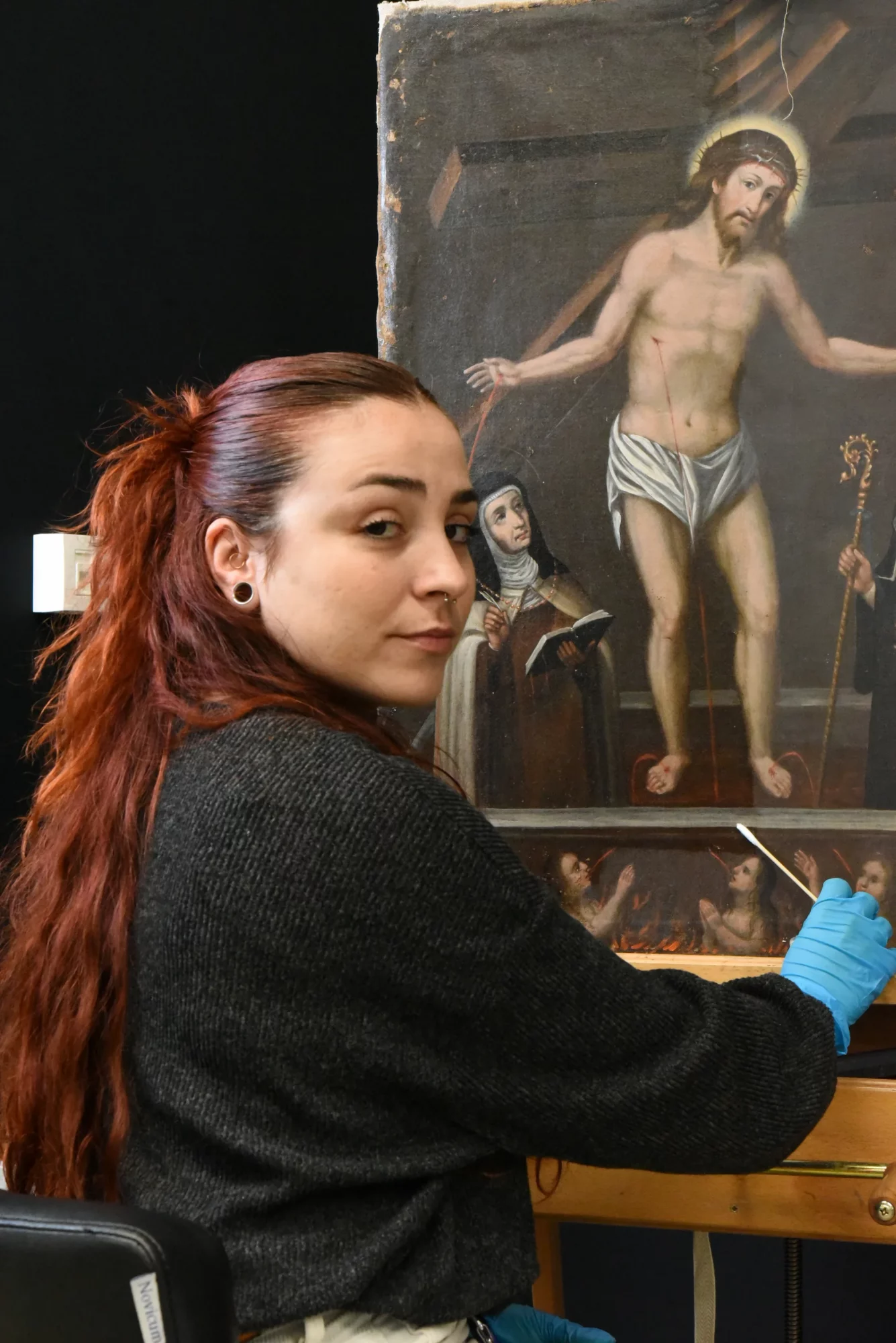
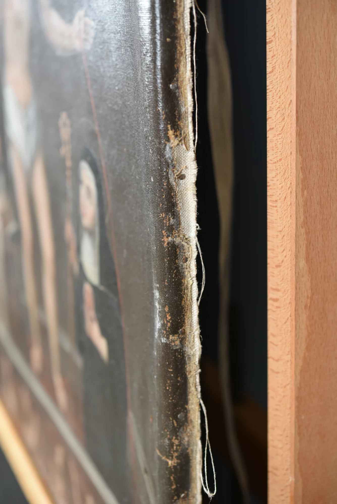
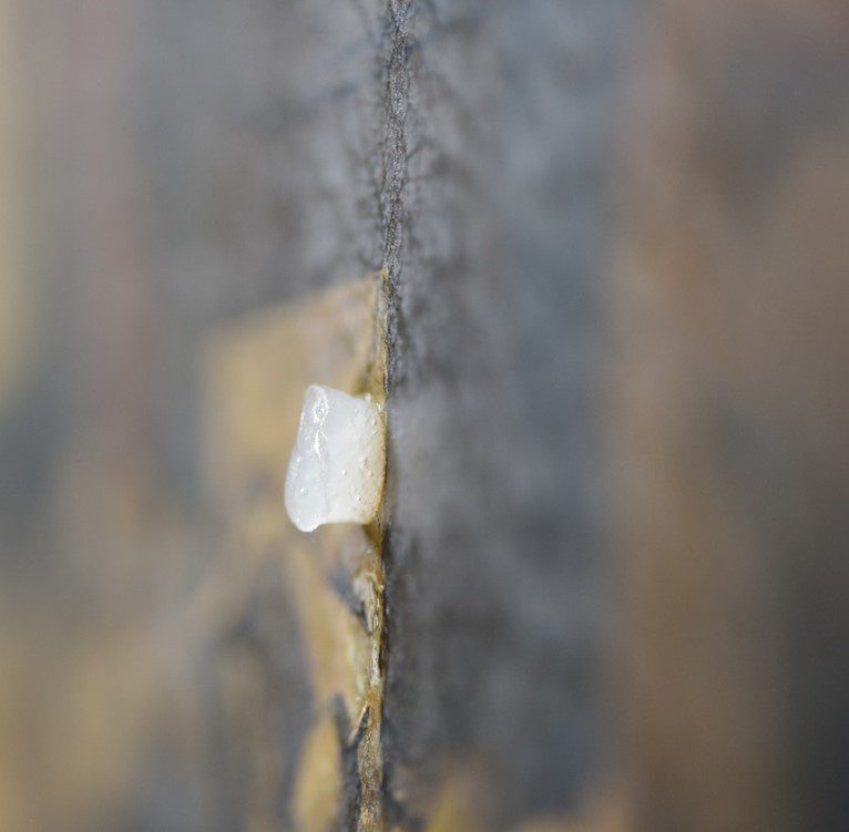
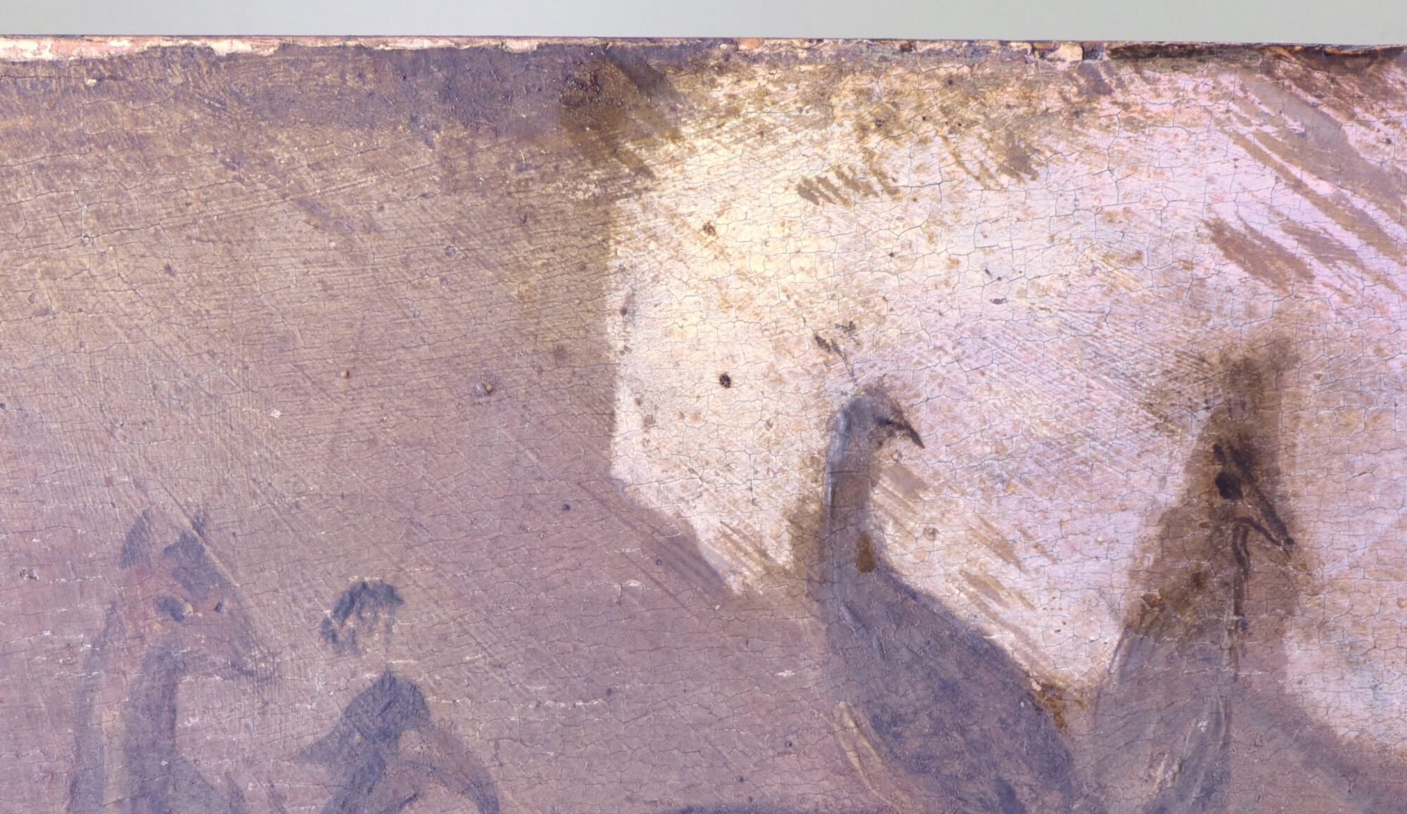
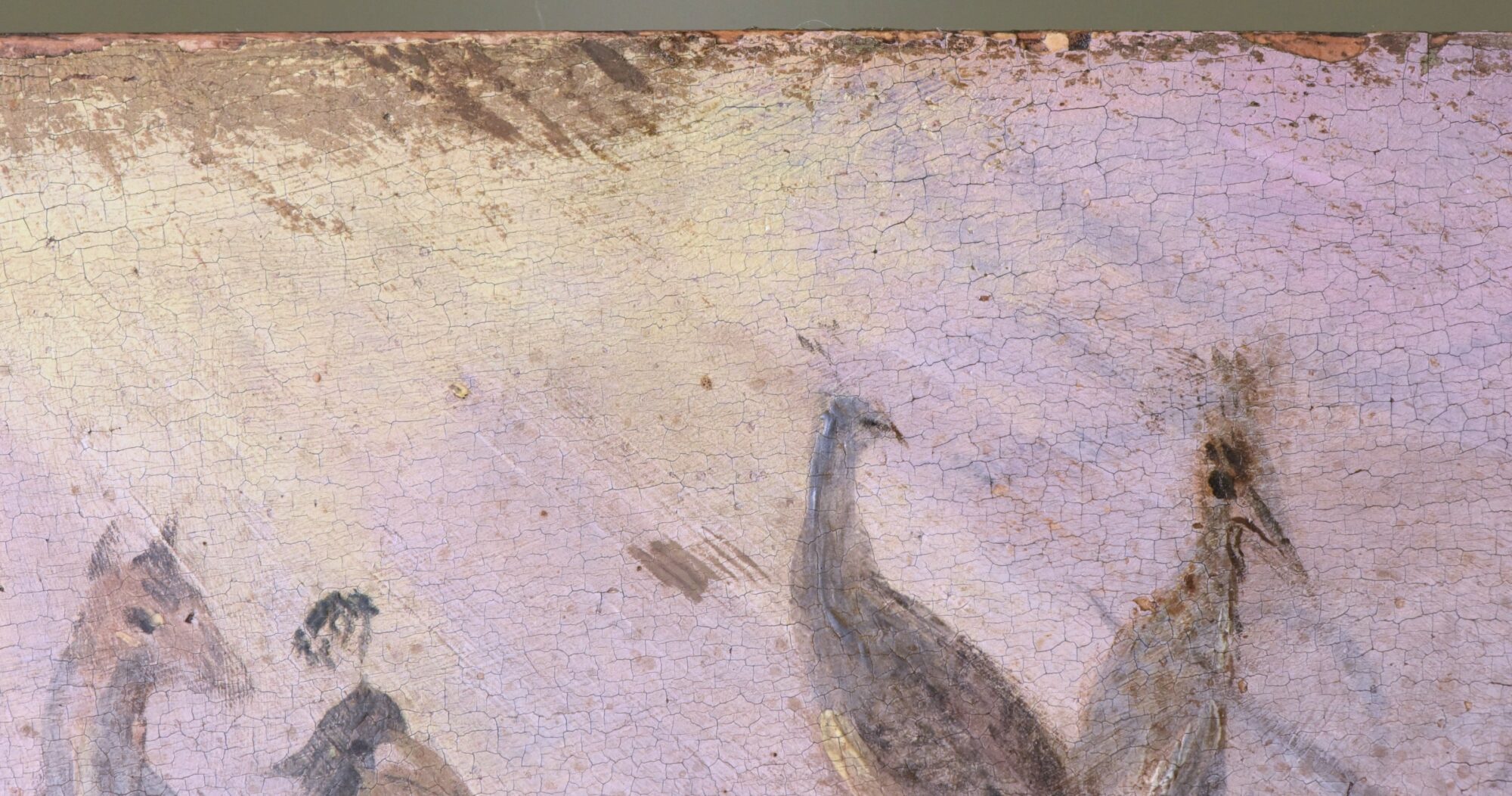
One of the greatest challenges of this restoration concerns the painting’s structural support. The canvas showed pronounced distortions along its edges. Once it had been removed from the stretcher, it became clear that these deformations were caused by the overly thick edges of a previous strip-lining, which were incompatible with the exceptionally fine original canvas. Moreover, they had been attached using a thick, rigid synthetic adhesive that had penetrated deep into the canvas fibres, significantly contributing to the distortions.
The treatment began with the careful removal of the strip-lining and, where possible, the remaining adhesive residues. After comparing different treatment methods, controlled humidification using Evolon was selected, followed by the gradual mechanical reduction of the adhesive residues, as this approach produced the best results.
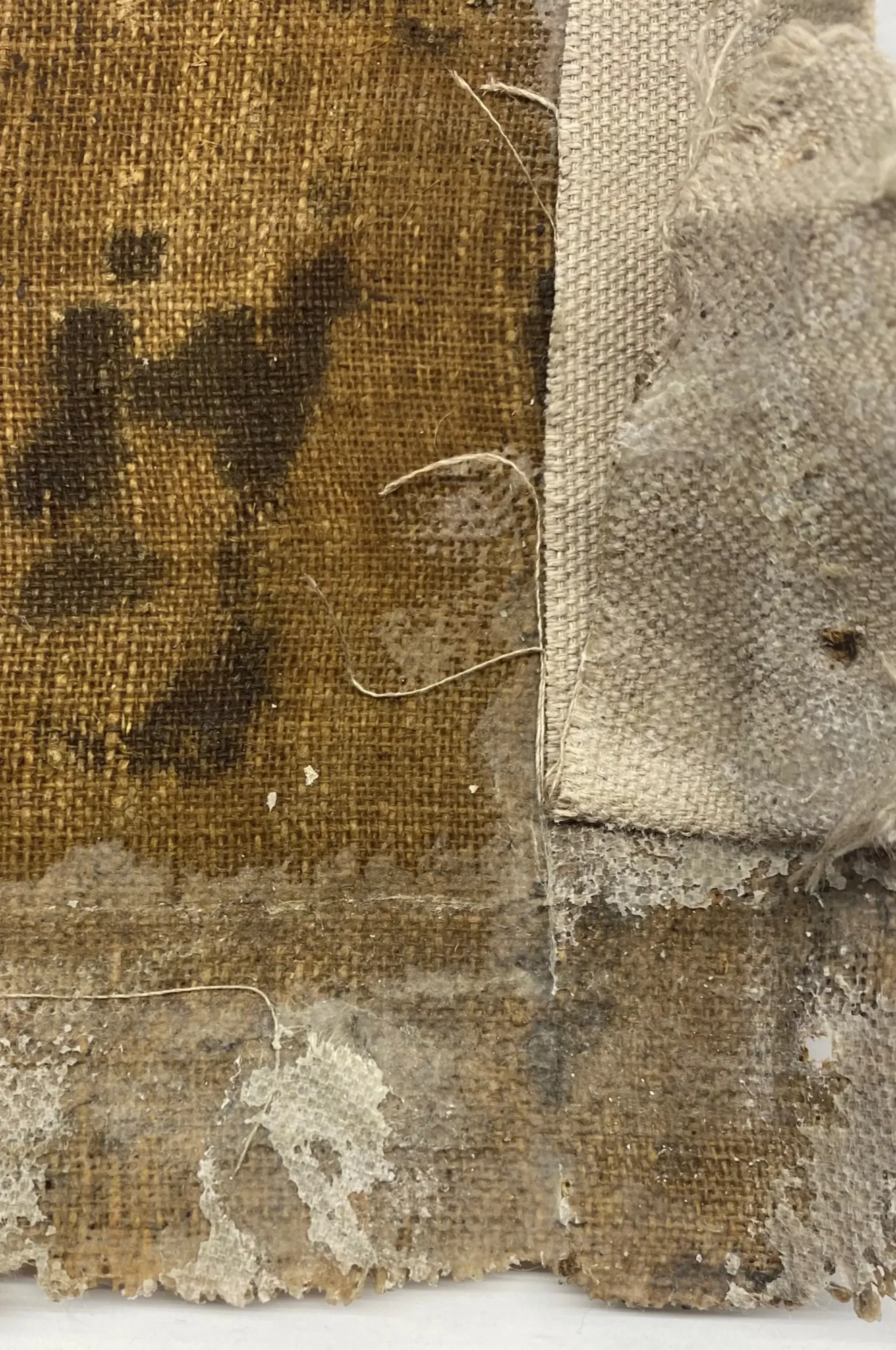
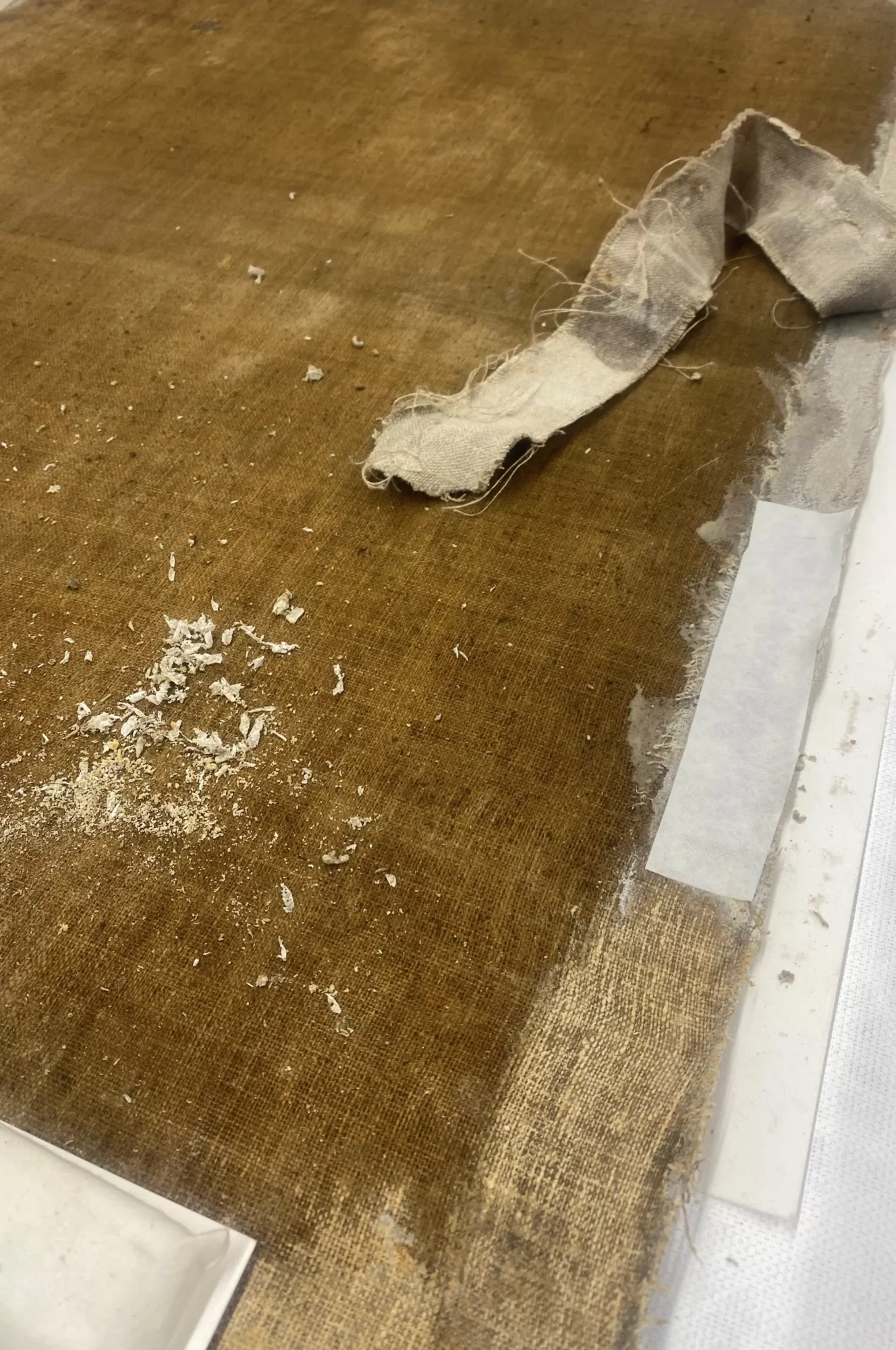
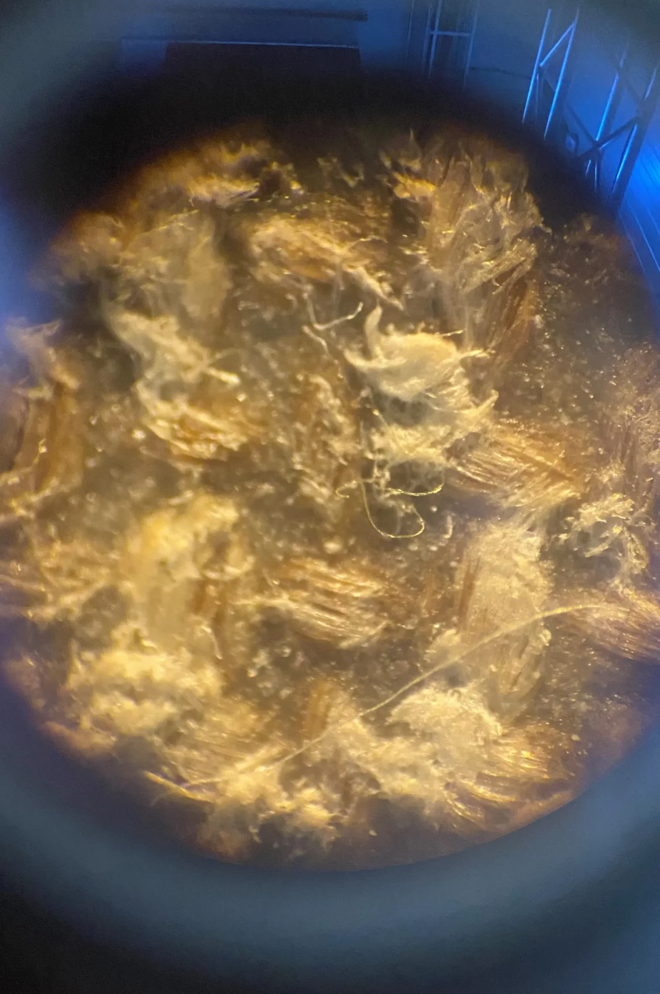
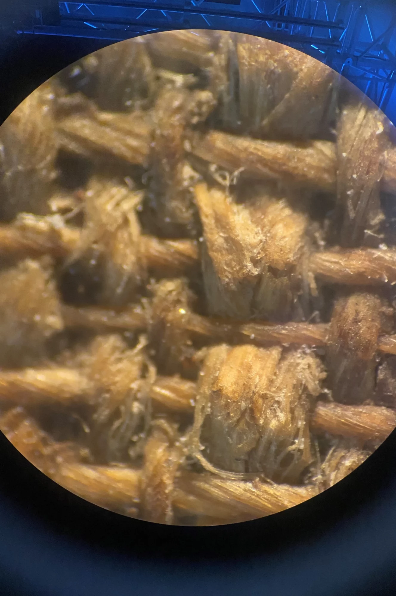
Examination of the reverse also revealed that the original canvas had been impregnated with a synthetic adhesive, which had caused a brownish discolouration. Microscopic analysis showed that the adhesive had a characteristic plastic-like appearance and had penetrated deep into the canvas fibres. Although several gel-based cleaning systems were tested, the adhesive responded only minimally to the solvents used.
Although the adhesive could be partially softened, its complete removal would have required extensive mechanical treatment. Given the exceptionally fine weave of the original canvas, this would have posed an unacceptable risk to the integrity of the support. A more conservative approach was therefore adopted. The adhesive residues associated with the strip-lining were reduced as far as could be done safely, while the remaining adhesive on the reverse was carefully removed using Wishab sponges and smoke sponges. This treatment improved the flexibility of the canvas without compromising its delicate fibre structure.
The distorted edges were then gradually flattened through controlled humidification followed by drying under restraint. This treatment significantly reduced the deformations and restored a more even tension across the canvas.
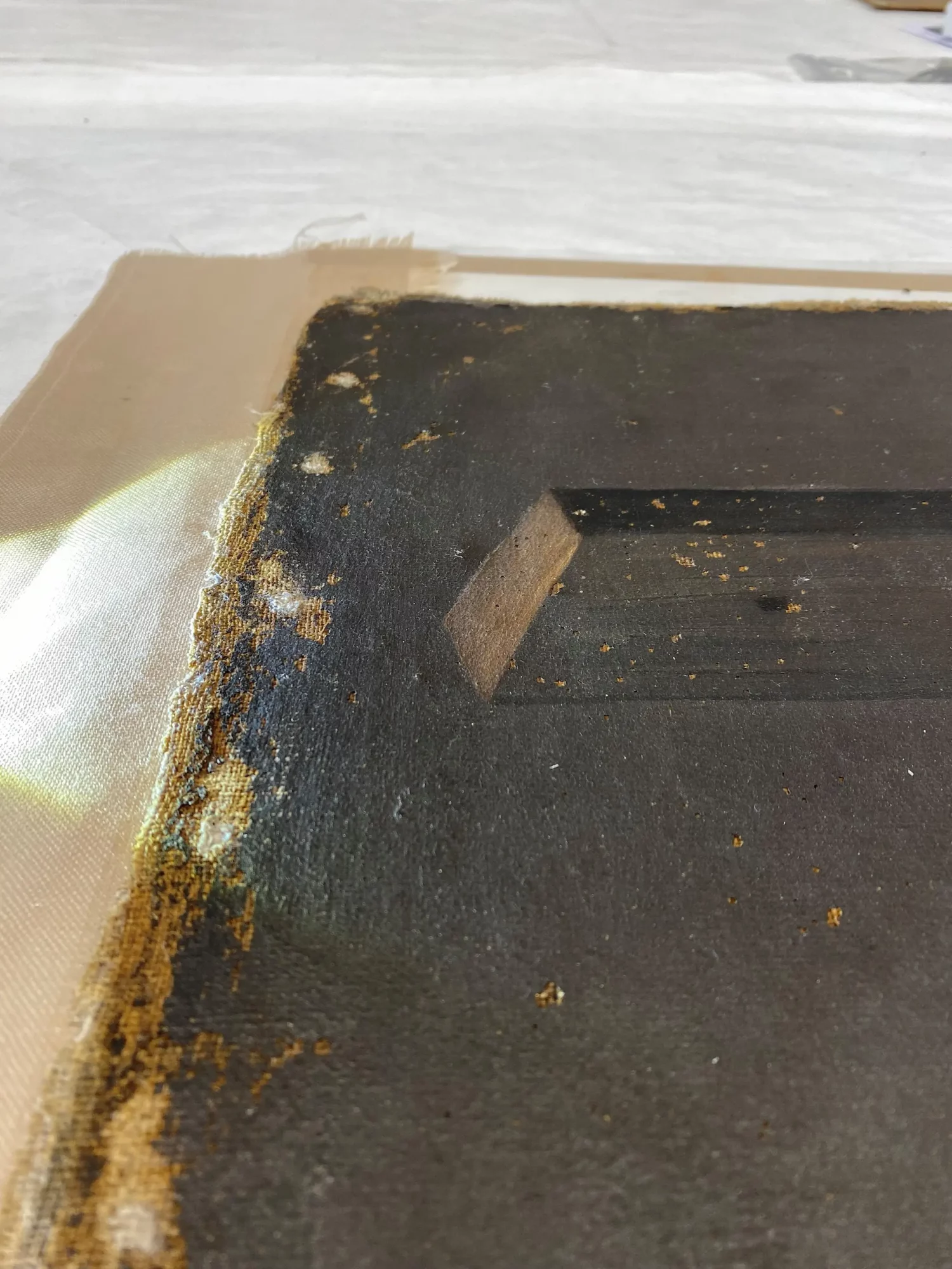
During the structural treatment, another important discovery was made. Colonial paintings were often attached by their painted edges rather than having the canvas wrapped around the stretcher. In this case, one of the original edges had been folded over and secured to the side during a previous restoration. As a result, the original position of the canvas on the stretcher had been altered, causing the painting’s original presentation to be lost.
Although the current stretcher is not original, it was considered suitable for continued use. Extensions were therefore added, allowing the painting to be re-stretched in accordance with its original configuration.
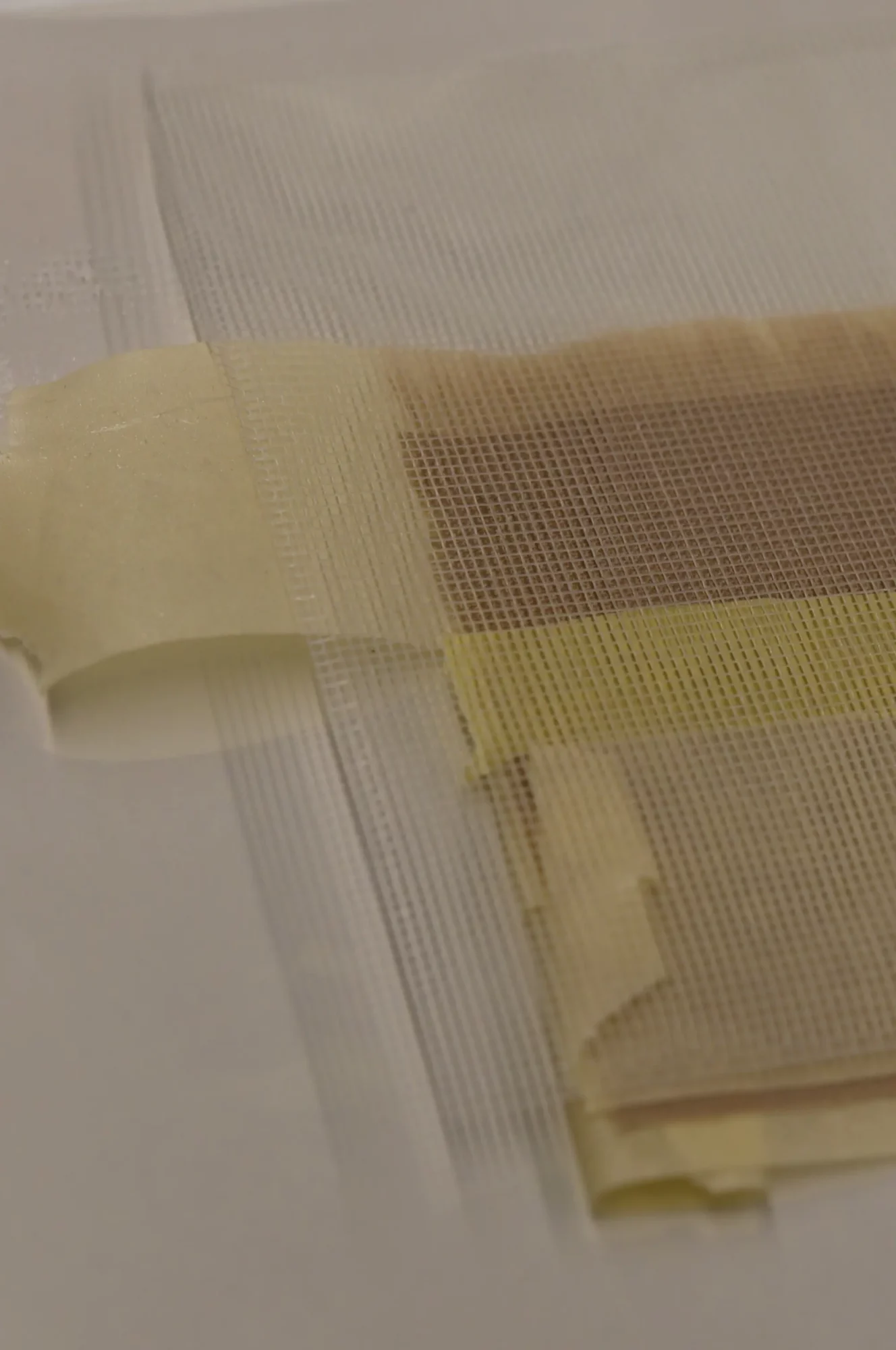
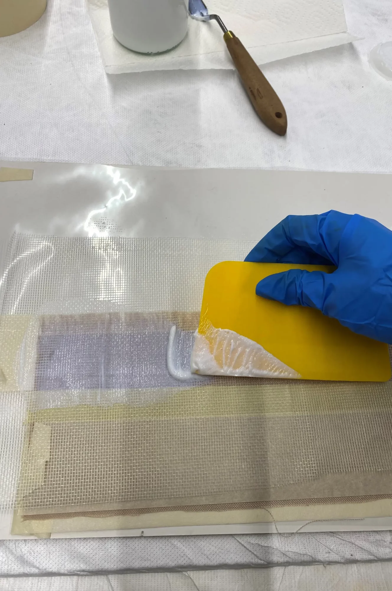
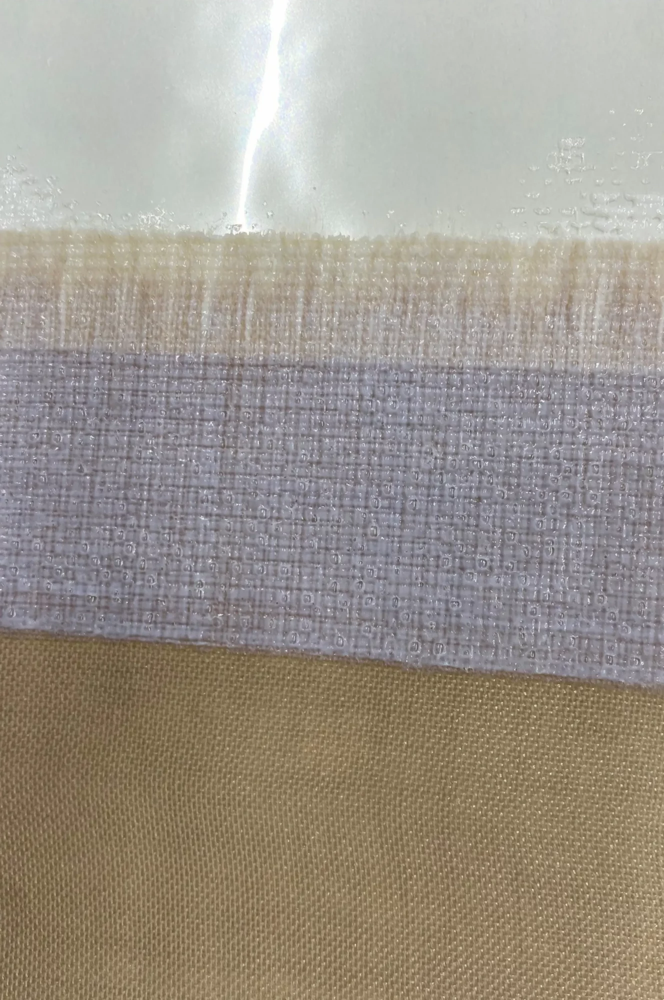
The painting is currently being fitted with a new strip-lining using a thinner fabric that is more compatible with the original canvas. The nap-bonding technique is being employed, in which the adhesive is applied as an open network rather than a continuous film, limiting its penetration into the canvas fibres. This method provides the necessary structural support while reducing the risk of future distortions, which is particularly important given that the fibres are already saturated with residues of the previous adhesive.
With the structural treatment nearing completion, the restoration is entering its final phase. Attention will now shift to the treatment of the painted surface, including the retouching of paint losses and the aesthetic integration of the restoration. Once the work has been completed, the final result will be shared on our website and in our newsletter.
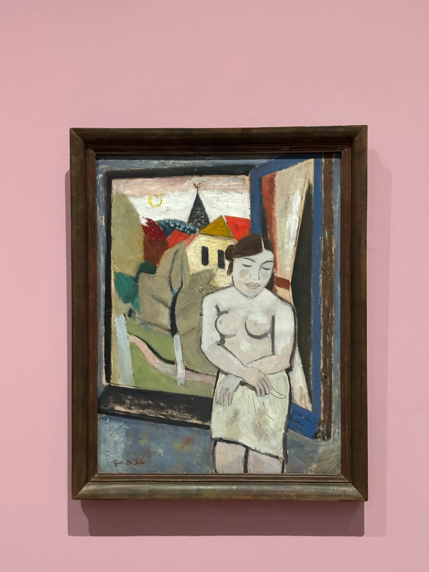
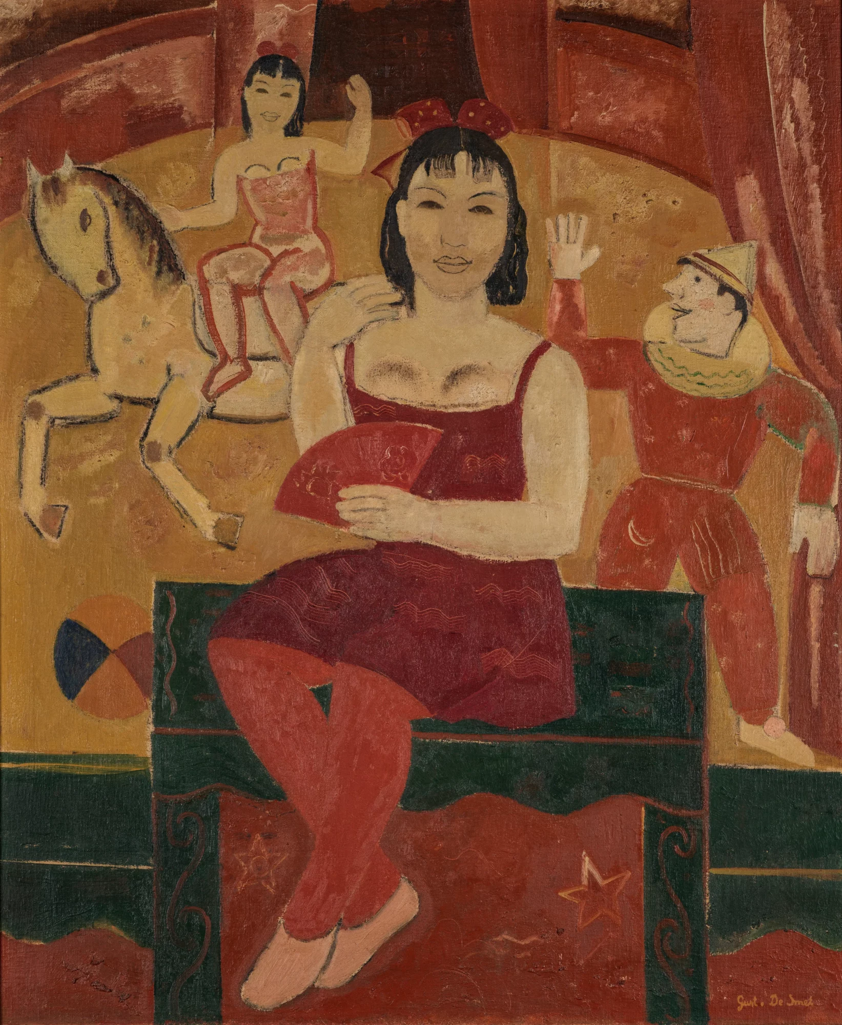
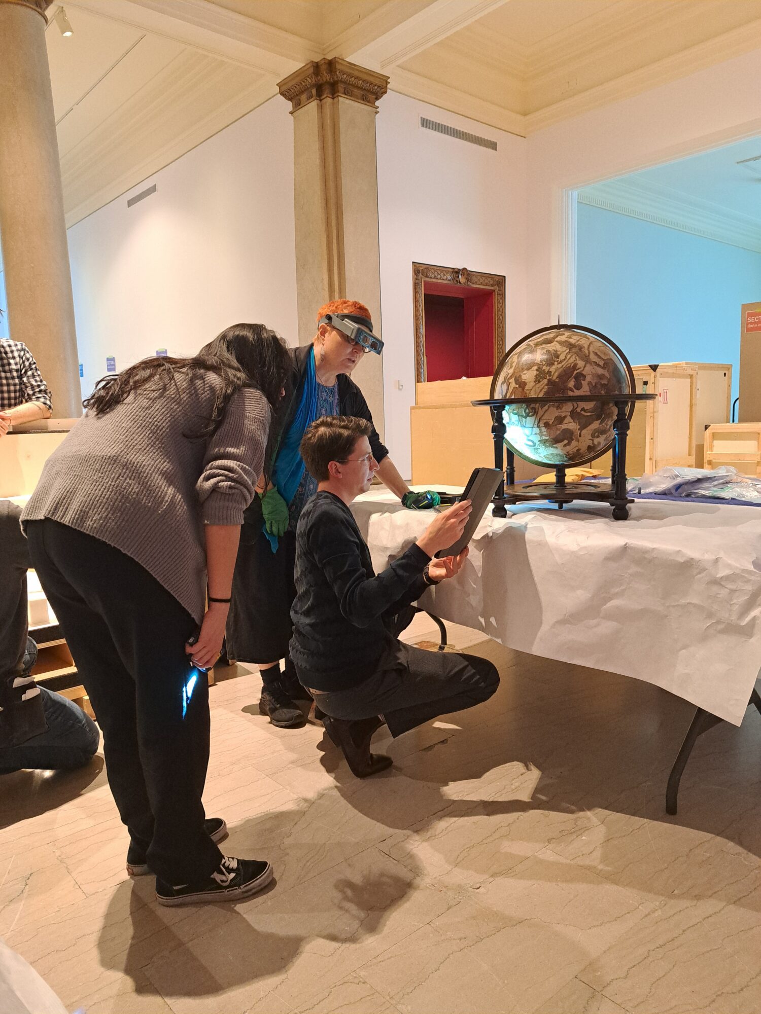
Gustave De Smet at Stedelijk Museum Alkmaar
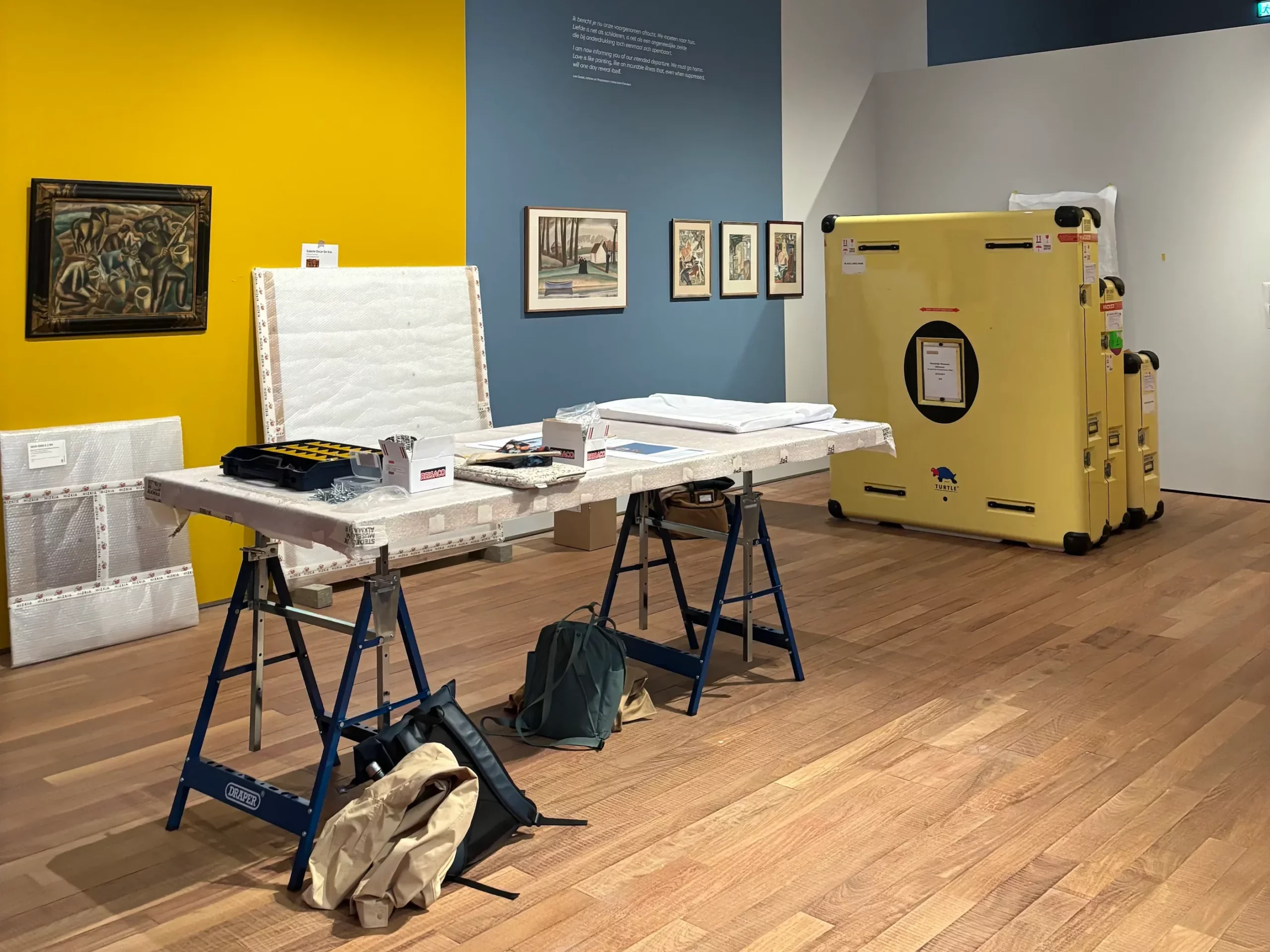
For Gestel – De Smet, the Stedelijk Museum Alkmaar brought together works by Leo Gestel alongside, among others, seven paintings by Gustave De Smet on loan from The Phoebus Foundation. The exhibition creates a dialogue between two distinctive voices of European modernism. We went behind the scenes during the installation and condition checking of the loans.

Before a painting reaches the museum wall, it undergoes a carefully managed journey behind the scenes. Once the works arrived in Alkmaar, they were unpacked on site and meticulously inspected by both a conservator from The Phoebus Foundation and a conservator from the museum. Using detailed condition reports and close-up photographs prepared in the conservation studio, every painting was checked to ensure its condition remained fully unchanged from before departure.
Certain paint layers in some of Gustave De Smet’s works required particular attention. Due to aspects of the artist’s painting technique, some areas displayed pronounced cracking and craquelure, making close monitoring during transport and installation essential.
Only once the condition checks had been completed were the paintings installed by the art handlers. A precise and carefully coordinated process that largely unfolded out of sight, yet remained essential in bringing the works safely before the public.
The exhibition runs at the Stedelijk Museum Alkmaar until 13 September 2026.
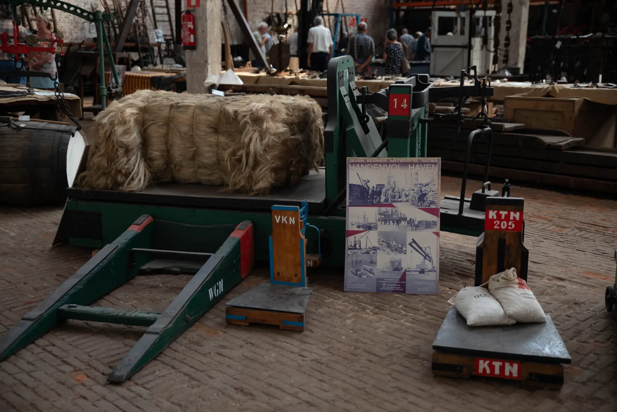
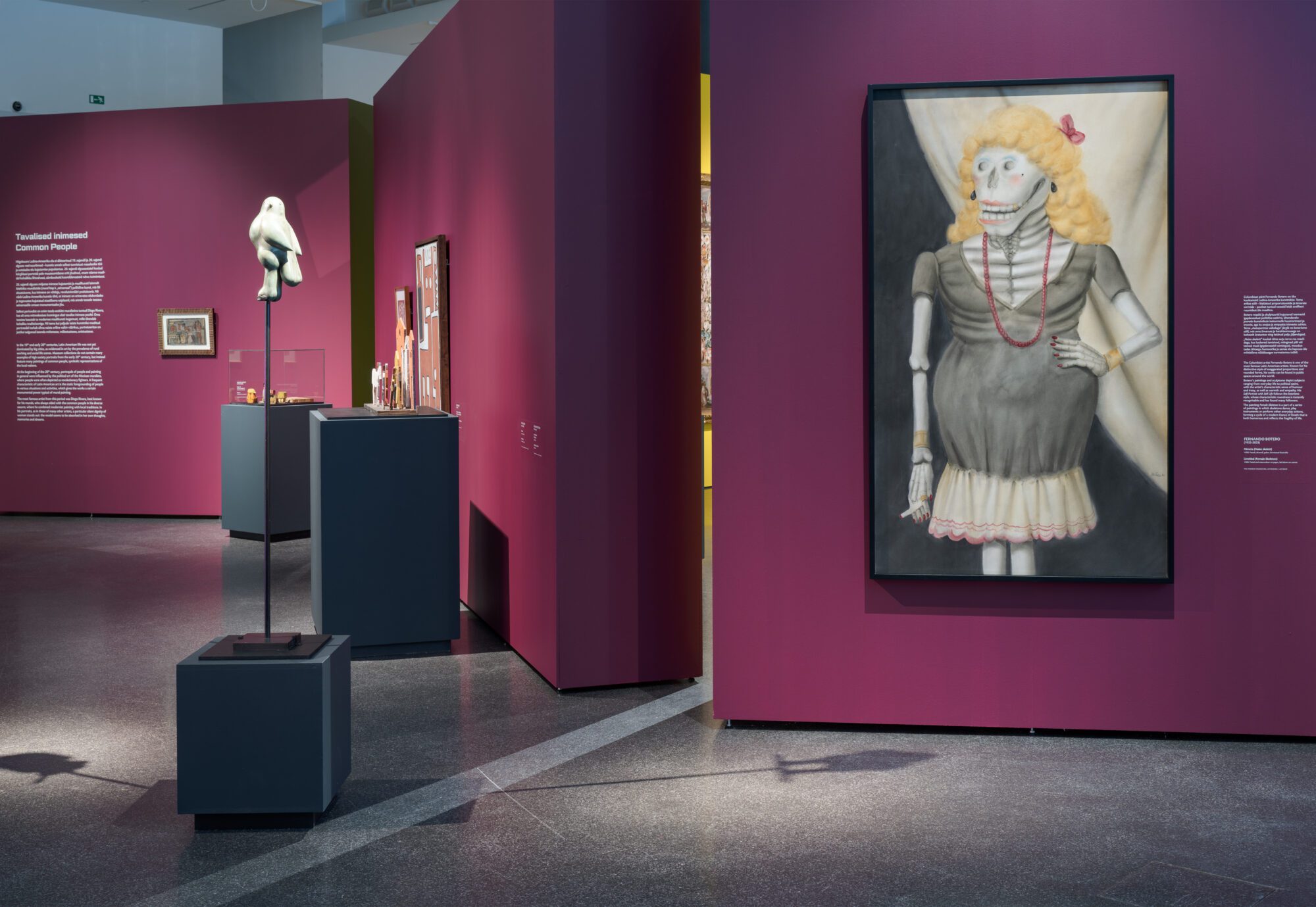
Geheugen Collectief at Den Argentin
There you are. In an old warehouse by the Port of Antwerp, a heavy cargo hook in your hands, and beside you a sturdy retired docker showing you how it is done one last time. “Right then, hook it on.”
Hook it on?
For Geheugen Collectief, a historical project agency that usually works its way through archives, libraries and interviews, this is a rather unusual form of fieldwork. Their work typically results in exhibitions, publications and other public-facing projects. Learning by doing, and immersing themselves in the world of Antwerp’s dock workers, is new ground for them.


New ground, though not without precedent. The collaboration with The Phoebus Foundation began in 2023, with the commission to write the story of the Boerentoren. Thousands of archival documents later, this resulted in The Farmers’ Tower: Story of an Icon. Since the summer of 2025, that collaboration has continued, this time turning its attention to the rich history of the Port of Antwerp, beginning with the foundation’s maritime and logistics heritage collection.

At the heart of the project are the stories of dock workers, along with the objects and machinery that shaped their daily labour. To uncover them, the team from Geheugen Collectief regularly visits Den Argentin, a former warehouse where the Maritime and Logistics Heritage collection of The Phoebus Foundation is housed and cared for. What at first glance seem to be silent objects acquire a name, a purpose and a past there: ‘ne piet’, ‘een mussebekske’, ‘een kreng’.


Thanks to the knowledge and enthusiasm of the volunteers, a world that is seldom told begins to unfold layer by layer. Object by object, story by story, a vivid and deeply human portrait emerges of the lives and work of dock labourers in the nineteenth and twentieth centuries.
The final result will take a little while longer. More soon, here and in our newsletter.
Conservation and Restoration Treatment of an Untitled Work (1948) by José Pedro Costigliolo
Clémence Jacqmin, a paintings conservator specialising in modern and contemporary art, works as a freelance conservator for The Phoebus Foundation. Her first assignment concerned the conservation and restoration of an untitled painting from 1948 by the Uruguayan artist José Pedro Costigliolo (1902–1985).

The painting is executed in oil on unalit, a support made of compressed wood fibres. At first glance, the work appeared to be in relatively good condition. Closer examination, however, revealed a number of disruptions within the monochrome paint areas. Surface dirt, scratches and stains gave the painting a dull appearance, but it was above all earlier interventions that caused the greatest visual disturbance.

Alongside general surface soiling, which could be safely removed through wet cleaning using a carefully adjusted aqueous solution, more complex forms of damage became apparent. During cleaning, pH levels and conductivity were closely monitored to prevent swelling of the relatively young oil paint layer. Wear and previous retouchings, however, proved considerably more challenging.


The wear mainly takes the form of surface abrasion, where the paint layer has been locally compressed. This results in a glossier appearance than that of the untouched areas. The original paint remains present, but is effectively “compressed” and becomes particularly visible under raking light.
The retouchings and overpaint, by contrast, sit directly on top of the original paint layer. As with Old Master paintings, they were applied to disguise losses or damaged areas. Unlike older paintings, however, the paint layer here is too young and too fragile to allow the use of solvents to remove these additions. The earlier intervention is therefore irreversible. In addition, the colour differs slightly and the overpaint has a noticeably more matte finish than the original surface, creating a clear aesthetic imbalance.
Two opposing issues thus emerge: areas that are overly glossy and areas that appear too matte. The treatment focused on refining the retouching technique in order to subtly lower or raise the level of gloss locally, a delicate and demanding process.


Using a range of retouching materials, the treatment was tailored to the specific issues of the painting, with constant attention paid to full reversibility in water. This approach avoided introducing yet another irreversible intervention, as had occurred in the past, while still aiming for a visually coherent result.


This project clearly illustrates the complexity of retouching in modern and contemporary conservation practice, where the challenge lies not only in colour matching, but also in achieving a precise balance between mattness and gloss.


From storage to exhibition
In the conservation studio of The Phoebus Foundation, we meet Maron Zwakman, junior conservator. In her role, she oversees the Foundation’s outgoing loans, a responsibility that has grown steadily in recent years as an increasing number of works from the collection travel nationally and internationally to be presented to the public. In some cases this involves a small selection of works, while in others it extends to entire exhibitions. Recent examples include Saints, Sinners, Lovers, and Fools at the Royal Ontario Museum in Toronto, Garden of Delights. The Seventeenth-Century in Bloom at the Kadriorg Art Museum in Tallinn, and the recently announced exhibition Wonders of the World – From Maps to Masterpieces, opening at the National Museum of Oman in late 2026.

Careful preparation in every detail
Before an artwork can set off on its journey, it goes through a careful, multi-layered process. One of the first steps is assessing whether the object can travel at all and whether conditions at the host institution are suitable. The team then looks in detail at what the artwork needs to be transported and displayed safely. This may involve adapting the frame, designing a bespoke plinth to provide proper support, or using a climate-controlled case. In some instances, conservation treatment is required before the work can travel.

A key part of this preparation is the condition report, which carefully records the state of each object. This makes it possible to spot and address any changes that may occur during transport or while the work is on display.
A practical example: Jean Brusselmans in Brussels
At the moment, Maron is preparing a painting by Jean Brusselmans for an exhibition at BOZAR, opening in October 2026. The work requires particular care due to fragile, lifting paint flakes and a soiled paint surface. Through careful surface cleaning and the consolidation of the paint layers, the painting is being stabilised so it can be safely displayed in optimal condition.


Care upon return
Even after an exhibition has closed, the care of the artworks remains central. At the end of January 2026, Tuin der Lusten came to an end at the Kadriorg Art Museum. For this exhibition, Maron and her colleagues travelled to Estonia to oversee the deinstallation of around 300 objects, ranging from paintings and textiles to taxidermy.


On site, assessments were made to determine which works would require additional attention upon their return to the depot. In this way, every artwork, even after an intensive period of travel and display, could be stored safely and in optimal condition once again.
Behind every exhibition and loan lies a carefully coordinated process that largely takes place behind the scenes. In the conservation studio of The Phoebus Foundation, artworks are prepared to travel safely, be displayed responsibly, and return in optimal condition once an exhibition has ended. In this way, the collection is cared for with the same attention and expertise wherever in the world it is presented.
Workshop on the Heat and Low-Pressure Table in the Conservation Studio
The conservation studio of The Phoebus Foundation has recently acquired a new addition: a heat and low-pressure table. This significantly expands the range of possibilities within conservation projects, while supporting an approach based on minimal intervention and maximum control.
As the conservation team is constantly working on a wide range of treatments, the heat and low-pressure table can play a meaningful role. To explore its use and potential with due care, a workshop was organised, giving conservators insight into its operation, applications, advantages, and points of attention, with a view to its thoughtful use in practice.
For this occasion, Davide Riggiardi travelled from Italy to the conservation studio of The Phoebus Foundation for a three-day workshop, where he shared his expertise on the applications and possibilities of the heat and low-pressure table.
Professor Riggiardi teaches paintings conservation at the Academy of Fine Arts of Palermo and contemporary art conservation at the Academy of Fine Arts of Brera. He is also active as a conservator in his own studio in Milan, where he focuses on preventive conservation and minimal intervention.

The principle behind the table lies in its perforated surface, which allows air to be distributed evenly. When a painting is placed on the table and covered with a layer of Melinex (polyester film), a vacuum pump draws the air out from beneath the object, creating low pressure. The painting is gently pulled downwards, resulting in an even tension across the entire surface, without applying direct pressure to the paint layer. Unlike the use of weights, the intervention remains highly controlled and exceptionally subtle.
One of the practical sessions involved comparing consolidations carried out on mock-ups, both with and without the use of the low-pressure table. Both mock-ups were distorted and showed the same powdering paint flakes. Seven different adhesives were applied to the surface in various ways: using a brush, a tissue and a spray gun.
Initial observations showed that, in consolidations carried out on the low-pressure table, the solvent evaporated more quickly and penetrated the layers more deeply and evenly. Without low pressure, by contrast, ring formation and distortion occurred, indicating an uneven distribution of adhesive and a less effective consolidation in depth.

In addition to consolidation, the workshop also addressed the execution of edge linings on the heat and low-pressure table. This relatively minimal and, depending on the adhesive used, reversible intervention reinforces weakened canvas edges and enables re-stretching, while the low-pressure function allows for controlled drying without weights and avoids direct pressure on the paint layer. By increasing the temperature, thermoplastic adhesives can also be applied.
The conservators experimented with various adhesives, including Plextol© and BEVA® 371, as well as with different application techniques. The various functions of the table were also tested during the execution of edge linings, both under low pressure and at elevated temperature.

Applying thickened Plextol© using a mosquito net results in a chequerboard pattern. This even distribution ensures stronger and more uniform adhesion between the original canvas and the edge lining.

The edge lining is first positioned on the reverse of the painting. The painting is then turned over and placed under low pressure to dry in a controlled manner. The pressure is generated beneath the painting, while the pictorial layer remains as undisturbed as possible.

These examples represent only a small selection of the applications of the heat and low-pressure table. An entire day was devoted to discussing various case studies drawn from conservation treatments currently underway in The Phoebus Foundation’s conservation studio. The conservators exchanged views with one another and with Professor Davide Riggiardi on questions relating to challenging consolidations and the treatment of supports. Many ideas emerged from these discussions, some of which will soon be put into practice with the greatest possible care for the artworks.
Justus Sustermans’ Portrait of Cosimo III de’ Medici as a Child in its Final Stage of Restauration
Last month we outlined the initial phase of the restauration of Justus Sustermans’s Portrait of Cosimo III de’ Medici as a Child (1649). The treatment has since reached completion. After the removal of the degraded varnish, the work progressed to structural interventions aimed at correcting long-standing distortions in the canvas.

Local adjustments were first attempted. Although these reduced the undulations, the overall tension of the canvas remained insufficient. It was therefore decided to remove the painting from its stretcher and apply a strip-lining to all four edges.
The painting then underwent planification to relax the canvas fibres, allowing for an even and secure re-tensioning on the stretcher. This treatment eliminated the planar distortions and resulted in a considerable improvement in both the appearance and structural stability of the work.

The original poplar stretcher proved to be in poor condition, marked by termite damage, cracking and warped elements that had likely contributed to the earlier deformations. A new, purpose-built stretcher was therefore commissioned, following the construction of the original.

The treatment concluded with the filling of losses, chromatic reintegration and the application of a final protective varnish. These final stages bring Cosimo’s features back into focus, highlight the refinement of Sustermans’s technique and ensure the work is structurally safeguarded for future preservation.


Curious about the first phase of the restauration process? Read the full article here: Behind the Varnish: The Child Portrait of Cosimo III de’ Medici.
Beneath the Varnish: Justus Sustermans’ Portrait of Cosimo III de’ Medici as a Child
Halfway through her fellowship at The Phoebus Foundation, Brazilian paintings conservator Aline Assumpção from São Paulo is restoring Portrait of Cosimo III de’ Medici as a Child, a delicate work by Flemish master Justus Sustermans (1597–1681). Dating from 1649, when Cosimo was just eight, the portrait reflects Sustermans’ role as court painter to the Medici family and his ability to fuse Italian and Flemish style. Here, he captured the young Cosimo in a tender play of light and shadow.

The painting presented a heavily oxidised varnish that had significantly darkened the composition and obscured the nuances and contrasts of colour. Retouchings and additions bore witness to earlier restoration campaigns. The work had also been reinforced with a lining canvas, which altered its original dimensions through the addition of six centimeters of linen along the lower edge. As a result, the proportions changed slightly and the composition was extended. This may also have prompted the reinforcement. Impressions from previous stretcher marks reveal that the painting was once stretched on a smaller frame.

What is curious about this glue-based lining is that it consists of four piece of linen sewn together, forming a kind of patchwork structure. The reason for this approach remains unknown, although it is possible that a canvas of the desired size was not available at the time. Since the support showed evident deformations, a structural intervention was necessary.
The lining consists of a fine and tightly woven linen, in contrast to the original canvas, which has a much coarser weave. This structural tension between the two, together with the visible seams and the inadequate attachment to the stretcher, appears to have caused further distortions.


Cleaning the aged varnish layers and earlier retouching required great delicacy. The original canvas was loosely woven, and the paint layer revealed a fine craquelure and a porous structure. As a result, solvents could easily penetrate the canvas and cause the material to stiffen. To prevent this, a controlled and superficial cleaning was carried out, dissolving the varnish only at the surface without allowing it to pass through the canvas.
For the cleaning, PVA-Borax gels enriched with agar were used, forming a subtle double-network system. This allowed for a highly controlled and superficial action of the solvent, softening the varnish layer gently without penetrating the canvas. In combination with Evolon, a fine microfibre textile that helps regulate the solvent’s activity, the yellowed varnish could be removed gradually. The result is a clearer image, revealing the decorative details in the sitter’s clothing and the delicate subtleties of the artist’s brushwork.


During the preparation of the treatment, we had the opportunity to consult with Simon Bobak, London-based paintings conservator specialising in structural conservation. During his visit, we discussed several ongoing cases in the studio and the specific challenges each work presents.
For the treatment of the Portrait of Cosimo as a Child, it was decided to address the problem as locally as possible, with minimal intervention as the guiding principle. The upper edge of the canvas was found to be secured by only two nails. Through the careful use of weights and gentle humidification, the planar distortions were gradually reduced and the surface stabilised. The upper edge was then released from the stretcher and strengthened with a narrow strip-lining. The deformations have since improved, and this precise local intervention may well suffice to restore the painting’s structural integrity and visual coherence.

The restoration is still in progress. After cleaning, a protective varnish will be applied to isolate the pain layer before the next stages of treatment, such as the the filling of losses, the pictorial reintegration, and the final varnish that will complete the process.
Stay tuned on our website and newsletter for the next chapter of this restoration!
Heritage Day Flanders 2025
During Heritage Day Flanders we took a look behind the scenes at Den Argentin, where we were delighted to welcome more than 200 visitors. Surrounded by monumental cranes, sturdy tractors and old shunting wagons, they experienced the atmosphere of the harbour as it once was. Thanks to our enthusiastic volunteers and their personal anecdotes, visitors gained a unique insight into the maritime and logistical heritage of the port. Take a look back at this special day!


Travelling Flowers
At The Phoebus Foundation’s depot, all hands are on deck. Our upcoming exhibition Garden of Delights. The Seventeenth Century in Bloom is soon heading to Estonia, and that calls for meticulous preparation. Every artwork – along with the entire scenography – is being carefully checked, packed and made ready for transport, piece by piece.
Due to the scale and complexity of the operation, everything is handled in multiple phases. Several teams work side by side: conservators oversee the condition and safety of the works, art handlers manage the physical transport and packaging, while project staff meticulously coordinate the logistics and planning. Every step is carefully documented.
The destination of this large-scale operation? The magnificent Kadriorg Art Museum in Tallinn, where our floral-themed exhibition will soon open its doors. Nestled in a historic park and renowned for its baroque charm, the museum offers the perfect setting for this celebration of seventeenth-century splendour. And who better to bring it all to life than fashion designer Walter Van Beirendonck, the mastermind behind the scenography?
Estland, here we come!


A new life for the altarpiece of Saint-Denis-en-Broqueroie
In the workshops of The Phoebus Foundation, the late medieval limestone altarpiece of Saint-Denis-en-Broqueroie is currently undergoing a thorough restoration. Once richly polychromed, the piece shows signs of centuries of neglect: yellowed varnish, soot, grime, and numerous paint losses. The focus is on the delicate polychromy – the color palette that once brought the altarpiece to life – and the treatment of the limestone support.

One of the most striking damages is the head of Christ, which has become detached from his body. This break is being carefully repaired: the head is reattached, the break surface filled, and subtly retouched. Several lost crockets – architectural details that once crowned the sculpture – are also being reconstructed based on style and remaining traces.

Prior to the actual treatment, the altarpiece was thoroughly examined. A condition report was drawn up, mapping all damage, dirt, and overpainting. During a test restoration, various methods were tested to reveal the original materials as respectfully as possible: from cleaning and fixing flaking paint to removing disturbing varnish layers. Step by step, the work is being brought closer to its original appearance – with respect for its history, and for the future.
‘Het komt allemaal goed’ in the Keizerskapel
When visiting an exhibition, one mostly sees the end result: artworks presented in a carefully considered setting, ready to move, surprise, or provoke thought. But behind that apparent effortlessness lies an intense process that takes months of work by an entire team. For Het komt allemaal goed in the Keizerskapel, the initial idea came from writer-singer Rick de Leeuw and Executive Director Dr Katharina Van Cauteren. In the months that followed, they collaborated with a diverse team of project coordinators, scenographers, art handlers, and exhibition builders to bring the exhibition to life.
A spur-of-the-moment idea at the office on an ordinary weekday about a suitable location unexpectedly leads to a Sunday visit to Jean-Pierre De Bruyn, the owner of the Keizerskapel. The concept for the exhibition Het komt allemaal goed immediately appeals to him. Less than a week later, scenographer Lee Preedy joins the conversation. Her experience with scenography in sacred spaces proves to be of immense value. She knows how to respect the centuries-old context while simultaneously creating something that is visually striking. With twelve artworks in mind – carefully selected by Rick de Leeuw – she begins to sketch. Everything revolves around a balance between restraint and impact.

As soon as the concept is finalised, the art handlers take over. In their workshop, they build each component of the installation with the utmost precision. From the wooden base structure to the fine finishing touches, everything receives careful attention. Once all the elements are ready, they are transported to the Keizerskapel. There, the construction begins with the installation of a raised floor—the foundation of the entire scenography. This floor quite literally and figuratively lifts the visitor above the everyday. In doing so, the space begins to tell its new story.


With the floor in place, the walls follow, clad in warm red velvet. The deep colour creates an intimate atmosphere that suits the chapel. Here and there, mirrors are integrated—subtly, but with purpose. They break up the perspective and make the space appear larger than it is. Some parts of the box allow you to see beyond, letting your gaze wander through the room. These visual openings create rhythm and curiosity. The visitor is invited to explore.


Once the structure stands firm, it is time for the artworks themselves. One by one, the twelve pieces are carefully hung, each with attention to light, line, and proportion. The lighting is fine-tuned down to the smallest detail to ensure each work comes into its own. At the same time, security systems are installed and the audio guides are tested. The introductory video also receives a prominent spot at the start of the exhibition route. The entrance area is given one final makeover, including a welcome desk and custom wall coverings.


And then the moment arrives: the doors can swing open to the public.

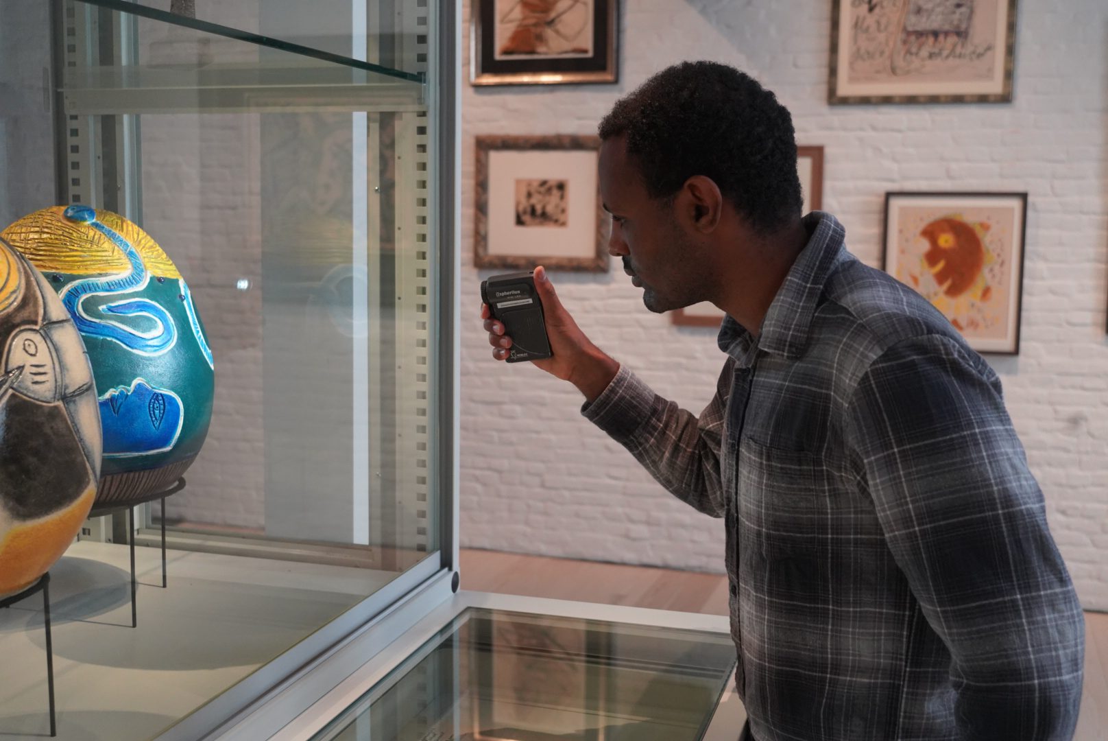
Restoration of Saint Rosalia
Jade Hill is an Edinburgh-based paintings conservator, and our most recent fellow at The Phoebus Foundation. Over the past few months, she has applied her conservation expertise to treat several works of art. Notably, she carried out image reintegration on Portrait of Archduke Maximilian and Portrait of Archduchess Elisabeth, two portraits by Jakob Seisenegger (1505-1567), and assisted Jill and Ellen Keppens in the complex removal of varnish and overpaint on the Seige of Horn by Peter Snayers (1592-1667).
One of Jade’s key contributions during her fellowship is the full restoration of Saint Rosalia, an eighteenth-century Baroque painting by the Mexican artist, José de Páez (1720-c.1790).

Jade at work on Saint Rosalia
Saint Rosalia is a small, religious scene on a copper support, in the style and palette typical of the artist. The composition centres around two prominent figures: Saint Rosalia of Palermo, Sicily is on the right, depicted in a dark-blue dress, wearing a crown of red roses and holding a crucifix. A winged angel, dressed in red, is to her left, gesturing towards heaven in the top left corner. The figures appear inside a cave, with a distant view of a building on the shore-front, likely to be Palermo Harbour, and a skull appears in the foreground; these details are characteristic to depictions of the saint.1

Saint Rosalia before treatment
An inscription in the lower left corner, loosely translated from Latin to English, reads: ‘I, Rosalia, of Sinibaldi, of Quisquina, and of the roses. In adoration of my lord, Jesus Christ, I dwell in this cave to be closer to Him.’ Sinibaldi is the family name of Rosalia and Quisquina is the Sicilian municipality of her family. Rosalia lived in a cave near Palermo as a hermit in devotion to her faith.
Though undated, the painting was signed ‘Jph. de Paez fecit en Mexico.’ The artist previously signed works ‘Joseph de Paez,’ with the abbreviated signature only appearing in works completed from 1770 onwards,2 thus likely dating Saint Rosalia on or after this date.

A fascinating feature of Páez’s working process is the tendency to repeat compositional elements, particularly the positioning and proportions of figures.3 In a comparison with another Páez painting in The Phoebus Foundation collection, La Divina Pastora, not only can one observe a common palette of earthy tones complimented with rich reds and deep blues, there is also a striking resemblance between the face and head positioning of the central figures. Overlaying both of the portraits digitally, they are proportionally almost identical, with only the scale and expressions differing.

Detail Saint Rosalia

Saint Rosalia and La Divina Pastoria overlaid to show similiarities

Detail La Divina Pastora
Close examination of Saint Rosalia has uncovered two areas of pentimenti, or visible traces of changes made by Páez during the creation of the painting. These adjustments appear on the left shoulder and hand of the angel, and give us an indication of the creative process used by the artist to ensure compositional balance and proportional accuracy.

Detail in reflected visible light with areas of pentimenti indicated in red, on the angel’s hand and shoulder
Copper is a very stable support, as it does not react to environmental fluctuations to the extent that canvas and wooden panel do, and therefore the paint layer did not exhibit a network of craquelure typical of a painting of this age, and there was no actively flaking paint. However, due to the smoothness of the substrate, paintings on copper panels are susceptible to paint loss from accidental damage; Saint Rosalia had suffered from this fate, with many significant losses in the paint layer resulting from abrasions, as well as from planar deformations in the support. A previous attempt at restoring the piece had covered an area to the left of the painting in thick, dark overpaint, obscuring original image and creating a disfiguring effect to the composition.


The aged, natural resin varnish was visibly oxidised, with slight yellowing and ingrained dirt. A relatively straight-forward varnish removal was carried out using free solvents; however, the thick layer of overpaint was far more stubborn and required further initiative. A series of water-in-oil macro-emulsions were explored, with the intention of solubilizing and removing the later additions without causing damage to the paint layer (and the metal plate). Great care was required during this stage of the treatment, as the test area was rather small, and it was important to apply the gel in a controlled manner, removing 0.5cm² areas at a time and monitoring its effect, ensuring only the overpaint was affected.


Aqueous filling materials should ideally be avoided for use with copper panels, due to the necessity of limiting any contact of water with the support. Furthermore, there is no requirement for a flexible filler typically used on canvas supports, that accommodate for fluctuations in relative humidity. Pigmented Wax Resins (PWR) were therefore explored for use; these are a suitable material because of their workability, lack of colour-shift upon application, and compatibility with conservation-grade retouching materials. The pigment content also adds toning to the infills and thus removes the necessity of a separate ‘basic retouching’ step.
It has previously been indicated that the beeswax content in commercially available PWR infills has the potential to have unwanted reactions with copper supports due to its acidity; normally, a localised isolation layer is recommended to prevent this, which reduces the depth of the already-shallow losses. Recent researchers have developed an alternative PWR, using Cosmoloid H80 and Regalrez® 1126, heated together and combined with pigments, before pouring into a mould.4 Following the guidance outlined in the research article, three PWR sticks were made, each using a different pigment to aid integration: titanium white, burnt umber, and raw sienna. These were applied to the losses with the use of a heated needle, allowing precise control to add texture and match the surrounding paint layer.


Once the infills were complete, image reintegration was carried out using carefully colour-matched Golden PVA conservation paints, unifying the overall image and bringing the painting back to the way the artist had intended.

Saint Rosalia after treatment
Footnotes
- Palazzotto, ‘La Patrona contesa. L’iconografia di Santa Rosalia e le dispute della committenza religiosa a Palermo da Van Dyck a De Matteis’, in: V. Abbate, G. Bongiovanni & M. De Luca (eds.), Rosalia eris in peste patrona, exh. cat., Palermo, Palazzo Reale, 2018: 61-72.[↩]
- M.M. Castañeda Hernández, José de Páez: personalidad artística, gusto e irradiación de su obra de 1750 a 1780, master paper, Universidad Iberoamericana Ciudad de México, 2016, http://ri.ibero.mx/handle/ibero/339.[↩]
- Y.A. Ramírez Sánchez, ‘Il proceso pictórico de José de Páez: Ciclo de la vida de la Virgen, santuario de Guadalupe, San Felipe, Chihuahua, México’, Intervención, 2, 24 (2021): 248-302, doi: 10.30763/intervencion.256.v2n24.35.2021.[↩]
- C.R. Pires, L. Carlyle, K. Seymour et al., ‘An Investigation into the Suitability and Stability of a New Pigmented Wax-Resin Formulation for Infilling and Reintegration of Losses in Paintings’, Journal of the American Institute for Conservation, 63, 3 (2023): 168-189, doi: 10.1080/01971360.2023.2172130.[↩]
From Rust to Restoration: Preserving Maritime and Logistic Heritage
In the chilly workhalls of Den Argentin, former dockworkers and stevedores work steadily on. With seasoned hands and a wealth of experience, they dedicate themselves to breathing new life into old machines and tools. It is tough work, especially in winter, but their motivation is stronger than the cold. They understand the value of this heritage and refuse to let their knowledge and craftsmanship fade away. Here, amid the scent of oil and the sound of scraping metal, the spirit of the port remains alive.

Jan and Julien – mechanics
“We are standing next to the heaviest forklift we have. It comes from Westerlund and was made in Germany. For seventeen years, it stood outside, exposed to the elements. When it arrived here, it seemed like a hopeless case. The steering was full of water—we removed that—and the entire vehicle was seized up with rust.
The engine and pump were completely corroded, but we restored them step by step. My good friend and colleague Julien overhauled the cylinder head and reassembled it, and that’s how we eventually got the forklift running again. It drives now, but unfortunately, lifting is no longer possible. Some parts we managed to find at a vintage equipment dealer in the south of France.
This forklift weighs 7 tons and was originally capable of lifting 5 tons. Normally, it would have a Perkins engine—an English engine—but this one is exceptionally fitted with a sixty-year-old Mercedes engine. Mercedes was known to be more reliable than Perkins, which is why this engine was widely used at the docks.
Freddy repainted the vehicle, and now we are working on the final touches. The importer was particularly enthusiastic about this forklift because so many original parts are still intact.
What makes this forklift extra special is the removable counterweight at the back. The city’s cranes could only lift 5 tons, and since the forklift itself weighed 7 tons, it couldn’t simply be hoisted into a ship’s hold. That’s why the 3-ton counterweight was detached, splitting the machine into two parts of 4 and 3 tons. Once inside the hold, the counterweight was reattached using a special safety bolt.
That safety bolt was crucial because, without it, the counterweight could come loose. Unfortunately, maintenance was sometimes neglected, and the bolt wasn’t always installed. People assumed the weight would stay in place within a groove in the chassis, but with heavy rattling, it occasionally came loose. This could lead to serious accidents—and it did. A forklift like this has a long history behind it, with many dangers and lessons. We do our best to bring it back to life, but always with respect for the past and the people who worked with it.


Fred – electrician in the chemical sector
“Antigoon was a neglected child, abandoned at the docks. The crane was eventually taken on as a school project with the intention of restoring it. The school completely dismantled the crane but never reassembled it. That’s how it ended up here, at Den Argentin, in pieces on pallets.
With several people, we started working on it, and now, after four to five years, it is almost finished. All the original parts have been recovered, except for the bodywork. It was in such poor condition that we could no longer use it. We did keep the old bodywork, but we completely recreated a new one, with an identical paint color and lettering.
The crane is no longer operational because some engine parts are missing and can no longer be found. However, the engine itself has been completely reconstructed and is visible. Starting it up would be too dangerous, as the safety mechanisms no longer work. The crane would keep pulling, keep moving… That’s why we chose to set it up permanently, so it perfectly showcases how it originally looked and functioned.
We are now in the finishing phase. The exterior still needs to be fully lacquered, the interior further cleaned and also lacquered. In addition, the crane will receive an anti-rust treatment, and the underside will be completely coated. For the hoist, we did not use cables but ropes of similar thickness to demonstrate how the hoist was originally guided.
In addition, we are working on the restoration of a small 100 kg bascule scale so that it can once again weigh with an accuracy of up to 10 grams. These antique scales are extremely precise. The difference between a bascule and a tripod scale—both types of weighing instruments—is that the bascule operates on a ratio of 1:10 or 1:100. To weigh 1 ton, you only need to counterbalance it with 10 kg. With a tripod scale, the ratio is simply 1:1. Moreover, a bascule is more compact and easier to transport, whereas a tripod scale is more cumbersome to dismantle and more prone to damage during transport.
Visitors can place weights themselves and experience how precise these devices are and how heavy certain port objects weigh. We also have a larger one of 1000 kg, a KN3. The question remains: do we leave these devices in their aged state, marked by the passage of time, or do we repaint them to restore their original appearance? Sometimes, it is easier to repaint a device and then bring it back to its original state.


Roger – miller
“When we work on these old machines, it feels like we are bringing a piece of history back to life. In front of us are an overhead-driven drilling machine and a bandsaw, both witnesses to an era where craftsmanship and mechanical innovation went hand in hand. But the passage of time has left its marks: rust, moisture damage, and wear threaten to diminish their historical value. That’s why we do everything we can to clean and restore them with respect and care.
Our first step is always a thorough cleaning. We carefully degrease the machines, remove dirt and dust, and sand the affected parts. Then, we lubricate the necessary components again to protect them from further corrosion. Although we cannot make the machines operational again—both for safety reasons and due to current regulations—we can preserve them as best as possible so that they remain a tangible part of our heritage.
Take the old bandsaw for woodworking, for example. This type of machine was originally powered by a motor, an advanced technique for its time. The drilling machine next to us is even rarer. We can hardly find any documentation on this model, and how the drive belts were arranged remains a mystery. I search through archival records dating back to 1820, but so far, I have only found sketches without any indication of the drive system. This makes the restoration all the more challenging—and fascinating.
Some devices in our collection surprise us with their advanced technology. One of the machines we are currently working on dates back to 1820-1830 and features a fully overhead drive system. Moreover, it has multiple drive mechanisms, which is remarkable for that period. This demonstrates how progressive people already were in thinking about automation and efficiency in the workshop.
Our volunteer Julien can assess the historical value of these machines like no other. During his career, he worked with similar devices and remembers how they were used in the port to repair tools and equipment. His stories bring history to life and provide valuable context for our restoration work.
Thanks to these efforts, we can not only keep the past tangible but also showcase the evolution of technology and craftsmanship to future generations. These machines may no longer be operational, but their story continues to live on.”

Freddy – driver of cranes and tractors
I am currently working on refreshing a port tractor—a powerful workhorse capable of both pushing heavy loads and carrying out repairs. This is an intensive process in which I first thoroughly degrease the tractor and then repaint it.
This particular tractor has a powerful front push function used to move train wagons and other heavy materials. At the rear, a welding machine is mounted, allowing it to be used for repair work as well. This makes it a versatile machine, although the push function and the welding unit were not always perfectly compatible.
I have been working on this project for several months and am now focused on repainting and refreshing the power unit and the drive motor. These components are crucial for the operation of the welding unit. Through this maintenance and renovation, the tractor not only gets a refreshed appearance but also remains in optimal condition for the heavy tasks in the port.”


Martin – dockworker and crane operator
“My role within Den Argentin is to continue an important mission: the preservation and accessibility of port heritage. We are committed to showcasing the highlights of our collection to visitors and providing guided tours. Additionally, we document disappearing professions, the old port, and the many anecdotes associated with it.
Another important task is recruiting new volunteers, as people drop out every so often. Thanks to my network, which includes many older individuals with niche knowledge, we can verify valuable information and restore the collection accurately. Additionally, I continue to actively promote Den Argentin, inviting groups to discover our open workshop. It is especially motivating for my colleagues and me to share our progress with visitors, who often share the same nostalgia for this heritage.
Unfortunately, a lot of valuable experience and knowledge is lost over time. Fortunately, people know where to find me when old port equipment is at risk of disappearing. For example, three Westerlund forklifts have been saved from the scrap heap here. Many hangars where outdated port equipment was stored have already been demolished due to asbestos or the risk of collapse. Today, the care for port heritage is increasingly left to private initiatives, as governments reduce their involvement. As a result, much valuable heritage disappears before we can save it, simply because it is discarded and destroyed.
That is why we, as dockworkers, are especially grateful that an art foundation like The Phoebus Foundation is so dedicated to restoring and preserving port heritage. Thanks to their efforts, our history continues to live on and can be cherished by future generations for decades to come.”

Harry – first a stevedore, then commercial director at Seaport Terminals
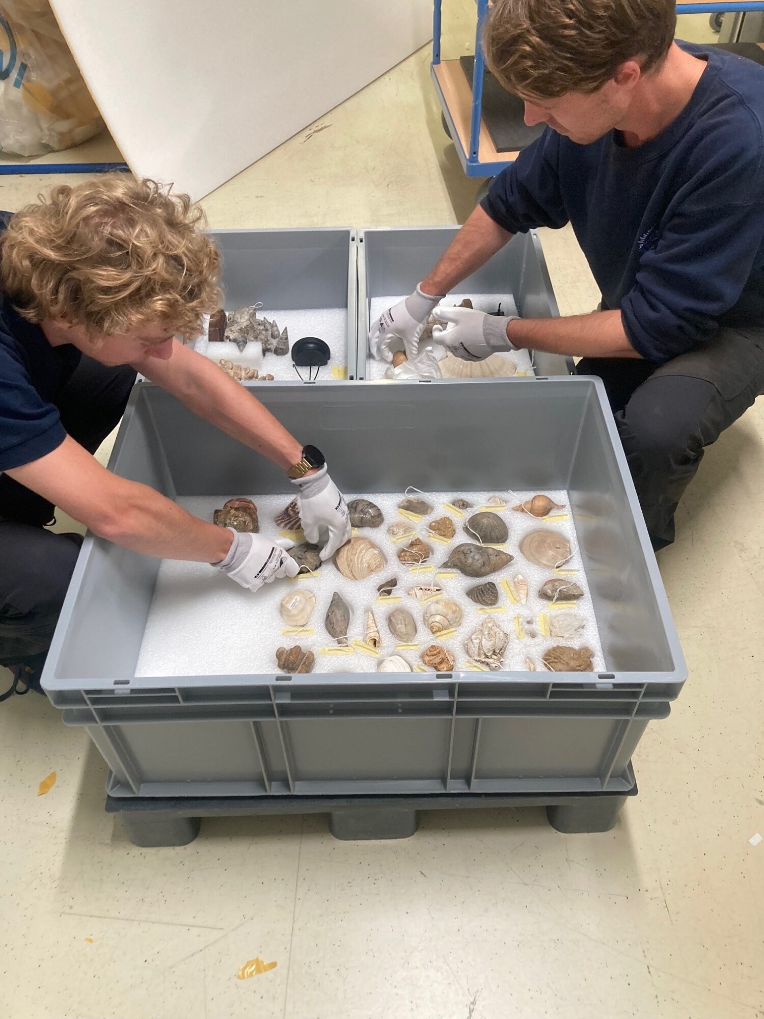
As a volunteer, I am responsible for the administration and archiving of objects within our collection. This means that I document each object with images, titles, and descriptions. So far, we have recorded 1,200 objects, and we continue to expand the collection with additional information: years, the link to the correct nation, and the location where these objects were in the harbour.
In addition to archiving, I give tours to visitors alongside other volunteers. During these tours, I provide a general explanation about the harbour, while my colleagues share their expertise on the objects they are restoring.
When a new object arrives, we begin the registration process. We measure it, note any damage, and start describing and dating it. We also try to determine which nation the object once belonged to. Sometimes, we come across disappeared nations, which requires additional research: where were they located, and during which period were they active?
Our collection is now 95% inventoried. For some objects, such as pirrewits or jute sacks, we have so many variations that we only record a selection of the most interesting specimens.
In addition, I act as an intermediary between our team on-site and the administration of The Phoebus Foundation. They support us with orders, deliveries, advice, guidance, and research, so we can carry out our work here efficiently.
It is remarkable to be part of this project and to make the history of our harbour tangible for the public.”

Den Argentin is open for group visits every Thursday upon request.
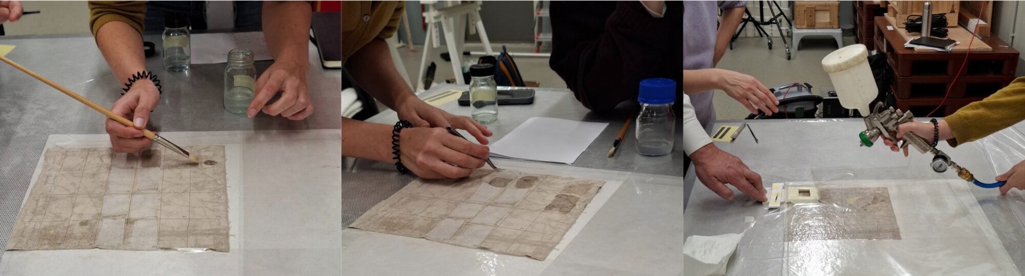
Restoration Workshop: Working with Polyvinyl Alcohol-Borax/Agarose Systems
Restoration and conservation techniques are constantly evolving: materials and methods are updated based on new technologies and discoveries. To stay informed about the latest developments, we frequently organise workshops in our restoration studio where specialists share their expertise with us. In December 2024, we were particularly honoured by the visit of Dr. Ehab Al-Emam from Sohag University in Egypt. He earned his PhD at the University of Antwerp on the application of polyvinyl alcohol-borax/agarose (PVA-B/AG) systems for cleaning artworks.1 Dr. Al-Emam successfully used this method to find a solution for removing deteriorated consolidant and thick soot layers from porous wall paintings in the temple of Seti I in Abydos, Egypt.2 3 Thanks to this method, aged varnish layers have also been safely removed from a wall painting in Antwerp.4
During the two-day workshop, our restorers were immersed in the theory and practice of PVA-B/AG systems, which we will refer to as ‘gels’ for simplicity. The first publication on the use of polyvinyl alcohol-borax (PVA-B) gels in restoration practice dates back to 2009.5 The application has been further refined and developed in recent years, including the combination with agarose (AG) gel. Blending PVA-B with AG gels creates a hydrogel with a double network. This has the advantage of bringing together the positive properties of the two systems while decreasing the negative ones. For example, PVA-B gel has low mechanical strength, causing it to adhere (or stick) to porous materials, potentially leaving residues on the artwork when peeled off. On the other hand, AG gel is very rigid and does not adhere to porous surfaces. However, its disadvantage is that it is rigid, making it almost impossible to adapt to the relief or structure. Thus, the contact with the artwork’s surface is not homogeneous. Blending PVA-B with AG gel results in a highly suitable medium for treating artworks as the gel can be safely peeled off from the (porous) surface without leaving residues. The workshop focused primarily on the preparation of PVA-B/AG gel and its application for cleaning paintings with discoloured varnish layers. It also included information on how to optimize several parameters to obtain the best cleaning results.

One of the key properties of PVA-B/AG gel is that it can retain liquids (including the cleaning agent) and release them gradually on the paint surface. This is particularly useful when the paint or the support of the painting is very porous. By placing the gel on the surface of the painting, the solvent in the gel can soften the varnish, allowing it to be partially absorbed by the gel and then removed shortly after with a cotton swab or compress. An additional advantage of the gel is that the contact time with the solvent can be precisely timed to avoid the penetration of the solvents into the sublayers of the painting and limit the cleaning action on the interface between the gel and the treated surface. Due to the gel structure, the volatile solvent also evaporates less quickly, which is safer for the restorer as they are less exposed to solvent vapours.
Practice leads to perfection. Therefore, our restorers will continue experimenting with the use of PVA-B/AG gels in the coming months. They will not only test and adjust the recipes as needed but also apply the gels in their various restoration projects. Specifically, they will focus on choosing the proper concentrations of the gelling material, the cleaning agents that can be incorporated into the gel, and the contact time between the gel and the artwork, in order to efficiently remove the varnish layers. Exciting times are ahead in the studio!
Footnotes
- E. Al-Emam, Cleaning of Wall Paintings by Polyvinyl Alcohol–Borax/Agarose (PVA–B/AG) Double Network Hydrogels: Characterization, Assessment, and Applications, doctoral dissertation, University of Antwerp, 2021.[↩]
- E. Al‑Emam, A. Ghafour Motawea, K. Janssens & J. Caen, ‘Evaluation of Polyvinyl Alcohol–Borax/Agarose (PVA–B/AG) Blend Hydrogels for Removal of Deteriorated Consolidants from Ancient Egyptian Wall Paintings’, Heritage Science, 7, 22 (2019): 1-18, https://doi.org/10.1186/s40494-019-0264-z.[↩]
- Al-Emam, E., Motawea, A.G., Caen, J. et al. Soot removal from ancient Egyptian complex painted surfaces using a double network gel: empirical tests on the ceiling of the sanctuary of Osiris in the temple of Seti I—Abydos. Herit Sci 9, 1 (2021). https://doi.org/10.1186/s40494-020-00473-1.[↩]
- Al-Emam, E.; Beltran, V.; De Meyer, S.; Nuyts, G.; Wetemans, V.; De Wael, K.; Caen, J.; Janssens, K. Removal of a Past Varnish Treatment from a 19th-Century Belgian Wall Painting by Means of a Solvent-Loaded Double Network Hydrogel. Polymers 2021, 13, 2651. https://doi.org/10.3390/polym13162651.[↩]
- E. Carretti, S. Grassi, M. Cossalter, I. Natali et al., ‘Poly(vinyl Alcohol)−Borate Hydro/Cosolvent Gels: Viscoelastic Properties, Solubilizing Power, and Application to Art Conservation’, Langmuir, 25, 15 (2009): 8656-8662.[↩]
The rediscovery of the Siege of Horn
In the 1630s, the Antwerp-born Peter Snayers painted the Siege of Horn. Although less known today, he was a famous battle painter in his time. He worked in Brussels, where his main patrons were based: the court and military commanders. They were eager to have their own triumphs and those of their predecessors immortalized.
Although his war scenes are particularly detailed, Snayers did not go to the front to gather information. He painted his usually very large canvases in his studio, basing them on prints and reports from military engineers and other eyewitnesses. This makes Snayers’ depictions extremely precise. This also applies to the Siege of Horn, which depicts the attack on that Austrian city during the Eighty Years’ War.

It strongly appears that Snayers painted the Siege of Horn on commission from the successful Spanish commander Diego Mexía de Guzmán, the Marquis of Leganés. Besides being a military strategist, he was a true art lover and owned an extensive painting collection. As evidenced by the preserved inventory, the Marquis collected works by the leading masters of his time, such as Peter Paul Rubens and Frans Snijders. Snayers’ Siege of Horn is also mentioned in it!
The restoration of the Siege of Horn is a particularly exciting and challenging project. Over the centuries, the canvas has endured a lot. It was enlarged, visible by the added strip at the top and the different craquelure patterns in the paint layer. It was also heavily overpainted. Removing these non-original paint layers requires an extremely meticulous and careful approach.

Currently, restorers Jill and Ellen Keppens have started the first phase of the treatment. They were able to relatively easily remove the top varnish layer and the first layer of overpaint. These overpaints are lighter in tone than the underlying parts. Normally, you would expect the opposite: that colors become lighter after removing varnish and overpaints. Under the first layer, they found older and discolored remnants of varnish, oil, glue, and retouches. These remnants make the restoration complex because they are often very difficult to remove.
The piercing eyes of a horse or an unexpected figure reveal the excellent painting quality of the facial expressions. These surprising details unveil a glimpse of the original splendour of the painting and serve as a reference for further treatment. The many powerful details, such as the expressive faces, dynamic troop movements, and wild horses typical of Snayers, will be carefully restored in the second phase of the treatment.


In that phase, Jill and Ellen will also remove stubborn retouches. Where complete removal is impossible, they will ‘thin’ them to create a harmonious overall experience. They will then apply a protective intermediate varnish and begin filling in gaps and retouching. Finally, the canvas will receive a final varnish layer, and Snayers’ Siege of Horn will once again be admired in all its glory.

Jill and Ellen are at the beginning of a long journey. Every day brings new insights and unexpected details to light that deserve the necessary time and attention. This makes this restoration treatment not only challenging but also immensely fascinating. And one thing is certain: the end result will be worth the precision work.

Want to know more about battle painter Peter Snayers? Then also read this Phoebus Finding.
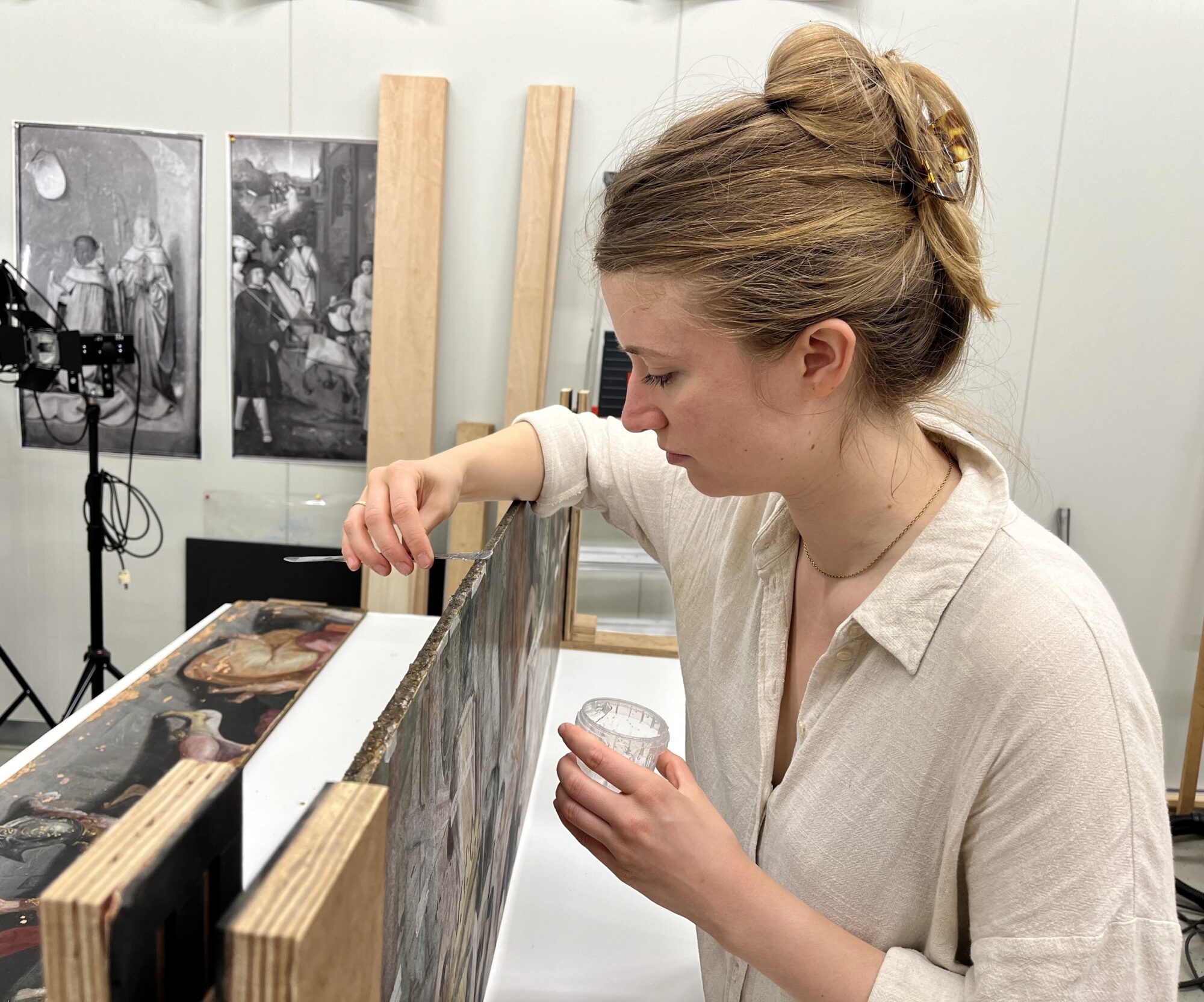
Update: restoration panel Maarten De Vos
In an earlier article, we informed you about our treatment of the panel depicting the Apostle Peter with the centurion Cornelius (ca. 1560–1600), attributed to Maarten De Vos. This was a challenging treatment, because the painting was covered by layers of grime, old varnishes and overpaint, and the support was in poor condition. However, as is often the case, the oak panel was in poor condition. The boards showed multiple complex cracks, and the panel joints no longer aligned. Additionally, earlier restoration attempts had caused further damage to the wooden support. Therefore, the structure has been reinforced, and the panel will also be supported from the back.
The cleaning of the painting revealed a painted surface that was degraded by aggressive past treatments. It was also disfigured by stains due to chemical reactions in the paint. Luckily it preserved beautiful details as well: bright colours and the great quality of the portraits. But all in all, a structural treatment needed to take place.
Most structural issues of the painting derived from misguided past treatments and bad quality of the support. This had become reactive overtime and had warped. Woodworm and an original rigid framing had caused the first fractures and the disjoint of the bottom board before the damage caused the cradling of the painting. Cradling, a treatment not commonly used today, involves thinning the panel and attaching a rigid grid to the back to help support and straighten the painting. The panel rejected the cradle, causing it to partially come off and leading to severe cracks, flakes, and blisters in the paint layers. While further damage often happens with cradling, it’s usually not as dramatic as this.
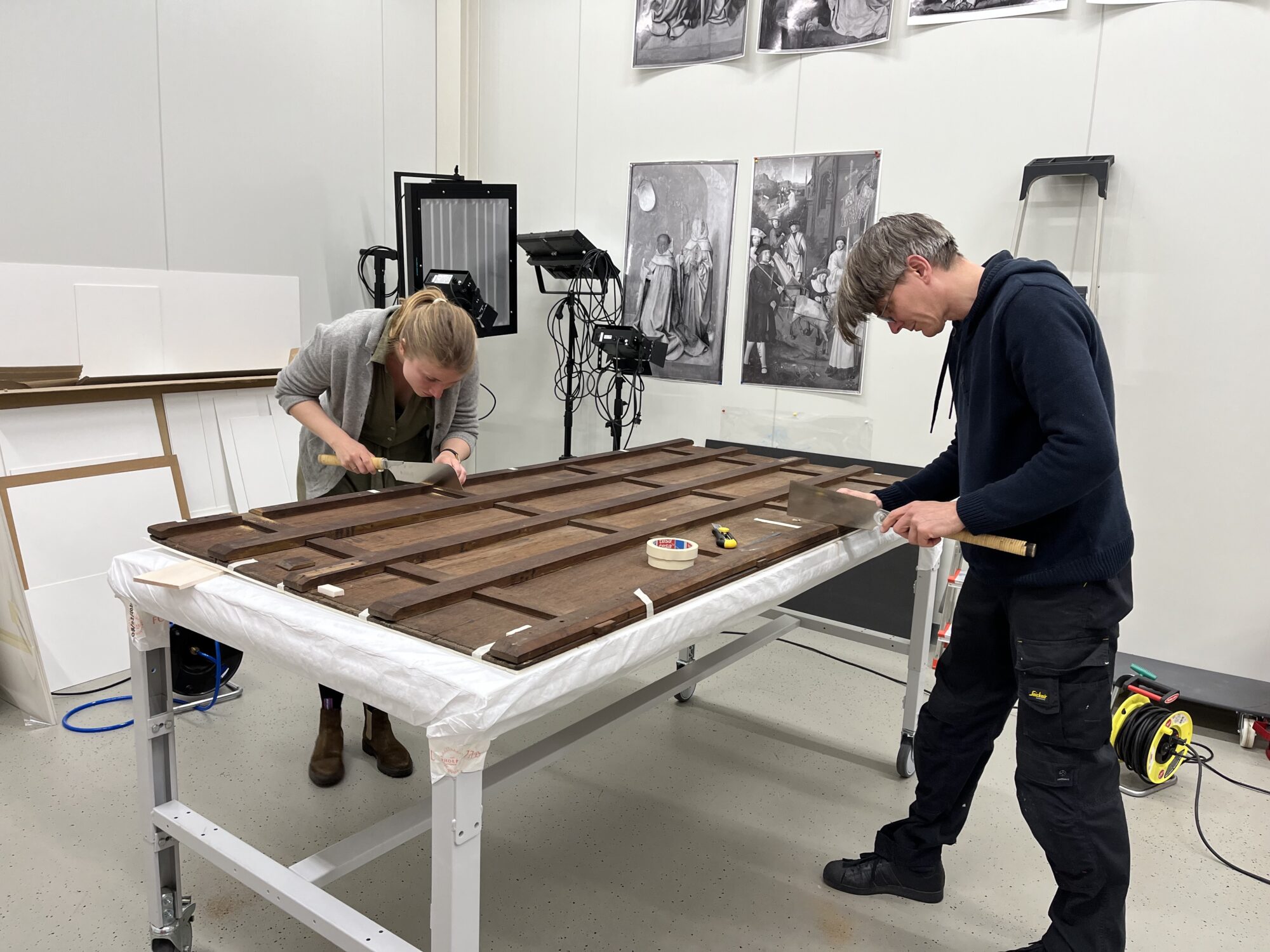
Their job was to fix the panel and also address the issues that caused the damage. The goal was to restore its structure and improve the surface’s shape and level. With this in mind, Sara Mateu and Brian Richardson, along with Franziska Bunse, started the repair work earlier this summer.They removed the cradle and cleaned off the glue residue. Once they had a clear view of the back, they separated the boards that had come apart before. This let them clean the old glue left in the joints and cracks from past repairs.
Being the biggest panel ever treated in the studio, they built a custom-made gluing bridge – a temporary structure used in the conservation and repair of artworks – that could comfortably accommodate its size.
They started by fixing the smaller and easier fractures before tackling the more complicated damage. The panel had a serious compound fracture in an area affected by woodworm. These fractures are hard to repair because they go into the woodworm tunnels and come out somewhere else, making it hard to connect the damage seen on the front and back. Repairing some of these fractures needs a special technique that ensures a lasting fix but removes original material, so it’s only used for the worst cases.
The panel responded very well to a less invasive approach and they were able to treat all fractures and rejoin all boards with their standard approach. Despite being successful with the repairs, the panel remains weak and requires additional reinforcement.
The next step will be to create and attach a support to the back of the panel.
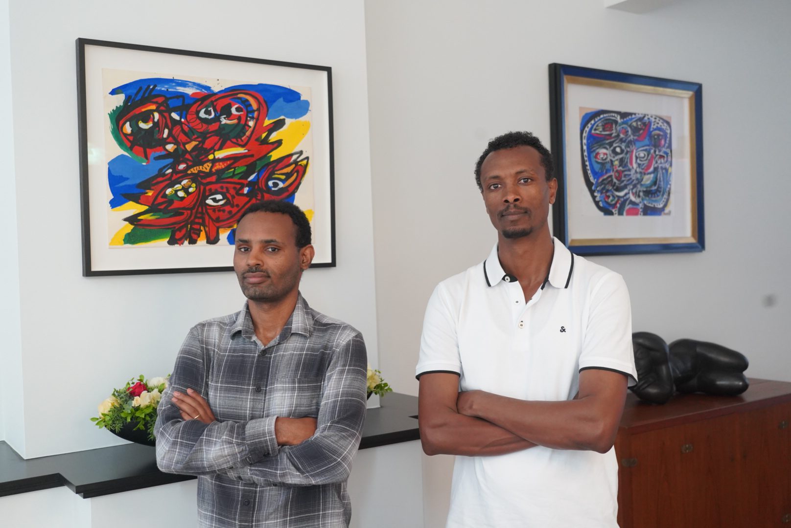
Preventive Conservation: A Month with Shimels and Ayenew at The Phoebus Foundation
Last month, we went behind the scenes and got to know our new student interns, Shimels Ayele Yalew and Ayenew Sileshi Demssie. They supported our team in various activities focused on the preventive conservation of different works from The Phoebus Foundation’s collection.
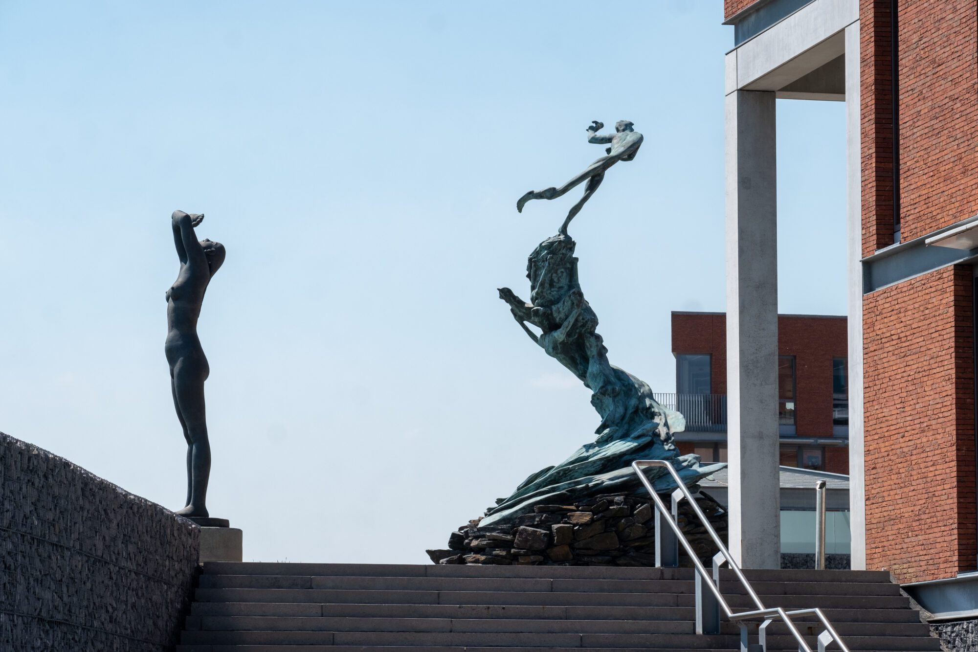
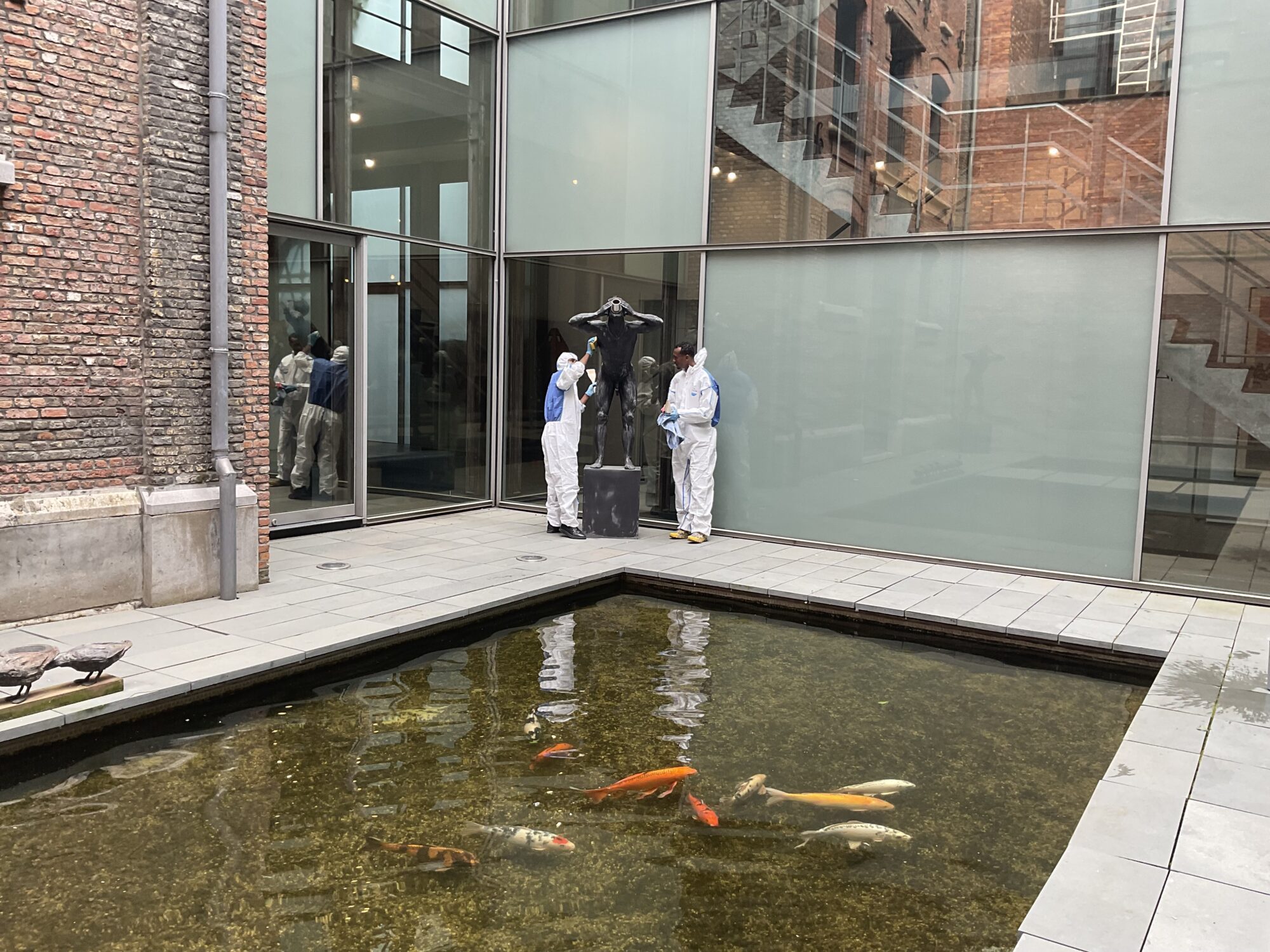
Singelberg, located on the Schelde in the industrial port, offers a stunning contrast between the unique setting and the works of masterful artists such as Minnebo, Atelier van Lieshout, Pablo Atchugarry, Michael Aerts, and many others. However, this location also presents challenges, such as the impact of air pollution and freshwater on the sculptures. Therefore, a preventive approach is essential.
Ayenew focuses on the conservation of architectural heritage in his doctoral research, using various analytical methods based on measuring the outdoor climate. Thanks to his expertise, he is working with Shimels to assess the damage to the sculpture park. The condition of both the outdoor and indoor sculptures has been carefully inspected and documented. Many of the sculptures were treated preventively a year ago; for example, some bronze sculptures received a new layer of wax, while marble sculptures were cleaned and checked for mechanical damage. By maintaining the annual inspections, the impact of the outdoor climate on the sculptures is increasingly well documented and predicted.
Ayenew Sileshi Demssie is a doctoral student at the University of Antwerp, specialising in conservation and restoration.
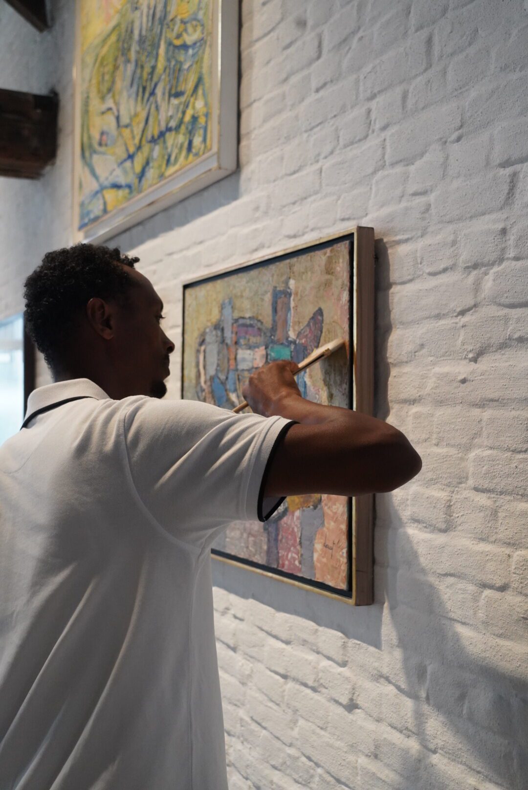
Over the past month and a half, he has focused on inspecting and documenting the condition of paintings, sculptures, and other artworks. His work included preparing detailed condition reports, cleaning sculptures using dry techniques, and identifying potential risks for future intervention.
Ayenew found that most artworks are in good condition but emphasised the need for ongoing inspection and intervention to ensure their long-term preservation.
Shimels has extensive knowledge in the conservation of historical books, specialising in Ethiopian Coptic manuscripts on parchment. This expertise proved invaluable while studying The Phoebus Foundation’s book collection. In his doctoral research, Shimels focuses on the preventive conservation of historic parchment. As a result, he has been able to identify various types of parchment and, under the guidance of conservator Oliver Claes, carry out several conservation projects, including cleaning pages using mild solvents and dry techniques.
Shimels Ayele Yalew is a lecturer at Bahir Dar University in Ethiopia and a doctoral student at the University of Antwerp, with a BA and MA in History and Heritage Management.
At The Phoebus Foundation, his tasks included assessing the condition of various artworks, such as books, paintings, and sculptures, preparing detailed condition reports, and carrying out cleaning activities.
Ayenew and Shimels reviewed a total of over 90 artworks. Additionally, they examined an important series from Pedro Figari’s oeuvre and gained insight into the impact of oil paint on pressed cardboard. They also assessed and documented the works currently on display at the CoBrA Depot. This collection, with its wide variety of artists’ materials, is extremely sensitive. Updating condition reports is essential to ensure the state of the collection. Their contributions this summer were therefore of great importance, and the experience was immensely valuable.
Based on their findings, The Phoebus Foundation’s atelier will adjust its approach and may involve a specialised team for this ongoing conservation. This presents a significant but exciting challenge!
Visitors often arrive by bike or via the waterbus to the site. Since the restructuring of the tours and guides at The Phoebus Foundation, it is now also possible to book a guided visit. Weekend reservations are free but mandatory to ensure visitor safety.
The restoration of a panel attributed to Maarten De Vos
Painting conservator Franziska Bunse, who has been a Fellow at The Phoebus Foundation for the past three months, is restoring a panel painting from the foundation’s collection under the expert guidance of Sara Mateu and in collaboration with Brian Richardson. This work is attributed to the circle of the Antwerp master Maerten de Vos (1532-1603).
The painting depicts various scenes from chapter ten of the Acts of the Apostles, which tells the story of Saint Peter and the centurion Cornelius. Peter receives a vision in which the heavens open and a large sheet is lowered down. This sheet contains all kinds of animals that are considered unclean according to Jewish dietary laws. When Peter refuses to eat these animals, it is explained to him that nothing created by God is unclean.
Subsequently, two soldiers sent by the centurion Cornelius knock on Peter’s door to invite him to their master’s house. Peter accepts the invitation and goes with them. When he arrives at the centurion’s home, the centurion kneels before Peter, but Peter tells him to stand up, explaining that God has shown him that everyone is equal. In the end, Peter baptizes the centurion.
What is remarkable about this work is that the scenes are depicted from right to left.
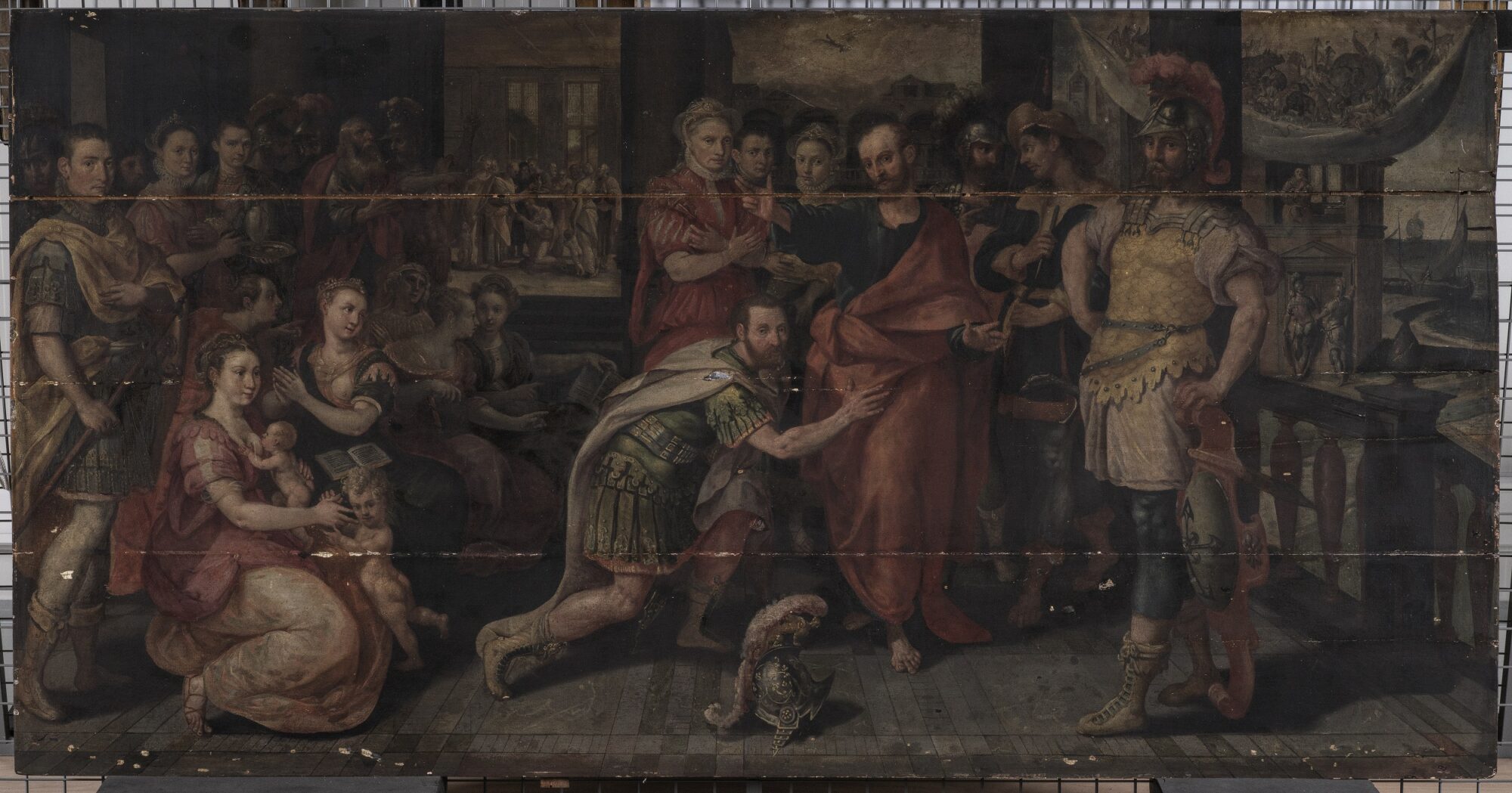
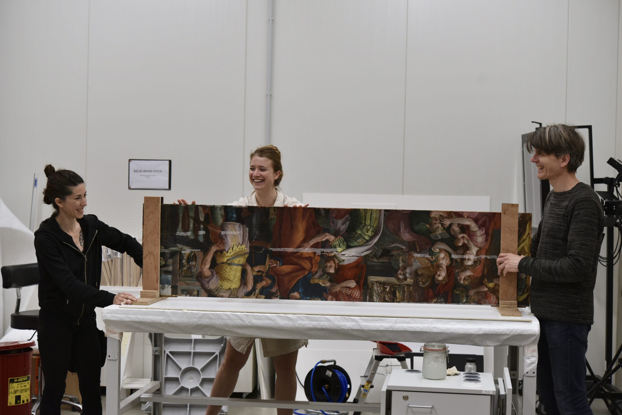
The painting consists of four oak panels with a horizontal grain and measures 99 cm x 190.3 cm, giving it a relatively elongated format. Upon arrival at the conservation studio, the panel was in a very critical condition. The exact state of the paint layers was difficult to assess because a thick layer of dirt and a yellowed, non-original varnish completely covered the surface. The first step was to clean the painting, which became a challenge. Removing dirt, old varnish, and discolored retouches that had been on the surface for centuries had to be executed carefully to avoid damaging the original paint layers. Additionally, thorough tests were needed to determine the appropriate method. By cleaning the painting with a combination of various solvent gels and gentle mechanical techniques, the vibrant and intense color palette was revealed once more.
The damage primarily affected the structure of the painting. Two joints (the top and bottom ones) were completely open, and many cracks weakened the panels.
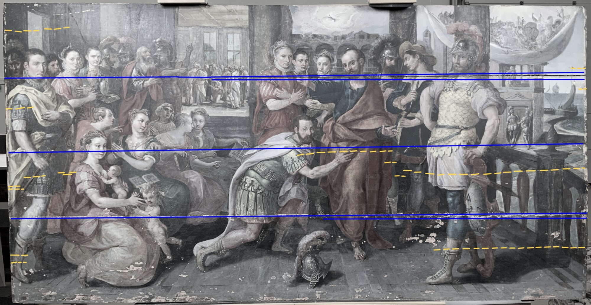
These damages also affected the paint layer, leading to loss. The structural damage was partly the result of, and certainly exacerbated by an old wooden strainer. This supporting structure, which was likely attached to the back of the painting in the 19th century, contributed to the deterioration.
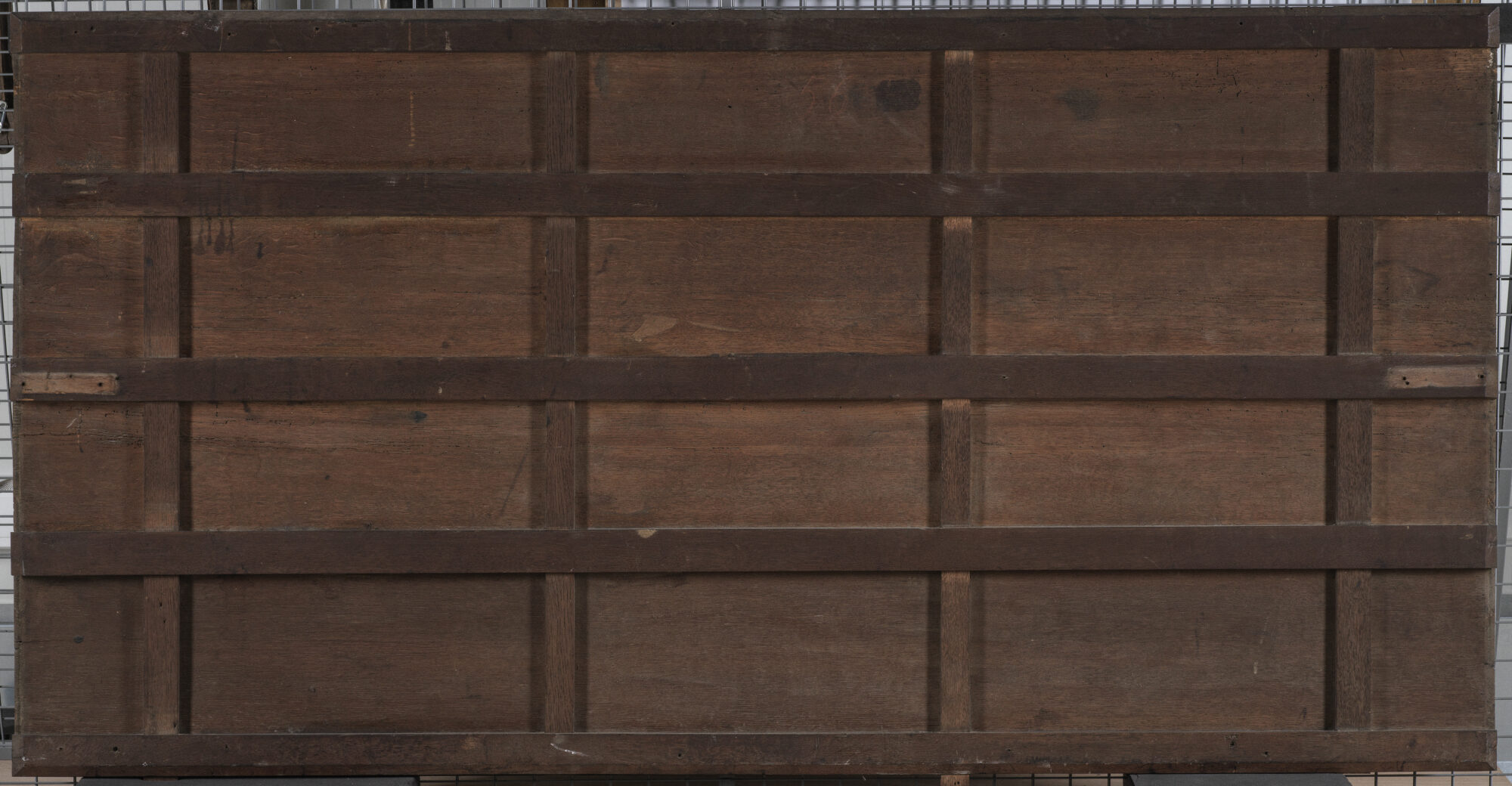
Although the restorers acted to the best of their knowledge at the time, this wooden strainer was not beneficial for the painting’s wooden support in the long term. Additionally, an old woodworm infestation locally weakened the panels. Under the guidance of Sara Mateu, we removed this old, dysfunctional wooden strainer
To conserve the cracks and open joints and to properly re-glue them, the top and bottom panels were then dismantled.
At the moment, this restoration is still ongoing. The structural support requires further conservation, and filling and retouching the lost paint layers are yet to be addressed. Interested in seeing the results? Follow us on our website and social media to stay updated!
Behind the Scenes in Tallinn
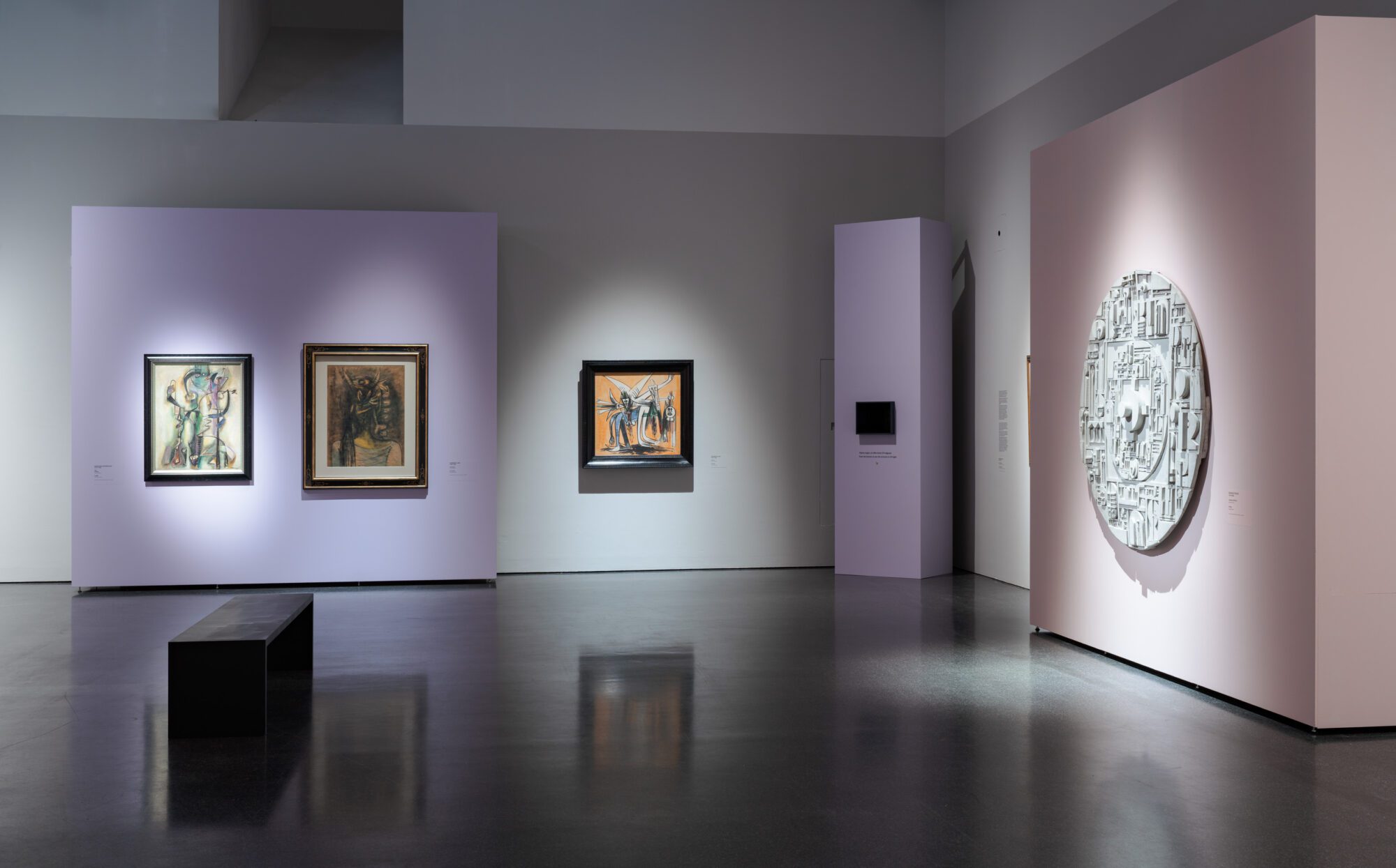
On June 21, 2024, the exhibition History and Mistery: Latin American Art and Europe opened at the Kumu Art Museum in Tallinn, Estonia. This exceptional installation features 112 Latin American works curated by Sirje Helme and Kadi Polli, whilst offering a unique scenography designed by renowned artist Kristi Kongi and showcasing magnificent works from the Viceroyalties period, alongside a selection of modern artworks by well-known artists such as Joaquin Torres Garcia, Roberto Matta, and Diego Rivera.
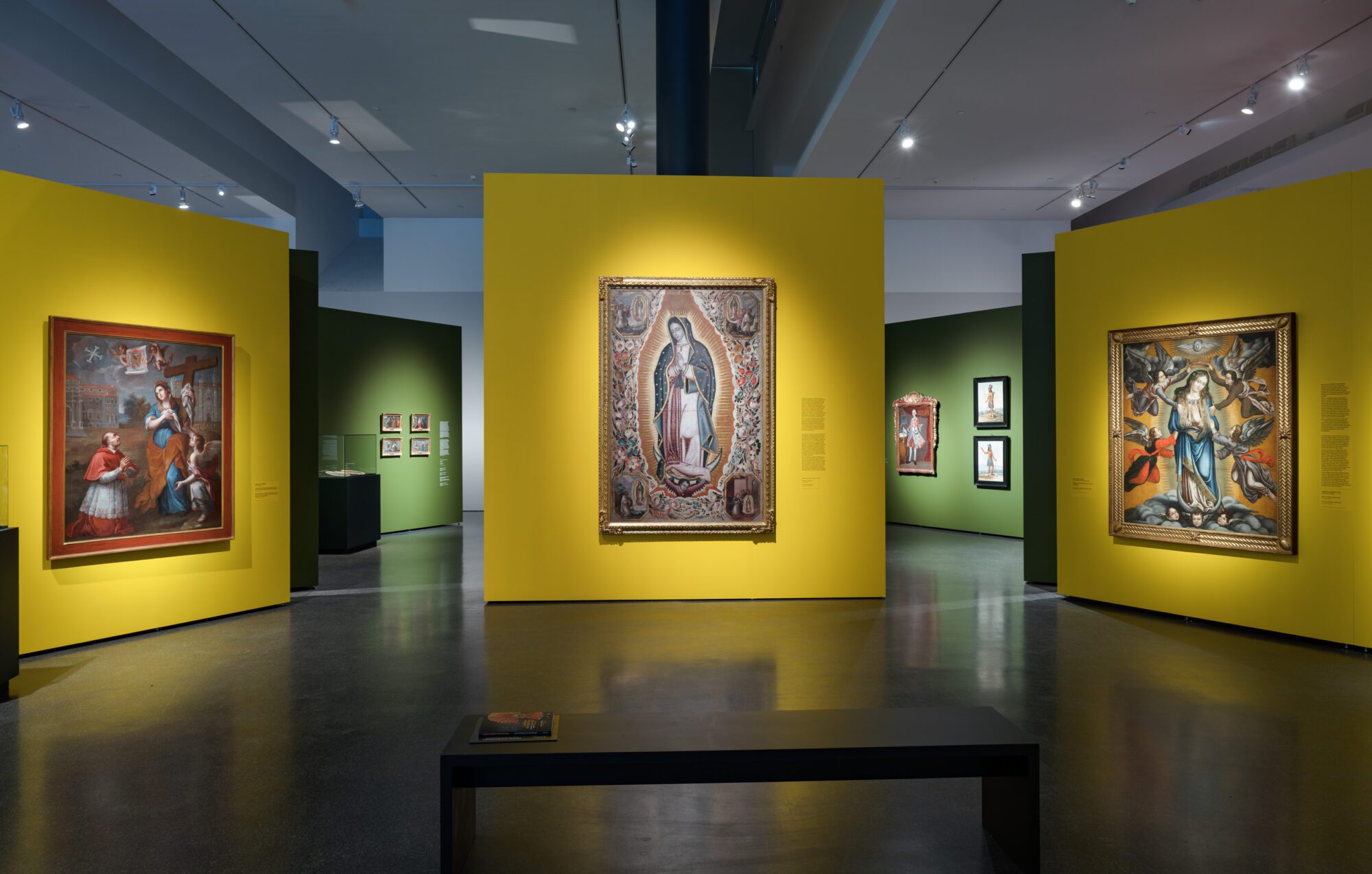
A special space has also been dedicated to the work and life of Leonora Carrington. The Phoebus Foundation has loaned seven works for this exhibition, and the team of curators and project coordinators has traveled to Tallinn to assist with the preparation and installation of these artworks, which are being shown internationally for the first time here.
Special attention has been given to the delicate materials of some artworks, and extensive preparations have been made to ensure the installation proceeds efficiently and safely. Careful restoration has been carried out, and special packaging and installation requirements have been applied. Furthermore, additional security measures have been implemented to protect the artworks from potential vibrations in the space.
History and Mistery: Latin American art and Europe runs until November 3, 2024, and is accompanied by several public events introducing the artistic relationships between Latin America and Europe. For more information and tickets, please visit the museum’s website at kumu.ekm.ee.
Behind the Scenes in Montreal
At the Montreal Museum of Fine Arts (MMFA), a lot of work has been going on behind the scenes over the past few weeks in preparation for the upcoming exhibition Saints, Sinners, Lovers and Fools, which opens on 8 June 2024. A particularly fascinating aspect of the preparation was the journey undertaken by the artworks, as well as the setup of the exhibition space itself. With dedication and precision, every effort was made to ensure that each artwork would be optimally displayed, allowing the public to enjoy an unforgettable experience.
The artworks from The Phoebus Foundation’s collection have once again crossed the Atlantic Ocean, this time to reach their destination in Montreal, following last year’s stops in Denver and Dallas. In The Phoebus Foundation’s restoration workshop and storage facility, the loaned pieces were meticulously handled and packed in the safest possible manner to ensure they would arrive at the museum without any damage. In total, 130 artworks traveled by plane to Canada, requiring careful coordination and planning for the transport!
Upon arrival at the prestigious Montreal Museum of Fine Arts, after a long journey, the installation of the artworks could begin. Collaborative teams from the museum and The Phoebus Foundation carefully unpacked each piece, followed by a thorough condition check. Although the artworks were packed in airtight and shock-resistant crates, transport is never without risk.
Under the watchful eyes of the restorers and coordinators from both the museum and The Phoebus Foundation, the artworks were carefully installed in their designated places. It is always a significant challenge for curators and scenographers to position the pieces perfectly, ensuring they fit both conceptually and aesthetically within the exhibition space. After a successful installation, the final scenographic adjustments were made, including lighting, signage, and interactive elements.
Behind every exhibition is a team of curators, art handlers, technicians and other specialists working together to bring that vision to life.
Saints, Sinners, Lovers and Fools runs from 8 June to 20 October 2024. For more information and tickets, visit www.mbam.qc.ca.
Restoration of Wautier’s ‘Bust of a Saint’
Eva van Zuien, independent restorer specialising in old masters, recently completed the restoration of a true artistic gem. Commissioned by The Phoebus Foundation, she breathed new life into Bust of a Saint by Brussels artist Michaelina Wautier.
Michaelina’s distinctive touch is easily recognisable in this beautiful work. The way in which she painted the soft features, the eyes and the drapery embodies her characteristic style. Additionally, the artist signed the work in her typical manner, placing her full first and last name, Michaelina Wautier fecit, in the upper left corner.
The painting was in a moderate condition before treatment. It had been lined in the past, but the edges were damaged, causing the canvas to no longer be adequately stretched on the frame. Furthermore, the paint layers appeared dull due to surface dirt and the presence of a yellowed varnish layer. Notably, a significant portion of the background on the left side of the painting had been subject to overpainting.
Removing the old varnish layer resulted in a notable transformation. Previously obscured original colour nuances, like the blush on the cheeks, became more discernible in the face, and a gradient from light to dark in the background became more visible. The removal of the old overpainting on the left revealed an original underpainting, deliberately left exposed by the artist in a vertical strip. The reason for Wautier’s choice in this matter remains unclear, but it seems that this bust might have been painted on the edge of a larger canvas.
An interesting phenomenon in this painting is the presence of many protrusions on the paint surface. Countless small white crater-like formations are visible throughout the entire work. This is the result of lead soap formation, a chemical ageing process in the paint layer. Considering the disruptive visual effect of these light dots, it was decided to retouch the most distracting ones.
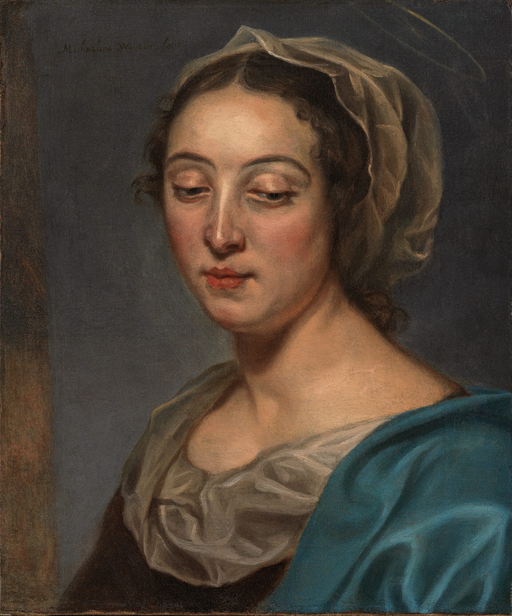
Thanks to this careful restoration, the artwork can once again be admired in all its splendor!
Research on T. rex skeleton at the Sauriermuseum
At the Sauriermuseum in Aathal, Switzerland, where our 67-million-year-old T. rex, Trinity, is on display, a team of paleontologists led by Dr. Nizar Ibrahim from the University of Portsmouth is conducting a thorough investigation of the skeleton.
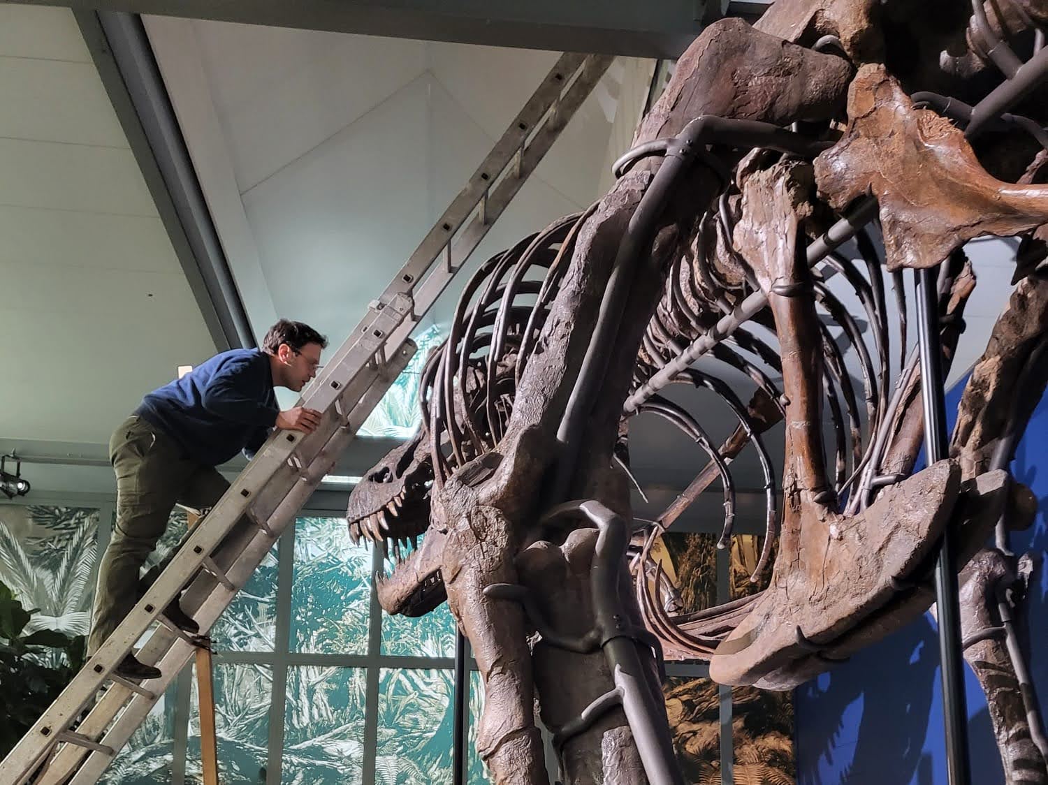
The researchers have carefully examined the skeleton’s tail, as well as the ribcage, forelimbs, and skull. In this way, the team is collecting data on the size and appearance of the bones, while paying special attention to paleopathologies that provide evidence of traumatic injuries and diseases.
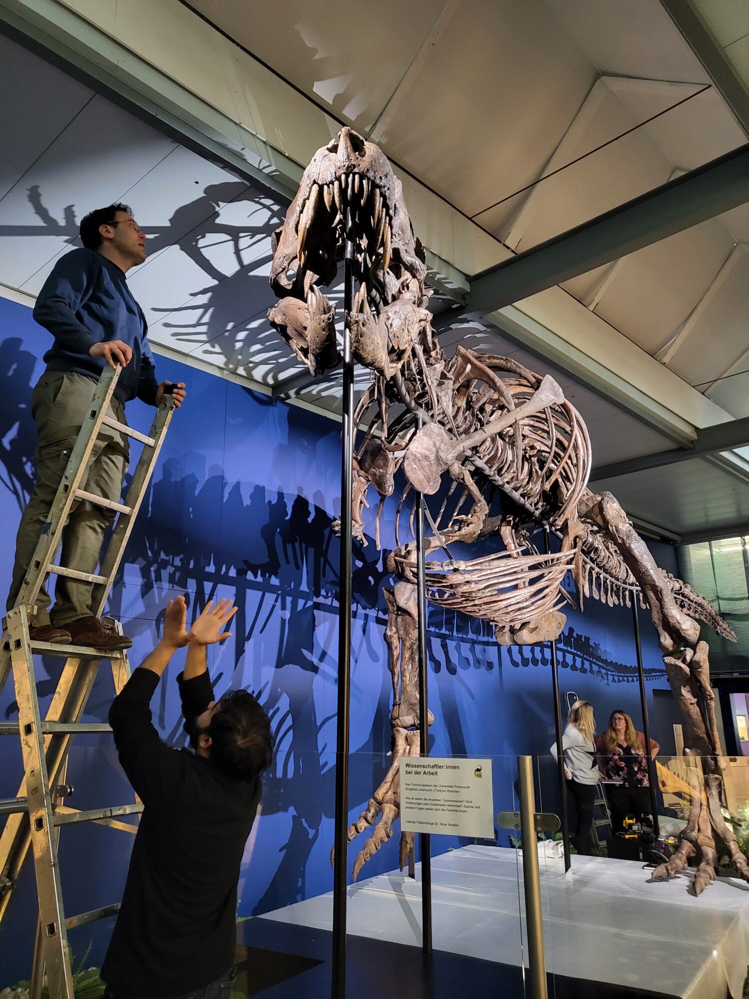
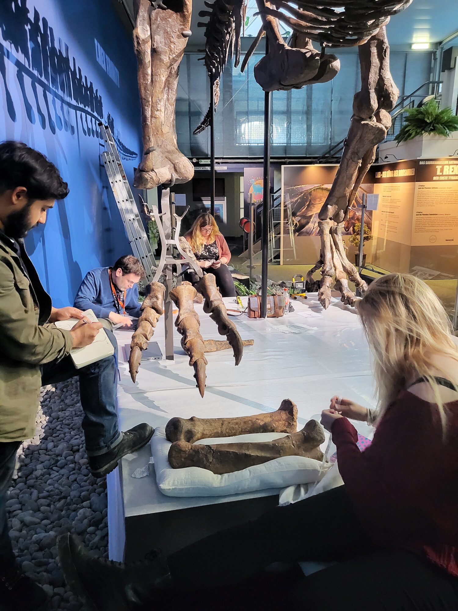
This meticulous research will provide valuable insights for the field of paleontology and offer new perspectives on one of the world’s most fearsome dinosaurs, so keep an eye on our website and newsletter for further developments!
Curious about the personal testimonies of the researchers? Check out the university’s website:
Restoration of ‘Eden’: A Glimpse Behind the Scenes
This month, we take you behind the scenes in our restoration studio. Under the guidance of Clara Bondia, Julio Alpuy’s Eden is being prepared for an upcoming exhibition.
Julio Alpuy (1919-2009) was a Uruguayan artist closely associated with Torres García’s inner circle of collaborators. He played a fundamental role in the diffusion of Latin American art in the United States and Europe. His works have been exhibited extensively in galleries and institutions worldwide, attesting to his illustrious career. Painted in 1979, this large-scale oil on canvas is part of a series depicting Eden, featuring a narrative character of naturalistic figures intertwined with depictions of multiple couples.

Although the painting was initially mounted on its original stretcher, it quickly became apparent that it did not meet its purpose. The stretcher was not very sturdy due to the thin wooden slats nailed together. As a result, it lacked strength and a movable system to allow for proper tensioning of the canvas, resulting in significant distortions and instability. Additionally, the painting was susceptible to harmful vibrations during any movement or handling, posing a challenge for proper conservation.

Furthermore, the canvas had incurred damage and breakage at the bottom, prompting an earlier restoration attempt. This involved applying a patch crafted from commercially prepared aged canvas, secured with an unidentified synthetic adhesive that had become yellowed and brittle over time. Unfortunately, the patch was visibly marked on the front side, causing a rectangular distortion that hindered the accurate view of the artwork.

After removing the dust, the old patch was treated. The process was highly delicate, but the adhesive was gradually softened and mechanically removed. Additionally, the residue that had penetrated between the fibers was eliminated. The distortion was corrected with controlled weight and humidity, while the original fibers of the canvas were repositioned. Finally, a new reinforcement of synthetic fabric and thermoplastic film layer was applied. As a result, the tear was both volumetrically and chromatically retouched.
As for the stretcher, various options were considered. Ultimately, it was decided to replace it with a new one that meets the requirements necessary for the proper conservation of the artwork. The chosen support is made of high-quality wood with a controlled mobility system.
The artwork was carefully prepared by protecting the edges to prevent potential loss of polychromy during handling. Afterwards, the old stretcher was removed and the back of the canvas was cleaned, removing the accumulated dirt. Subsequently, the artwork was placed onto the new frame and properly stretched to avoid vibrations and aesthetically enhance the accurate representation of the painting.
Curious about where Julio Alpuy’s Eden will be on display? Keep an eye on our website and social media!
Through the art photographer’s lens
In the midst of a bustling schedule filled with numerous projects and publications, these days are also particularly busy in our photo studio. From capturing the intricate details of medieval retables and the timeless allure of baroque portraits to immortalizing the essence of Latin American sculptures, Antwerp postcards, and books of hours, our photographer, Michel, navigates a kaleidoscope of artistic expressions. Each piece demands meticulous attention, often requiring a creative orchestration in order to achieve optimal results.
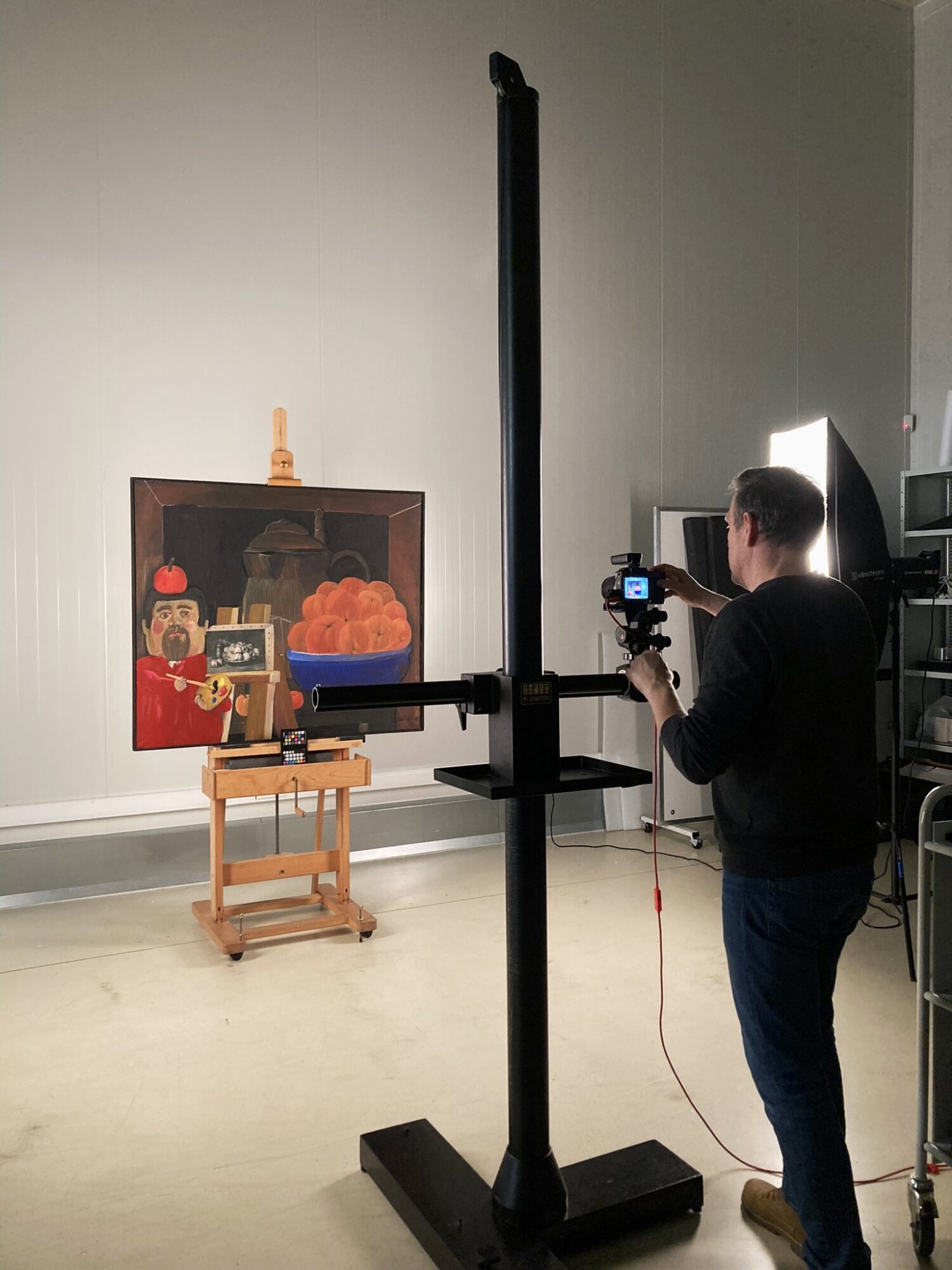
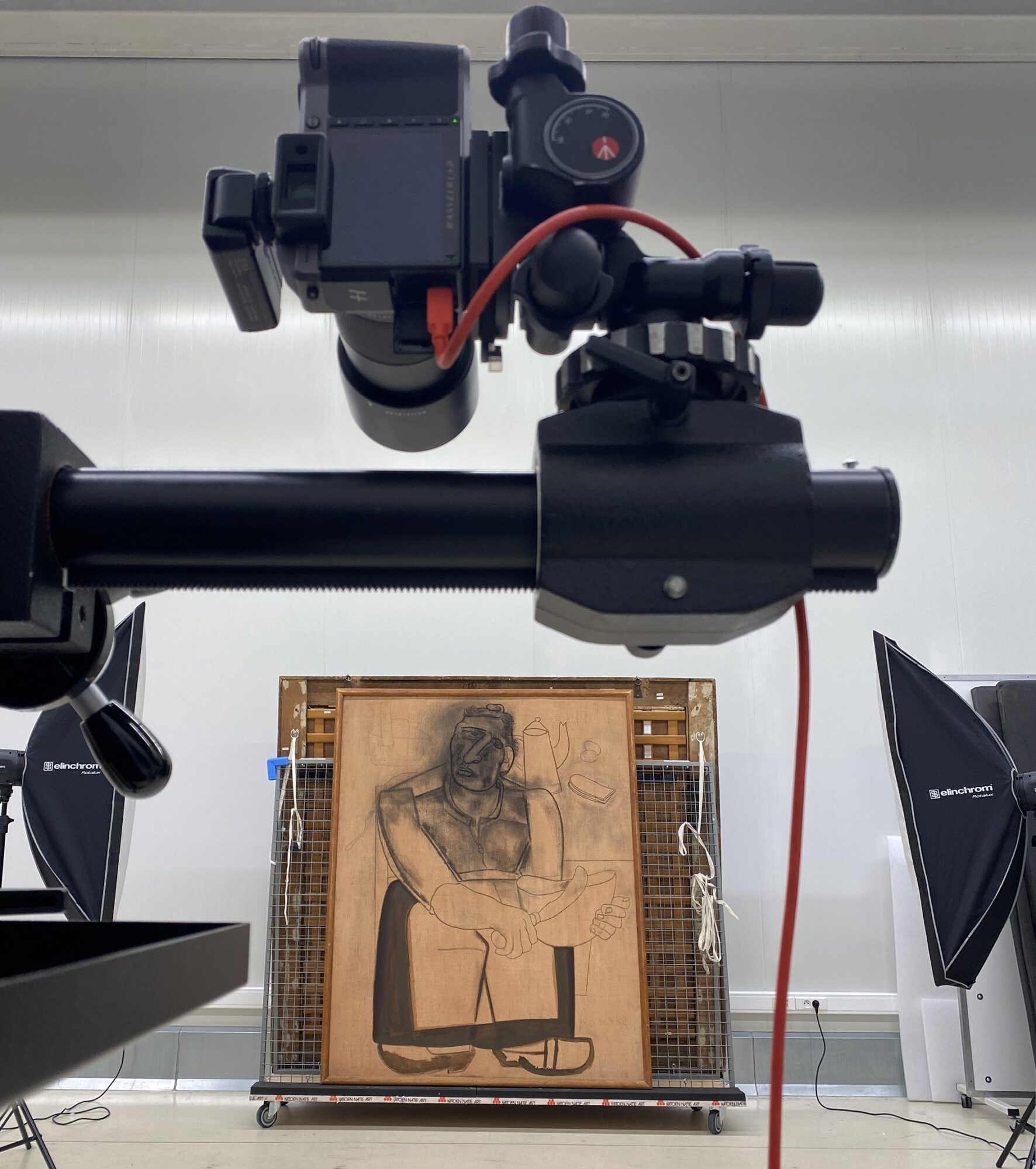
Aside from capturing a charcoal drawing, Michel focused on photographing two captivating sculptures by Permeke this month: the 1938 pieces titled Bust of a Woman and Niobe. The initial challenge lay in the positioning of these sculptures and prioritizing their safety. Therefore, the decision was made to photograph them horizontally. This choice was inspired by the sculptures’ secure storage space.


Not only the form but also the material from which the sculptures are made posed a unique difficulty: the shiny bronze reflects enormous amounts of light akin to a mirror. While a disguised self-portrait of the photographer might add an artistic touch, it is best avoided for photographs destined for collection registration and publication. To filter out reflection as much as possible, Michel set to work with his lightcube, a white “tent” designed for object photography. Through the strategic use of white cardboard, white cloths and tripods surrounding the artwork, the light cube turned into a small, custom-built photo studio for the sculpture. This process demanded time, presenting the following question: Are all reflections completely eradicated? Does the lighting require softening or repositioning? With each shot, Michel analysed the entire setting.
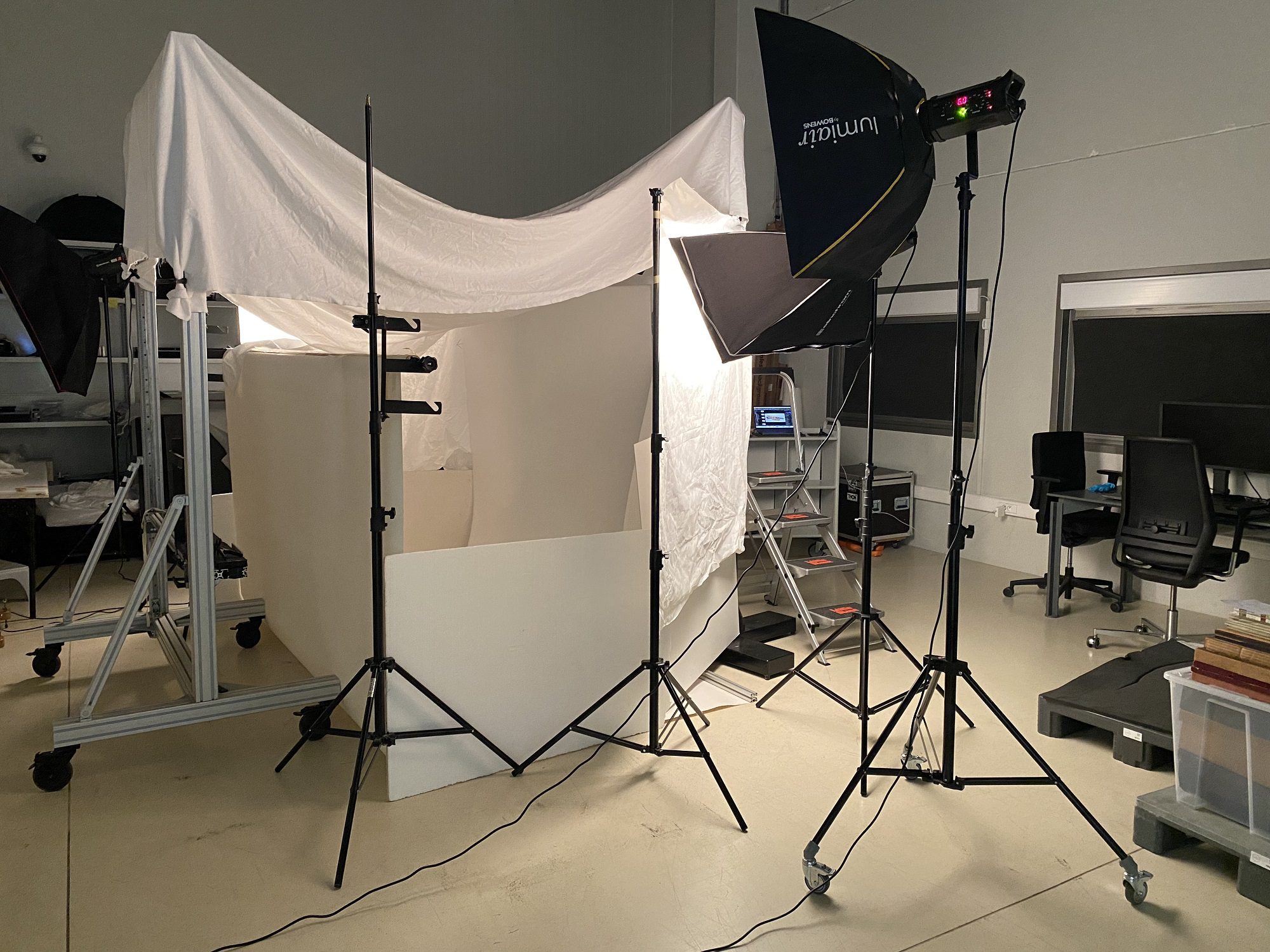
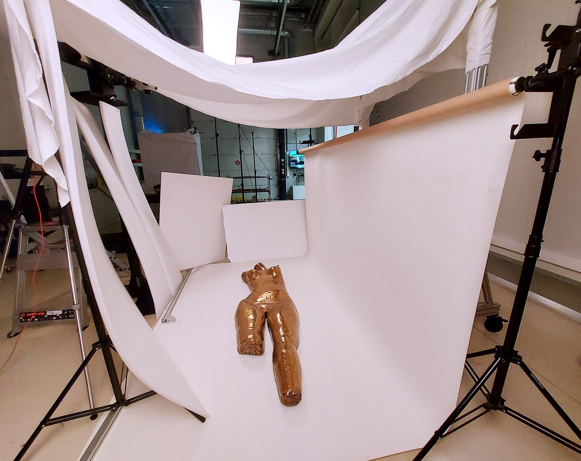
After capturing the image, meticulous post-processing followed in Photoshop. After all, obtaining the perfect photo requires precise image editing. Photographs with different lighting were combined to create the most natural representation possible. Furthermore, any distracting elements from the background, such as cardboard edges, were skillfully removed.
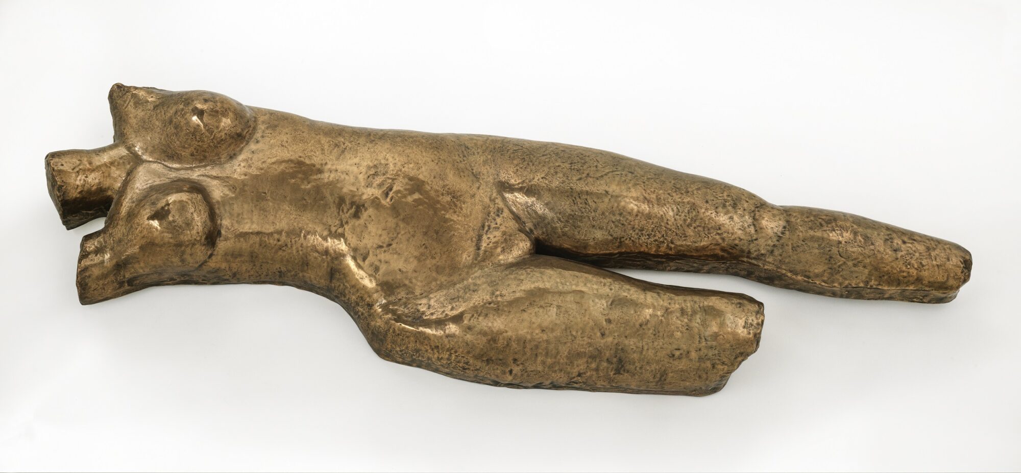

The end result is truly impressive: the fabric and tent structure are imperceptible, and the photograph is devoid of any distracting reflections. The whole process underscores that photographing a work of art is more than just a quick snap with a camera.
Restoration of the Witches’ Sabbath panel
This month, we take a closer look at the restoration of an intriguing work of art: The Witches’ Sabbath, a 16th-century masterpiece by Frans Verbeek. We focus on the restoration of the oak support, carried out by Brian Richardson, a specialist in the conservation and restoration of wooden objects and furniture.
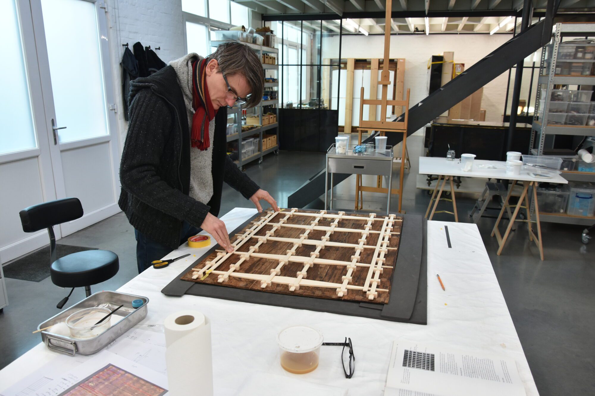
Structure and damage pattern of the wooden carrier
The panel consists of three horizontally oriented oak boards, the top one being 26.5 cm wide, the middle one 21.0 cm, and the bottom one 23.0 cm. This is not clearly visible on the back; during previous restorations, the glue joints were covered with veneer, which made the situation very confusing. It is notable, however, that the panel is only 7 mm thick, which is thin for a panel of this size.
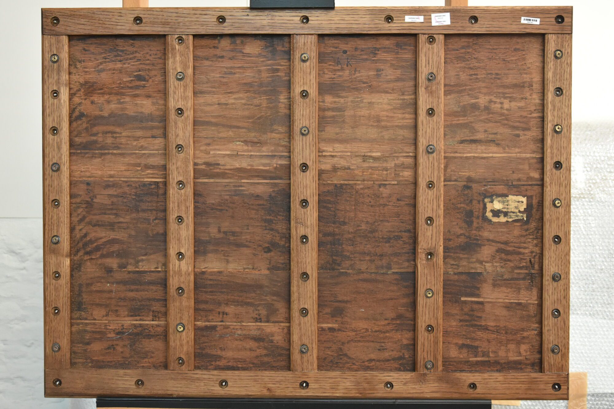
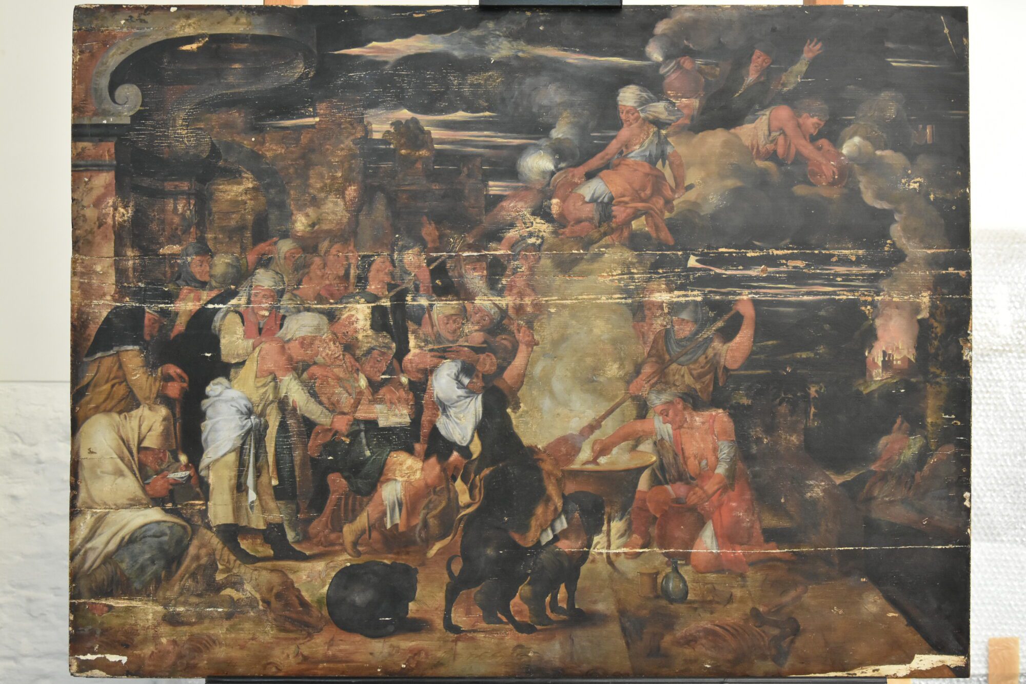
An earlier restoration treatment, presumably from the second half of the last century, included the addition of a support structure at the back to reinforce the panel. Despite the attempt to develop a sprung support structure, the system falls short because the window construction is immobile. Saw marks and serrations in the wood suggest that the panel was thinned, possibly long before the 20th-century support structure. The patina on the backside has been partially removed for the support construction, and the cracks and glue seam have been reinforced with V-shaped inserts in walnut, but not all glueing is even, causing level differences at the front.
Removal of support structure
To improve the condition of the panel, Brian first loosened the support structure, including the screws on the back. He cut away the fastening blocks one by one with a gouge and chisel and finely sanded the panel to smooth the glue residue. The remnants of synthetic glue in the wood structure itself were not removed.
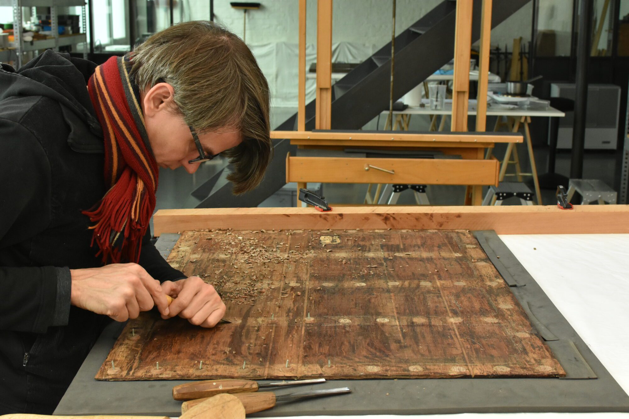
Correction of level difference
After removing the support structure, Brian decided to remove the V-shaped inserts – where the level difference to a crack was most disturbing – to open up the crack and improve the level difference. The expectation was that the V-shaped inserts would follow the cracks nicely. Once the inset pieces of wood were removed, only 2-3 mm would then remain where the crack would need to be loosened. Compresses were used to soak off the glue to then open the crack. Next, Brian carefully cut away the V-shaped inserts on the back with different types of wood chisels. Finally, the white glue, with which the inserts had been glued, was soaked loose with acetone and removed so that the notches were completely clean.
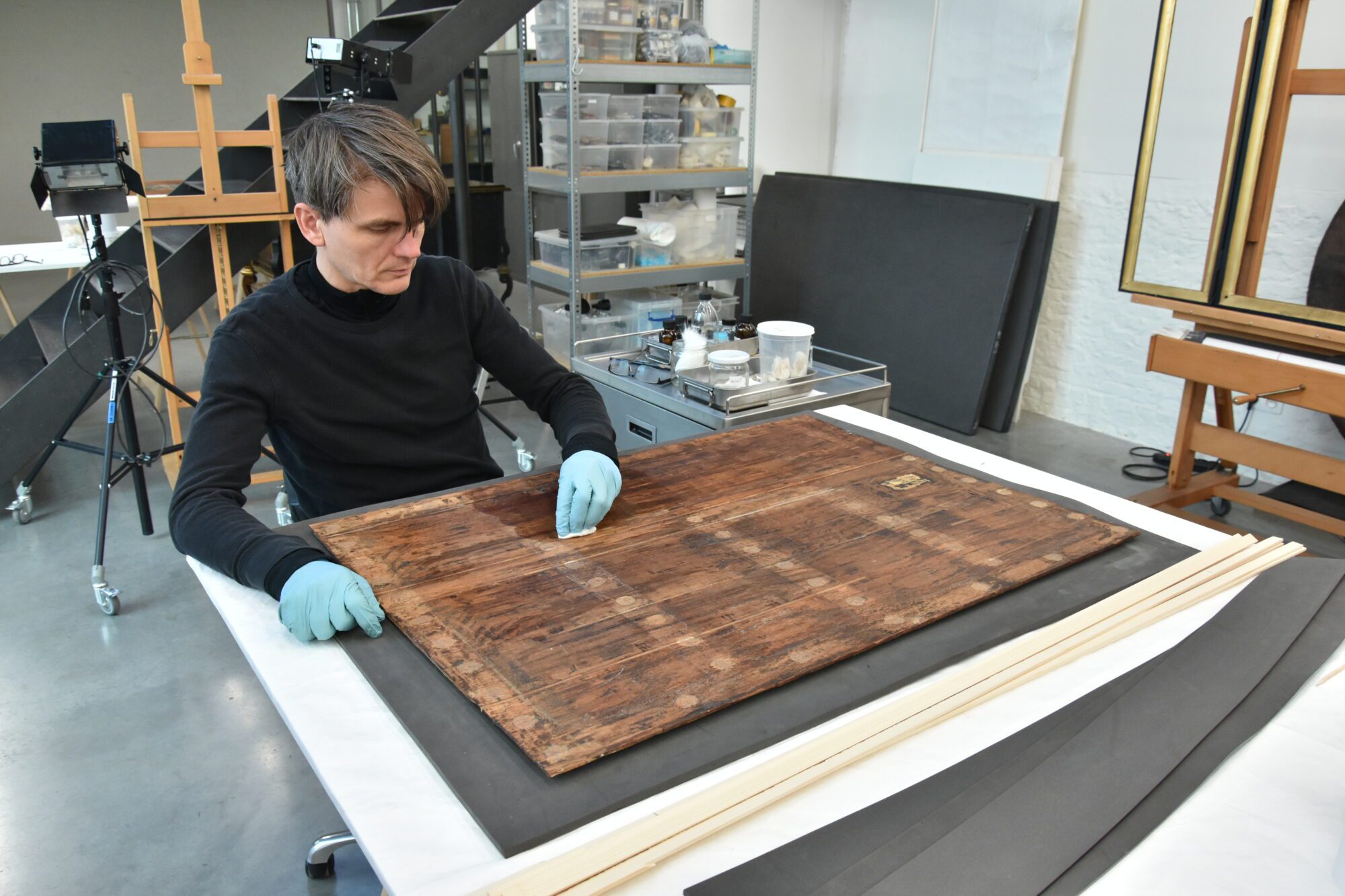
New construction
Without support, the panel was too fragile, so Brian placed a new support structure on the back. This system consisted of slats that were glued to the back with fish glue using small blocks. Each slat was slid into grooves in the blocks, creating an equal distribution of pressure across the backside. After this addition, the panel became considerably more stable and again manipulable.

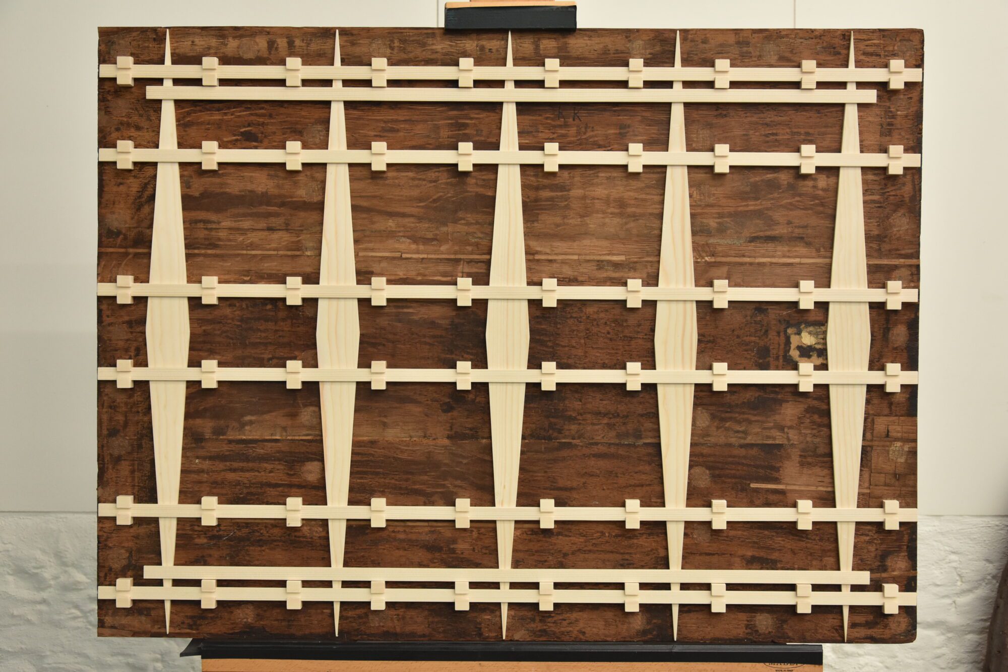
The Restoration of Archduke Maximilian and Archduchess Elisabeth’s Portraits
Over the past three months, we welcomed a new Phoebus Fellow to our studio: Perrine de Fontenay from Paris. During her fellowship, Perrine focused on the conservation of paintings from our sub-collections of Latin American colonial art and Old Masters. Among other projects, she collaborated with paintings conservator Sofia Hennen on two portraits by Jakob Seisenegger (1505–1567), depicting the Archdukes Maximilian (1527–1576) and Elisabeth (1526–1545).
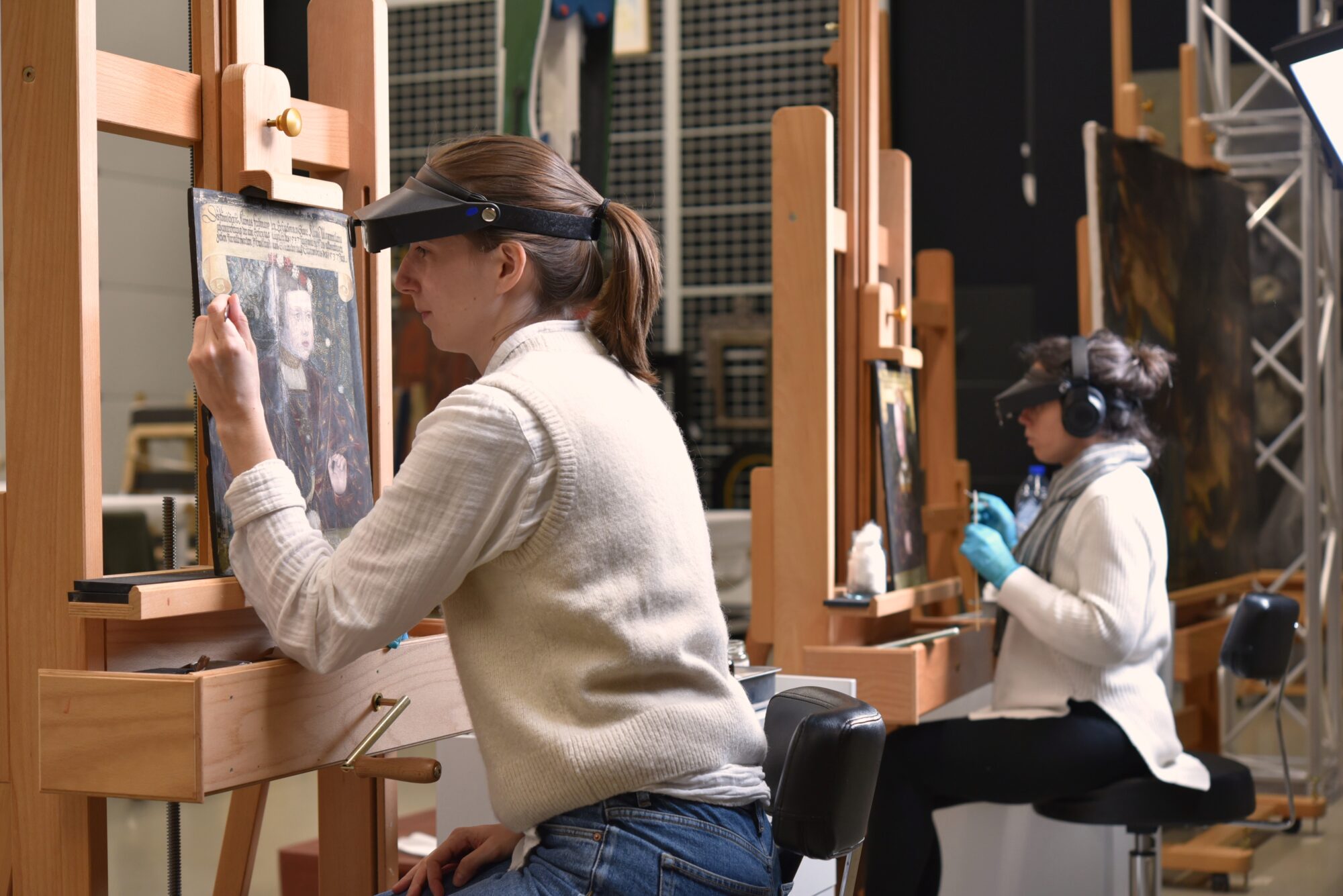
Over the past months, Perrine and Sofia took the time to carefully remove old overpaint, revealing the artist’s original, richly coloured background design.

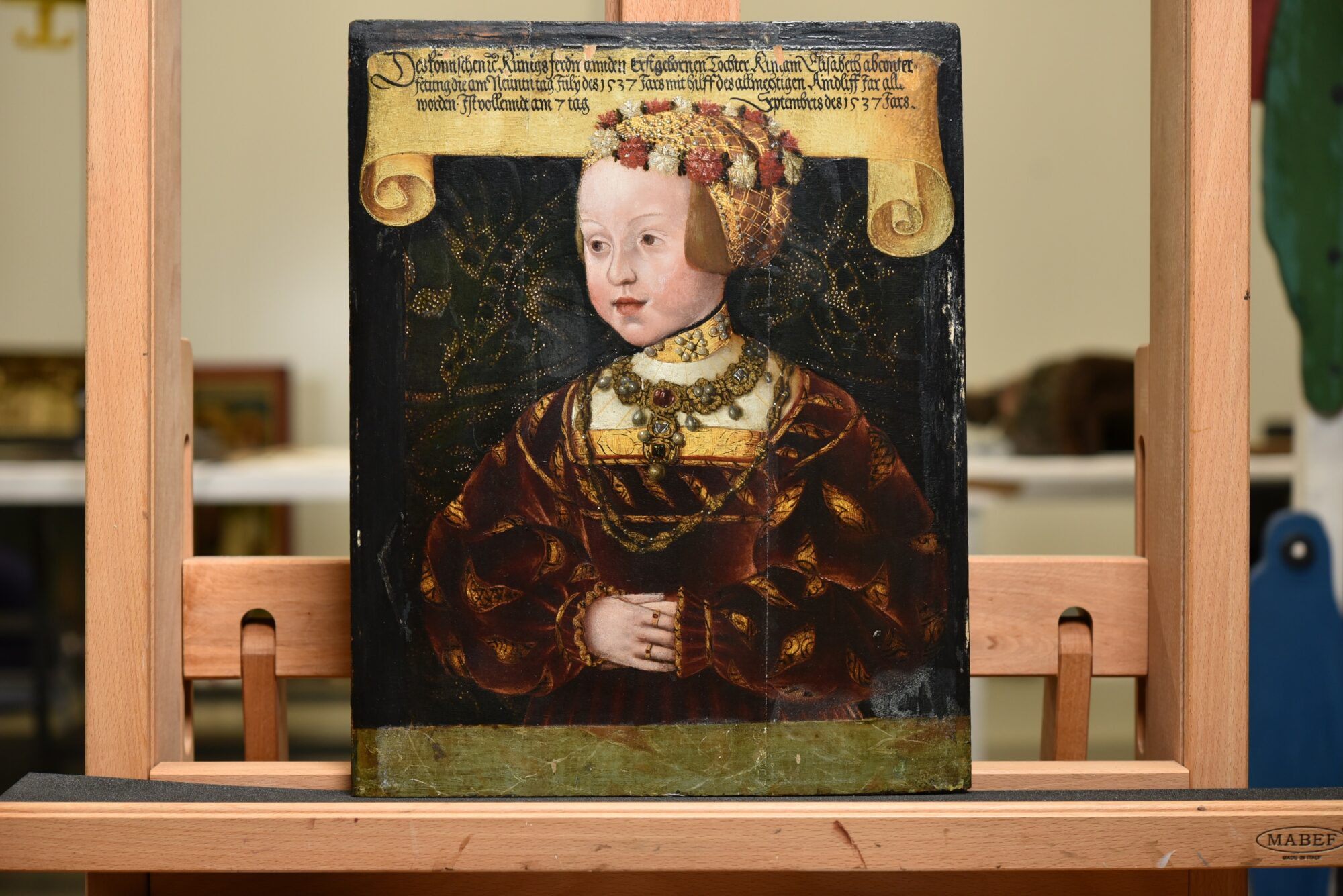
Jakob Seisenegger (1505 – 1567) painted the portraits in 1537, depicting the siblings Archduke Maximilian (1527 – 1576) and Archduchess Elisabeth (1526 – 1545) at the ages of 10 and 11, respectively. These oil paintings on linden or poplar panels showcase the children adorned in luxurious clothing embellished with jewels and flowers in their hair. The attire and jewels are detailed with gold accents. Both figures are positioned behind a green marble ledge. Initially, the backgrounds were dark brown-black, but in some areas, traces of a colourful layer beneath were revealed after removing oxidized varnishes and tinted layers.
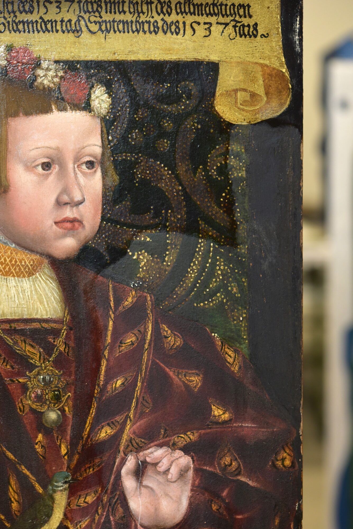
As the court-appointed painter to Ferdinand I, Seisenegger created numerous portraits of the children and other members of the Habsburg court. His artistic skills were highly sought after at the time. Receipts related to Seisenegger’s first commissions from Ferdinand I have been discovered, revealing the artist’s meticulous approach in selecting and preparing the panels for portraiture (Borchert, 2021). Similar to many painters of his era, Seisenegger maintained stringent standards for the materials that he worked with.
Since their creation, these portraits have undergone some alterations and have been subject to several previous restoration interventions before being entrusted to the care of Sofia and Perrine here at the conservation studio.
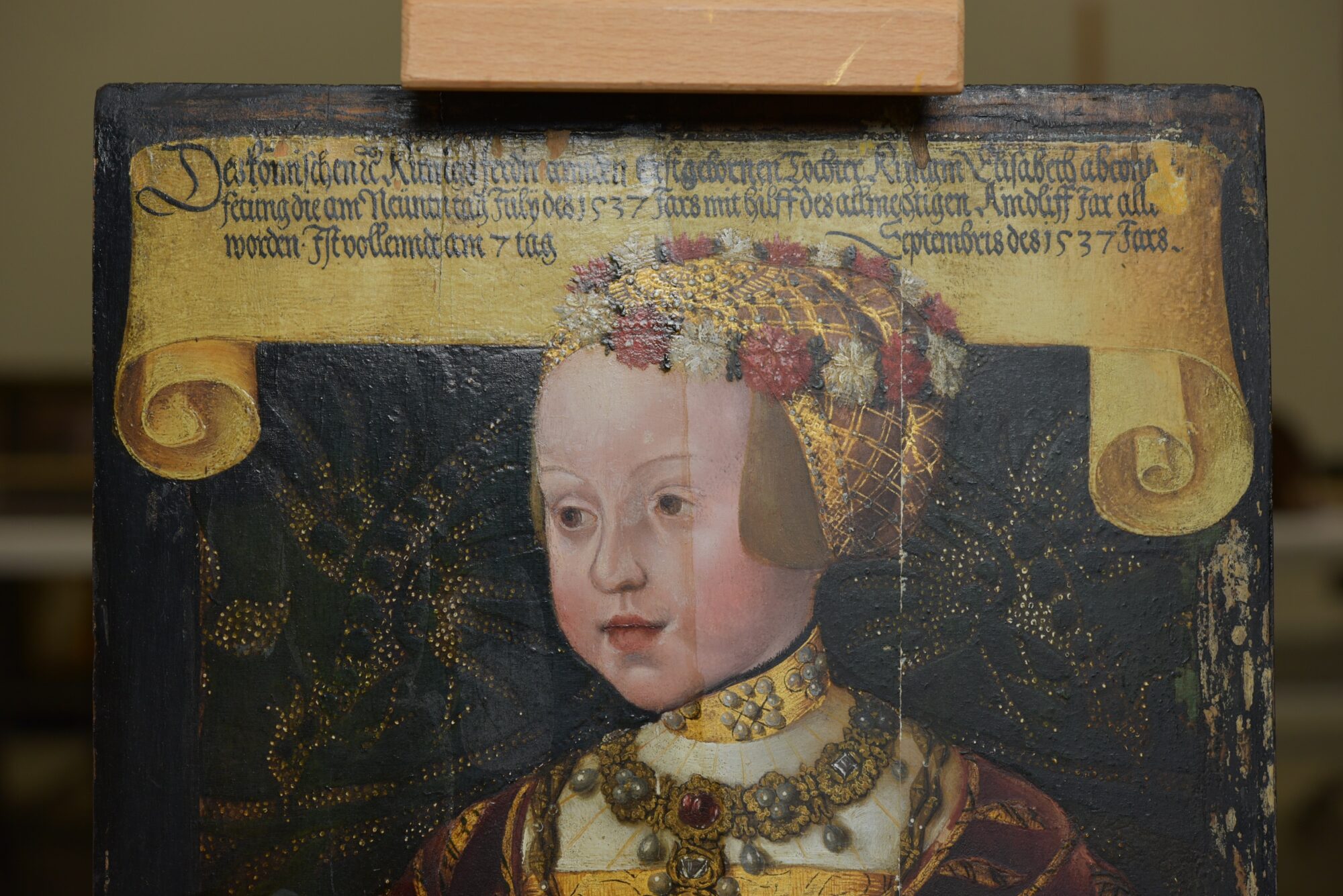
The portraits were carefully studied upon arrival to establish a general overview of their condition and the previous restoration campaigns they had undergone. Through observations in natural light and UV reflectance, testing, and comparisons with other portraits by Seisenegger, it was determined that the original green and gold brocade of the background was concealed beneath a darkened accumulation of old varnishes, non-original glazes, and greenish overpaint. The overpainting might have been done with the intent of unifying uneven or overly cleaned paint. Another possibility is that the overpaint was an aesthetic choice following a trend. Similar examples of portraits from the same period with brightly coloured backgrounds hidden by non-original layers and overpaint can also be found.

Previous interventions, potentially dating back to the 19th century, were also identified in the panel structures. The planks were split, their joints planed down and subsequently rejoined with wooden half-lap insertions. This was likely done in an attempt to flatten the natural curvature of the wooden panels. The intervention is notably apparent in the portrait of the Archduchess, resulting in a loss of a few millimetres from the top to the bottom of the panel, extending vertically across the entire composition.
It was decided to focus the restoration of the panels primarily on the varnish and paint layers. A structural intervention aimed at correcting the discrepancy in the composition of the Archduchess’s portrait was deemed too risky. Following meticulous testing, the numerous layers of varnish, non-original glazes, and overpaint were gradually cleaned and softened using solvent gels, enabling their mechanical removal with scalpels. Though a time-consuming process, the results were rewarding as the beautiful hidden details finally emerged. Fortunately, aside from the edges, the original paint layer underneath was well-preserved, revealing a luxurious green-and-gold brocade.
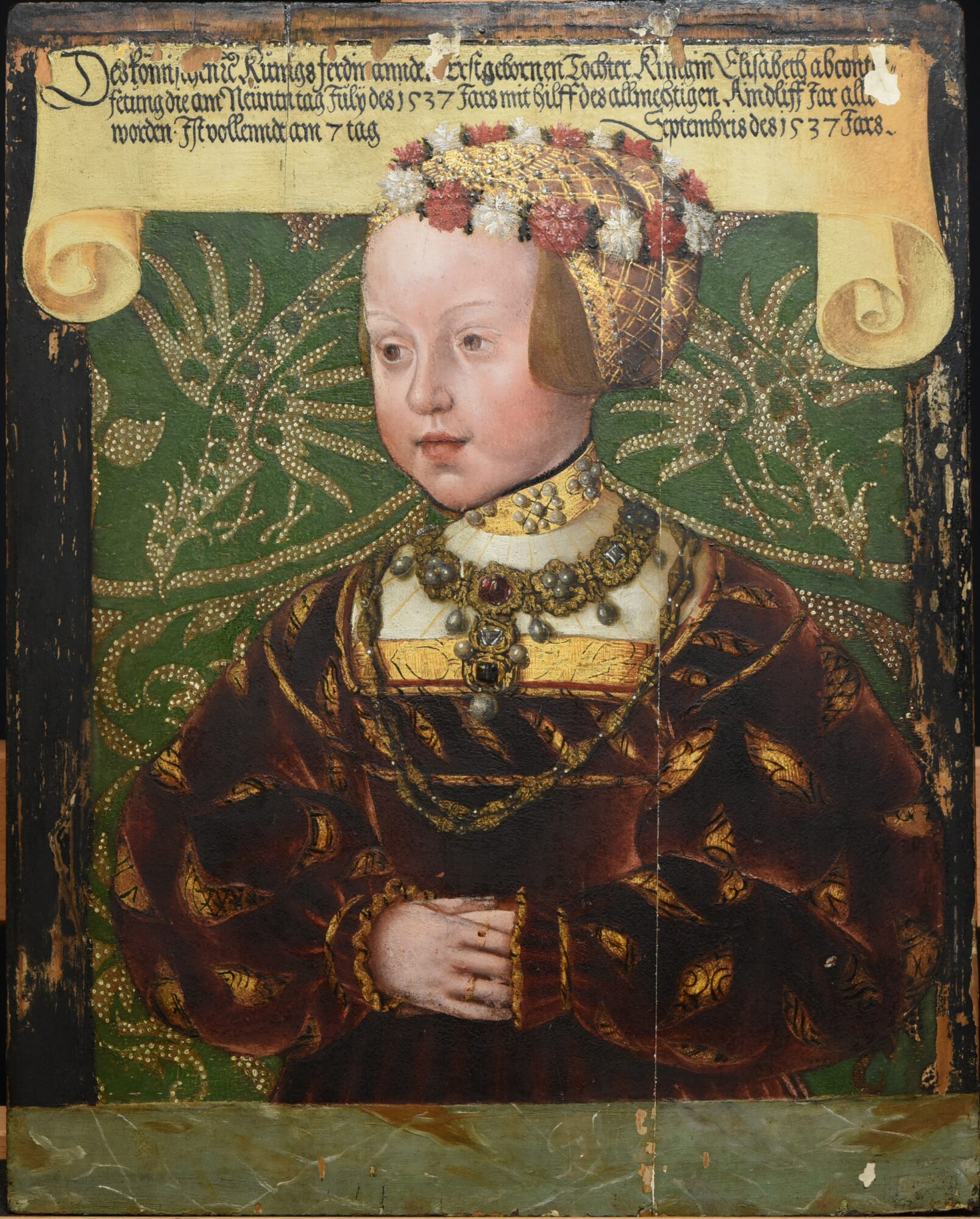
Meet our art handlers
For this unique behind-the-scenes feature, we talk with the team of art handlers who work for The Phoebus Foundation. Get to know Idris Sevenans, Claire Dieltjes, Bram Van Broeckhoven, Claartje Borgmann and Florian Sevenans who manage and organize, under the supervision of our COO Luk Van Hove, the operational ins and outs of the artworks from our collection. The team not only ensures the safety of the works of art, but also of the people who come into contact with them. Every piece that enters the depot is carefully checked for potential contamination by micro-organisms and framing problems and then inventoried. This procedure is important for the further progress of the preservation and conservation of the artworks. Although every work is treated with precaution, efficient handling is a must.
The art handlers tell you more about the art of art handling:
Florian: ‘Although my personal interest and passion are rooted in philosophy, I find the depot a particularly interesting working environment because I come into daily contact with very diverse works of art that are interesting from a historical perspective. Some artworks are not only aesthetically captivating, but are also sometimes a play on historical irony. Certain objects are literally and figuratively being brought closer together. In the depot, for instance, we hung a series of portraits of Italian writers side by side, including a portrait of Giovanni Pico Dela Mirandola (1463-1494). In 1486, this 15th-century nobleman and philosopher wrote an important treatise on the dignity of man in which he set out his views on truth and man’s place within the universe’.
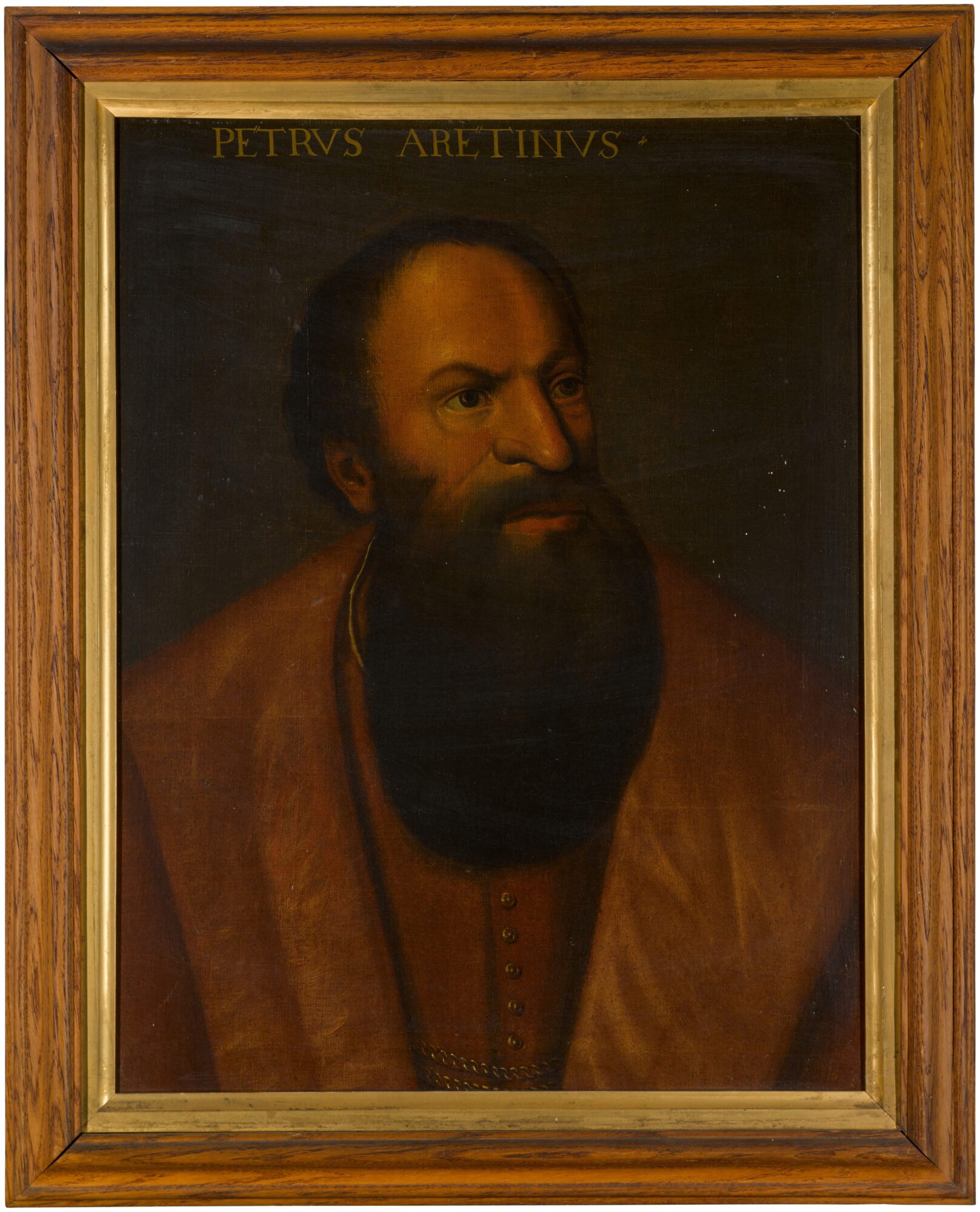

Next to it hangs another historical figure from a later period, Pietro Aretino (1492-1556). In his writings, he highlights the less flattering elements of human existence in his writings, such as the abuses of the church and the tameness of ecclesiastical authority. His writings instilled fear in sixteenth-century high circles. He was considered one of the first art critics and had contacts with great artists. As a result, these two portraits, where a whole story could unfold, suddenly become incredibly interesting when placed in confrontation with each other. It is very pleasant to work in an environment that triggers an almost daily historical sensation and awareness. This creates a connection with the bigger picture and adds value to preserving and passing on artefacts.’
Bram: In the past, I often came into contact with art history due to my academic background but also because of my professional life as a historical art expert for art auctions. It never fails to fascinate me how the value of artworks is influenced by historical facts, and how knowledge of material and technique within the art world adds value to a work of art. For example, I recently came across Catharina Hemessen’s (c. 1527/1528-1567) Portrait of a Lady (1550) where it was thought that a tortoiseshell horn had been used. In collaboration with the conservation team, we were able to reveal that it was merely an imitation. Our expertise thus becomes an added value for the recognition and identification of artworks. Caring for them on a daily basis is truly rewarding!’
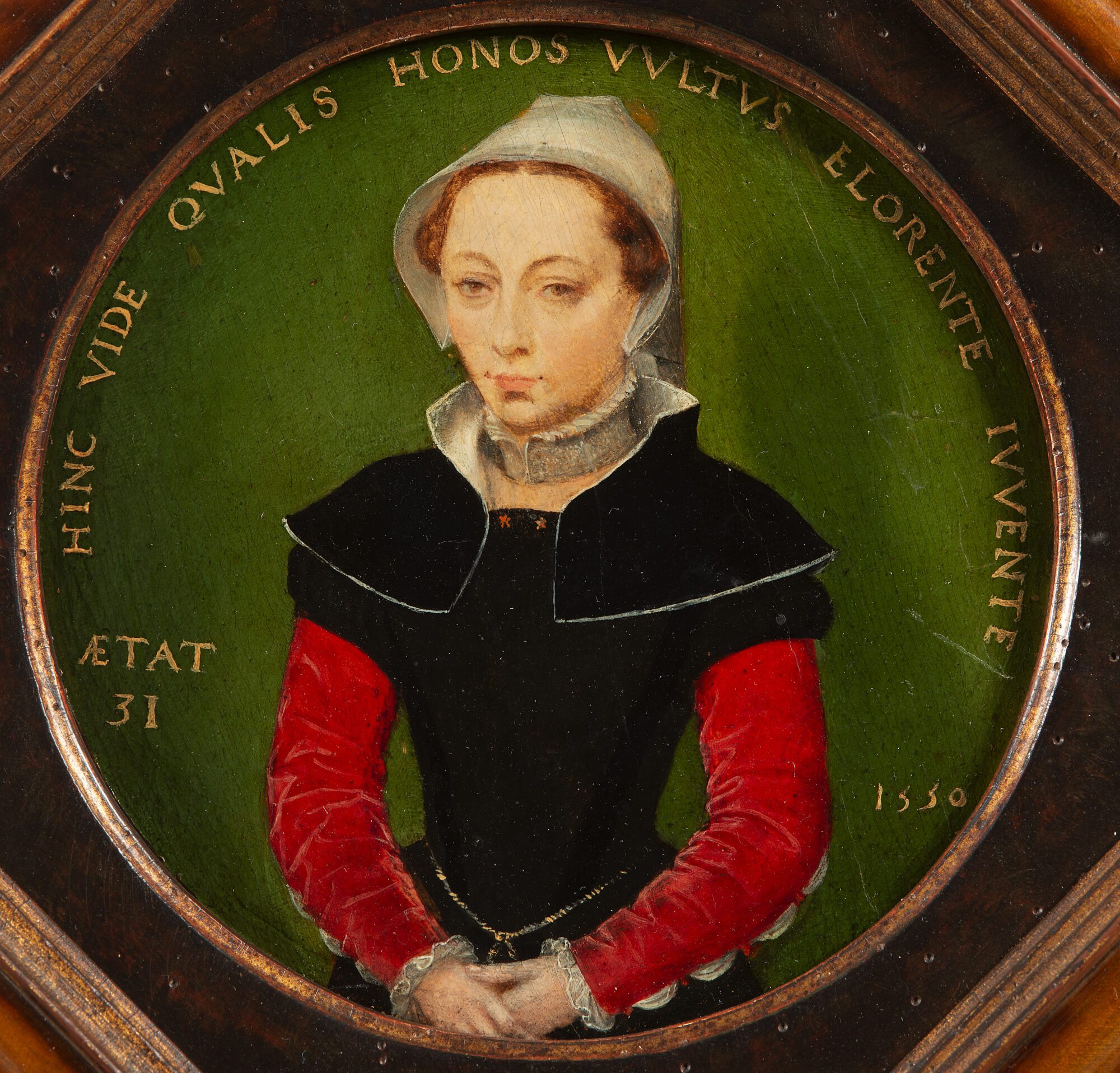
Art handler and artist Idris Sevenans also brings a strong dynamic to the team of our art handlers. Additionally, he is involved in analysing and dealing with art (archives) through his organisation AARS (Antwerp Artist Run School), providing a refreshing perspective on the goal of preserving and caring for art objects.
Idris: ‘During my research at the Royal Academy of Fine Arts, I was confronted with the transience of art objects and the importance of collecting them. Taking care of The Phoebus Foundation’s collection is a hugely rewarding cross-fertilization for me as an archivist and a teacher at the AARS (Antwerp Artist Run School). I thoroughly enjoy dedicating myself every day to both disciplines.’
Among all the male violence, there are also two amazing female art handlers: Claire and Claartje.
Claire: ”It’s rather a coincidence that I became an art handler. After completing my studies in fashion design in South Africa, I started looking for the next challenge. On the advice of my grandmother, I then came to Belgium to embark on a new adventure, which then brought me here. Walking into the depot every day, I step into another world. Moreover, thanks to my Antwerp-rooted colleagues, I have learned a lot about the country and city I now call home and their rich culture and history. I like the flexibility and variety of my job, but also security and planning. This is why I take on the administration of our team. Good planning and communication are crucial to successful completing our responsibilities. The friendship within our team ensures that no task is too hard and we come to work every day with a smile.’
The art handling team, which is continuously expanding in collaboration with Katoen Natie Art, is currently preparing several large loan projects. The team actively participates in courses and tasks are divided based on experience and expertise. They are an indispensable part of The Phoebus Foundation family!
Conservation treatment of ‘The Party’ by Rafael Barradas
As part of the conservation of The Phoebus Foundation’s modern and contemporary Latin American collection, Rafael Barradas’s painting The Party from 1910 is currently in the hands of Clara Bondia.
It showcases an expressive figurative style that predates Barradas’ renowned vibrationism. Within the artwork, his skills as a caricaturist shine through, evident in the joyful expressions and celebratory atmosphere exuded by the characters.

The oil paint layers on the canvas exhibit a modified format, with noticeable clear edge truncations in several areas. It is possible that these alterations were made either over time or by the artist during the creation process.
Through a comprehensive comparative analysis and empirical research, it was determined that the work was formerly lined using a resin wax system. It is evident that the initial adhesion between the pictorial layer and the canvas was inadequate, likely prompting the decision to conduct the lining treatment in the past.
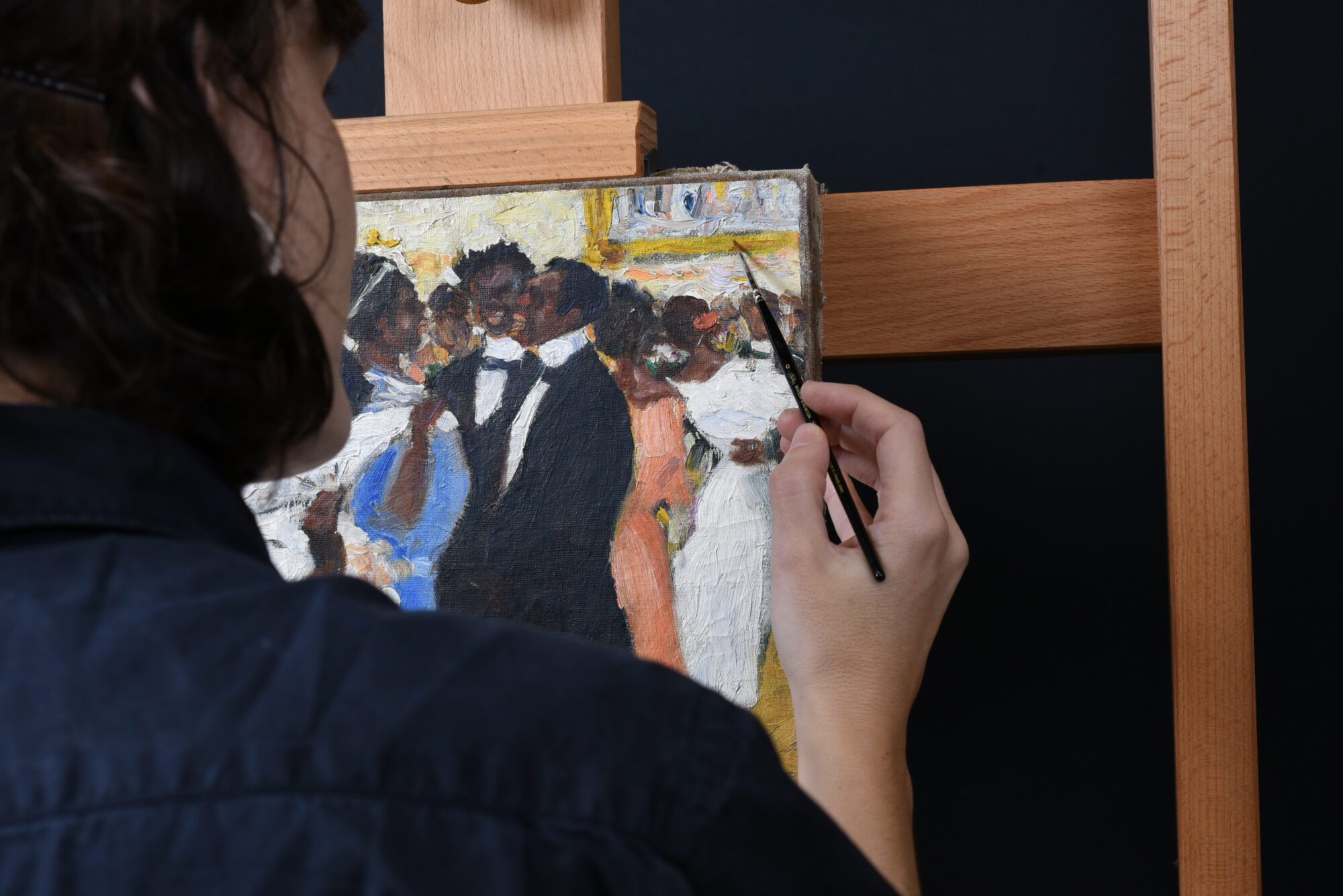
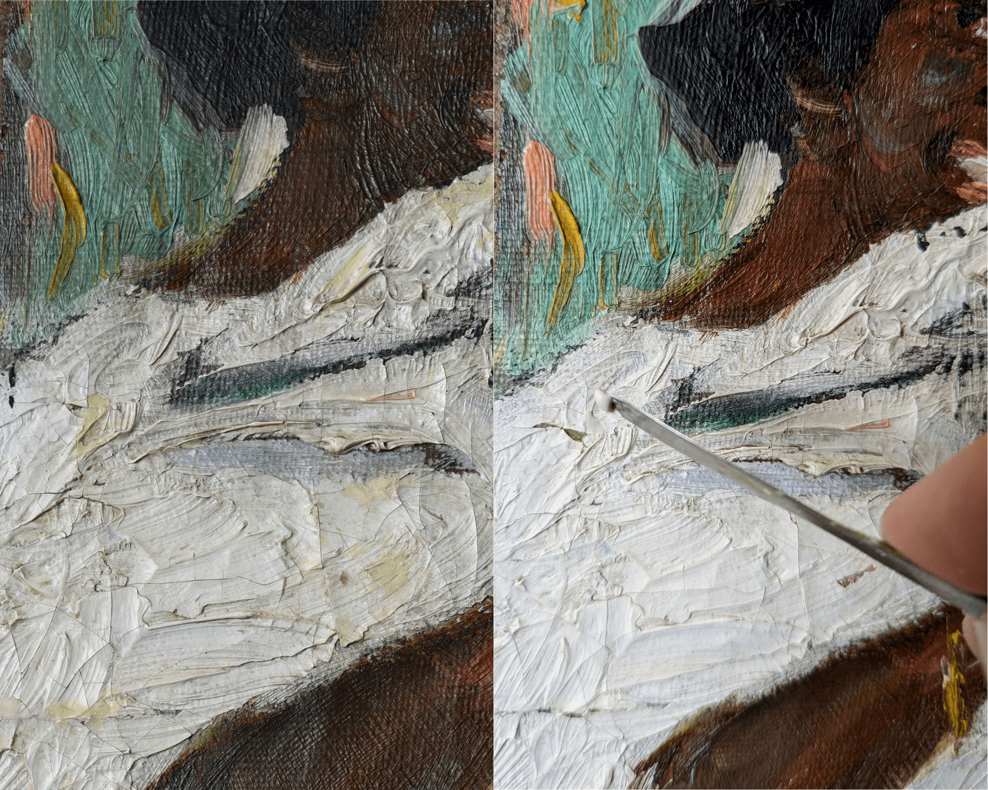
The tonality of the artwork was slightly darkened by a layer of dirt on the surface, and it had developed a yellowish hue caused by the oxidation of a thin layer of varnish. The white layers of the dresses of the female figures were by far the most affected. Additionally, there were issues related to polychromy, including discoloration and the presence of thick overpainting that encroached upon portions of the original paint layer.
Due to the weak condition of the artwork and the fact that the various changes are aesthetically disturbing, we decided to perform several treatments, prioritizing minimal interventions with absolute respect for the artist’s original intentions.

The restoration process began with a two-stage cleaning procedure aimed at eliminating surface dirt and removing the discolored, oxidized varnish and overpainting. This restoration effort successfully revitalized the work, revealing the vibrant original colors. In the next phase, the missing polychromy was addressed by conducting both volumetric and chromatic reintegration. Finally, a thin protective varnish layer was applied to safeguard the piece.
This conservation project is part of a larger initiative focused on preserving the Latin American art collection of The Phoebus Foundation. It is a pleasure to treat this painting along with several other gems and return it to its original glory.
The restoration of ‘Prometheus Bound’
Giovanna Tamà is an independent conservator specializing in Old Masters. Join us inside the The Phoebus Foundation restoration studio as she unveils her captivating work on various projects, including the restoration treatment of Prometheus Bound. Let’s take a look behind the layers of paint together!
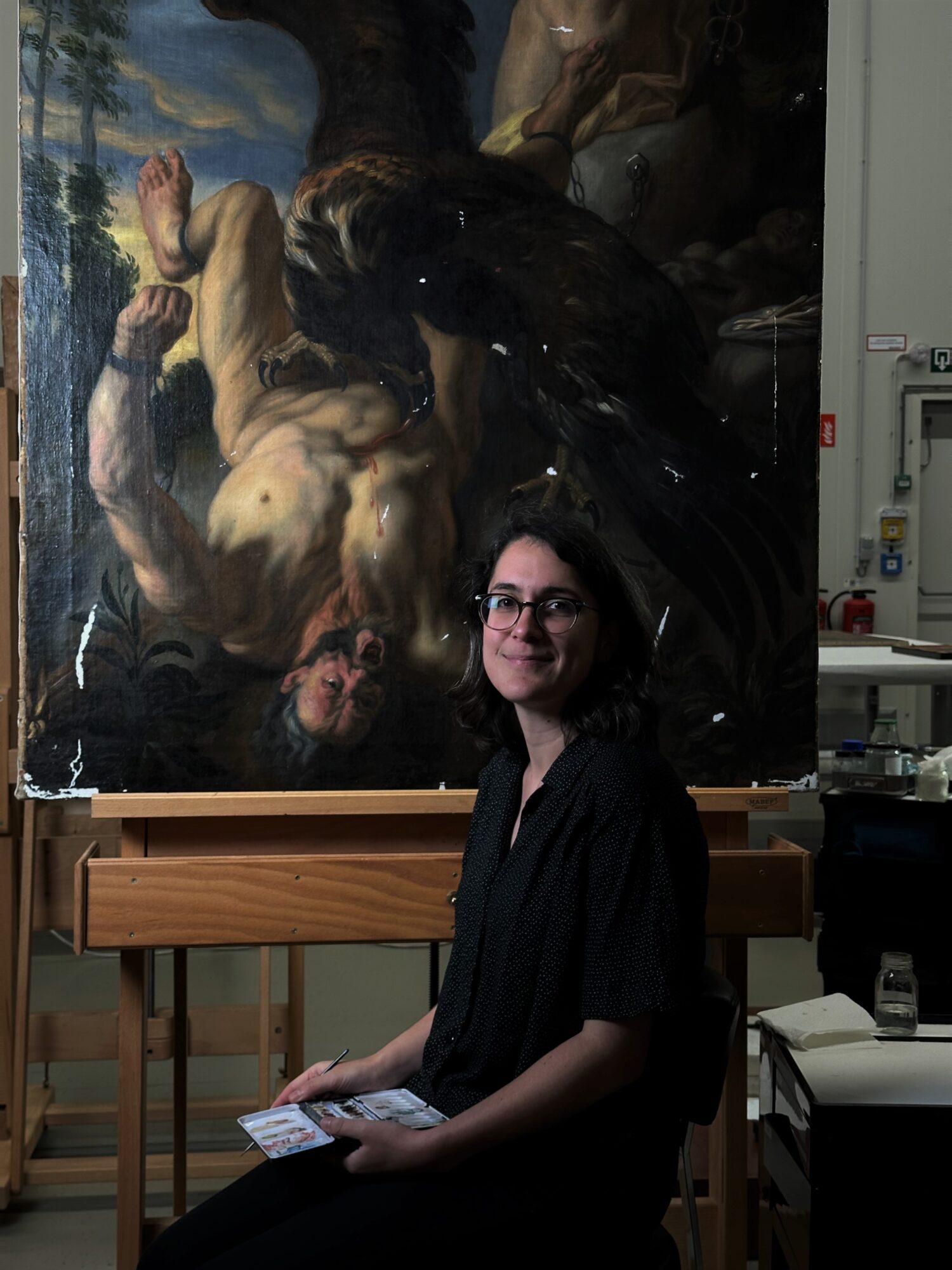
“One of my projects is the restoration of a painting by the studio of Jacob Jordaens (1593-1678), Prometheus Bound. A larger-scale depiction by Jordaens with the same subject and composition from around 1640 is currently in the collection of the Wallraf-Richartz-Museum in Cologne. It was common for Jordaens’ large and successful studio to produce reproductions of pre-existing compositions by the grand master.
Jordaens like to paint mythological and allegorical scenes, alongside genre scenes. In this particular artwork, he portrays the tale of Prometheus, who faced the wrath of Jupiter. His punishment involved the constant torment of having his liver pecked at by the supreme god’s eagle. This cruel fate befell Prometheus for daring to bring fire to men.
Over the years, the painting has already undergone some restoration treatments. It was given a new carrier and has been lined. In this old restoration, the edges of the canvas were cut off, so a small piece of the composition was lost.”
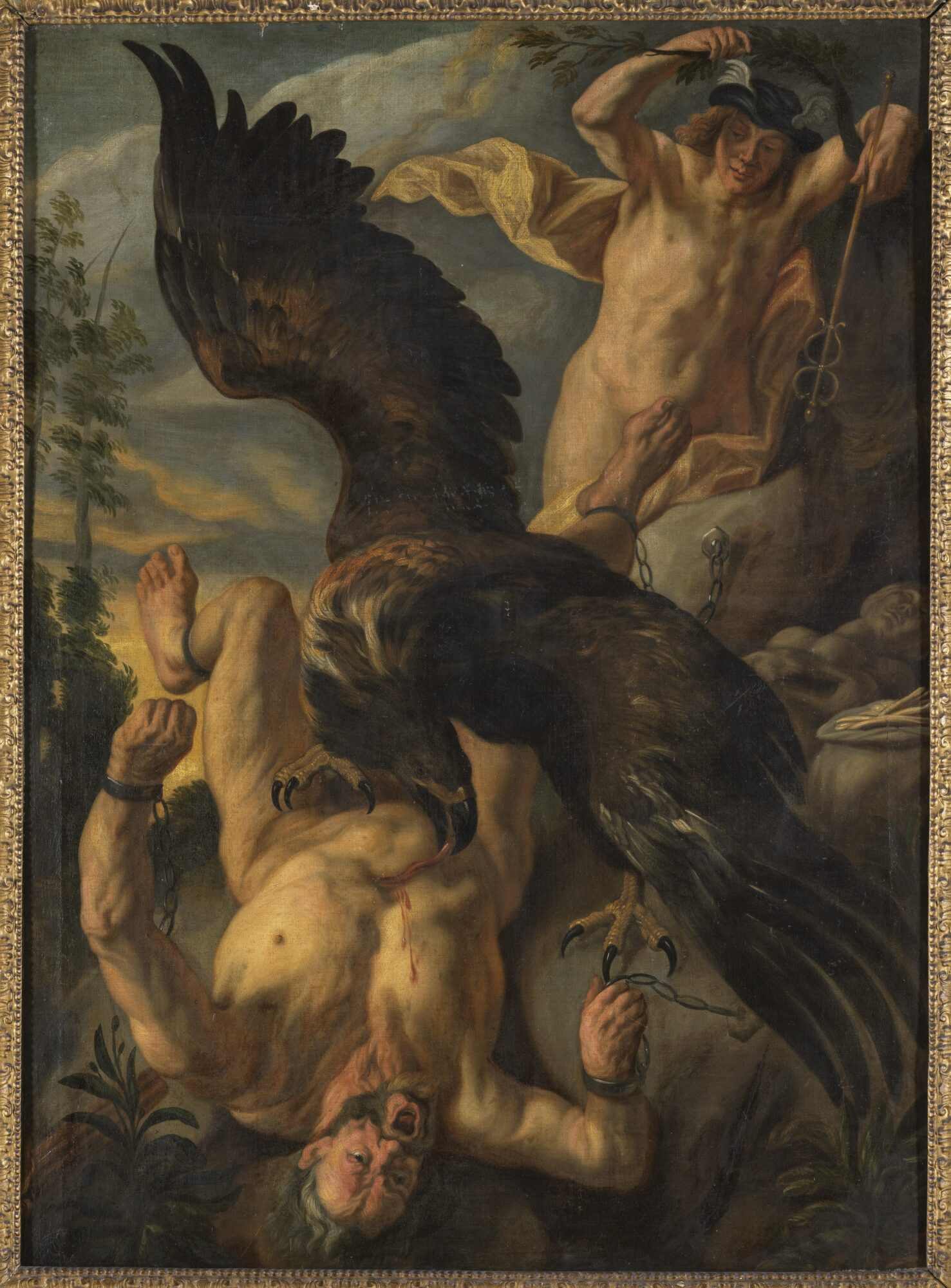
(before treatment)
“The painting was not in the best condition. Over time, it had taken on a highly darkened and soiled appearance as the varnish had yellowed greatly. To hide wear and paint loss, large areas of the original paint were carelessly painted over in the past. Numerous unnecessary accentuations were also added to the bodies of Prometheus and Mercury (figure above right).”
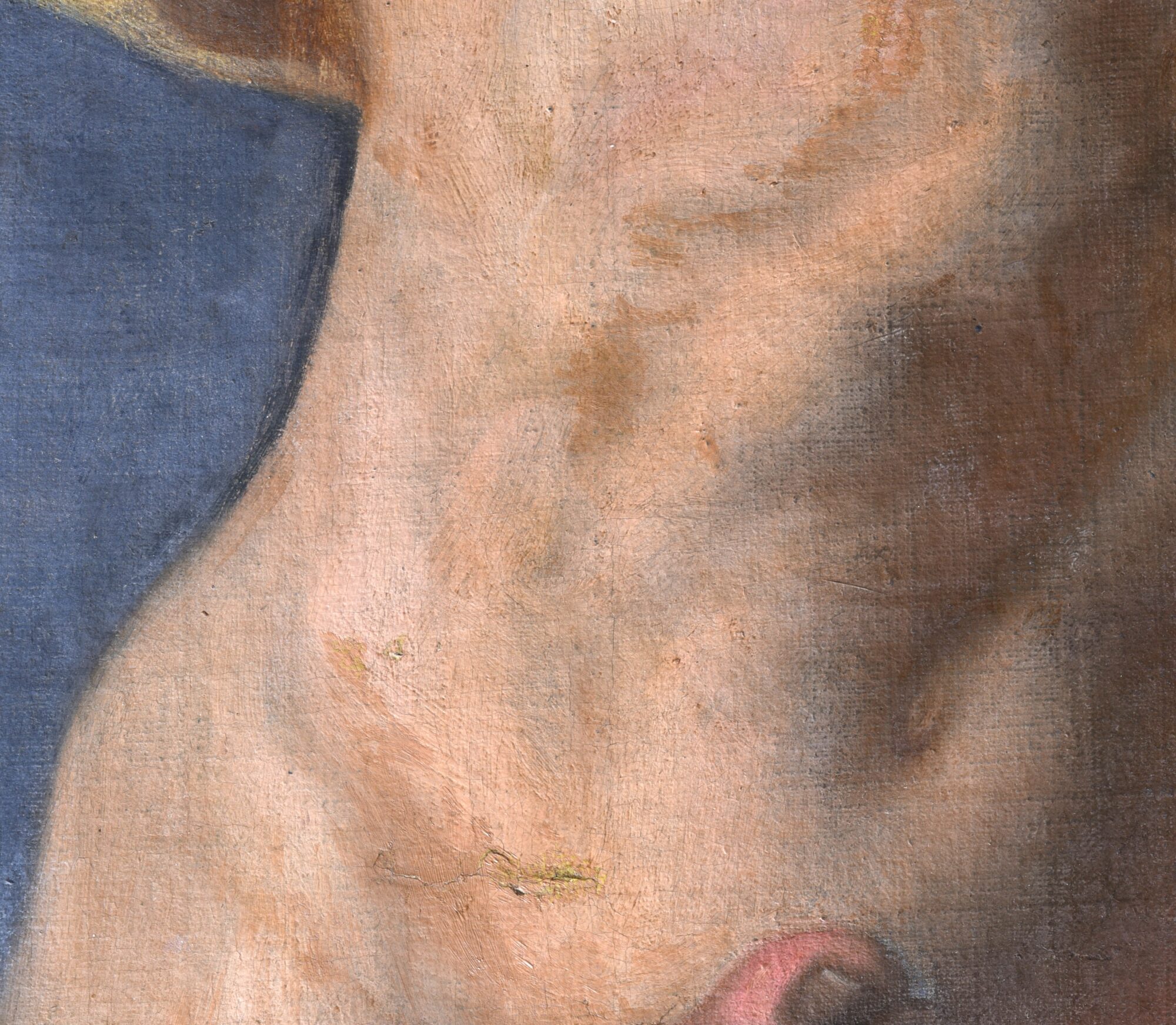
“During the removal of the varnish, the old retouching and overpainting, the original colors were restored to their glory. The details came back to light, and we could finally see the painting technique. After cleaning, an isolating varnish was applied to create a barrier between the original paint layer and the restorer’s interventions.”

Currently, Giovanna is working on the final stage of treatment. The next step is to fill and retouch the gaps in order for the painting to receive a final varnish.
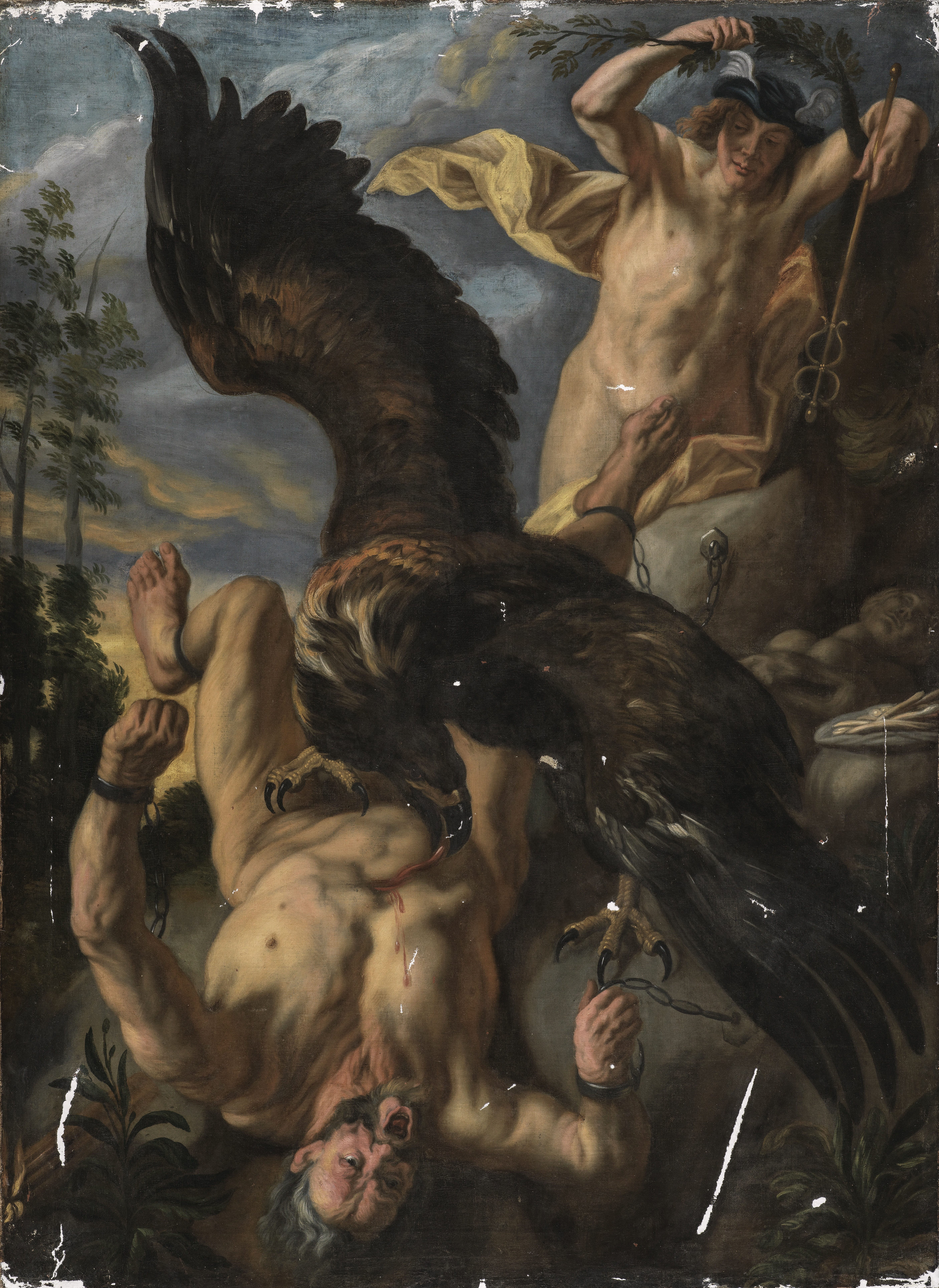
Restoration of ‘Theatrum Orbis Terrarum’
Oliver Claes has now been working as a paper and book conservator for more than a decade. This includes taking care of the conservation of The Phoebus Foundation’s topographical and historical book collection. For the past three months, Oliver’s work included the restoration of Abraham Ortelius’ sixteenth-century masterpiece Theatrum Orbis Terrarum.
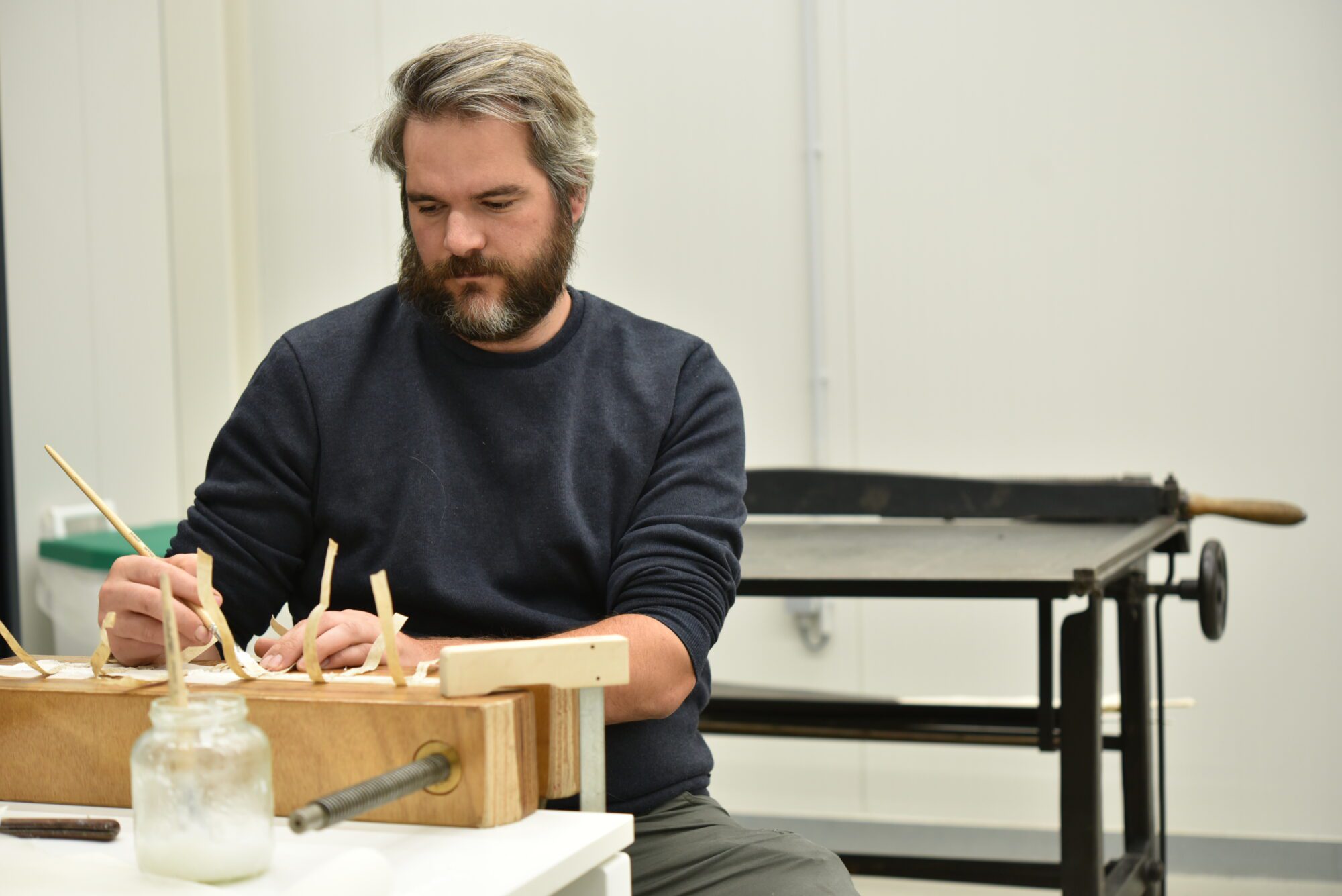
“The Theatrum Orbis Terrarum (‘theatre of the world’) is the very first world atlas, published on the 20th of May 1570. The map book was compiled by Antwerp-based Abraham Ortelius (1527-1598) and edited by Gillis Coppens I. Ortelius compiled the best and most reliable maps of his time in one volume. A unique feature of it is that all the maps were engraved in the same style and size on copper plates, as well as arranged by continent, region and state. This ensured that the atlas remained popular for decades and was even translated into other languages.”
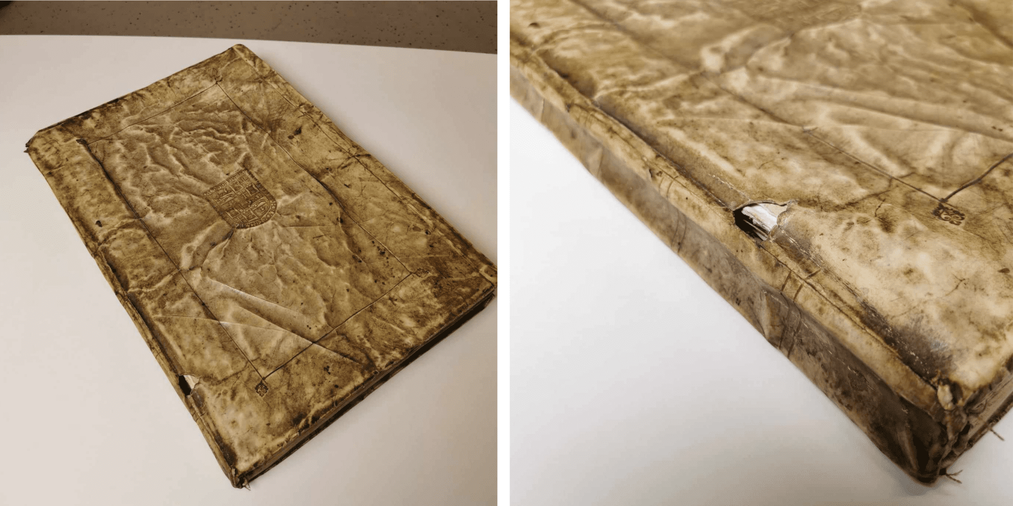
“The condition of the book was very poor. The book block (the collection of quires) was very soiled, and the binding distorted. Moreover, it had also come loose, and the various quires revealed multiple damages and gaps. The binding made of parchment was broken and could no longer fulfil its role of protecting the book block. Furthermore, the sturdiness that a binding should provide to the book block had completely disappeared due to the lack of sturdy cartons. Upon opening the book, the fragile and coloured title page immediately became visible.”
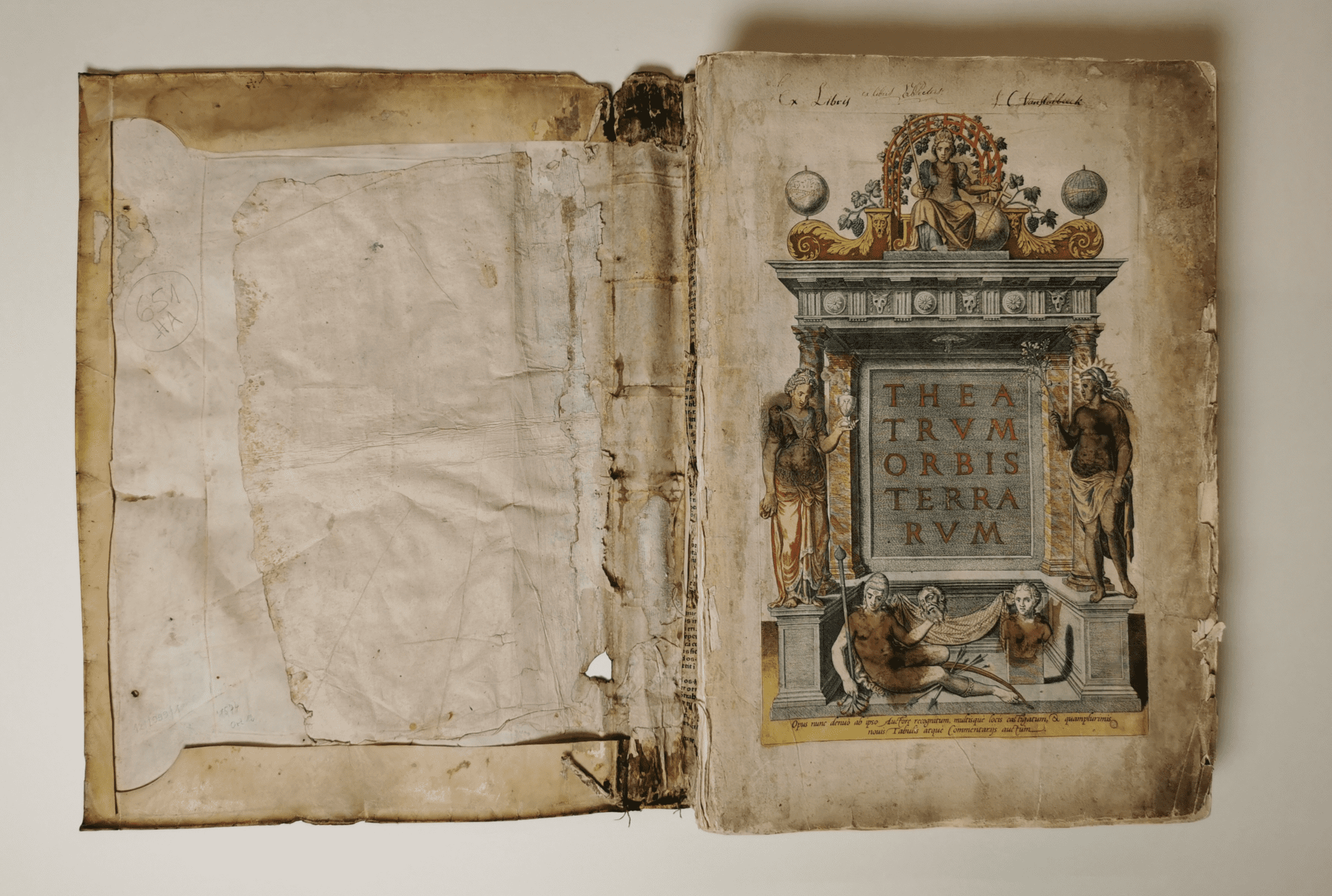
“The aim of the conservation was a thorough cleaning of all components, as well as filling and reinforcing the binding. To achieve this, the book had to be fully dismantled. Each gathering was individually reinforced with Japanese or Western paper, using starch paste.”
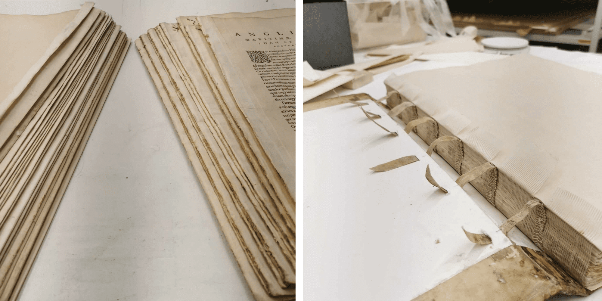
“Afterwards, all the quires were similarly bound with twine on parchment strips. The title page was also cleaned, completed and retouched. A fun finding during the restoration of this book was that a drawn “little man” was discovered on the inside of the parchment folded over the cardboard (of the book binding). Presumably, this was a personal addition by the bookbinder.”


“The vellum of the book binding was repaired with similar vellum and the lost cartons (covers) were filled in with acid-free cardboard.”
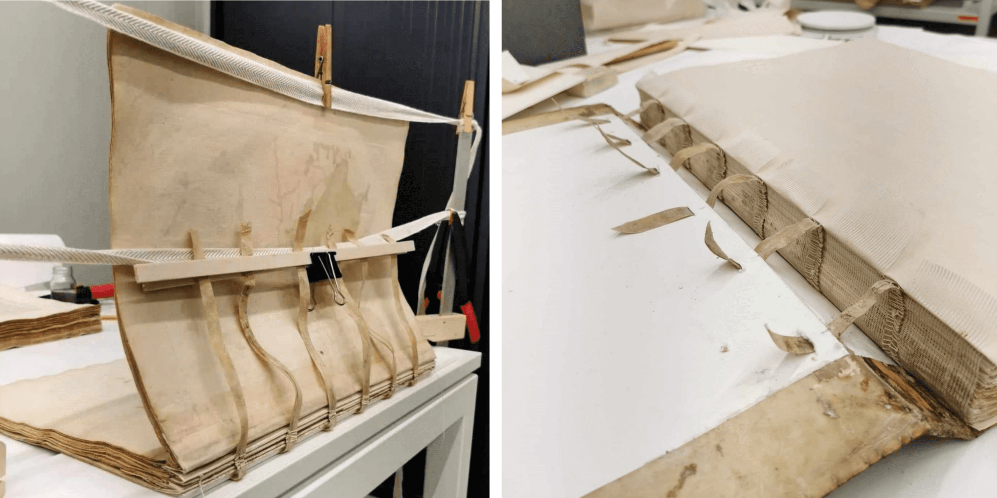
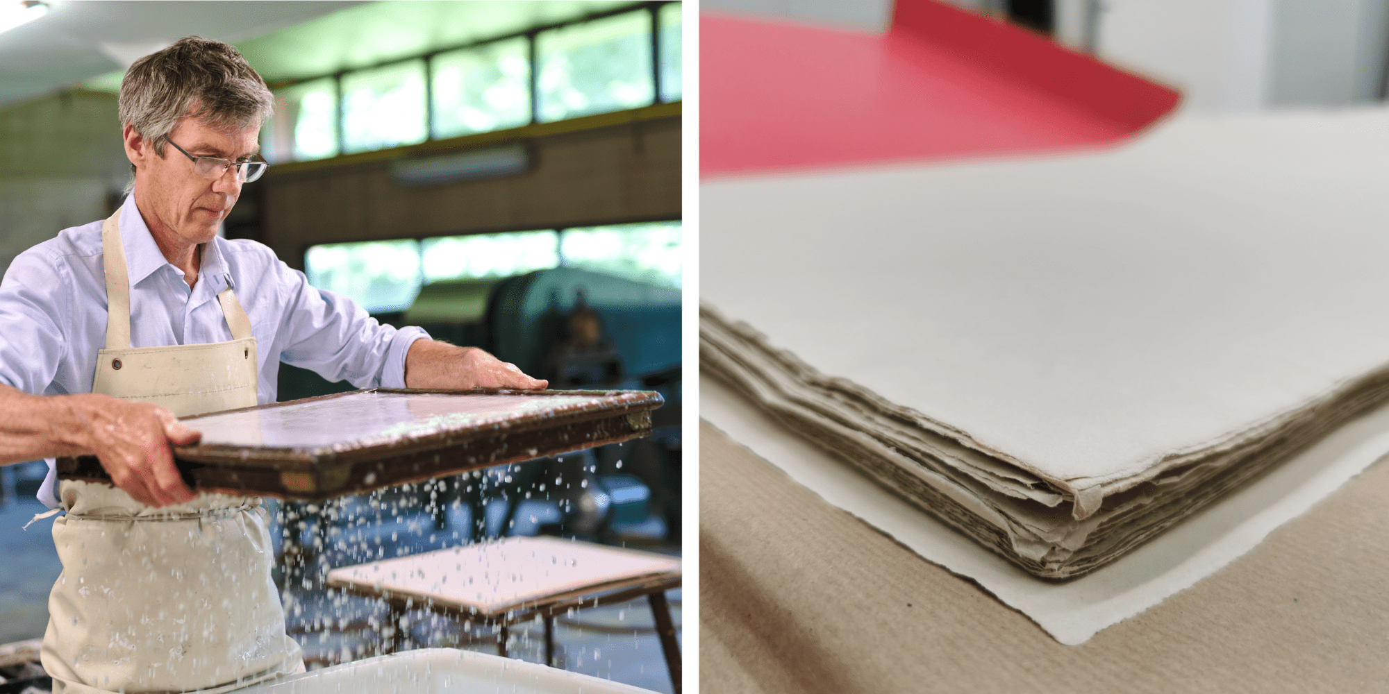
“A major issue was also the lack of endpapers. These are needed as protective pages at the front and back of the book. After an unsuccessful search in various art and paper shops, I eventually had the paper made by hand by the Walloon master papermaker Pascal Jeanjean. Using a sample of the original paper, he produced a similar sheet which, like the original leaves, is also hand-made. Handmade paper can be recognised by the chain lines or watermarks that become visible when the paper is held up to the light.”
Pascal explained more about this himself:
“Ik ervoor gekozen om grondstoffen te gebruiken die vergelijkbaar zijn met de oorspronkelijke grondstoffen van het papier van de atlas, namelijk katoenen lompen en stof. Na een behandeling van de katoenen lompen in een bad, ben ik gestart met het loskloppen van het katoen tot pulp in een Valley Beater, een moderne versie van een “Hollander”. Deze pulp vormt dus de basis voor het latere papier. Om de juiste papierkleur te benaderen werden minerale poeders bij de papierpulp gevoegd. Calciumcarbonaat werd toegevoegd om de alkalische reserve te verhogen.”
“Vervolgens werd het juiste schepraam gekozen met een gelijkaardig patroon van dunne koperdraden per vierkante centimeter (gearceerd) zoals bij het originele papierstaal. Uit een grote bak werd daarmee het papier geschept. Daarna werd een stapel papier, met tussenvellen van vilt, op elkaar gestapeld en met een grote papierpers het grootste deel van het water uit het papier gehaald (60%). Met tussenvellen van speciaal karton werd het overige vocht uit de vellen gehaald.”
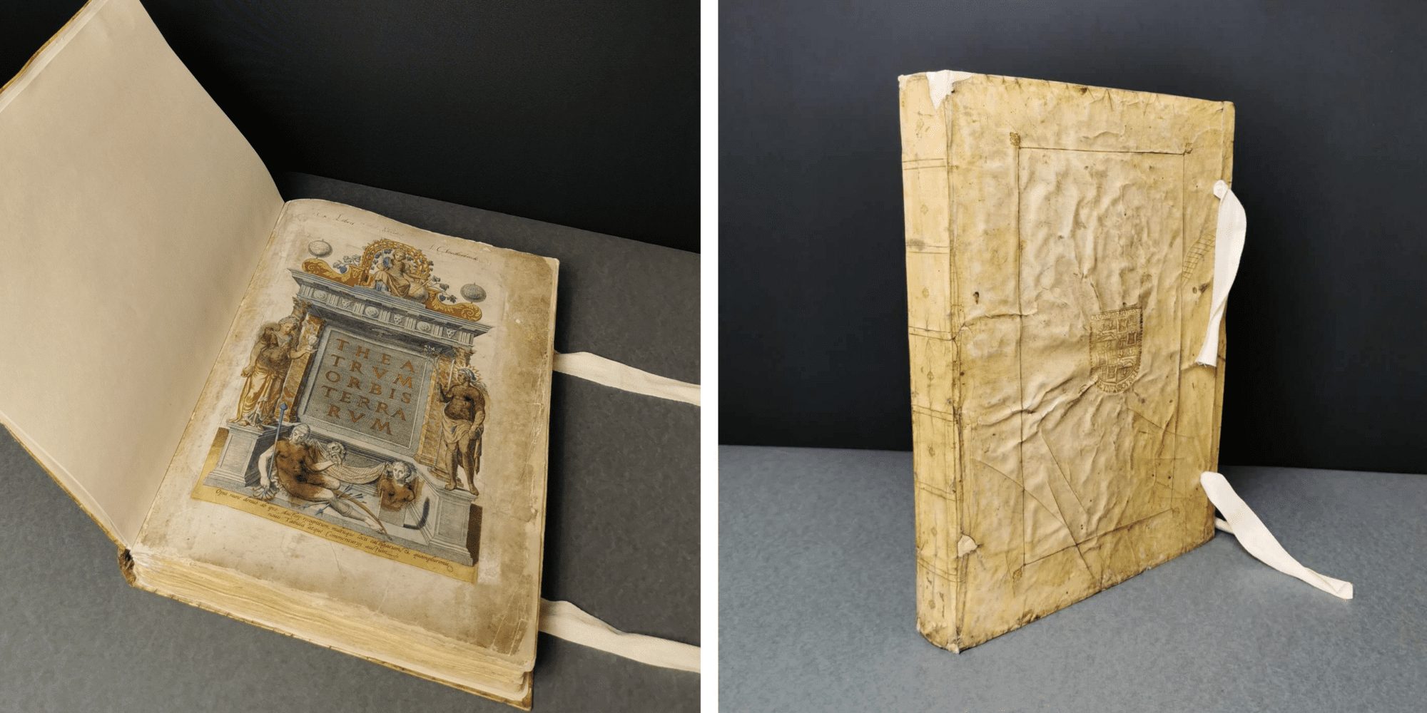
“The straps on which the book was joined were glued through and onto the cartons of the book binding during the rejoining of the binding and book block. This ensures that both parts stay tightly together. The new endpapers were glued to the inside of the boards (plates) of the book binding. Finally, new ribbons were added to the book binding.”
‘Noli me tangere’
This month, we welcomed a new Phoebus Fellow into our conservation studio: the French-Dutch painting restorer Annika Roy. For the next three months, Annika is taking care of Hendrick De Clerck’s Noli me tangere.
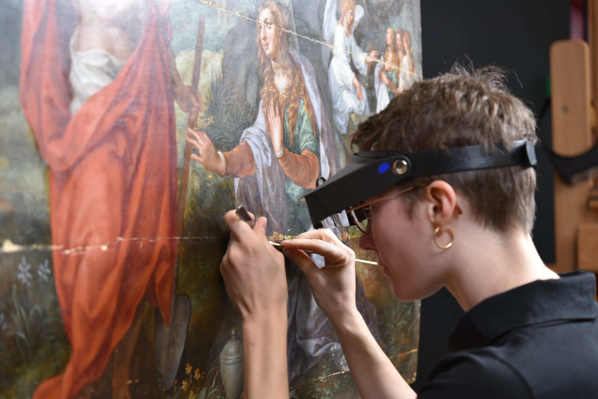
“This painting, dated between 1560 and 1630, depicts a famous passage from the New Testament, Noli me tangere (“Do not touch me”). It reads a little bit like a graphic novel. The first scene on the foreground shows Maria Magdalena, encountering Christ, after his resurrection. Mistaking him first for a gardener because of the shovel he is holding, she recognizes him, and Christ speaks the famous words ‘Noli me tangere’. You will also notice a second scene in this painting. On the right side, you can recognize the three holy women at Christ’s tomb and Maria Magdalena among them. They find the tomb empty, and an angel announces Christ’s resurrection. Your gaze is then guided to the Golgotha hill in the centre of the painting and in the background, you can see the city of Jerusalem.”
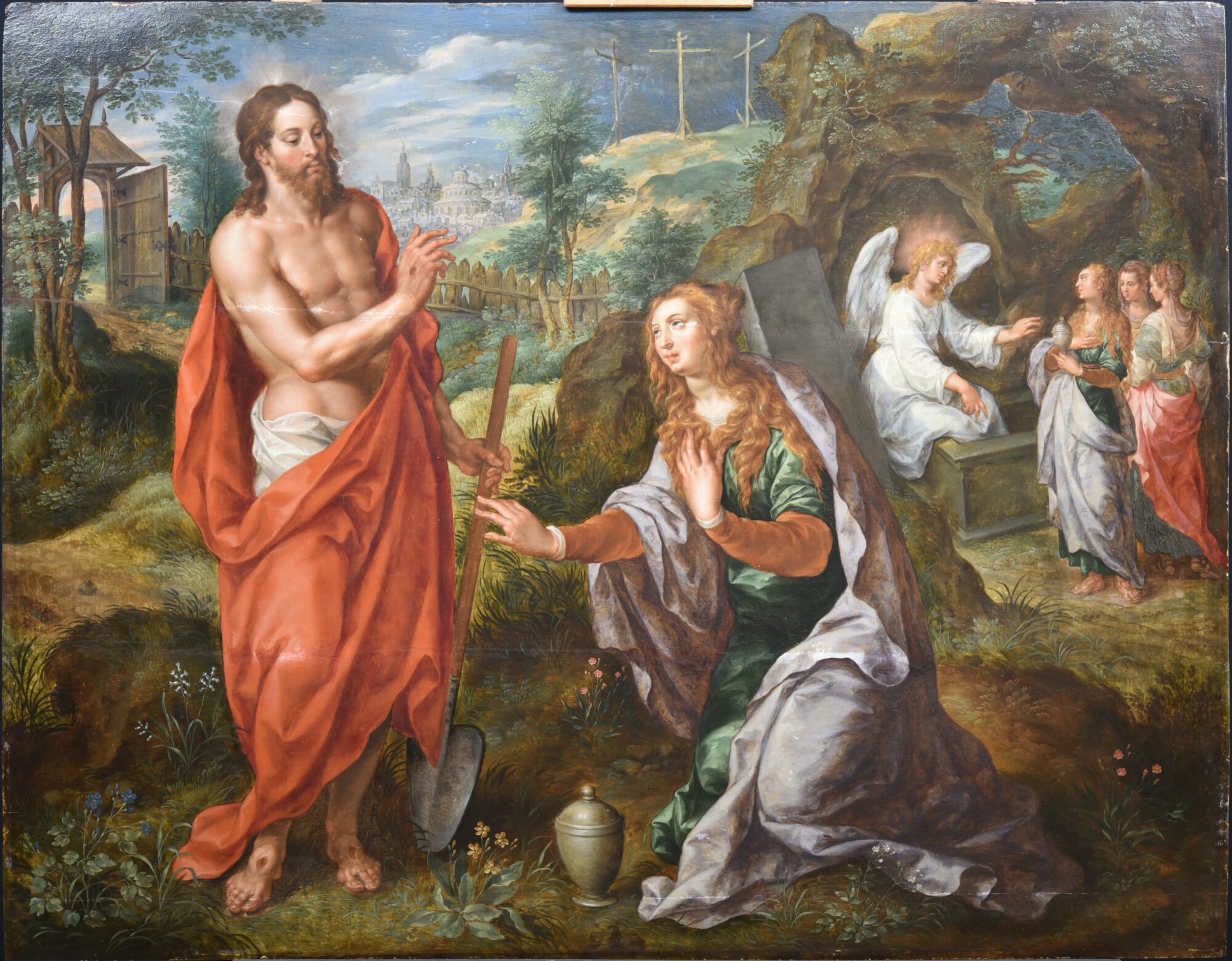
“Even before the treatment, it was clear that the painting has very bright colours and that the paint layer is in good aesthetical condition. The paint is rich in oil, and the glazes used by Hendrick De Clerck in the red and purple drapery of Christ and Maria Magdalena for example, are well preserved. It is very satisfying to notice this painting was not overcleaned in the past. De Clerck’s burshstrokes are very visible in the brown colours, where we can see the preparation in transparency. Furthermore, smalt pigment (blue coloured glass) has likely been used for the blue parts of the painting (sky and some draperies). The pigment unfortunately discoloured a little with time.”
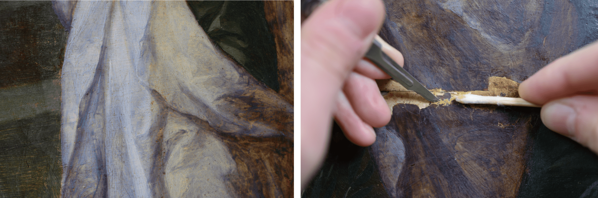
“The oak panel, consisting of four horizontal planks, underwent some structural treatment after which I could focus on the paint layer. The main damage was the up-lifting paint around the fills near the joints of the panel. The other alterations were mainly aesthetical: the fills were uneven, and the retouches were visible, especially the ones containing white. The varnish was also slightly yellowed.”
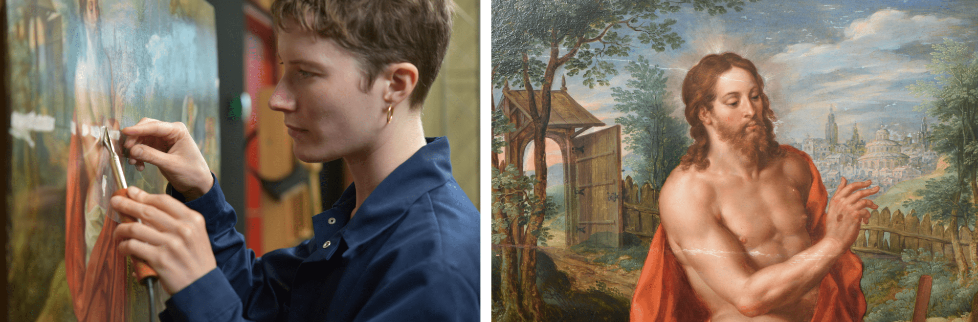
“The first treatment consisted in fixing the paint around the joints. I could then start the cleaning process, consisting mainly of the removal of the former restoration material: varnish, old retouches and fills around the joints. Some fills were overlapping on the paint layer. By removing them, it was exciting to uncover hidden original paint.”
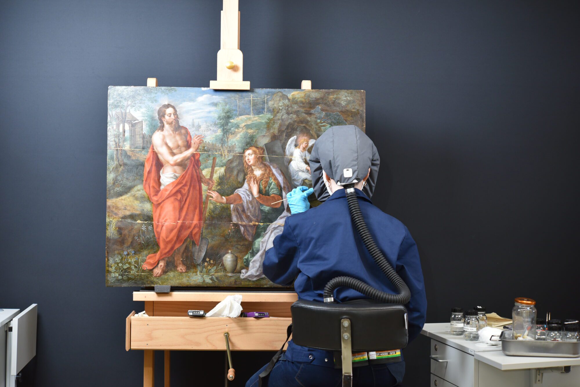
“In the upcoming weeks, the losses around the joints will be filled again, the painting varnished and then I will be able to start the retouching phase. It is a real pleasure to work on such beautiful panel and appreciate every detail of it.”
Curious about the results? Keep an eye on our website and social media!
Discover the unique portraits of the Inca emperors and Francisco Pizarro
At The Phoebus Foundation’s restoration studio, conservator Carlos González Juste and former Phoebus Fellow, Kaisa-Piia Pedajas, are currently restoring a unique series from the Phoebus collection, namely 12 portraits of Inca emperors and Francisco Pizarro. This month, we dive behind the scenes and take a closer look at this fascinating project.

Anonymous, Portraits of Inca Emperors and Francisco Pizzaro, c.1790-1810
These portraits, each no larger than an A4, depict an idealised representation of the Inca emperors and the figure of Francisco Pizarro, the conqueror of the Inca Empire. Portrait series such as these were very popular in the Viceroyalty of Peru during the 18th and early 19th centuries. Moreover, they were eagerly used as political tools. The iconography is based on an engraving by priest Alonso de la Cueva (1684-1754), in which the genealogy of the Inca emperors is succeeded by the Spanish monarchs. In this way, the Spanish rulers strengthened their claim as heirs of the Inca empire.
Throughout time, this message took on other meanings. The iconography was also used to document and confirm aristocratic Inca blood in certain families. As a result, family members linked themselves to Spanish nobility and were entitled to special privileges, including exemptions from taxes. As feelings of independence grew throughout the Viceroyalty, links with the Spanish monarchs were removed as an effort to restore the Inca empire.
Complex carrier and damage
Time to take a closer look at the portrait series. Studying the stretchers, it is clear that the portraits were produced on canvases, presumably made of cotton, and glued to strainers. However, this was not their original display. The irregular profiles reveal that the canvases were once cut from their original stretcher frame and then glued onto a new strainer. The canvases themselves are extremely thin with flat, regular waves, suggesting they were machine-made.
Beneath the blue background, we see a reddish ground, which is visible thanks to the transparency of the paint layers. These are so thin that it is almost impossible to see brush strokes!
Before the paintings came to the restoration studio for treatment, they had a dark, yellowish varnish layer and several overpaintings covering the canvases’ damages and edges. This varnish layer and retouches were also very irregular. The supports themselves were also particularly distorted due to the gluing to the strainer, creating strong tensions between the glued edges and the canvases.

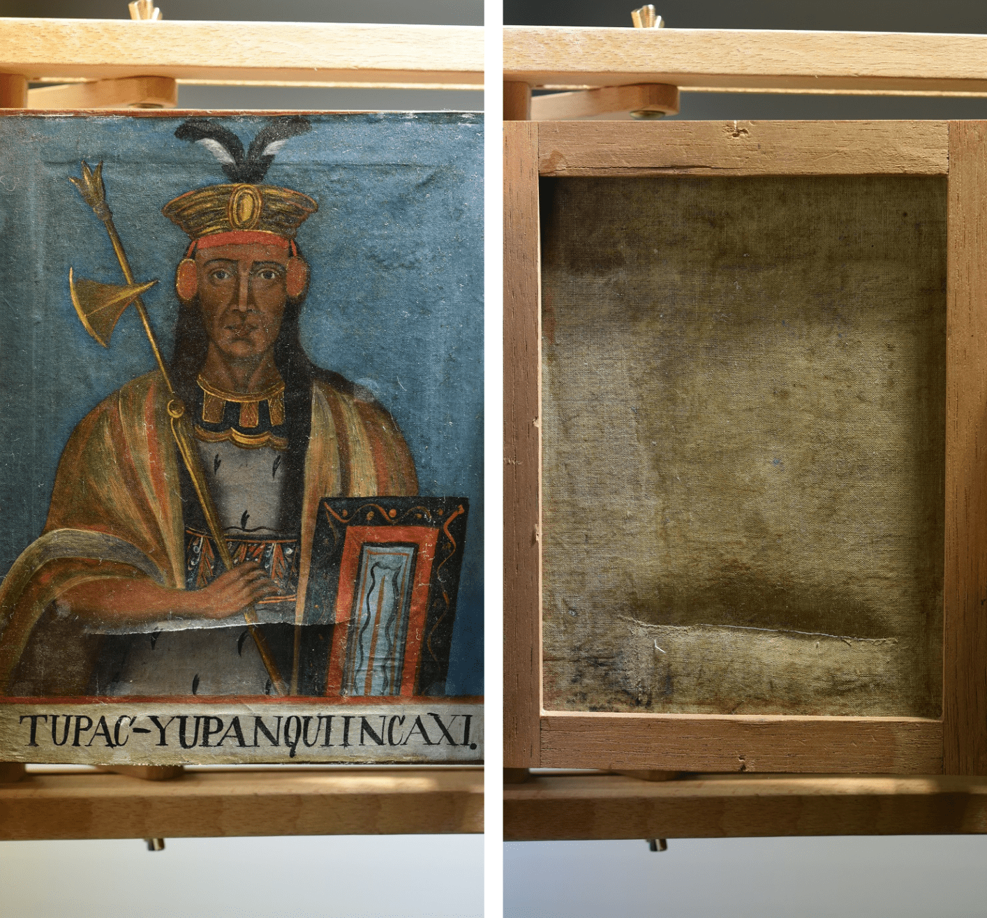
Behind the paint layers
To find out how the portraits were created, we analysed one of the paintings using the imaging technique Ma-XRF. This scientific technique allows us to distinguish the different chemical elements of the painting and thus identify the pigments that make up the work. The resulting research showed the use of pigments from the last decades of the 18th century and the first half of the 19th century, confirming the possible execution date. Among other things, the Ma-XRF images showed us the presence of mercury, indicating the use of vermilion for the colour red, while arsenic points towards orpiment for the gold areas.
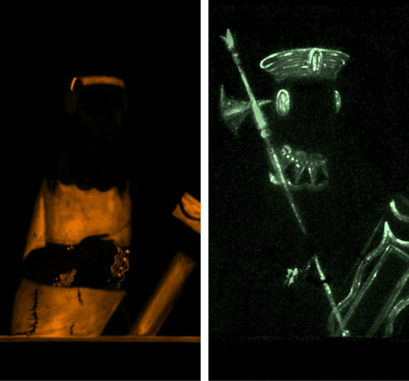
Before starting the restoration treatment, thorough tests were first carried out to find out the best method to remove the varnish. This was because it had darkened and had not only changed the colours of the paint but also made the supports, and the cloths, enormously stiff, resulting in various deformations. For cleaning, we opted for a non-woven Evolon® fabric and solvent mixtures that swell the varnish layers and can thus be easily removed with a cotton swab. In some areas, we also combined these techniques with gentle mechanical cleaning.
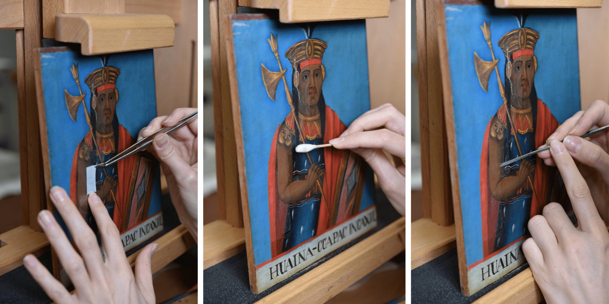

Certain pigments showed greater sensitivity and required extra attention. Additionally, we noted that the paintings had been only partially cleaned during previous restoration treatments and that a darker layer remained in some places (such as the incarnate and accessories of the portraits). After taking off the varnish layers, we also removed several overpaintings from the surface and reduced stains where necessary. Although the paintings initially looked the same, it became clear during and after the cleaning that the conditions of the paint layers and supports were vastly different for each portrait.
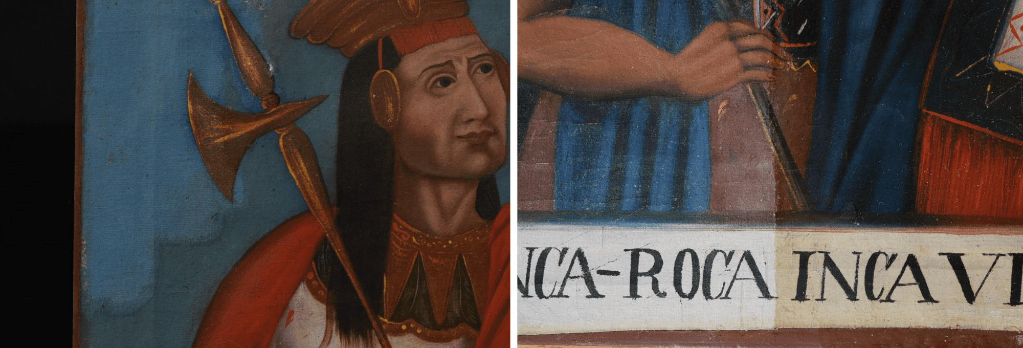
Thanks to the removal of the rigid layer on the paintings, the canvases also became looser and distortions reduced significantly in most cases. Many paintings were placed under weights to make the canvas slightly flatter. Areas and distortions that required extra effort were carefully treated with moisture and underwent thermo-treatment.
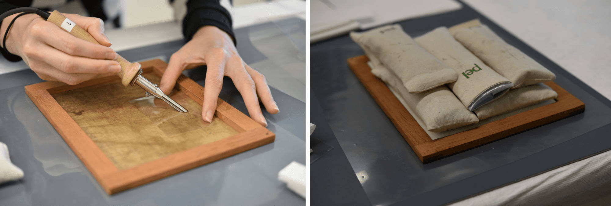
Furthermore, we also repaired the tears that were present in the canvas of some portraits. To minimise the damage, these tears were flattened and the edges were also aligned. They were then consolidated and supported on the back with a suitable adhesive.
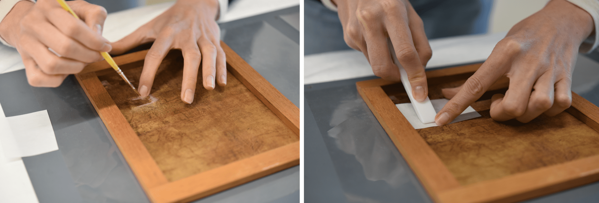
After the structural treatment, a thin layer of natural varnish was applied. This layer acts as an insulation layer for the original surface and helps to saturate the colours after removing the old varnish layers.
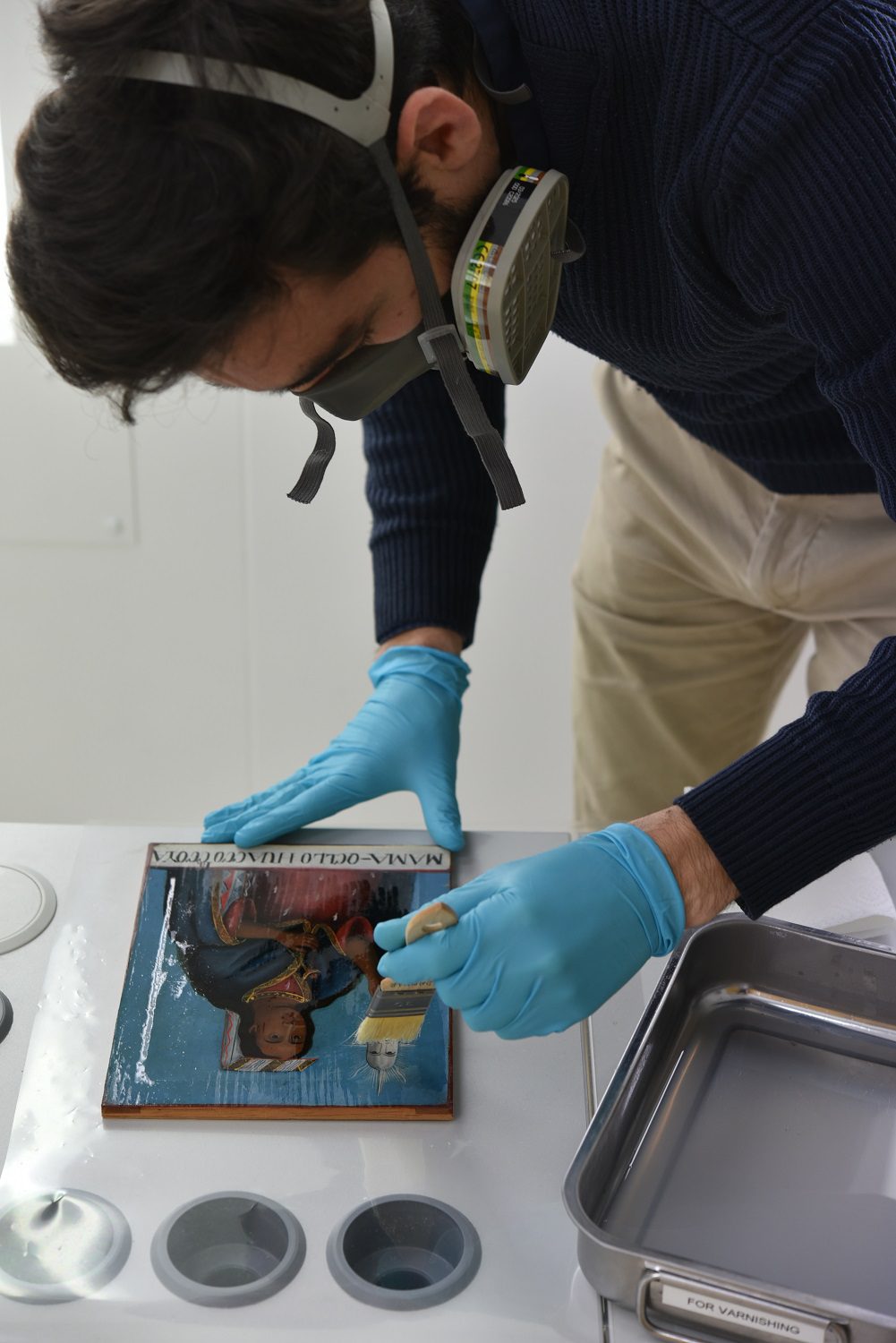
The restoration of this exceptional portraits series is still in full swing! After varnishing, our conservators will also continue to fill and retouch the gaps. As a result, the Inca emperors and Francisco Pizarro can soon be admired again in all their glory!
Take a step into the wonderful world of Leonora Carrington
Leonora Carrington’s work, The Dark Night of Aranoë is part of the Latin American sub-collection of The Phoebus Foundation. Restorer Naomi Meulemans is in charge of the foundation’s modern and contemporary collections and started the restoration of this work following a future loan project. This month, she takes us behind the scenes of the research, the restoration and the wonderful world of Leonora Carrington.
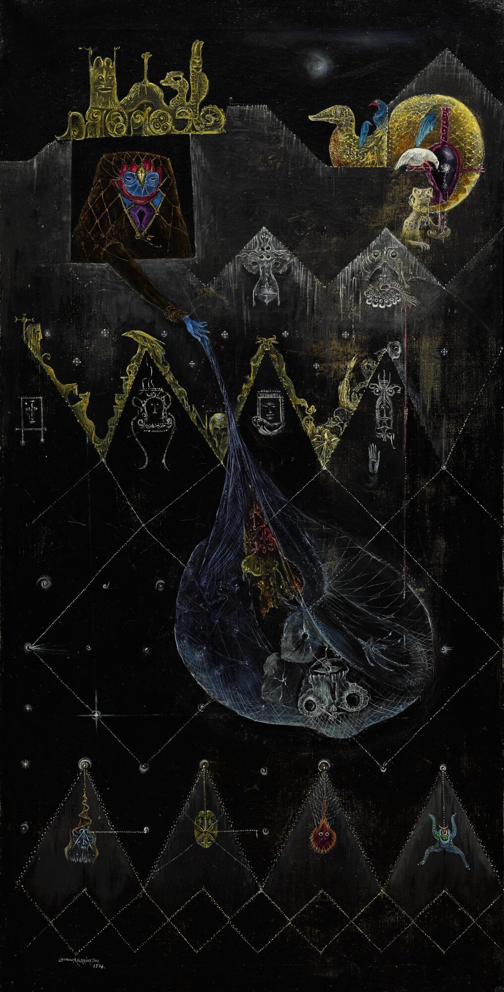
“Leonora Carrington’s work seems to lean close to her own life. It is fragile, almost velvety at times, but also dark and analytical. Although she often painted for an unfamiliar audience, it seems as if, for a moment, we may look deep into her hidden dreams, deep happiness and at the same time, raw trauma. All these symbolic figures and sophisticated elements are also present in The Dark Night of Aranoë. Usually, only the figures or decorative elements were thickened in the paint. This way of working creates space and quickly takes the viewer far away from our “recognisable” world because of the absence of any kind of technical perspective.”
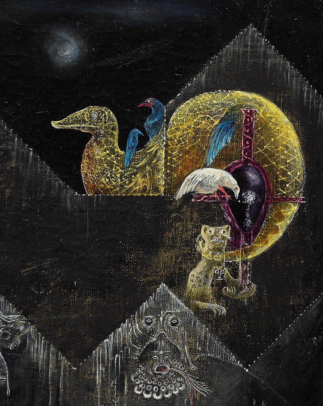
Details of The Dark Night of Aranoë

“A major comparison study with some of Carrington’s other works and a study of her methods lead us to suspect that the work was varnished at a later date, long after the work was created. Indeed, Carrington’s paintings are always very matte or even unvarnished. Because of the damage the layer does to the work, it was decided to remove it during the conservation campaign. With the restoration, we hope that this captivating work will find its strength again to inspire the viewer.”

Restoration of a seventeenth-century family portrait
This month, we go behind the scenes with twin sisters Jill and Ellen Keppens, who are currently restoring the seventeenth-century portrait of a nobleman from the Volpi family with his wife and children.
“A while ago, we were introduced to the Volpi family. This intriguing family of important diamond merchants, some with Italian roots, was active in 17th-century Antwerp. The fact that they were good at doing business is amply demonstrated in this portrait, through the depiction of white silk, pearls, diamond jewellery, lace, feathers, impressive buttons, a horse, a greyhound, their coats of arms and even the imposing footwear.”
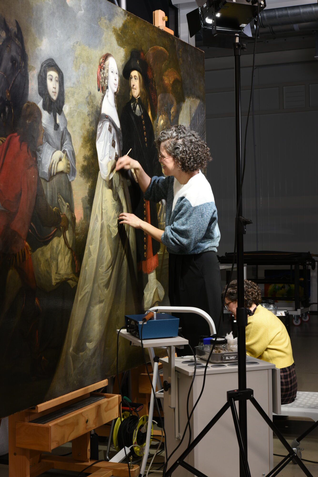
“Besides all this opulence, something else extraordinary catches the eye. The extremely pale incarnations of the woman in the white silk dress and the two children immediately catch the eye. Why their skin is so white is still a mystery. Has the pigment become discoloured and transparent? Does the white skin show their privileged position? Or were they already deceased when this portrait was painted? More research on the family may provide an answer here.”
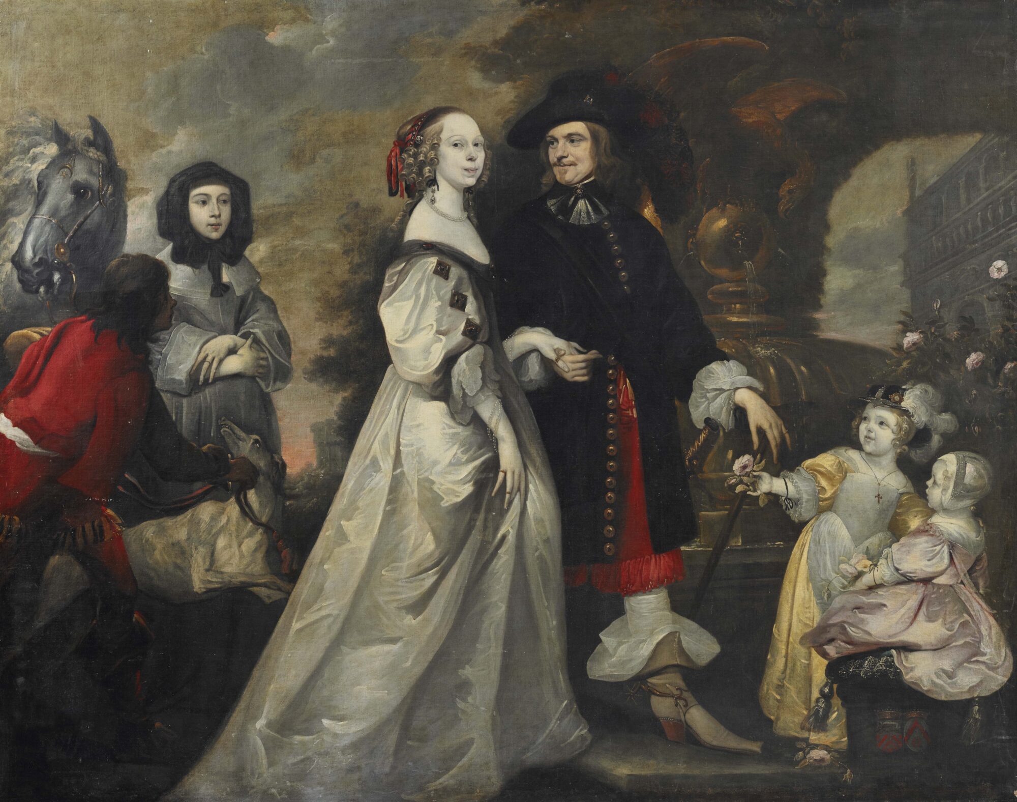

“The white incarnate is not the only ‘strange colour’ that stands out. The clouds also look bizarre. This is because the sky around it is discoloured. At one time, it must have had a strong blue colour, but the artist used smalt as a pigment. 17th-century artists often used this pigment containing cobalt because it was cheaper than the expensive ultramarine, yet could still obtain a nice blue colour. Unfortunately, it is also very unstable and over time, it often turns brown, yellow, grey, or becomes transparent.”
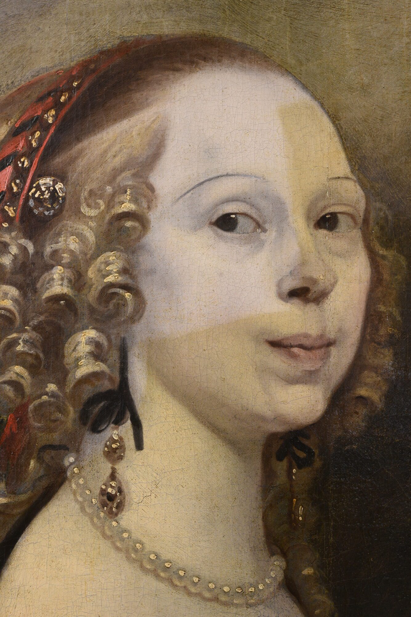
Curious about the final result? Keep an eye on our social media and website!
Conservation treatment of The Crucifixion panel by Master of the Legend of Saint Lucy
This month, Chief Conservator of The Phoebus Foundation Sven Van Dorst tells us about the conservation treatment of The Crucifixion panel by Master of the Legend of Saint Lucy. He masterfully describes how this work was created, where the stylistic influences come from, and what the damage phenomena can teach us. The power of this restoration emerges when we get closer to the heart of it through research techniques Sven employs in the process.

Before restoration
“This small panel depicting the crucifixion was painted by the Master of the Lucia Legend. His work is close to that of Hans Memling, so it is assumed that he was active in Bruges at the end of the 15th century. Based on an inscription on the back of the panel, we discovered that the little work ended up in Portugal during the 19th century in the collection of the Dukes of Palmella.”
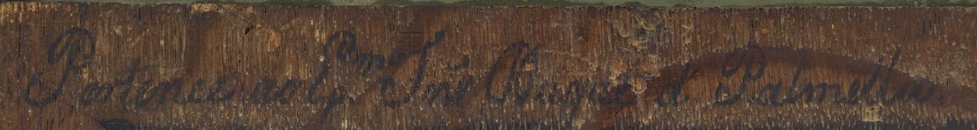

“Before the restoration began, the painting looked dull. The colors had a greenish appearance because the varnish was heavily discolored. With the help of Infrared Reflectography (IRR) and radiography (X-ray), it was possible to evaluate the condition of the painting in detail. As a result, we found out that the edges of the painting were completely overpainted. Originally, there was a border of about 1cm of unpainted wood around the work. This is typical of 15th-century paintings because the wooden panel was held in the frame using a groove. On the IRR, we can see some minor damage in the paint layer and the underdrawing that the painter used to draw his composition on the panel. The lines are angular, indicating the use of a “dry” drawing medium such as chalk.”
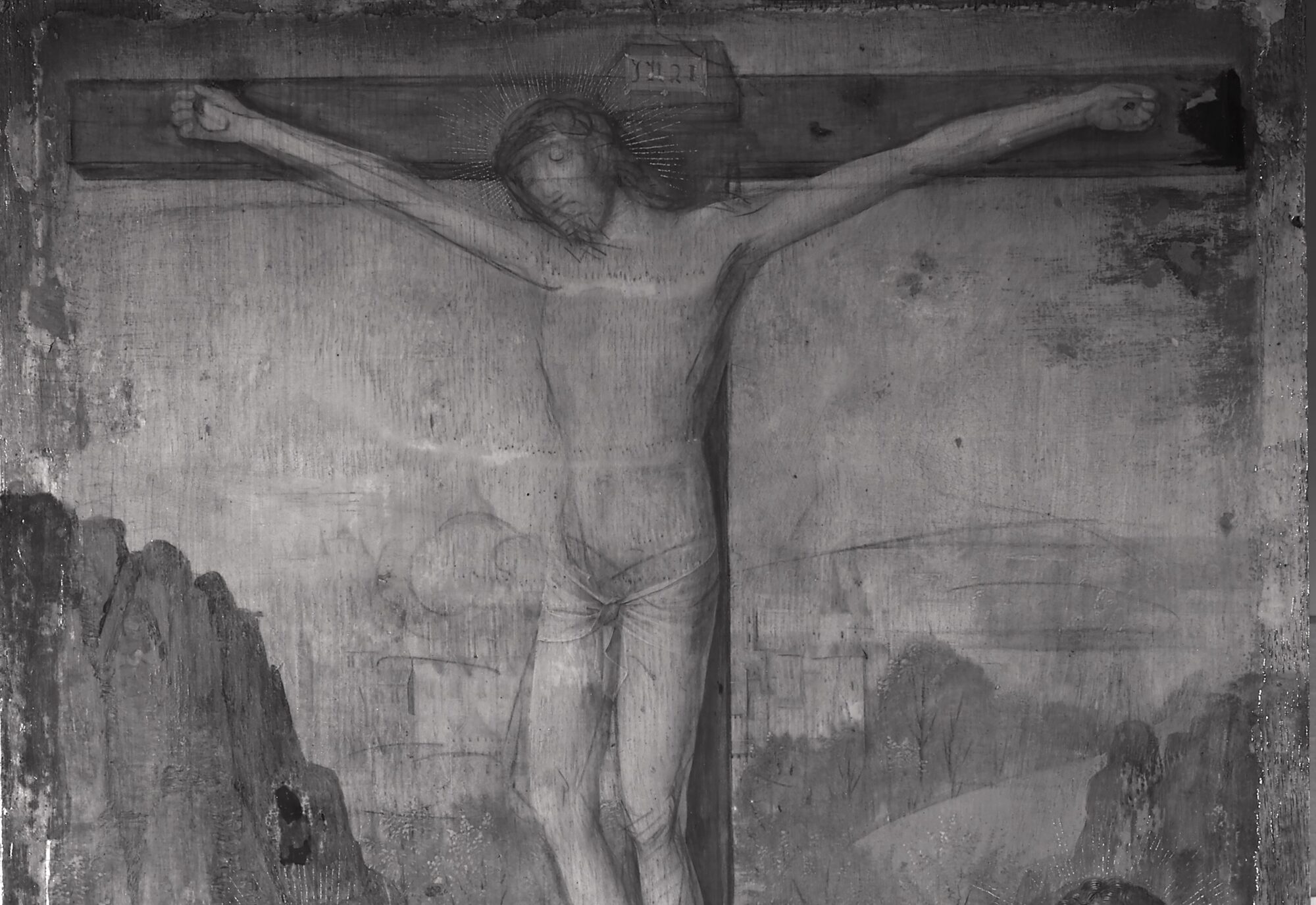

“After the examination, the restoration could finally begin. It took some work to remove the old layers of varnish. Using homemade gels, the varnish could be swollen in several stages and removed from the paint surface with a cotton swab. Immediately, the original vibrant colors and some of the old damage reappeared. In the next stage, the old overpaintings at the edges were removed. This was done under the microscope to avoid damaging the underlying paint.”
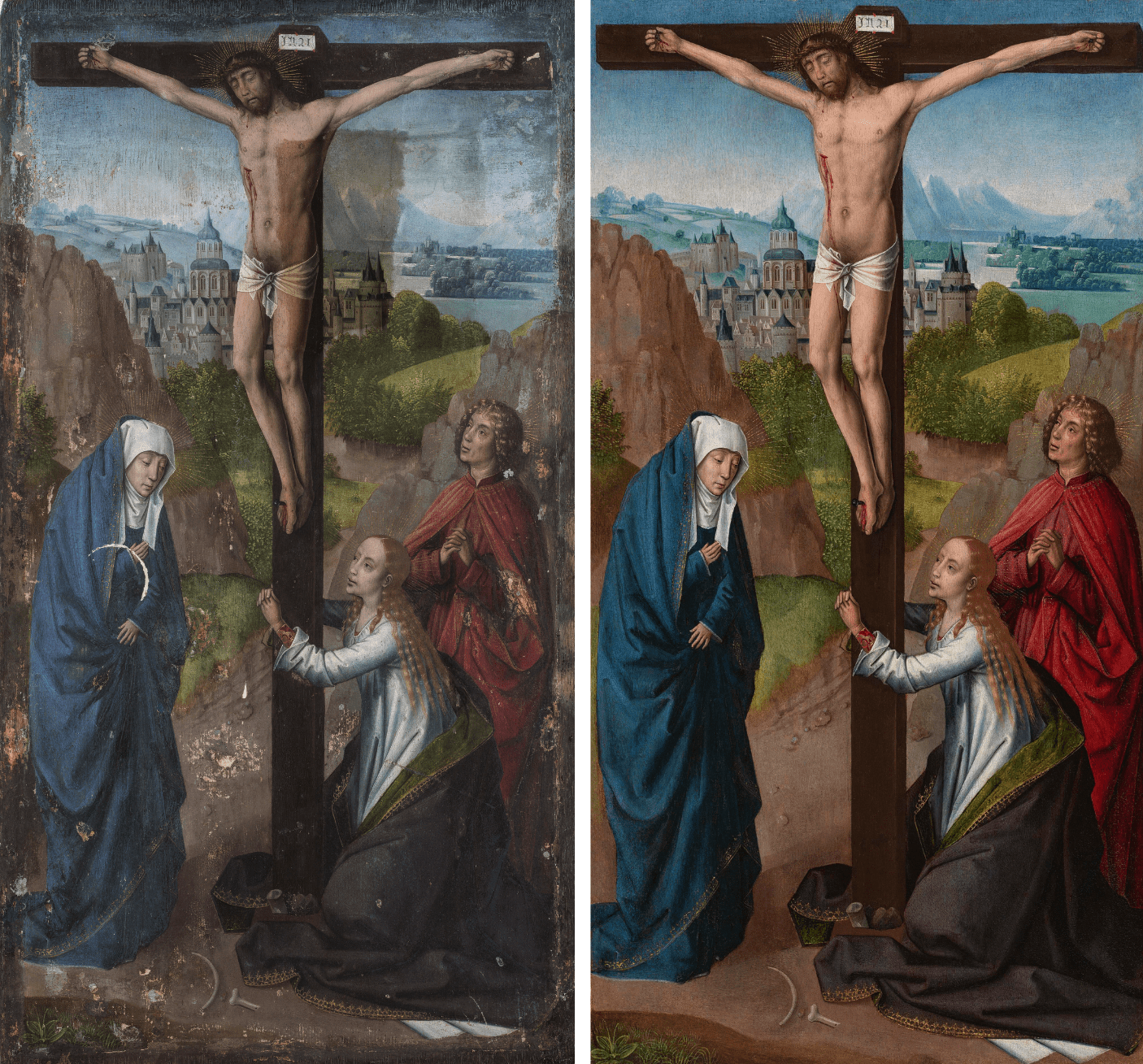
“Once the original surface was exposed again, the final phase of treatment could begin. First, a varnish was applied to protect the original. Next, gaps were filled and retouched to no longer stand out. The result was stunning and one of my most enjoyable projects. Now it is again possible to appreciate the refined technique and palette of the mysterious Master of the Lucia Legend.”

Behind the paint layers with Sofia Hennen
This month, we take you behind the scenes with Sofia Hennen, paintings conservator and art historian, who recently restored the work titled Tavern Interior by Pieter Pietersz from our collection.
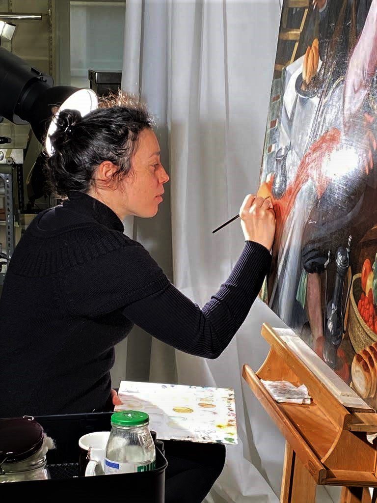
“The conservation-restoration treatment of Tavern Interior by Pieter Pietersz, dated from the second half of the sixteenth century, was trusted to me in May last year as my first project with The Phoebus Foundation. This beautiful oil painting on canvas immediately impressed me with its refined artistic technique. However, its condition also instantly startled me.”
“From the beginning, I noticed the painting was full of problems. Only after removing the varnish and overpainting did the real image emerge. The oxidized varnish and the altered past retouching concealed an excessively worn original paint layer that had endured harsh incidents over the past five centuries. Inadequate conservation conditions and past inappropriate restoration treatments, such as aggressive cleanings, invasive linings, old overpainting, etc., are some of the interventions worth mentioning.”
“Thus, the retouching of the painting after the cleaning was quite tricky and needed progressive and critical decision-making processes. As the painting showed generalized abrasion, it was necessary to bring retouching solutions that could conceal the damages in an “illusionist way” while respecting its material history. In other words, I had to subtly reintegrate the damaged image by imitating at the same time the abrasion and maintain this approach constantly. Keeping a homogenous and coherent aspect with the same quality of retouching all over the composition was difficult. Deciding when to stop was also challenging, as you could easily overdo it and keep retouching forever.”
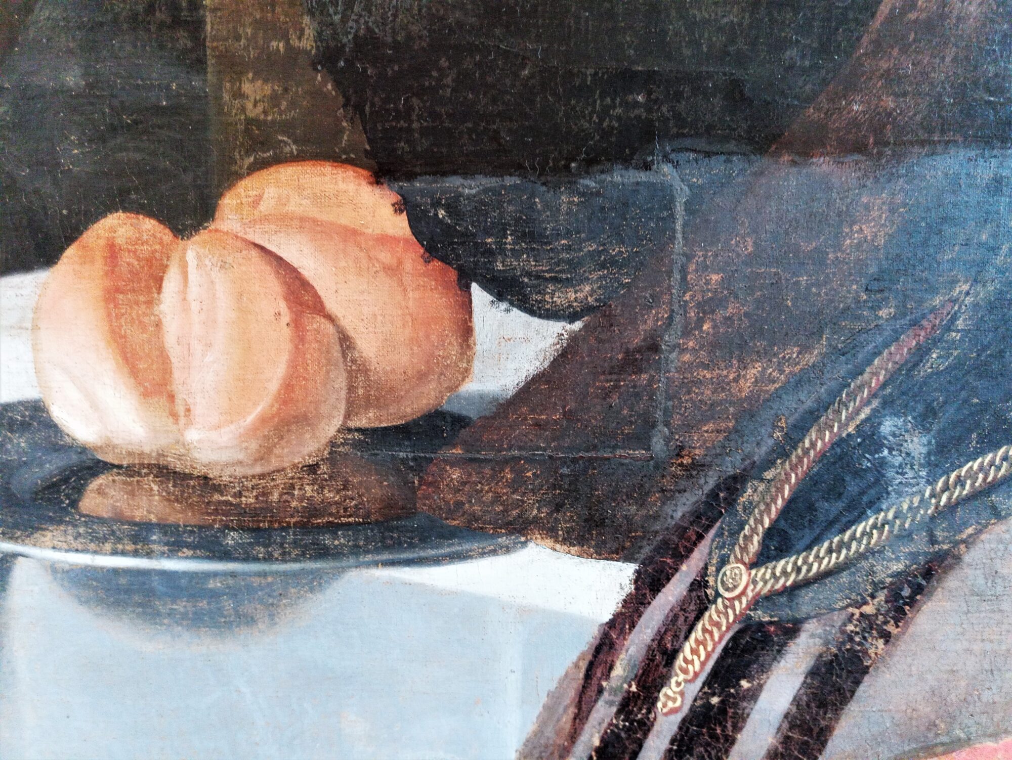
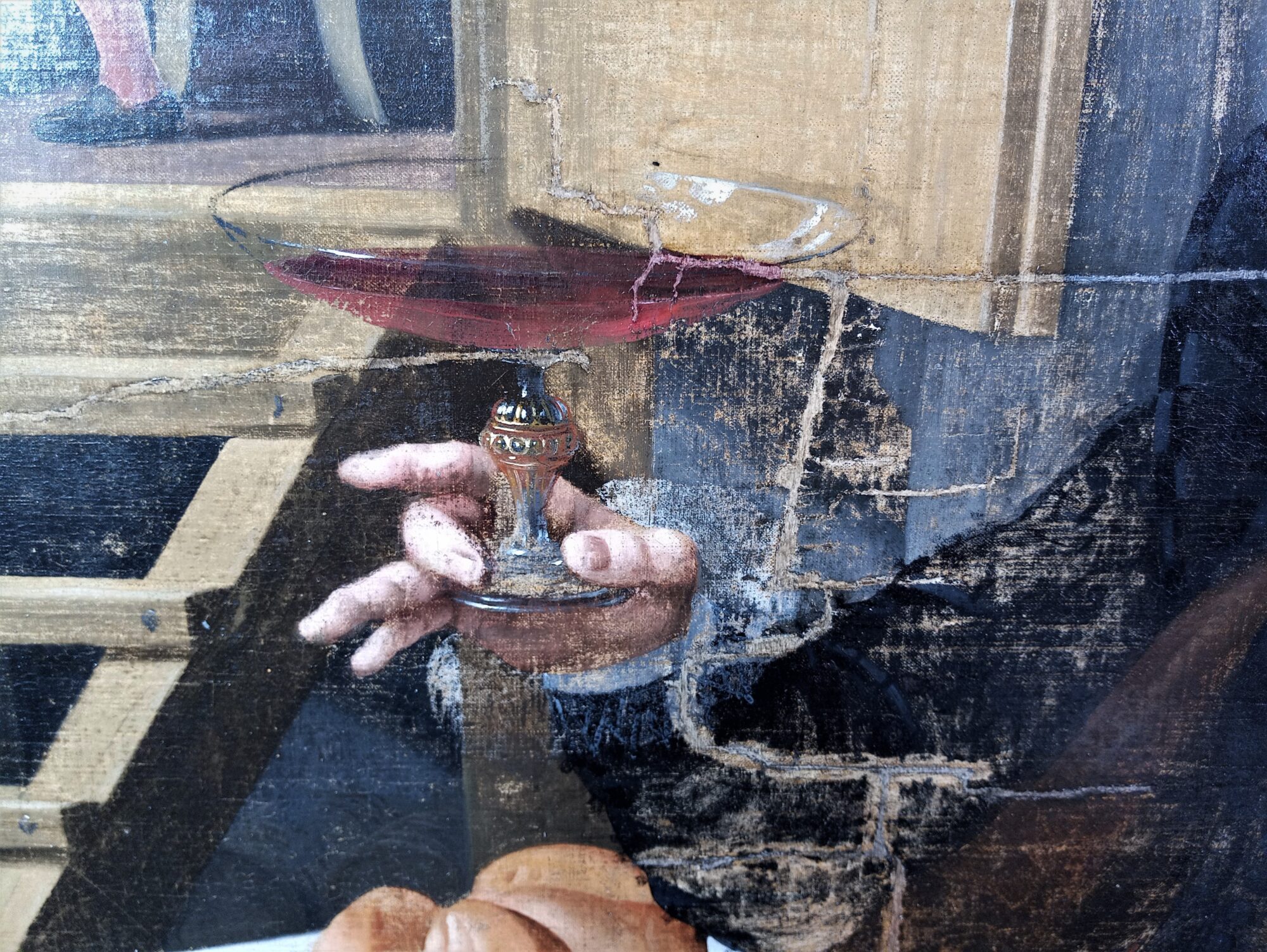
“To conclude, this has been one of the most challenging treatments I have ever done, so I can only be proud of the result. I am already excited for future Phoebus challenges like this one!”
After restoration
Restoration of a Wim Delvoye display cabinet
This month, we take you behind the scenes with Brian Richardson, a specialist in the conservation and restoration of wooden objects and furniture. Brian recently worked on an unusual installation by contemporary Flemish artist Wim Delvoye, which consists of a display case containing 12 saw blades and a gas bottle, each piece painted in Delft blue. This finely crafted antique cabinet references the Flemish neo-styles with their richly carved auburn wood and glossy varnish.
Wim Delvoye, Installation of 12 Saw Blades and 1 Gascan
“The antique “look” of the cabinet does not immediately suggest how it is constructed. In fact, the entire structure is dismountable. The walls, base, and crowning are not fixed with wooden joints but are held together with a few bolts, making the whole thing rather unstable. The additional problem is that the glass door at the front is different from the usual format for such a cabinet. An antique display case would usually have two doors that open from the center with several small panes of glass. When this door is opened, it drops down. With the cabinet also dangerously lifting forward, there is a real chance it could topple forward.”
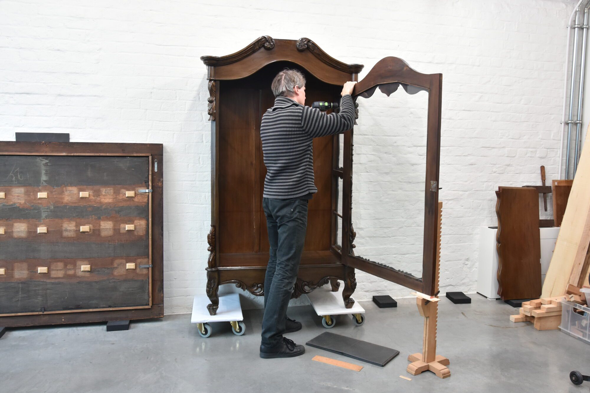
“The removable aspect of the artwork did make its restoration easier. The furniture was completely taken apart in order for me to work on the structure. After much thought and consultation, the approach was outlined. At the bottom of the side walls, four new wooden joints were provided to connect the walls to the base. This invisible intervention significantly improves the stability of the cabinet and counteracts toppling. Lastly, four L-shaped brackets were installed on the back of the furniture.”
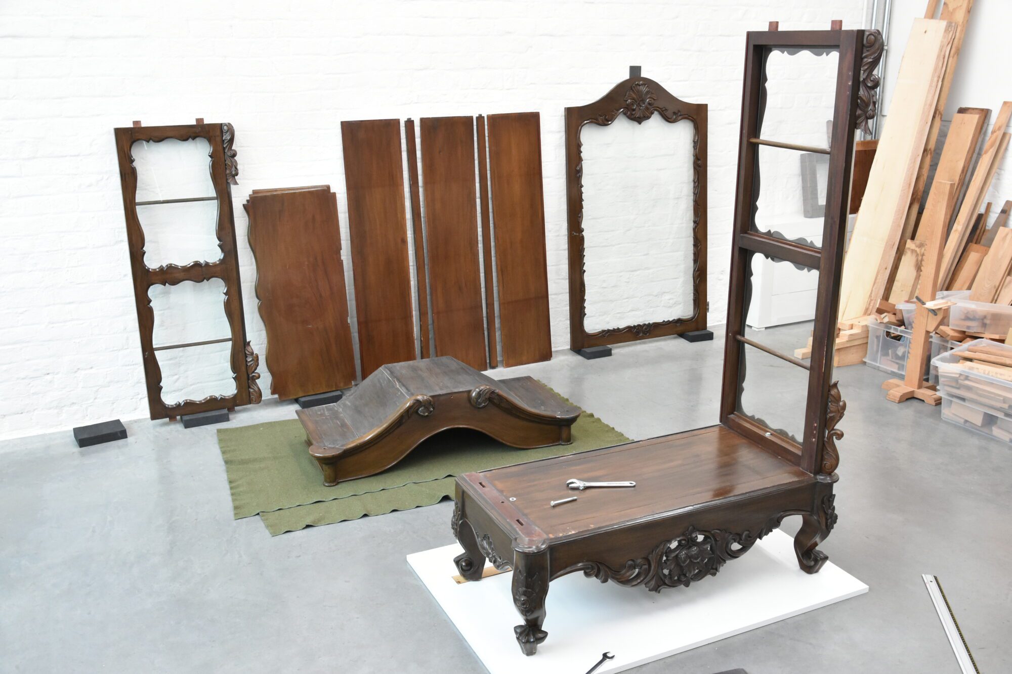
“In addition to these major structural interventions, smaller treatments such as gluing cracks, filling gaps in the wood, and retouching old impact damage were also performed.”
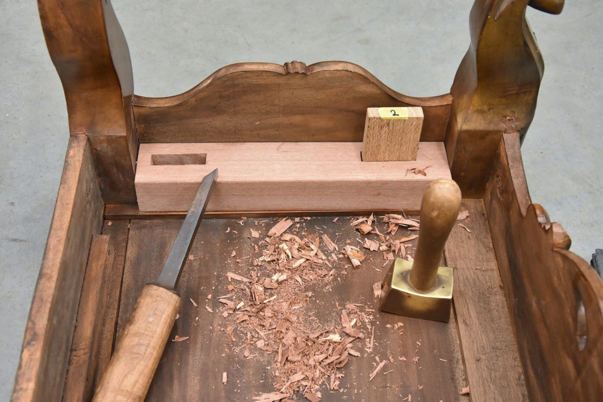
“Due to its complexity, restoring this antique/contemporary display case presented an enormous challenge, but the result was all the more satisfying.”
Behind the scenes in Sudbury
Collection Consultant Katrijn Van Bragt and Conservator Naomi Meulemans take you along on their journey to Sudbury, Suffolk (UK), for the installation of the Painting Flanders exhibition at Gainsborough’s House!
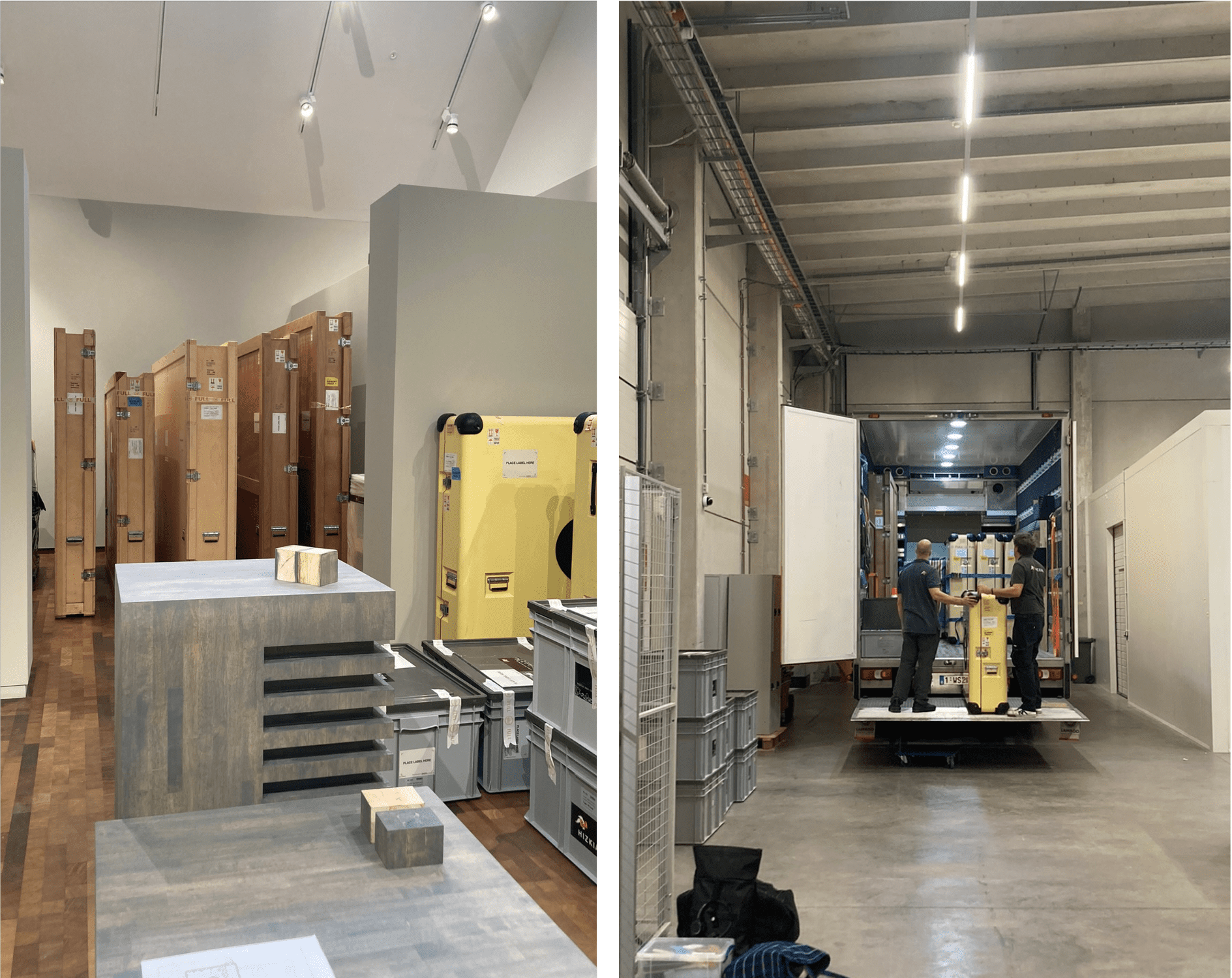
The works of art arrived safe and sound in Sudbury
Katrijn and Naomi made sure more than 40 masterpieces by Emile Claus, Gustave Van de Woestyne, James Ensor, Rik Wouters, and other Latem School artists could travel safely to Sudbury. Not an easy task in Brexit times! Each artwork was extensively analysed before departure and was packed in a custom-made crate. Aside from that, all customs formalities were arranged so the artworks could travel to the UK.
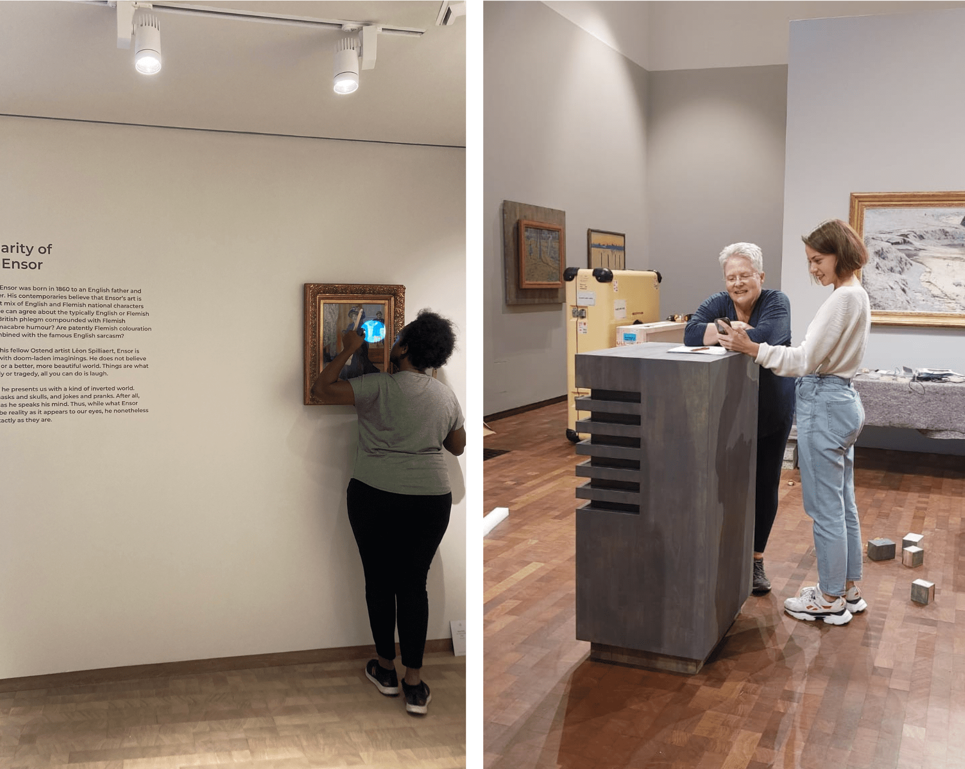
After crossing the channel and arriving in Sudbury, the paintings and sculptures were thoroughly checked to see if any damages would have occurred during transport. After everything was all cleared, a specialized team of art handlers installed each artwork under the critical eye of Naomi and Katrijn. Then, after applying labels and introductory texts to accompany the exhibition, testing the audio guide, and adjusting the lights, the exhibition was finally ready to be shown to the world!

With Painting Flanders, The Phoebus Foundation presents the story of an essential piece of Flemish art history from the end of the 19th century to the UK. The exhibition is a real debut as it is the very first at the newly built museum, Thomas Gainsborough’s House, in Sudbury, Suffolk. Discover the unique show until the 26th of February!
Phoebus Fellow of the month: Clara Bondia
This month, we go behind the scenes of our restoration studio, where a new Phoebus Fellow joins the team for three months: Clara Bondia. She is pleased to share more about her projects at The Phoebus Foundation.
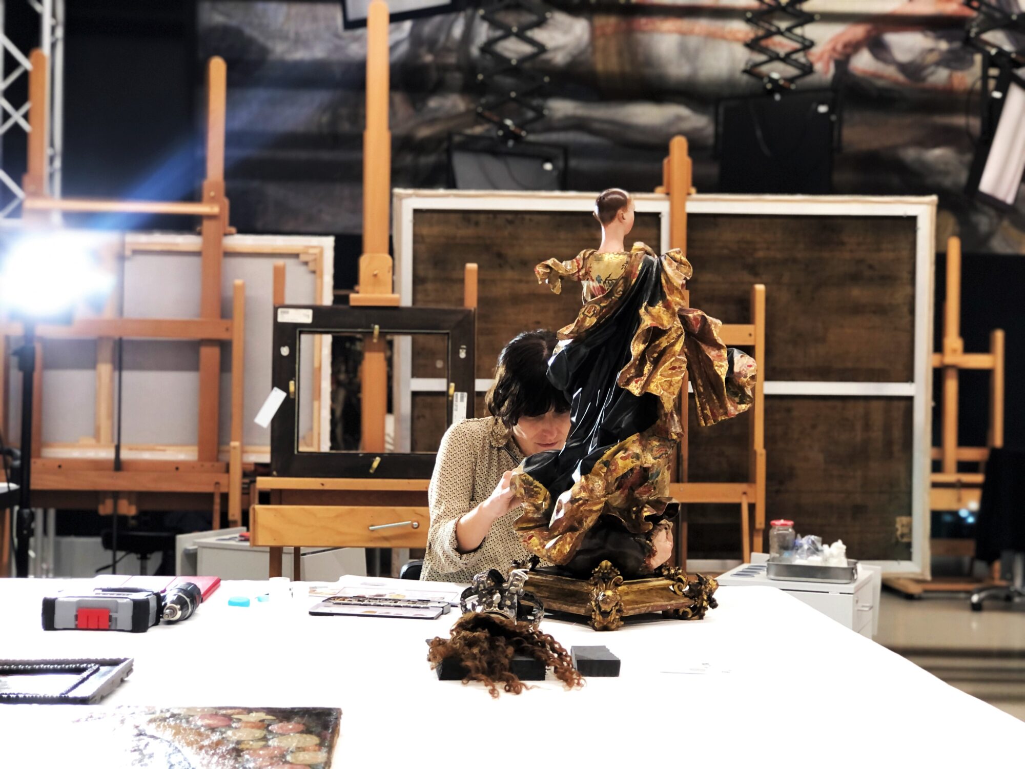
“On the one hand, I am studying and restoring an eighteenth-century Latin American sculpture of the Immaculate Conception, catalogued as School of Quito, one of the most prestigious traditions in colonial sculpture. The work is made of gilded, prepared, and polychromed wood, featuring carving and decoration of exceptional quality.”
“After the preliminary and analytical study using X-ray photography, I began stabilising the pictorial layer. The piece had been previously restored, so it was interesting to find out which parts were adhered to or overpainted. In this way, the degree of intervention could be determined. Once the pictorial layer was stable, selective cleaning was carried out, and some of the disturbing overpaint that distorted the view of the piece was removed. When the restoration is finished, it will allow for a better aesthetic reading of the piece.”
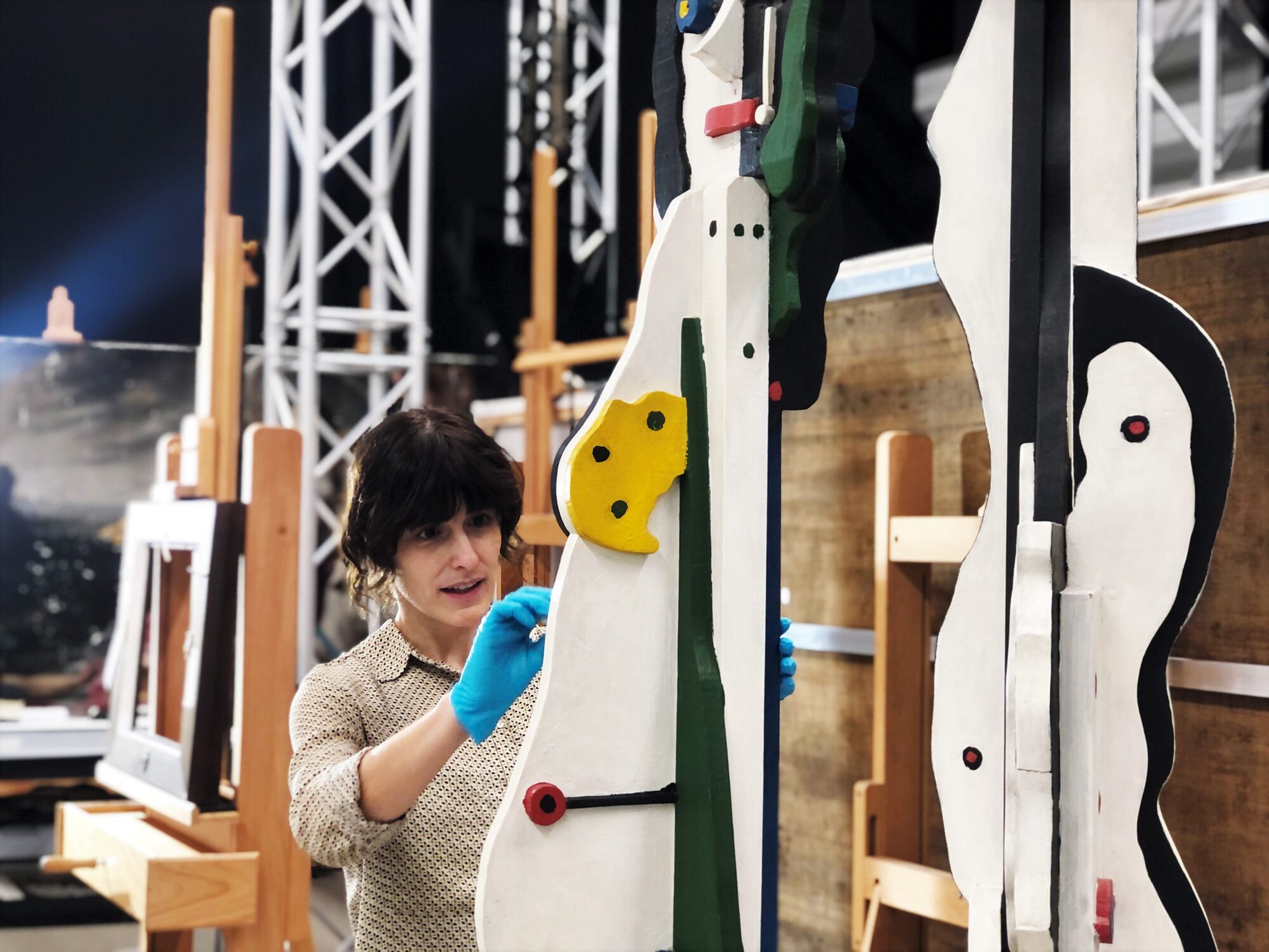
“On the other hand, I am also collaborating on an interesting research project on the work Muñecos (Dolls) by the Italian-Argentine artist Líbero Badii, which is an installation of several polychrome wood sculptures with oil. According to the artist, they represent “the figure of the massified contemporary man, and his need for vital cosmic projection, materialised through the strings that unite all the figures”. I enjoy working with contemporary art because of the great challenge it presents in confronting new techniques and new materials.”
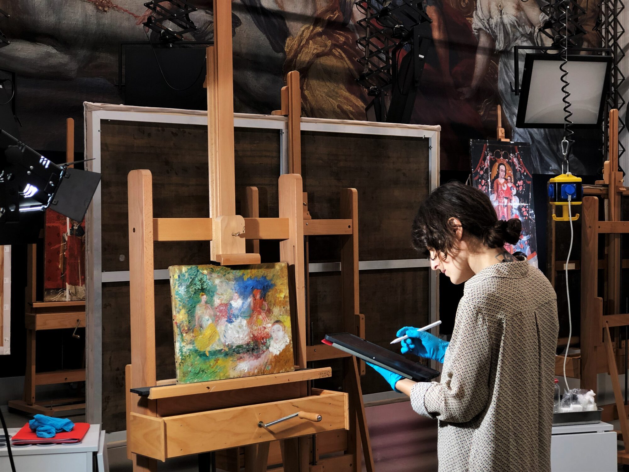
“During my stay at The Phoebus Foundation, I will also be able to collaborate in the revision of some other works in the Latin American collection of modern and contemporary art, carrying out condition reports and specific interventions. Ultimately, the pieces will be ready to travel and be admired. It is fantastic to work closely with an organization like this, which takes care of the conservation and research of each piece with the best possible means.”
A look behind the preparation of a condition check
Our exhibition Saints, Sinners, Lovers, and Fools at the Denver Art Museum is getting closer! However, preparations for such a large-scale project involve a lot of work. Our colleague Laura Geudens is happy to take you behind the scenes.
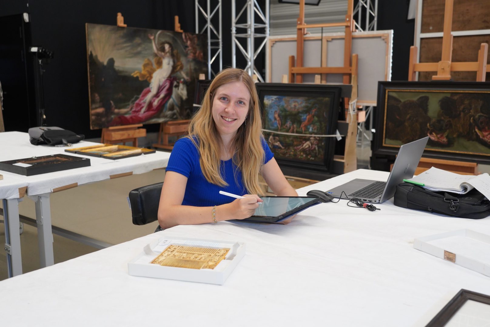
“As I have a conservation and restoration background, I support my colleagues in reviewing the condition reports for this exhibition. Before an artwork leaves for an exhibition, it is subjected to an extensive condition check. Based on that, I examine whether the condition of the work corresponds to the expectations. For me, it was particularly interesting to examine and document the collection of silver objects. These pieces are travelling for the first time and thus received a completely new condition report.”
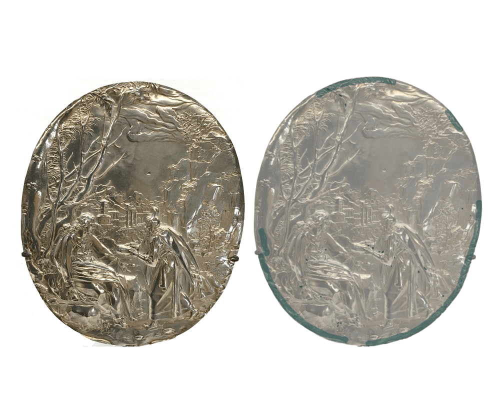
Damage view, on which slight tarnishing of the silver is indicated
“An example of this is A Silver Relief with the Temptation of Christ, a silver plaque forged by Arent van Bolten (1573-1633). Damage views were drawn up of the piece, which are images showing with a colour code the main damages and points of interest. Based on these images and for the exhibition’s purpose, the specific needs of the objects are determined. For this piece, it was decided to apply a felt layer to the contact points between the support and this object, allowing the piece to be displayed vertically safely.”
How do we date wood?
This month, we had the honour and pleasure of welcoming Dr Andrea Seim to The Phoebus Foundation’s art conservation studio. With her exceptional knowledge and research in dendrochronology – the scientific method of dating annual rings of trees (also called growth rings) to the exact year in which they were formed – Dr Seim is able to date and identify the wood used in paintings on panel.
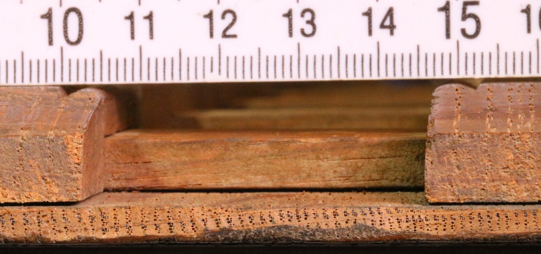
During her stay, Dr Seim examined the wood from the panel Virgin with Child and Two Putti in Floral Wreath (c.1600) by Andries Daniels ( active 1599-1602) and Ambrosius Francken I (ca. 1544/1545-1618). For the occasion, she expressed her interest in different research methods, pointing out the importance of documentation and research on environmental and climatic changes around the world. These historical changes are an important anchor point in the analysis of historical and archaeological wood. In addition, she explained the new developments in dendrochronological research. The Phoebus Foundation was delighted to facilitate this visit with a small workshop on wood research.

Discover the neon paint layers of Roberto Matta
Our sub-collection of Latin American art is also undergoing conservation treatments! Phoebus Conservator Naomi Meulemans is happy to take you behind the paint layers of Amorphous Figures by Chilean artist Roberto Matta (1911-2002).
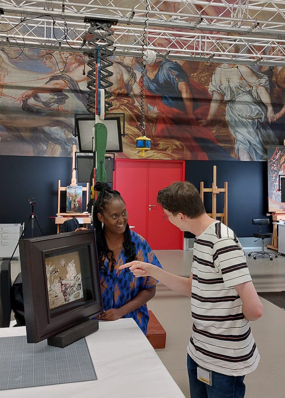
“Matta created this painting in 1940, at the beginning of a pioneering period in his career. Not only his surrealist artworks but also his original choice of materials made him a progressive modernist. Did you know that he even used fluorescent pigments for Amorphous Figures? Before the Second World War, this was very unusual in the art world! Research shows that he not only added the pigment for an aesthetic, illuminating effect but also to give deeper meaning to the artwork. The painting lights up when exposed to UV (ultra violet) light and lets the underlying figures flicker.”
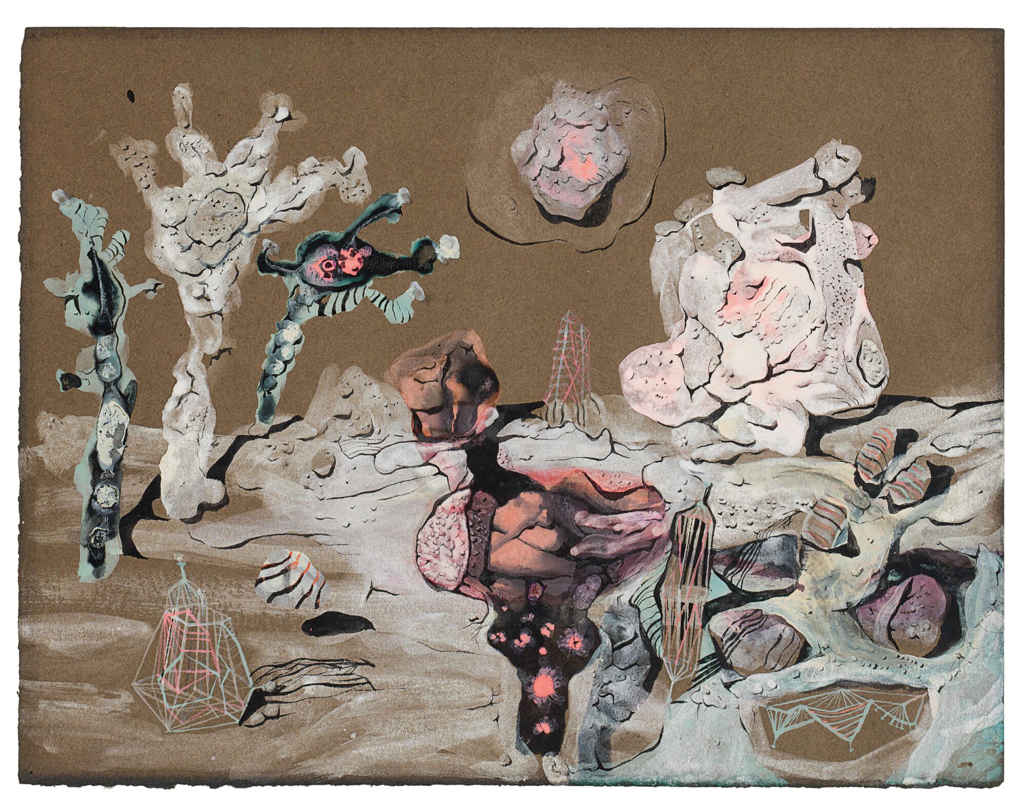
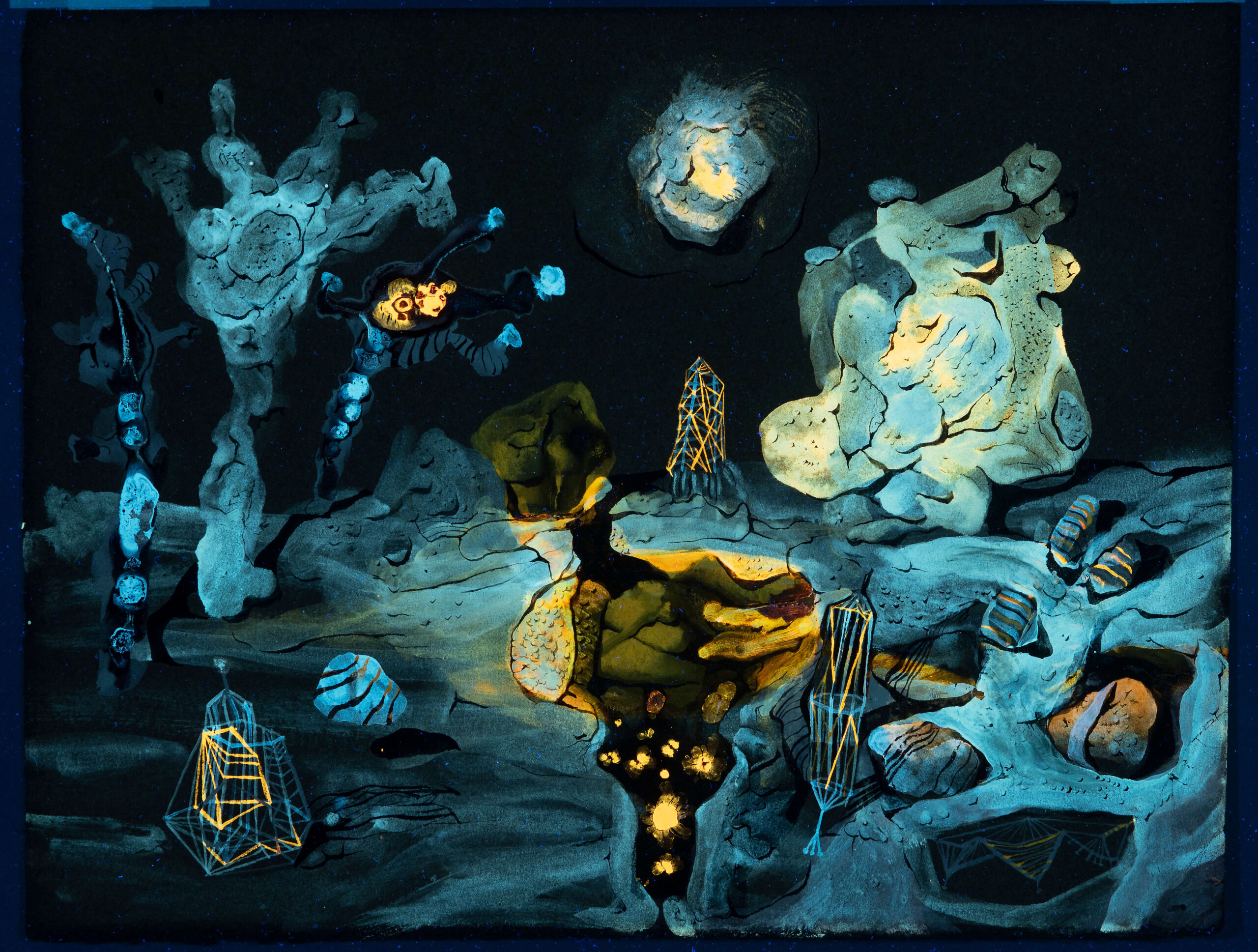
“In 2016, together with Conservator Giovanna Tamà, I investigated the ageing characteristics of the fluorescent pigment, with quite a dramatic result: after fifty years, the paint samples showed clear signs of ageing and after one hundred years, the fluorescent effect would even have varnished completely. Obviously, we want to avoid this! Therefore, it is important to protect the artwork against strong UV radiation. We opted for an adapted retouching method and a special frame. In order to protect the fluorescent layers but still be able to admire them from time to time, we installed a light switch on the frame to provide the artwork with controlled UV light when necessary. Doing so, we also created a surprising effect for the spectator!”
A closer look at our loan programme
You may have noticed… Our loan activities do not stand still! Moreover, ever since the end of the (worst) Covid-19 pandemic, we have a particularly large number of artworks that are leaving our warehouse on a short or longer journey to be presented in Belgium and abroad. Fortunately, Collection Consultant Katrijn Van Bragt and Conservator Anke Van Achter are there to keep everything on track!
“From Los Angeles to Mechelen, from Old Masters to alabaster sculptures, … The variety of works of art that are requested on loan is enormous! The institutions that call upon our collection are also extremely diverse: from historic churches to ultramodern museums. Each loan request therefore requires a unique approach.”

Conservator Carlos González Juste is taking care of Susanna and the Elders by Jan Massys
“First, we consider whether the requested artwork is available during the demanded period of time and whether the object may travel and be presented in the institution. After all, everything depends on the fragility of the object and the circumstances of the venue. Is the exhibition space airconditioned and safe? Does the artwork require additional transport or installation requirements, such as a climate box or shock-absorbing crate? Some works even get a full conservation treatment so that they are perfectly ready to be exhibited.”

Saint Barbara and Charles V in their custom-made packaging
“After all agreements with the borrower and the transport company are final, we draw up an extensive condition report. Once the artwork is packed and loaded into the truck, the journey can start!”
Meet our Phoebus Fellow: Alexandra
Meet our new Phoebus Fellow: Alexandra Taylor! All the way from New Zealand, Alexandra joined our conservation team last month. She will assist our conservators in various projects for the next three months.
Alexandra immediately started with the treatment of Jan Miel’s Figures Feasting at a Fair in Prati, outside the Walls of Rome, with the Basilica di San Pietro and Monte Mario beyond. This painting was commissioned by Marchese Tommaso Raggi (1595/6-1679) in Rome around 1650.
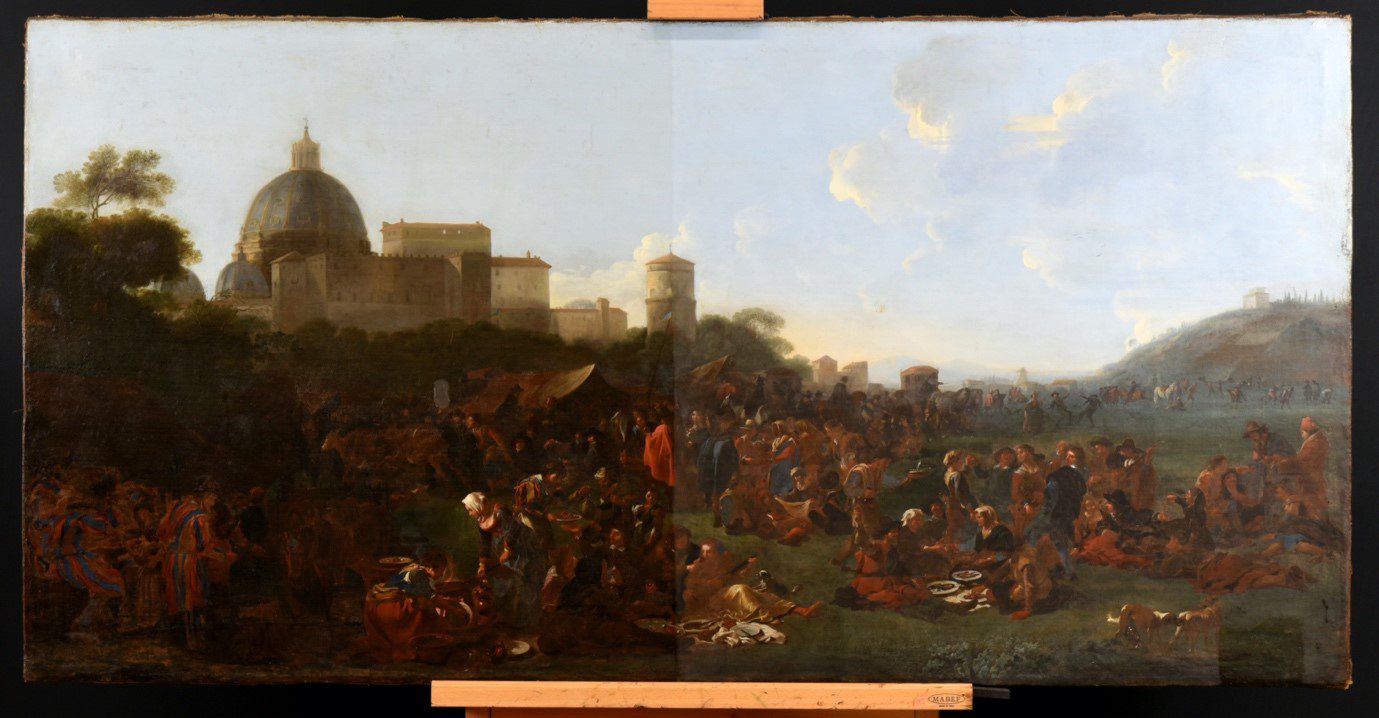
‘The analysis and technical research which precede a conservation treatment really fascinate me! They are the ultimate way to get closer to the master and discover his materials and techniques. These are skills I would like to develop further. The Phoebus Foundation is strongly committed to these analyses, so it is a great opportunity for me to collaborate in the Phoebus studio for a few months. Thanks to infrared reflectography, for example, I discovered inscriptions and pentimenti in Jan Miel’s painting, which are barely visible with regular light and therefore much harder to understand!’
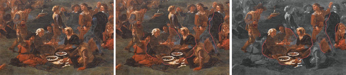
‘The restoration treatment is not a piece of cake! Not only do we need to remove dark layers of varnish and overpaint, we also need to tackle the canvas completely. The painting will look so much more colourful and stable after the treatment!’
Curious about the final result of Alexandra’s work? Keep an eye on our website, newsletter, Instagram and Facebook!
Behind the scenes with Dymphna
Crazy about Dymphna opened a month ago in Geel! Project coordinator Niels Schalley is happy to tell you more about the construction and installation of this fascinating exhibition:
“After a two-year delay because of Covid-19, it was fantastic to finally be able to bring the exhibition to the Saint Dymphna Church in Geel. We were eagerly looking forward to the installation of the Dymphna altarpiece in this unique setting. Thanks to the Crazy about Dymphna exhibition in Tallinn, we had already carried out the entire set-up once before and therefore, we were confident that everything would go smoothly.”
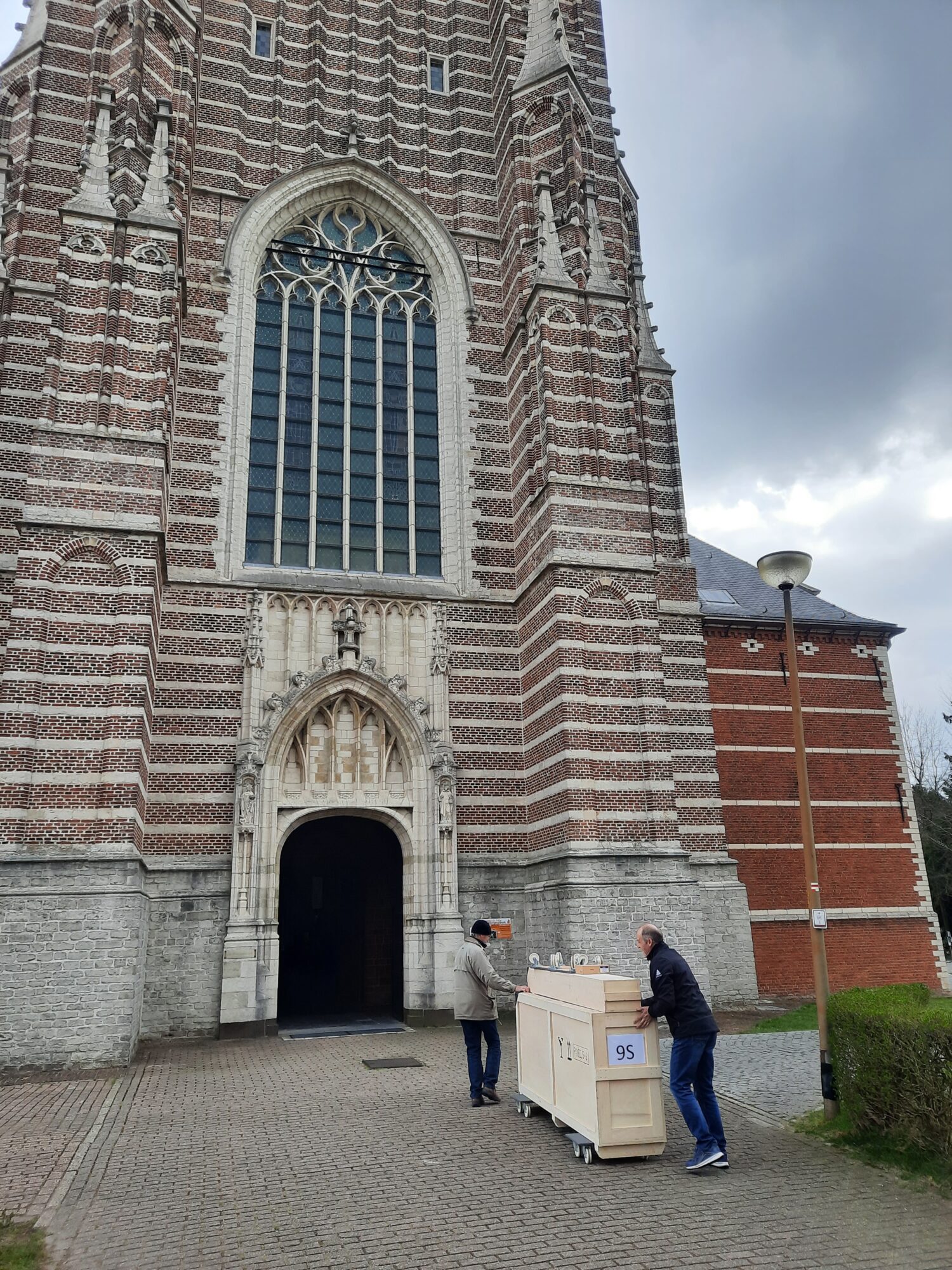

“After a two-year delay because of Covid-19, it was fantastic to finally be able to bring the exhibition to the Saint Dymphna Church in Geel. We were eagerly looking forward to the installation of the Dymphna altarpiece in this unique setting. Thanks to the Crazy about Dymphna exhibition in Tallinn, we had already carried out the entire set-up once before and therefore, we were confident that everything would go smoothly.”
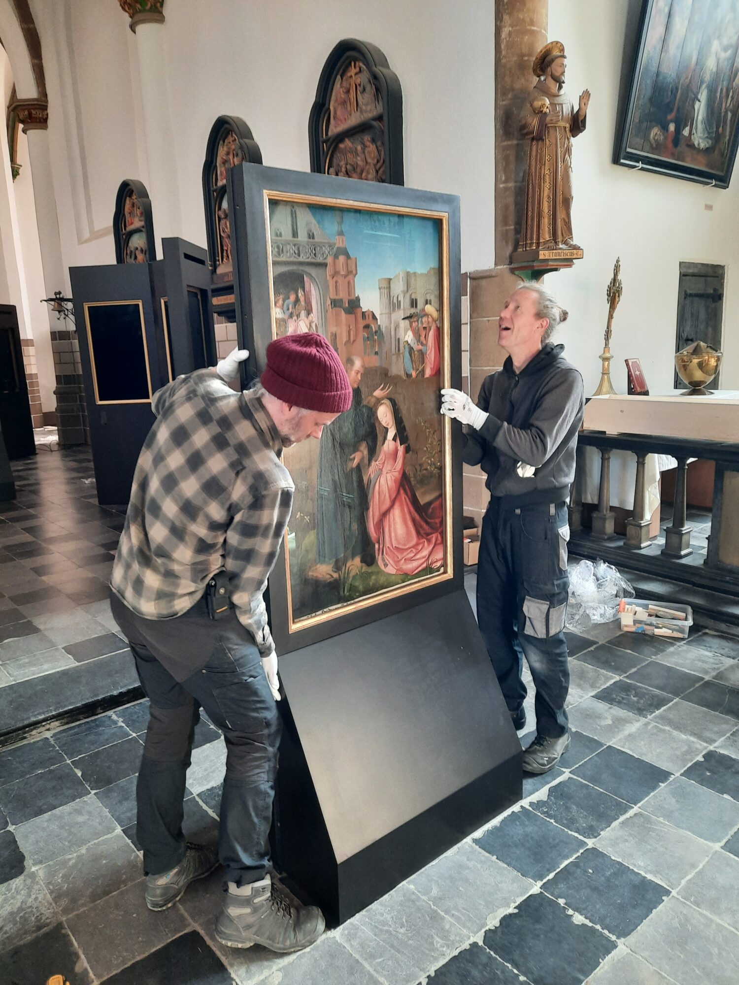
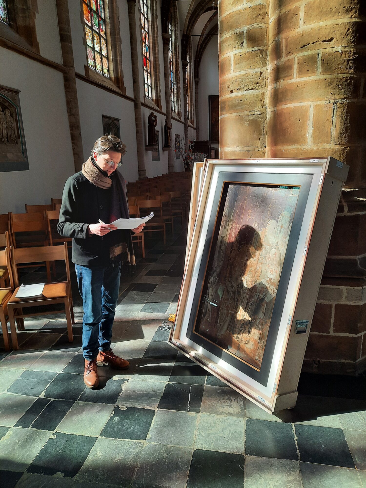

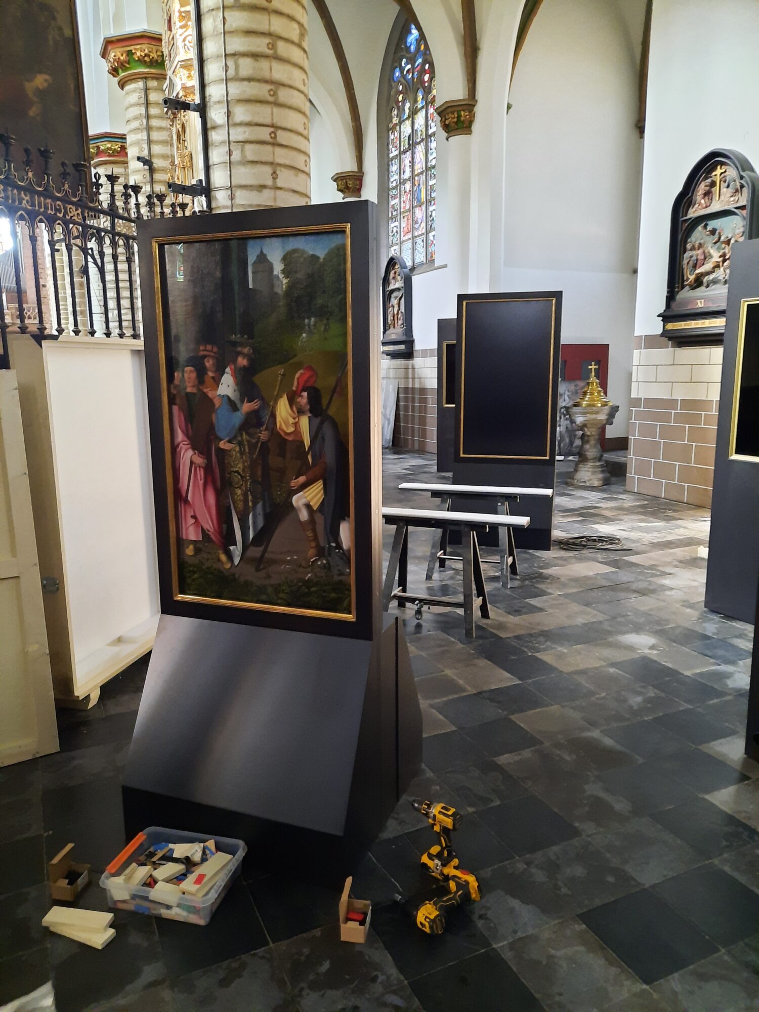
“In tegenstelling tot de locatie in Tallinn, de ontwijde Niguliste kerk, is de Sint-Dimpnakerk nog wel actief. Dit is een enorm voordeel aangezien het Dimpna-altaarstuk op die manier huist tussen de vele verborgen kunstschatten in een van de mooiste kerken van Vlaanderen. De acht panelen van het altaarstuk zijn zo opgesteld dat ze een echte ommegang vormen. Bijhorende sokkels met video’s vertellen razend interessante weetjes en emotionele getuigenissen. Op die manier ontluikt het verhaal van de heilige Dimpna in al haar glorie en facetten.”
Curious? Book your ticket now for only one euro!
Conservation treatment of Jordaens’ Christ Triumphant
Conservators Titania Hess and Laura Guilluy take you behind the scenes of the Phoebus conservation studio!
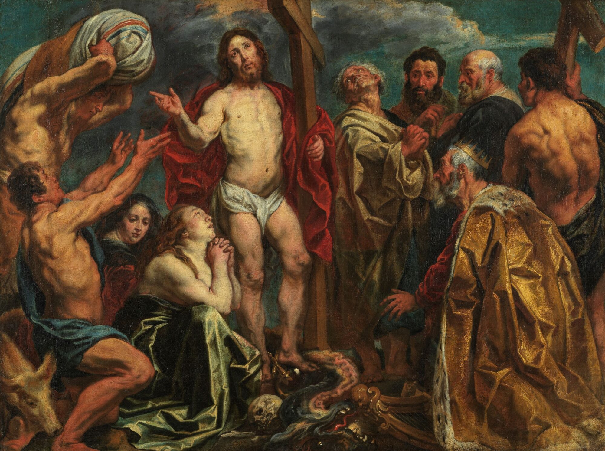
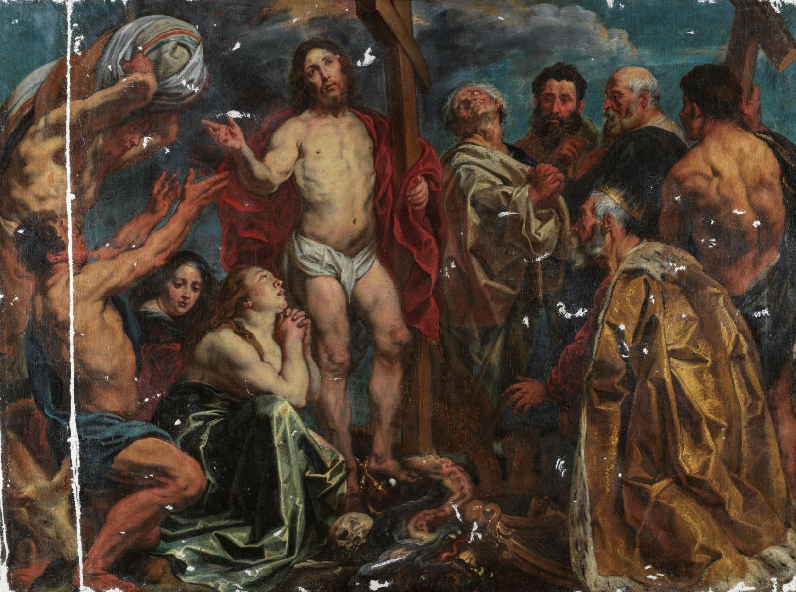
‘Christ Triumphiant, by Jacob Jordaens, has undergone a full restoration treatment! As the painting was relined during a previous treatment, the canvas was in excellent condition. Therefore, the treatment consisted mainly of the removal of oxidized varnish and encrusted soil. With gentle solvents and aqueous gels, we managed to reveal the original paint layer and its astounding palette. A few retouches and two layers of varnish were the final operations to our conservation treatment.’
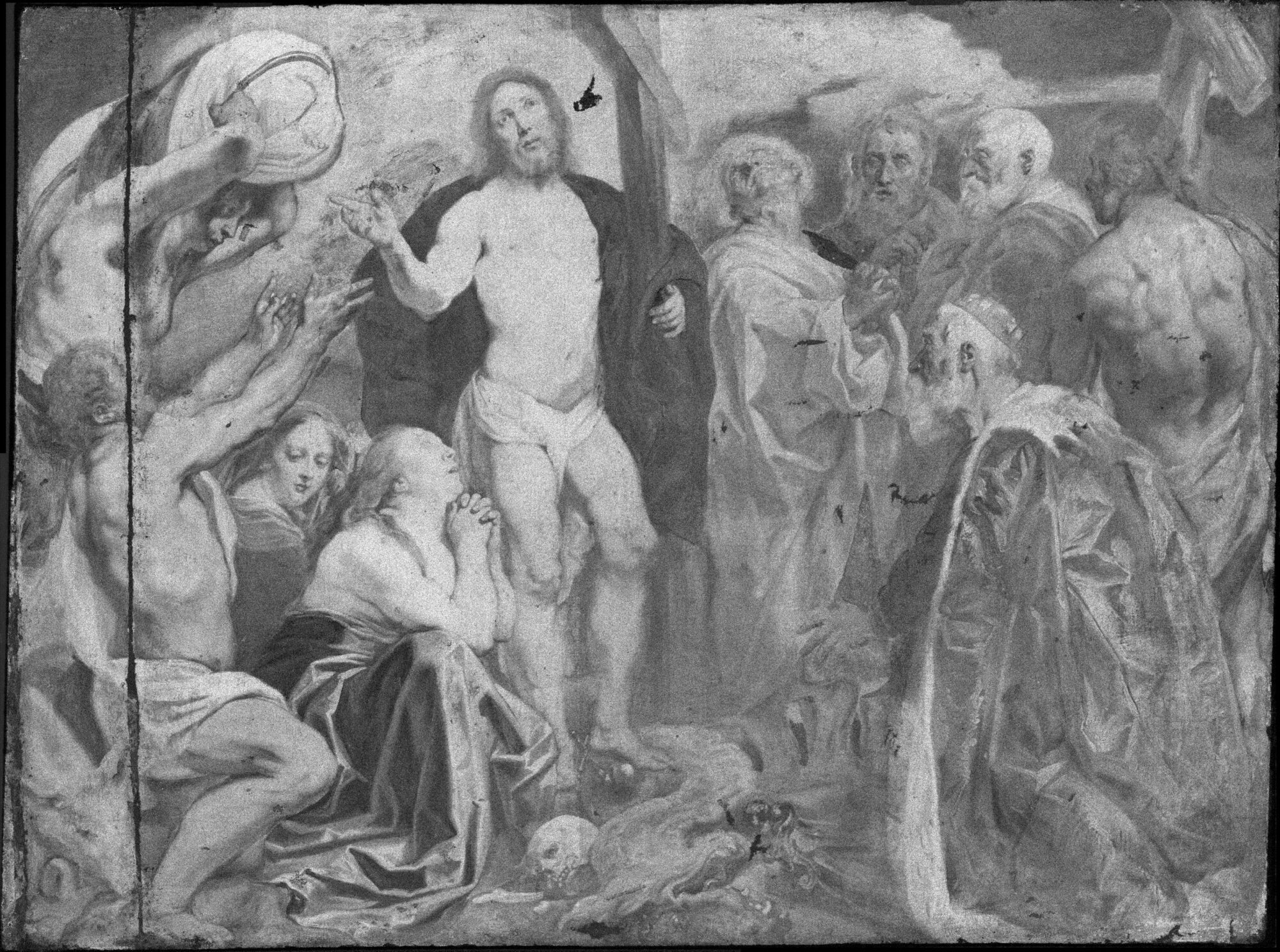
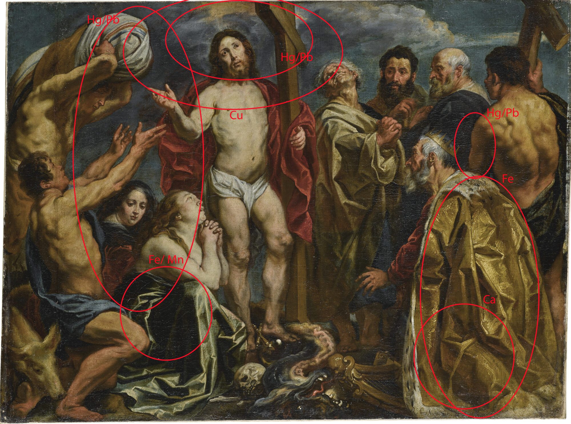
‘Prior to this treatment, the painting was subject to an intensive research, realised by Phoebus head conservator Sven Van Dorst. Using technical analysis such as Ma-XRF scans, various changes in the composition were discovered probably due to changes in the sizes of the canvas.
It turned out Jordaens painted a first composition on a less wide canvas! After a time, the Antwerp master enlarged the painting so he could realize the final composition. This enlarging of the canvas has already been observed in other paintings attributed to Jordaens, which are part of The Phoebus Foundation collection. The observation of these paintings was crucial in understanding the technics of the Antwerp great master.’
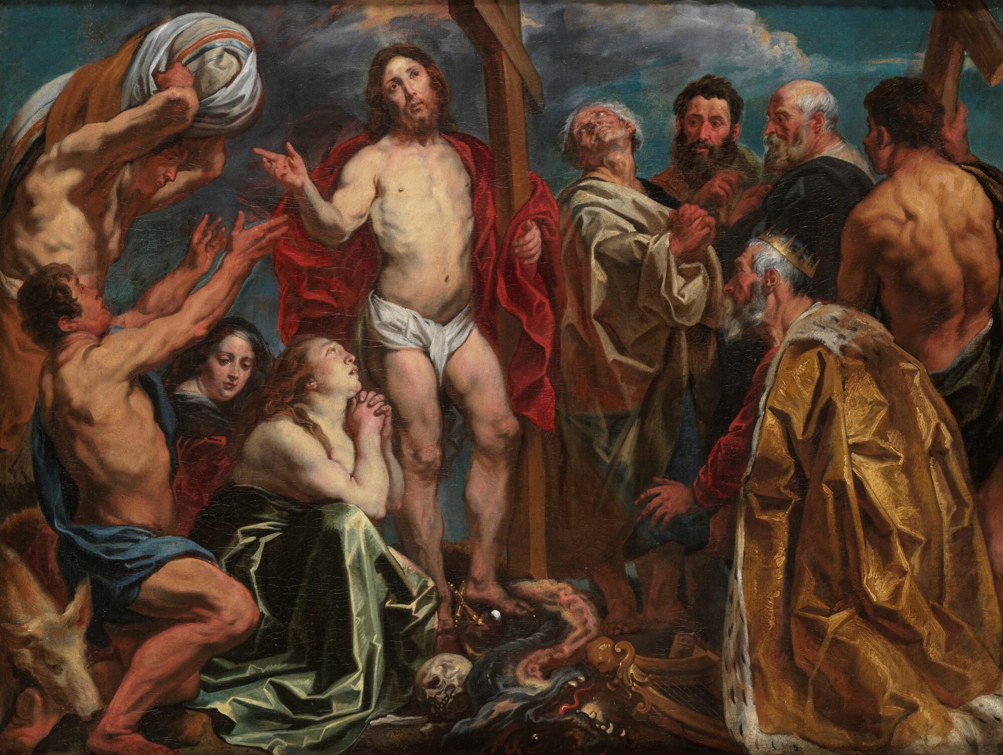
Conservation treatment of Los Muñecos
We start this new year with launching exciting conservation projects at the Phoebus conservation studio! Naomi Meulemans, conservator of the modern and contemporary sub-collections, oversees the restoration campaign of the installation Los Muñecos, created in 1960 by Italian-Argentinian artist Libero Badii (1916 – 2001).

Los Muñecos or The Dolls is an impressive installation of 14 wooden painted sculptures of almost 5 meters high. The instability of the wood and the drastic flaking of the paint layer demand an extensive restoration treatment.
Each doll bears a title that refers to a social personification. Just like our social connections in society, the sculptures are connected to each other in space by a cable. Moreover, they are also attached by a ‘Tablero’, symbol for the wheel of fortune.
Conservator Naomi started this campaign already in 2017, with a preliminary study in collaboration with collaboration with conservator and contemporary art specialist Frederika Huys. Additionally, a material analysis was performed in the studio. With surprising results: x-ray photography showed that the current damage is partly a result of the manufacturing process! Together with conservator Giovanna Tamà and the Royal Institute for Art Heritage (KIK-IRPA), the final conservation and research will be executed throughout 2022.
Stay tuned for the result!
Discover the secrets of The Virgin of the Candlelight
As usual at The Phoebus Foundation, conservation and research go hand in hand. A beautiful example is The Virgin of the Candlelight, an anonymous Peruvian work on canvas from the 18th century which is part of the collection Latin-American art from the Colonial period. Conservator Carlos González Juste offers a glimpse behind the scenes of the research and conservation of this remarkable painting!

‘Due to the thinness of the paint layer, it was already visible to the naked eye that there might be a previous painting underneath the current composition. Technical studies (IRR photography, x-ray images, MA-XRF scanning and wood analysis) have confirmed our suspicions and have revealed the existence of a completely finished painting underneath!’
‘With the conservation treatment and research of The Virgin of the Candlelight, we not only try to preserve the physical integrity of the artwork and recover its original colourful and delicate appearance. We also increase our knowledge about the techniques, materials and habits of the 17th and 18th century painting practices in Peru.’
Behind the scenes of the Ensor exhibition in Mannheim
For the exhibition James Ensor in Kunsthalle Mannheim (DE), conservator Naomi Meulemans travelled in 2021 as a courier to Germany to help with the installation of no less than 5 artworks that The Phoebus Foundation gave in loan for this project.
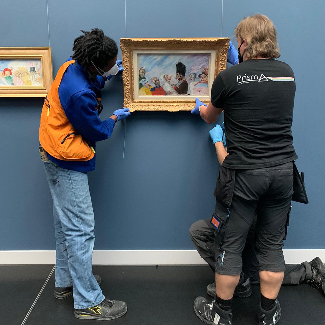
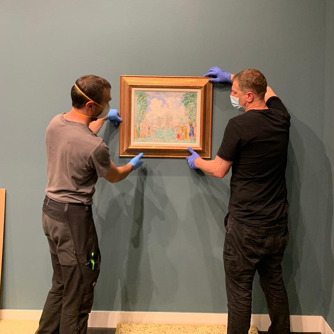
The work of the Belgian artist James Ensor (1860-1949), the famous “painter of masks”, is deeply rooted in the history of the Kunsthalle Mannheim. As early as 1928, the painter was celebrated there in a solo exhibition as an important contemporary exceptional artist. The exhibition in Mannheim focused on Ensor’s famous self-portrait-mask-death-still life motif, which claim an important place in his oeuvre.
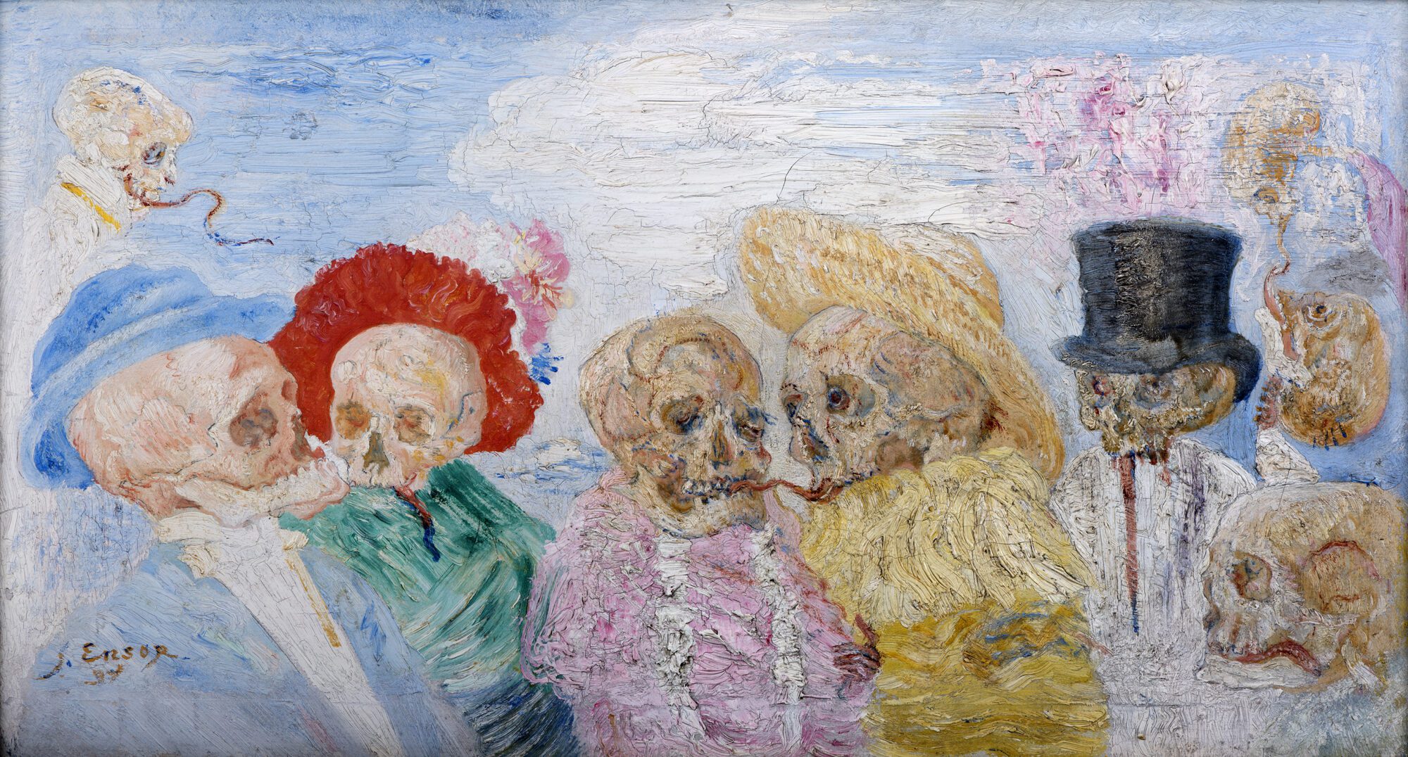
The restrictions due to Covid-19 made it quite a challenge for our courier to attend. Naomi, however, managed to oversee the installation of all 5 artworks and made sure that the climate in the museum rooms was controlled correctly – an absolute requirement for these valuable and fragile artworks.
Dive behind the paint layers of Joos Van Cleve
Phoebus Fellow Anna Rota (IT) is happy to offer you a glimpse behind the scenes of her conservation project at The Phoebus Foundation:
‘Despite its small size (25 x 25 cm), this painting by the studio of Joos Van Cleve (1485-1541), immediately attracts our attention. The unusual diamond-shaped support seems to be unique in the artist’s oeuvre and raises questions about the distribution of diamond-shaped paintings in Renaissance painting.’
‘The facial tones, with such a soft transition between light and shadow, can be compared to Leonardo Da Vinci’s “sfumato.” The artist was particularly attentive to detail and used various material tricks: just look at the thickness of the colour layer of the pearls in Mary’s hair or the folds of the white veil along her neckline. Mary’s hair and the faces and hands, on the other hand, are rendered with very thin brushstrokes.’
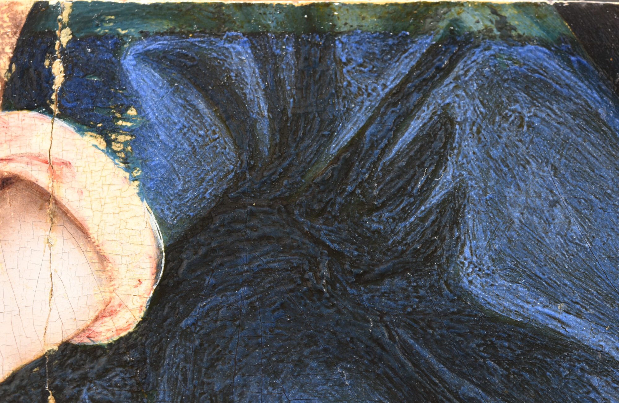
‘The removal of varnish and retouching has brought back the beautiful colors of the facial tones, as well as some details that were previously less visible. The conservation treatment has allowed us to discover more about the painting technique of Van Cleve and his studio.’
Discover the project of Phoebus Fellow Anne-Rieke
Art historian Anne-Rieke van Schaik (NL) focused during het fellowship on the sub-collection Topography and Cartography. Anne-Rieke is glad to give an insight in her Phoebus Fellowship program:
‘Early modern media, the narrative qualities of cartography, and the intertwining of maps, books and prints in this period are really my cup of tea. As member of the Explokart Research Programme on the History of Cartography (University of Amsterdam) I am working on various projects such as a specialized database and a handbook of historical cartography.’
‘During my Phoebus Fellowship, I examined the wide variety of objects in the rich Topography and Cartography collection of The Phoebus Foundation; ranging from sea charts, military news maps, cityscapes and early world maps to colored atlases, travel books and globes. My job was to perfection the inventory of the objects and to improve the catalog descriptions. The striking research results and treasures of the collection will be made accessible to a wider audience later on, for example in an exhibition or publication.’

Goodbye, Tallinn!
Time flies! After more than seven months, we said goodbye to the city of Tallinn at the end of November 2021, where we organized the exhibitions From Memling to Rubens and Crazy about Dymphna at the Kadriorg Museum and the Niguliste Museum. It was such an honour to travel abroad for the first time ever with our extensive collection of old masters! We are extremely grateful to our partners in Estonia for this unique opportunity. Due to their great success, both exhibitions were extended by one month so that visitors could enjoy these masterpieces even longer. At the beginning of December 2021, the team of The Phoebus Foundation travelled to snowy Tallinn to supervise the dismantling of the exhibitions and to bring all the art works back home.
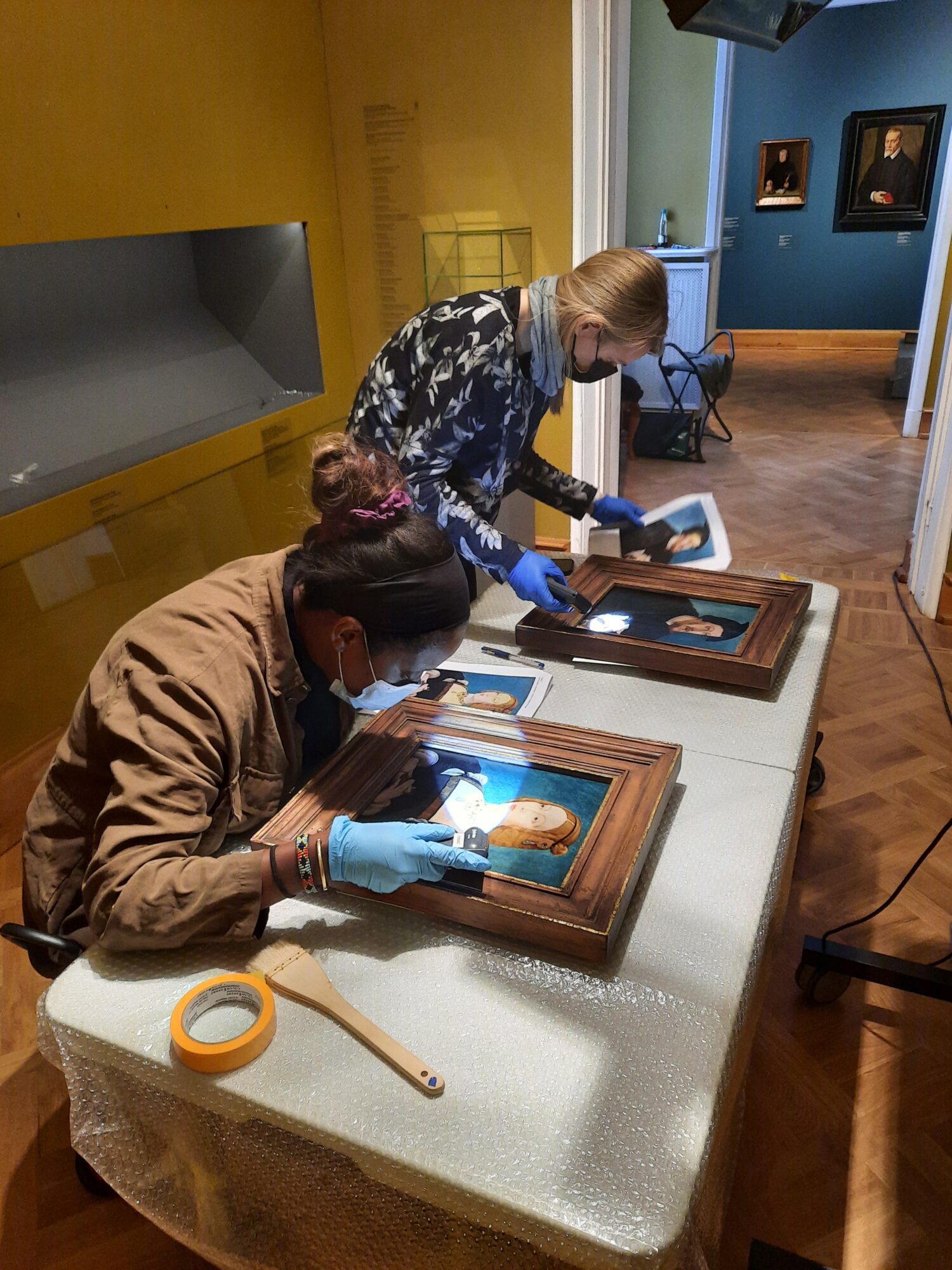
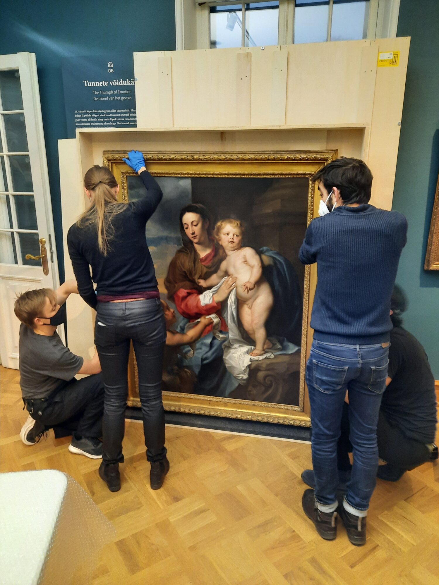
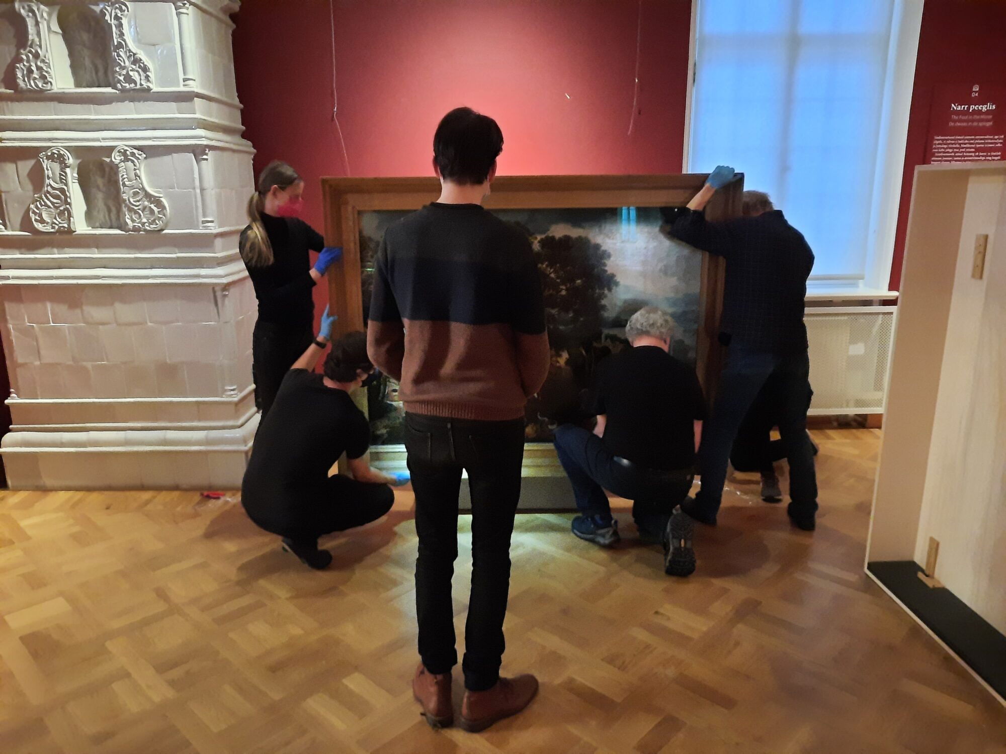
Take a look through the lens of our photographer
Collection registration and beautiful books don’t exist without perfect images. Take a look behind the scenes of our photo studio where our photographers capture various artworks with their lenses. Michel is happy to tell you more about this fascinating and challenging task.
Is there a great difference between the photography of artworks and other photographical genres?
‘Fine art photography really is a specialization. Most people think we just put a painting or sculpture in front of a white fond, we press a button and that’s it. It’s not that easy in reality. The photography of artworks is very technical because of the large diversity of objects. A glass vase, a manuscript or a painting each demand their own setting and lighting. Moreover, they need to be adjusted over and over again during the photoshoot. In fashion photography for example, the lighting is fixed and the model tries different poses to get a perfect picture. In art photography it’s the photographer who needs to play with light and shadow because the object doesn’t move obviously! (laughs). It’s always a new puzzle that needs to be solved.’
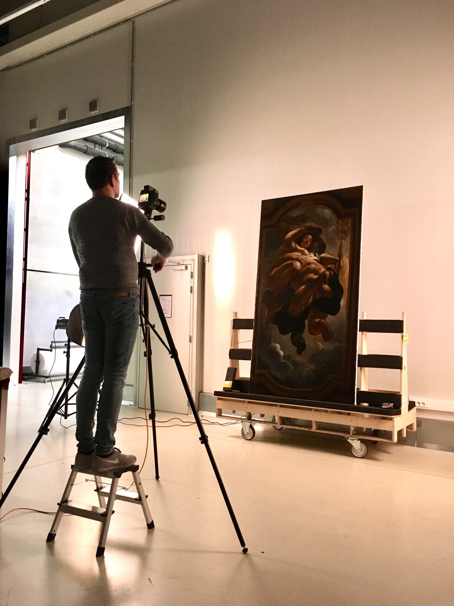
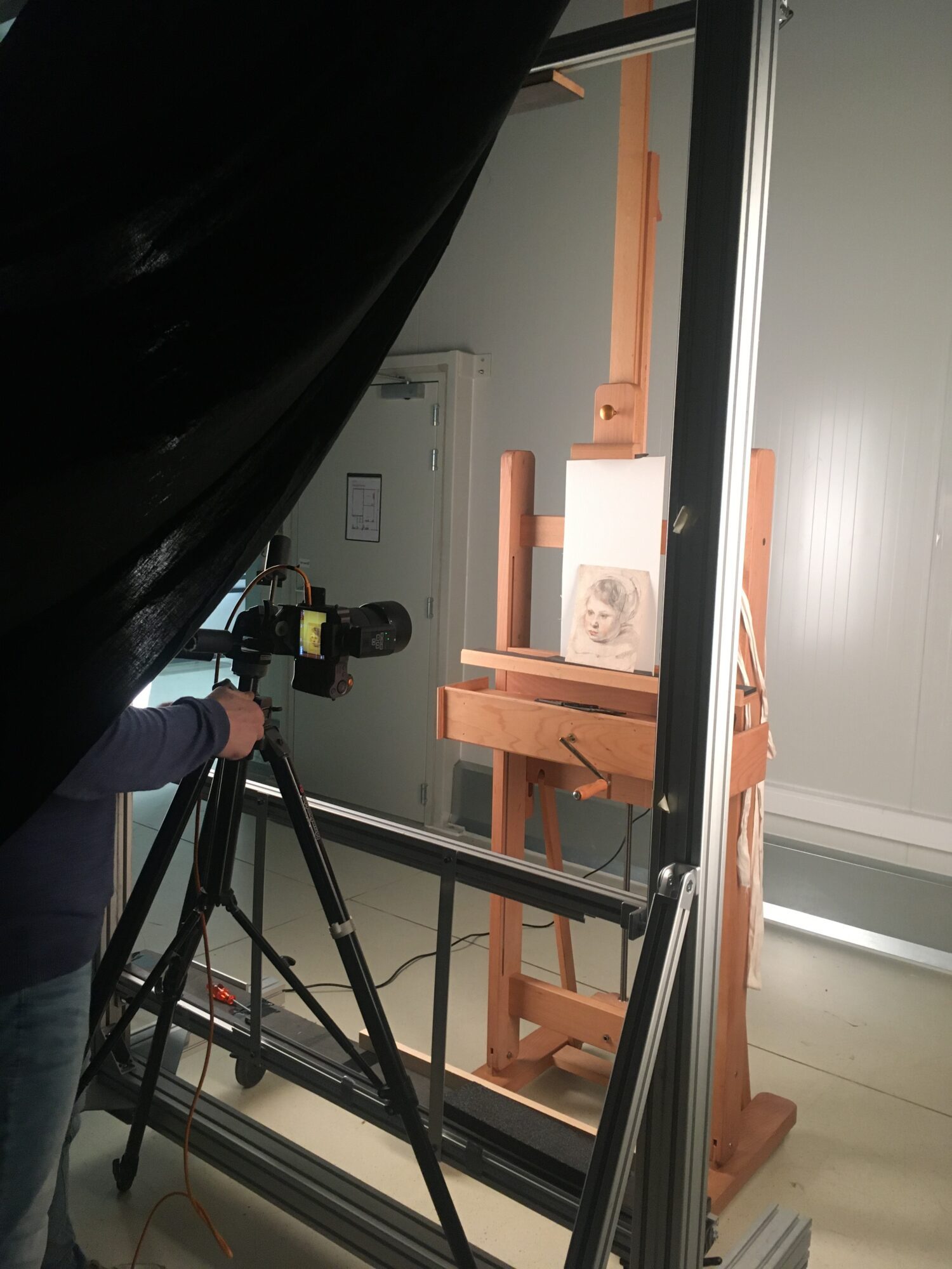
Where does your specialization and fascination for fine art photography come from?
‘By accident! One of my first jobs was the photography of two terra cotta vases of the Dominican Republic for an advertisement. I have been photographing for various institutions and projects ever since. After all these years, it is still an enrichment for me. The variety of objects I get to see through my lens is extraordinary! I also get the chance to have a close look at the artworks and I often discover remarkable details.’
Which type of object do you like the most?
‘Definitely sculptures. In most cases, every side of the artwork has been embellished as if the sculptor wants you to walk around. As a photographer I always try to find the best angle in order to display the sculpture as vividly as possible. It really is an experiment with light and shadow.’
A glimpse behind the scenes of our Maritime and Logistic Heritage Volunteers
Discover a very special part of The Phoebus Foundation’s collection: Maritime and Logistic Heritage! A team of enthusiastic volunteers is in charge of the daily routine of this extraordinary collection. As retired dockworkers with a passion for heritage they know this collection of historical risers, tractors, trucks, and measuring and weighing devices like the back of their hand. Every week, the group gathers together in the warehouse Argentin in the northern part of Antwerp to work on the conservation and the accessibility of the collection.
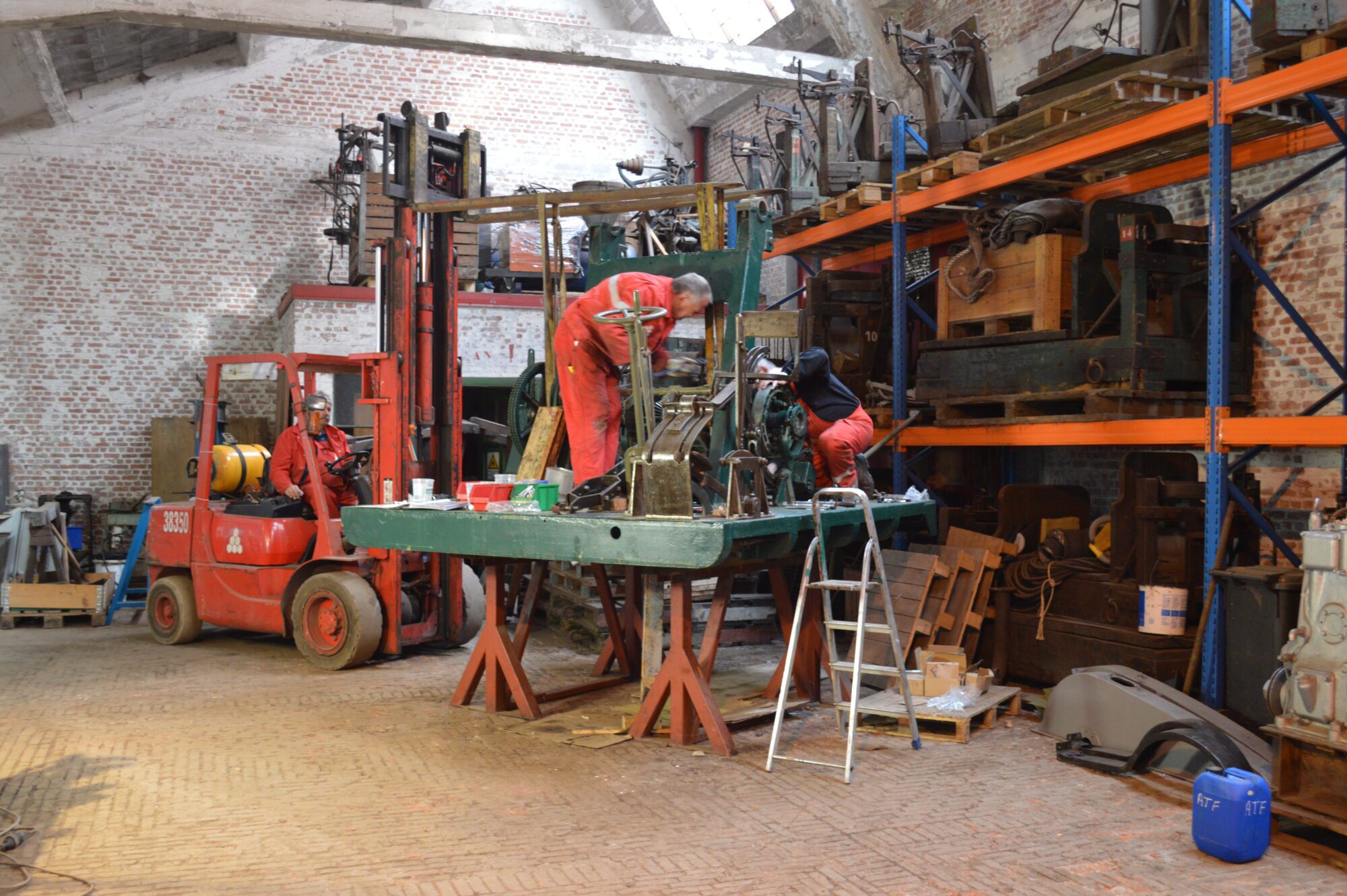
For some of our volunteers, a port heritage day already starts before dawn. Early bird Juul is always out and about at 6 AM. One after another, colleagues arrive and join the group. Around 8:30 AM there is a small meeting to discuss the daily schedule whilst enjoying a cup of coffee. All volunteers have their own unique background and expertise which makes everyone an essential member of the team. Juul and Roger are specialists in welding; Freddy knows all the secrets of tinkering and electrotechnics is Fred’s cup of tea. This diversity makes it possible to work on multiple large projects at the same time. An important element of their tasks is also the conservation of rare heritage objects. “The current major project we are working on is the Antigoon crane”, Fred explains. “It is a port vehicle of the early fifties and probably the last example left of its type. With lots of patience and effort, we managed to complete the mechanical work. It certainly wasn’t a piece of cake because we didn’t have a single plan or piece of documentation. Luckily we could count on the craftsmanship and expertise of our team members to solve these problems together.”
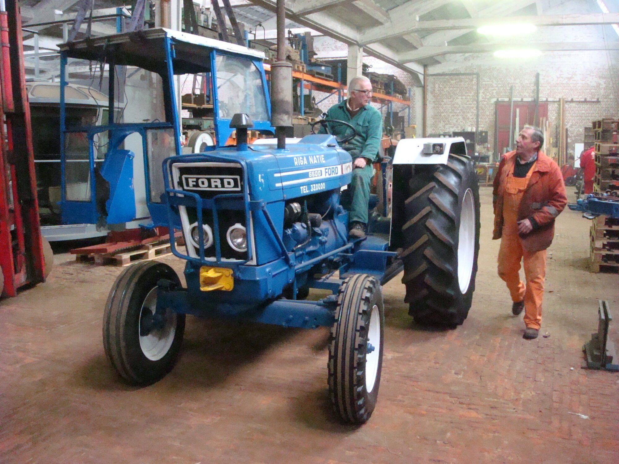
In small groups, the volunteers diligently continue their work. Painting, sanding, welding, restoration of all possible tools,… before you know it, it is time for a well-deserved coffee break where our volunteers share their memories from ‘good ol’ times’. “This is very important to us”, Harry, the youngest of the group, explains. “After retiring as commercial manager in the port industry after 43 years, I am grateful I could become part of this team. I have always been intrigued by history and I am happy I can contribute to the Logistics and Maritime Heritage here. Even though I don’t have a lot of technical expertise, I can cooperate in the large valuation project of the collection. We make sure every object is measured, catalogued and photographed. Some pieces are truly unique and have an extraordinary history, which always fascinates me. The many stories and interesting anecdotes bring the items back to life.” The other volunteers share the same passion and motivation.
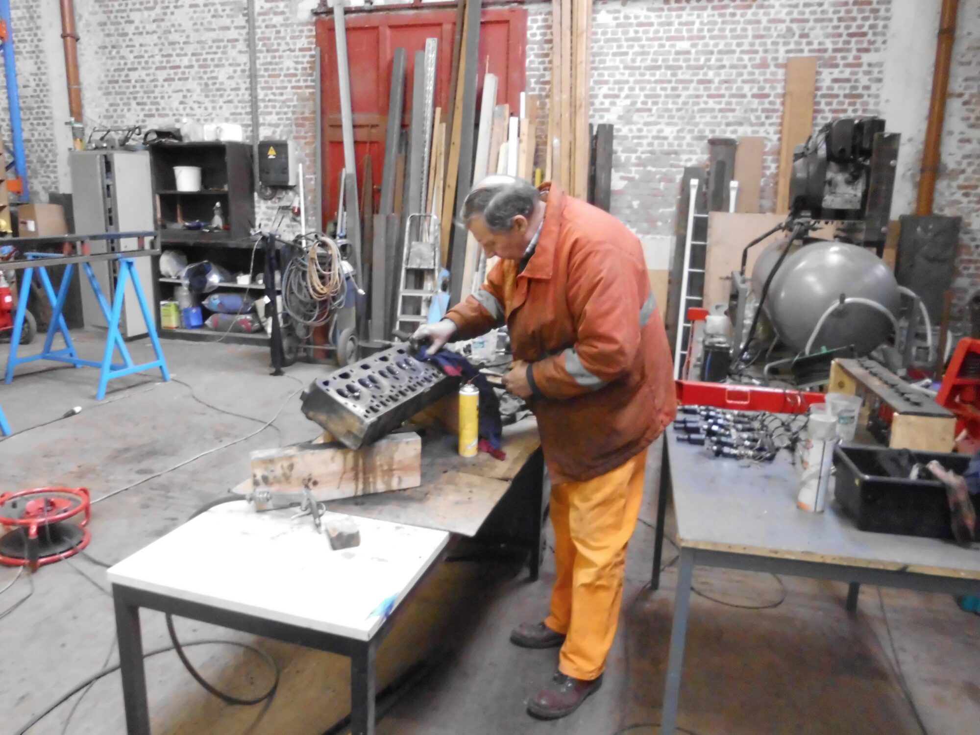
The team has completed many large conservation projects throughout the years. This is essential to volunteer Martin. “Our aim is to preserve the maritime heritage for future generations. The Antwerp port and her workmen are world famous because of their craftsmanship and professionalism. Sadly, this history is getting lost rapidly. The generation of whom I learned the tricks of the trade is now between 75 and 91 years old. Acts and tools from back then are no longer in use. Therefore, it is our task to pass on this important heritage to the future generations. We hope to realize this with our efforts in the Argentin warehouse.”
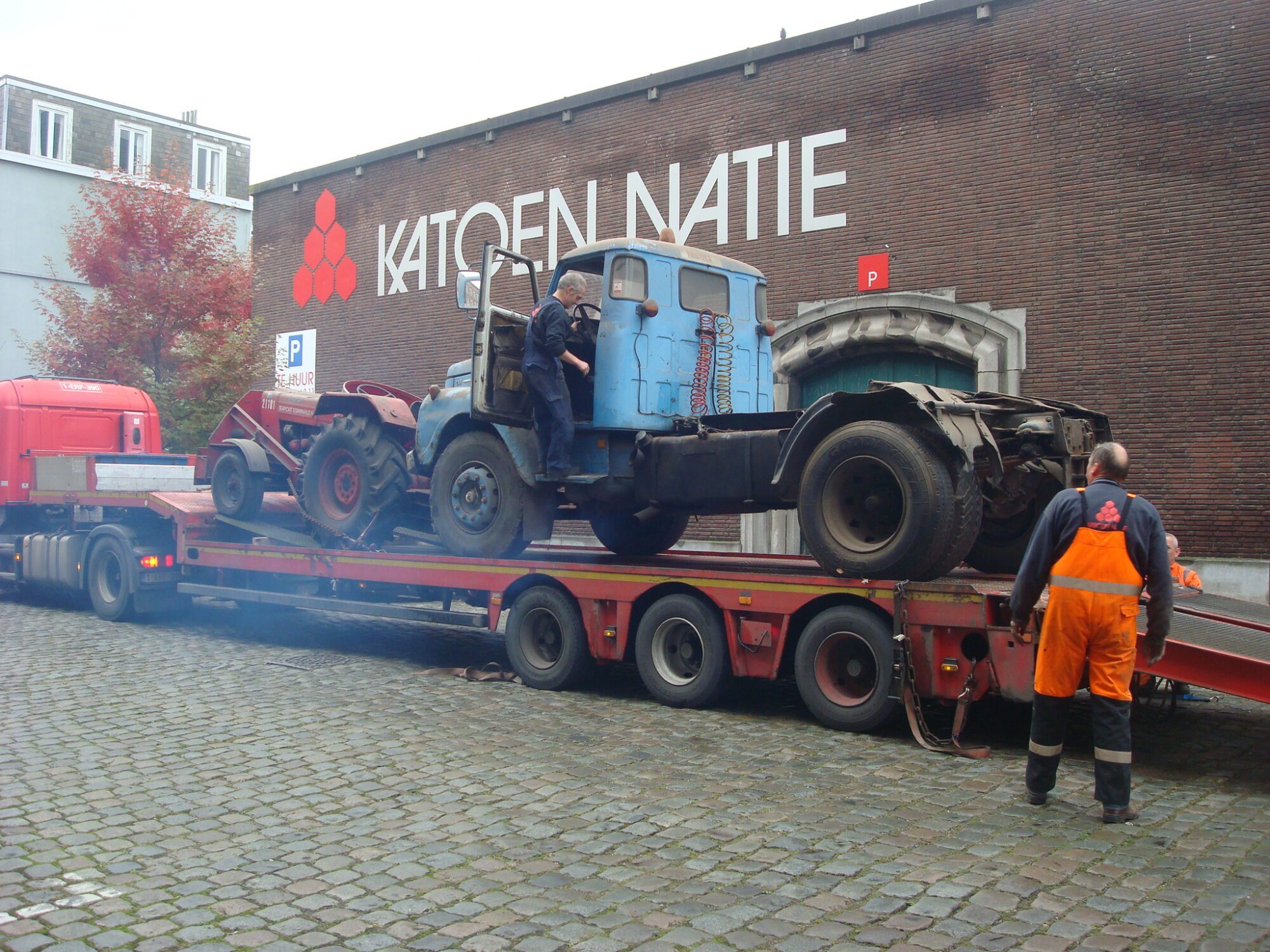
Until 12 PM the team collaborates on various port heritage projects. Then, it’s time for a well-deserved lunch. Volunteer Jacques, who has been a ship’s cook for years, often surprises the team with soup or a home-cooked meal. Old memories and various port anecdotes are shared around the table. Together, the volunteers dream about the future. “Hopefully, we can reopen our doors for group visits soon. This way, we can share our passion and moreover this exceptional collection with a broad audience again.”
Conservation treatment of the oldest oil painting in our collection
Take a look behind the scenes at the restoration treatment of one of the oldest oil paintings from the collection of The Phoebus Foundation. Dating from c.1418-25, the artwork is even older than the famous Ghent Altarpiece by the brothers van Eyck (1432). Consisting of four panels, dedicated to the Virgin Mary, it was probably originally part of a larger altarpiece.
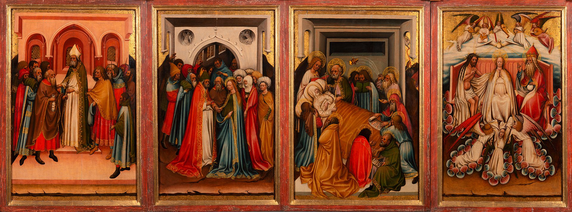
If you look closely, you can see that the artist was already very progressive by casting shadows on his figures, giving them a three-dimensional character. However, a technical cast shadow is still missing, which indicates that we are at an important turning point in Western art history. For this reason, we recently decided to start an extensive conservation treatment. During the treatment we hope to learn more about the geographical origin of the panels and about the methods and materials used by the painter.
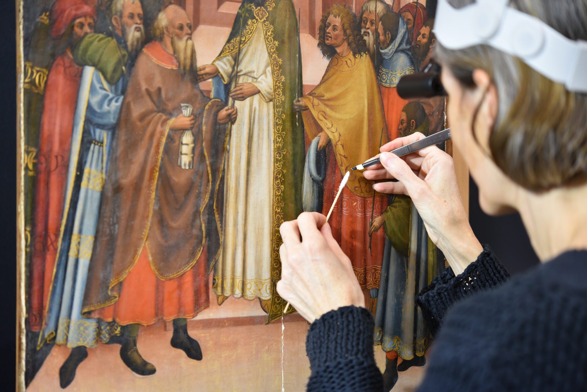
At the start of the restoration it turned out that both the execution and the gilding on the panel were in good condition. The treatment mainly provides for the removal of discoloured and outdated layers of dirt so that the sparkling colours can be visible again. Special care is required, especially on the fragile gilding. In the 15th century, the artist made small impressions in the gold leaf by using metal awls or punches in order to obtain the floral motifs in the upper part of the painting (heaven) which make this work so special. By removing the varnish and dirt, these motifs finally became visible again.
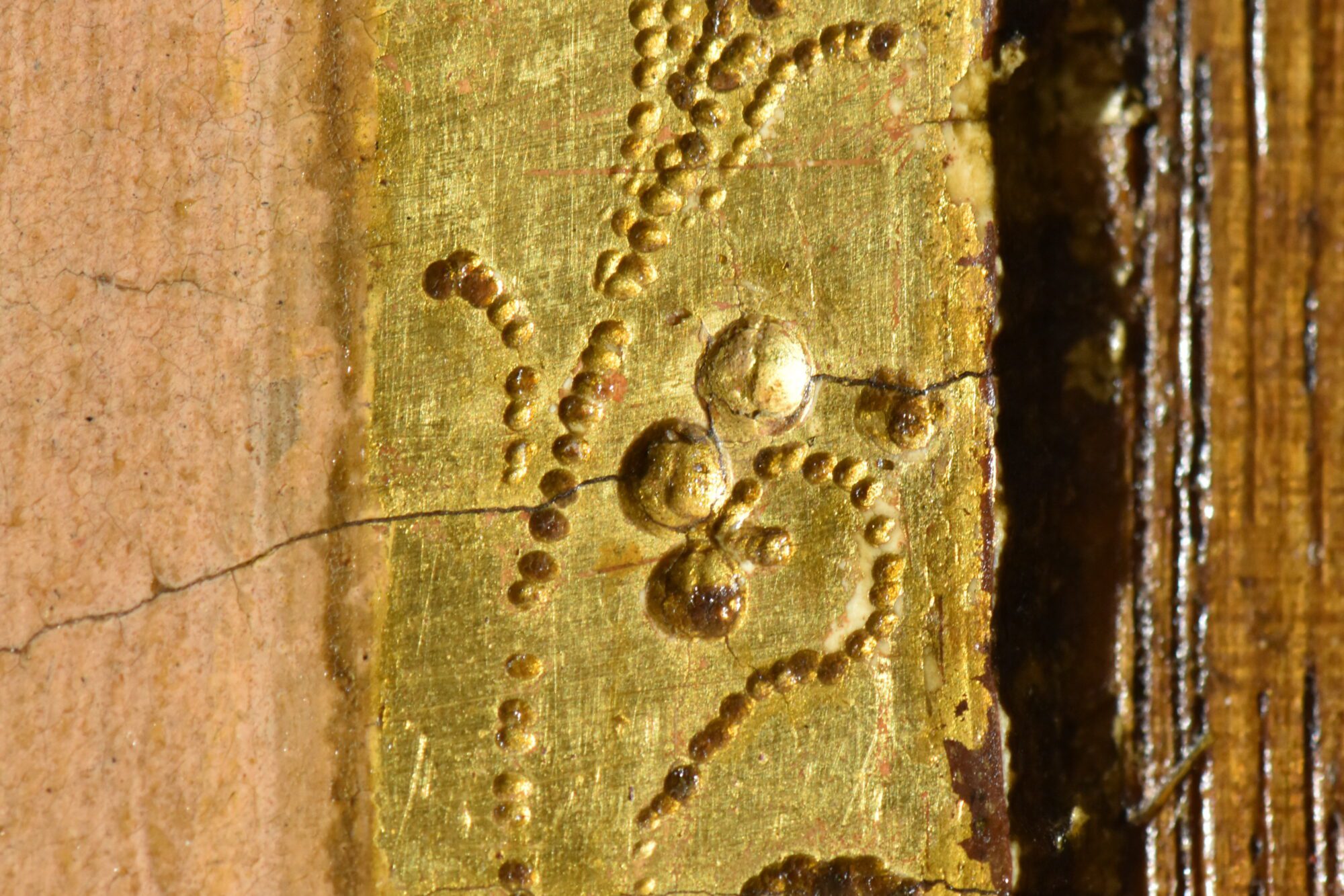
The conservation treatment is spread over 3 years and is carried out by Sven Van Dorst, head of the conservation studio of The Phoebus Foundation, in collaboration with Hilde Weissenborn, an independent conservator specialized in the treatment of 15th and 16th century Flemish masters.
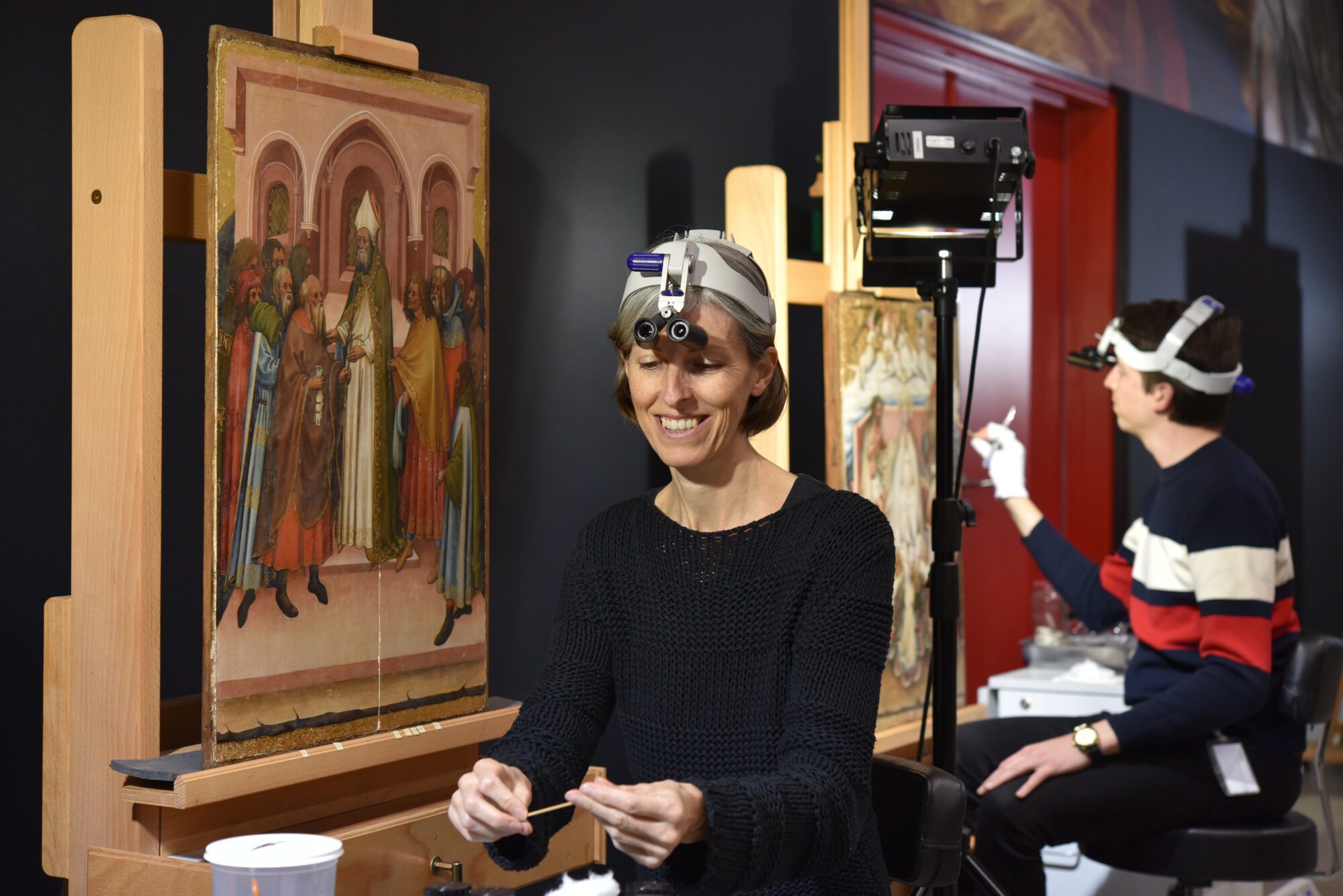
Take a look behind the paint layers of Jordaens’ The Sleeping Antiope
Especially for At home with Jordaens, various works by Jacob Jordaens underwent an extensive conservation treatment. Conservators Jill and Ellen Keppens take you behind the paint layers of The Sleeping Antiope Approached by Jupiter (1660).
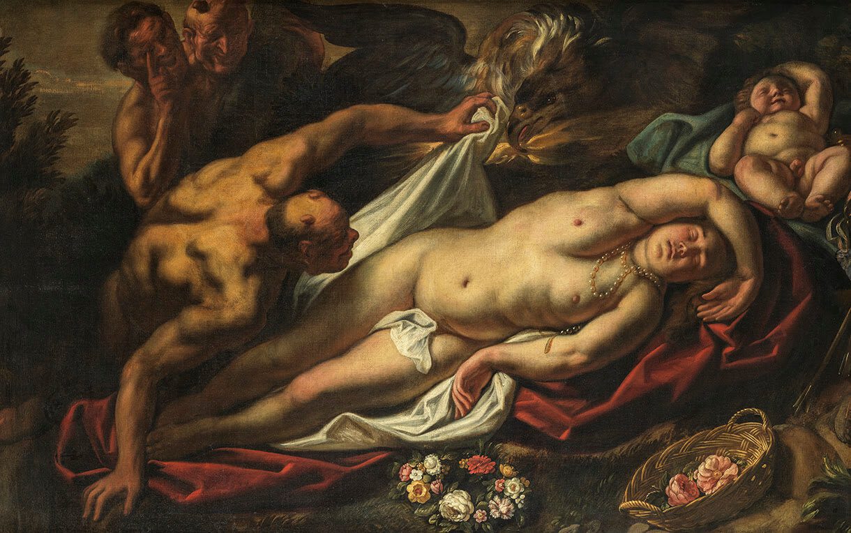
‘This painting reminded us of an old acquaintance! A few years ago, we restored a nearly identical sleeping beauty by Jordaens: Psyche. This time, it’s Antiope, accompanied by Jupiter who, disguised as a satyr, removes the cloth from her body.’
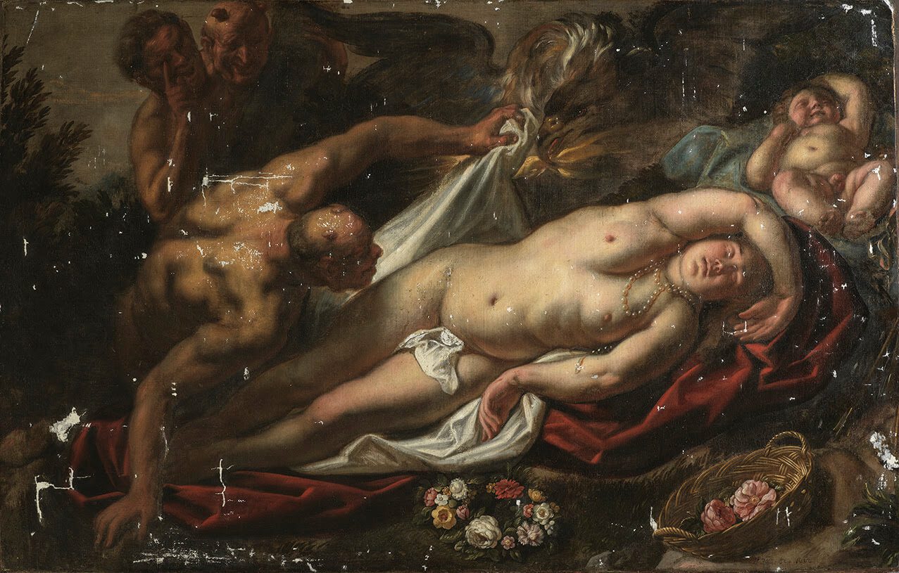
‘Jordaens and his contempories fancied erotic themes like this and especially the contrast between Antiope’s porcelain naked skin and Jupiter’s ugliness. This contradiction, however, became completely covered by a thick layer of varnish. When the varnish and the old retouches were removed, not only the beautiful colours but also Jordaens’ sketchy technique came to light again. The eagle’s wings are painted with a few quick brushstrokes of diluted brown paint, under which the grey colour of the ground layer shines through. In the feathers, Jordaens also applied a few thick, bright blue strokes.’
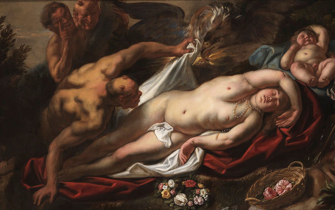
‘These sketchy areas and the rather limited format cast doubt on the purpose of this painting. Was it a finished work of art? Part of an elaborate preliminary study? Or did it serve as an example for a client? Whatever the case, The Sleeping Antiope is currently back at home with Jordaens at the Frans Hals Museum in Haarlem!’